Kyoto Brand Identity
Naming / Logo / Visual identity / Packaging
The project is inspired by Japanese culture, elements, and colors. I created all the details, patterns, and styles from scratch. I aimed to show how some simple and traditional Japanese symbols can be turned into an elegant fusion restaurant idea. I chose “Kyoto” for the name as it is one of the most beautiful and cultural cities in Japan, besides I like the name itself. I chose the logo font to match the Japanese vibe and style. By customizing it, I created a more unique, elegant, sophisticated, and simple logo with matching and interesting logomark, so that it would be recognizable and aesthetic.
As you can see, I used only three colors for the logo - white, red, and black. These are considered the most genuine and primary colors in Japanese culture. In addition, I associate them with food. For me, white describes the freshness of the food and its ingredients, red is the joy and pleasure that tasty food can bring, and black is elegance, the aesthetic side of fusion cuisine the importance of which is described by the well-known saying among chiefs “You eat with your eyes first.” The colors reflect Japanese culture and the project’s uniqueness at the same time.
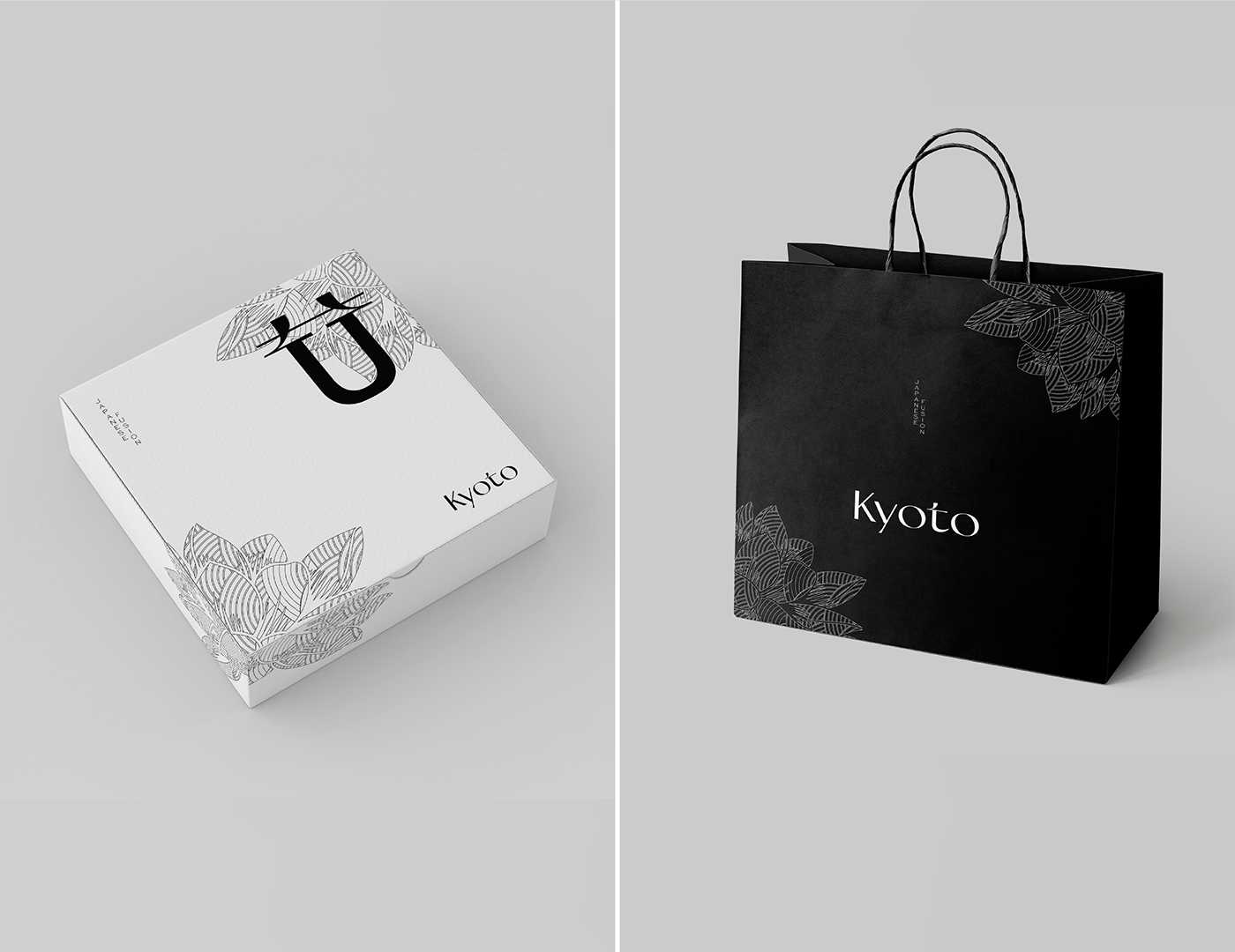
I made two packaging design concepts for the restaurant. One is more elegant, simple, and minimalistic with a patterned lotus flower, and the second, for the takeaway food is with a koi fish pattern.
I like this work as I was able to achieve what I had in my mind. Hope this will not remain just a concept. With this intuitive, elegant, minimalistic, and simple design, your restaurant will distinguish itself from thousands of other eateries.
Hope you enjoyed the project as much as I did. I would be glad to see your comments!