
PT | Um novo ciclo se inicia. É com muito orgulho que apresentamos ao mundo a nova identidade visual do Estúdio Okami Brand. O novo design trás verdadeiras e significativas mudanças que traduzem o nosso atual posicionamento e a forma como pensamos à frente de cada desafio a nós incumbidos.
Toda essa evolução se baseia em nossa jornada como empresa, no sucesso de nossas entregas e no impacto transformador que causamos na vida dos nossos clientes empreendedores.
All this evolution is based on our journey as a company, the success of our deliveries and the transformative impact we have on the lives of our entrepreneurial customers.
EN | A new cycle begins. It is with great pride that we present the new visual identity of Okami Studio Brand to the world. The new design brings true and significant changes that reflect our current positioning and the way we think before each challenge entrusted to us.
All this evolution is based on our journey as a company, the success of our deliveries and the transformative impact we have on the lives of our entrepreneurial customers.


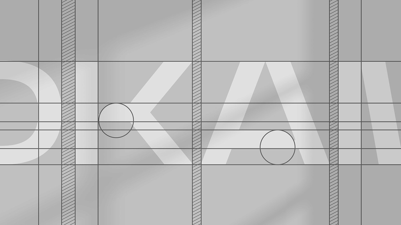
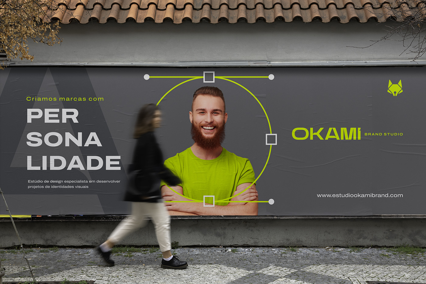
PT | A tipografia, tanto isolada quanto junta ao símbolo, conclui o nosso objetivo de representar por completo o nosso estúdio, pois ela tem consigo características peculiares que imediatamente provam que a empresa é jovial, atualizada, criativa e singular. As cores foram utilizadas propositalmente para tornar todo o projeto vibrante, harmônico, cativante e ousado. Cada traço e cor da nova identidade visual do Estúdio Okami Brand reflete a essência do nosso trabalho.
EN | The typography, both isolated and joined to the logo, completes our objective of fully representing our studio, as it has peculiar characteristics that immediately prove that the company is youthful, updated, creative and unique. The colors were used on purpose to make the entire project vibrant, harmonic, captivating and daring. Each feature and color of the new visual identity of Okami Brand Studio reflects the essence of our work.


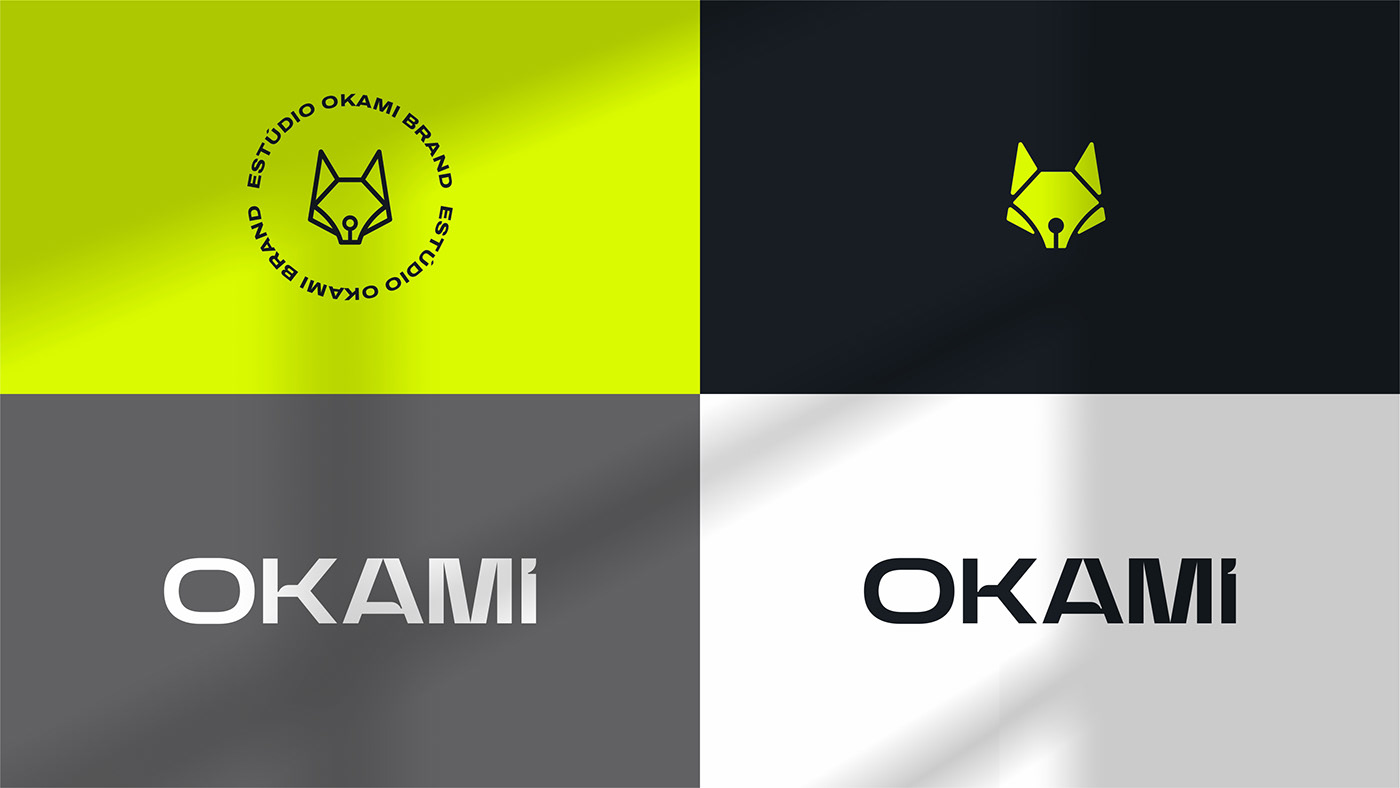
PT | O símbolo é representado por um lobo e uma pen tool fundidos e estilizados para tornar possível a concepção plausível de como funciona o nosso processo de criação e materialização dos projetos.
Lobo: Estratégia e faro aguçado para essência, modernidade, inovação, sofisticação, representatividade e o mais importante, o caminho dos resultados.
Pen Tool: técnica, precisão, controle, diversidade e expertise.
EN | The symbol is represented by a wolf and a pen tool fused and stylized to make possible a plausible conception of how our process of creation and materialization of projects works.
Wolf: Strategy and keen nose for essence, modernity, innovation, sophistication, representativeness and more importantly, the path to results.
Pen Tool: technique, precision, control, diversity and expertise.
Pen Tool: technique, precision, control, diversity and expertise.


Obrigado | Thanks

Equipe Criativa:
Creative Direction: Wtanabe Santos
Graphic Designer: Wtanabe Santos
Copywriting: Rodrigo Zortt
Motion Design: Wtanabe Santos | Rafael Medeiros


