SymbolStudio©
...
BRIGHTP●○L ... More than finance
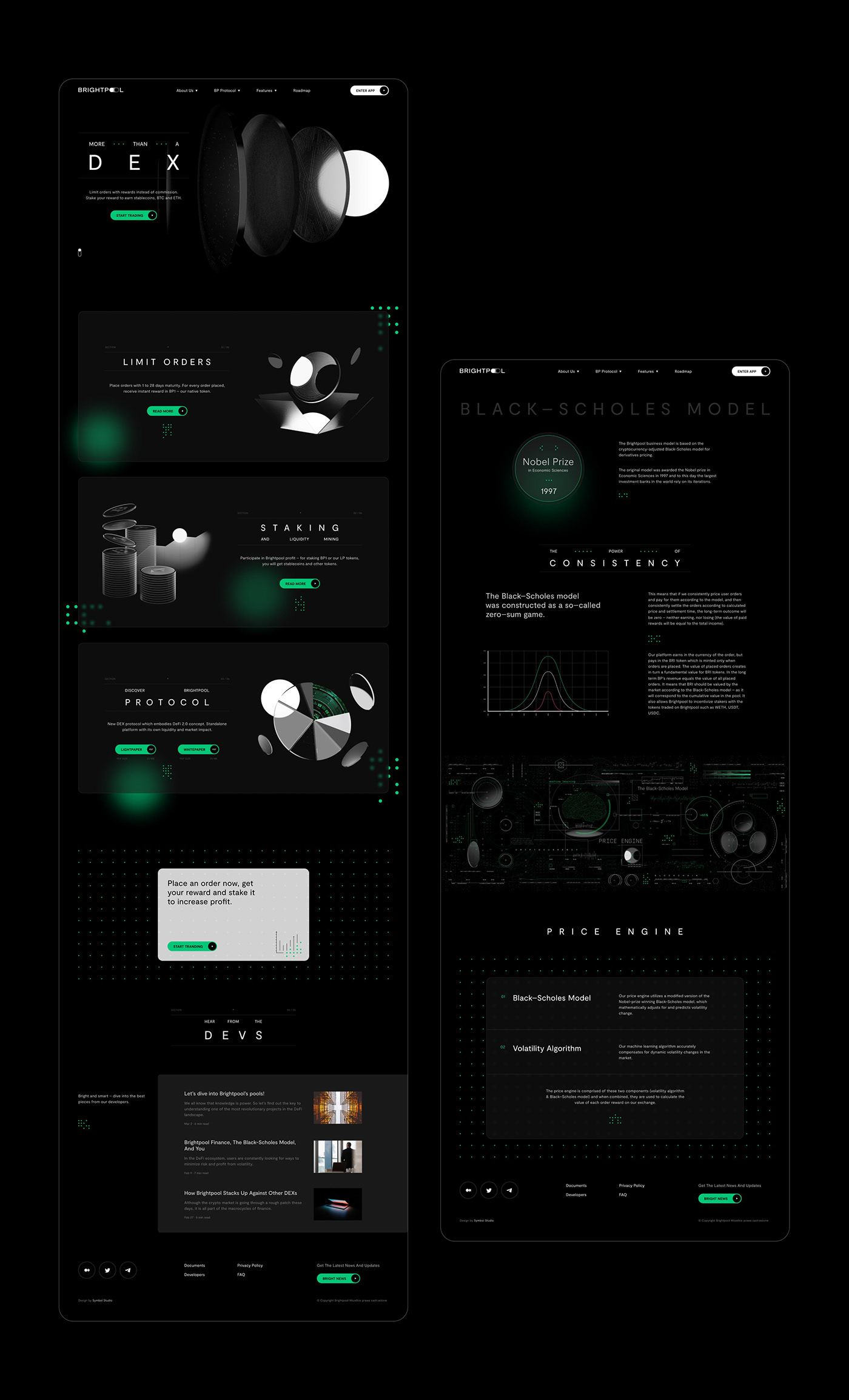
Brightpool is a decentralized cryptocurrency exchange (DEX) based on the Nobel Prize-winning Black-Scholes Model. In addition to not charging transaction fees, the exchange offers its users financial rewards for their orders, awarded as brand tokens – BRIs, which are sourced from a smart pool.
The brand operates in a market with numerous competitors, often presenting a poor image. These are usually start-ups focused on experimenting and raising funds from investors. The first and primary requirement of the client is to stand out from the competition through a consistent and professional image. Behind the most critical idea of the Brightpool brand is its functionality.
...
Credits & Scope of work:
Mateusz Pałka:
‣ Creative director
‣ 3D
Alan Kamiński:
‣ Analysis
‣ Logo design
‣ Visual strategy
‣ 3D
‣ Brandbook
‣ Design of identification elements
‣ Animations
‣ Website design
Przemysław Zięba:
‣ 3D
‣ Explainer video
The core of the brand.
Behind the core idea of the Brightpool brand is its functionality. The financial pool, located at the center of the exchange, is meant to attract, intrigue, illuminate and reward DEX users. Bright, in this case, has both meanings – light and smart. A smart, bright pool of cryptocurrencies that drives the entire mechanism of the exchange.
...
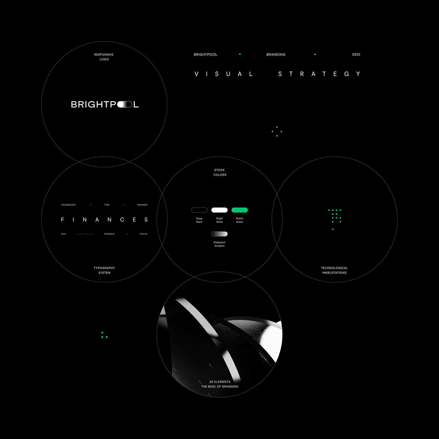
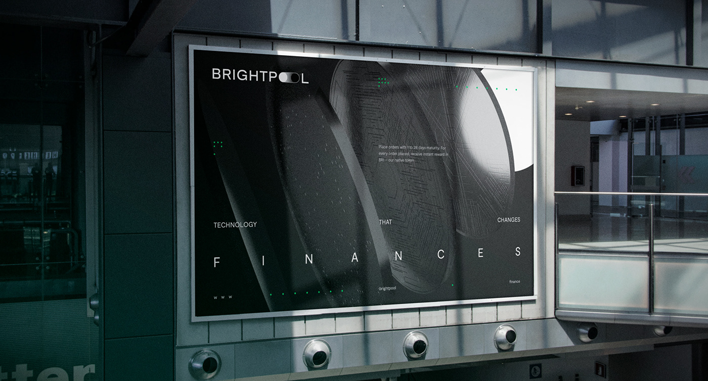
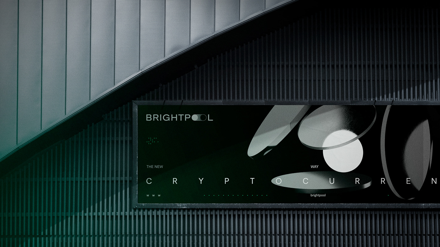
The logo is the foundation of the entire identity. The logo projects the essential mechanism of operation of the entire exchange, namely, the light pool. The reference to a digital switch emphasizes the flow and exchange of funds.
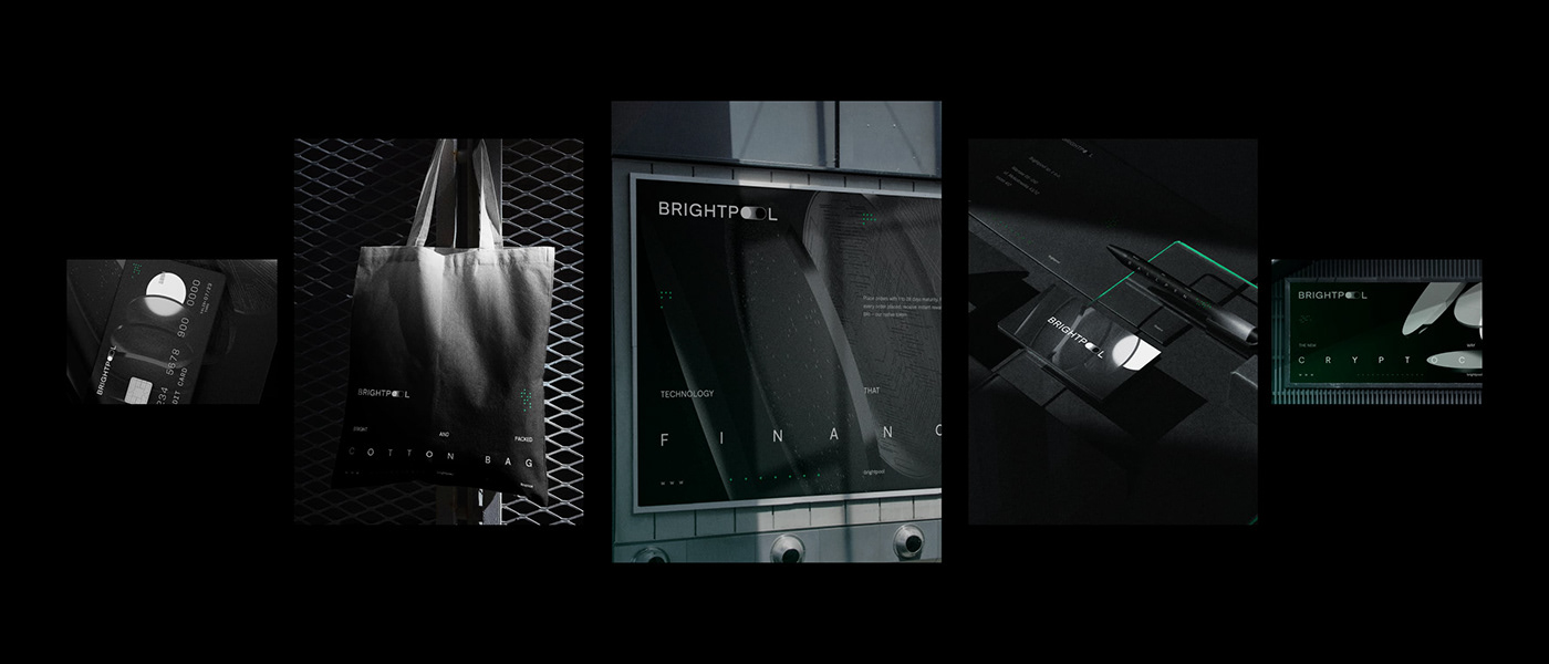
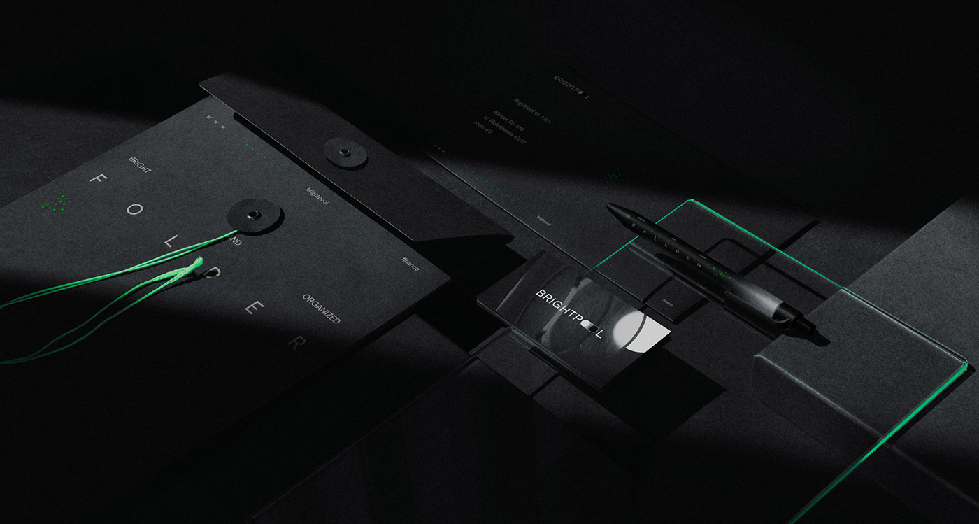
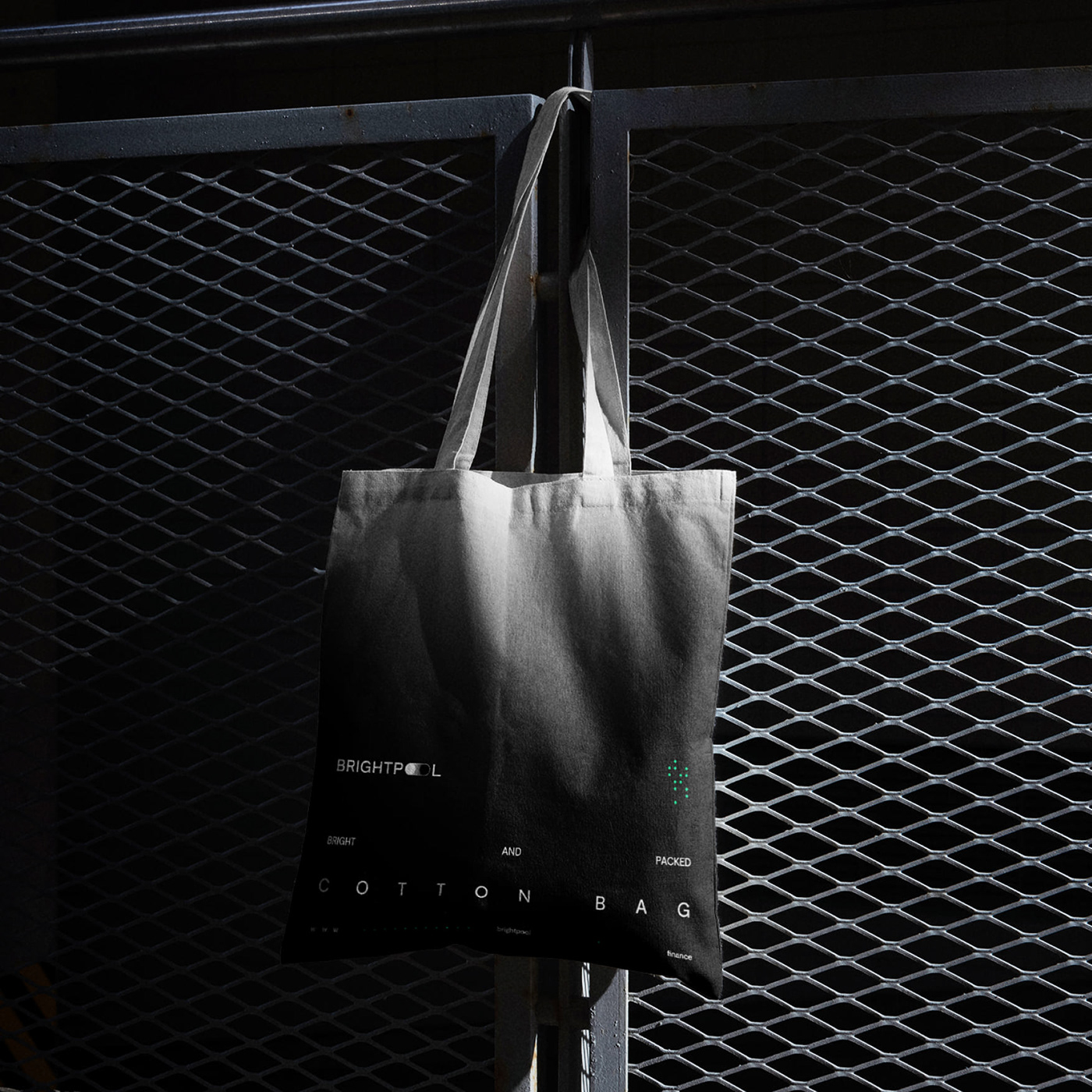
The primary brand colors are black and white. The image stems from the light pool interpretation, an important visual element of the composition.


Space
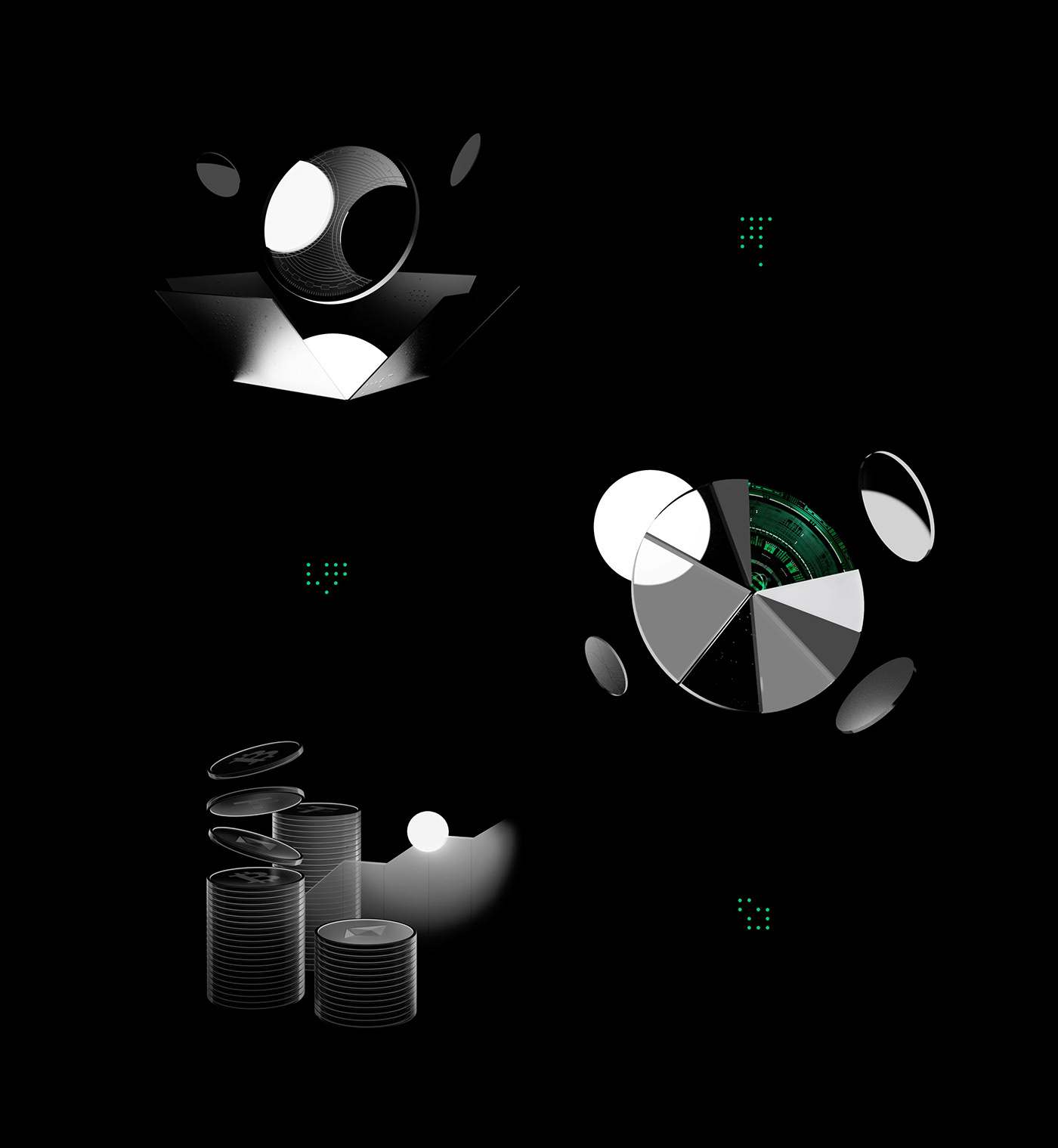
Contemporary design and technological development increasingly encourage us to turn to 3D solutions. In this case, both static and animated renderings play an essential role. They illustrate the advantages and aspects of the exchange operation, sometimes abstractly and sometimes literally.
...
The 3D illustrations show a white pool and glass disks, symbolizing coins and the levels of the exchange. These disks can take the form of specific currencies, such as the BRI Token, which we designed. The disks are always attracted to the pool and are always positioned in front of or around it.


Structure of the composition
The entire 2D layer is built on a grid, which facilitates the arrangement of elements. The typography of the headline, by a substantial expansion of the letters across the entire composition width, gives a more cinematic and somewhat cosmic feel. This procedure is intended to attract the recipient's attention and, by "decoding" the headline, reinforce the message, which becomes more memorable.
...
The composition is complemented by additional elements like green inlays and icons that reflect technology. In addition, we designed a consistent image processing system, where blacks are filled in with a green tonal transition in each photograph. This procedure results in tighter integration of photographs with the brand image.