Overview
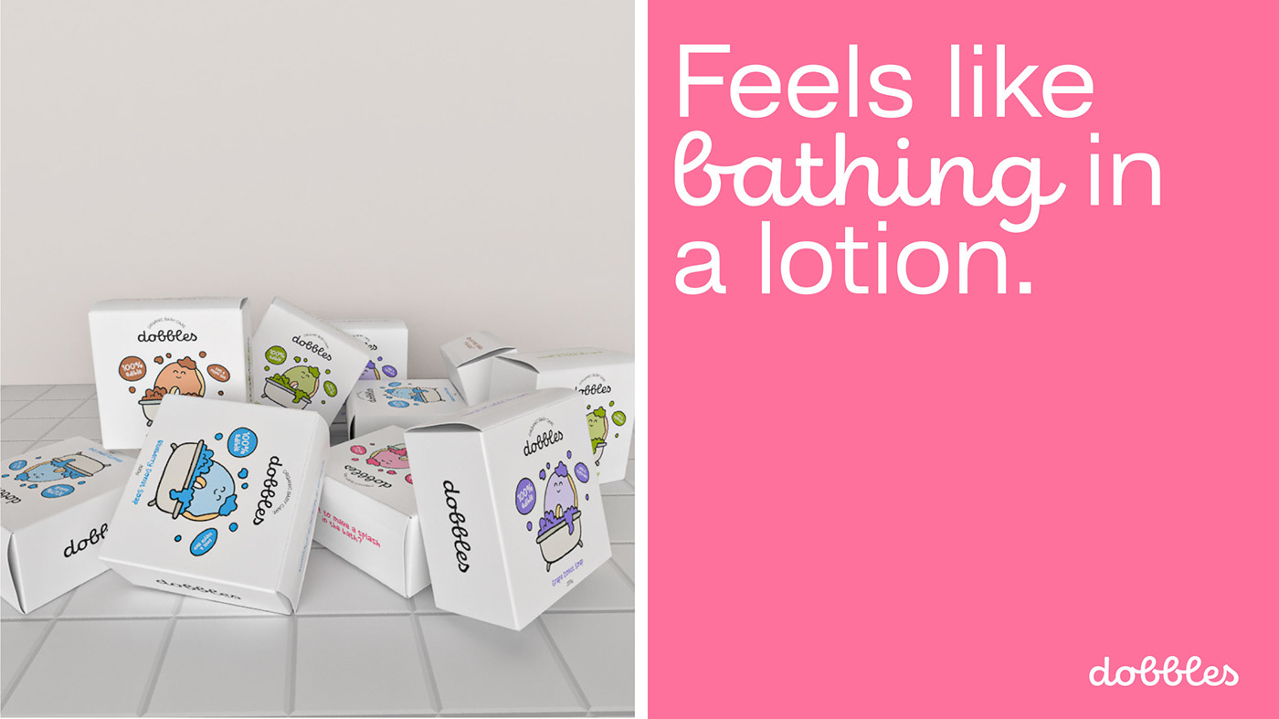
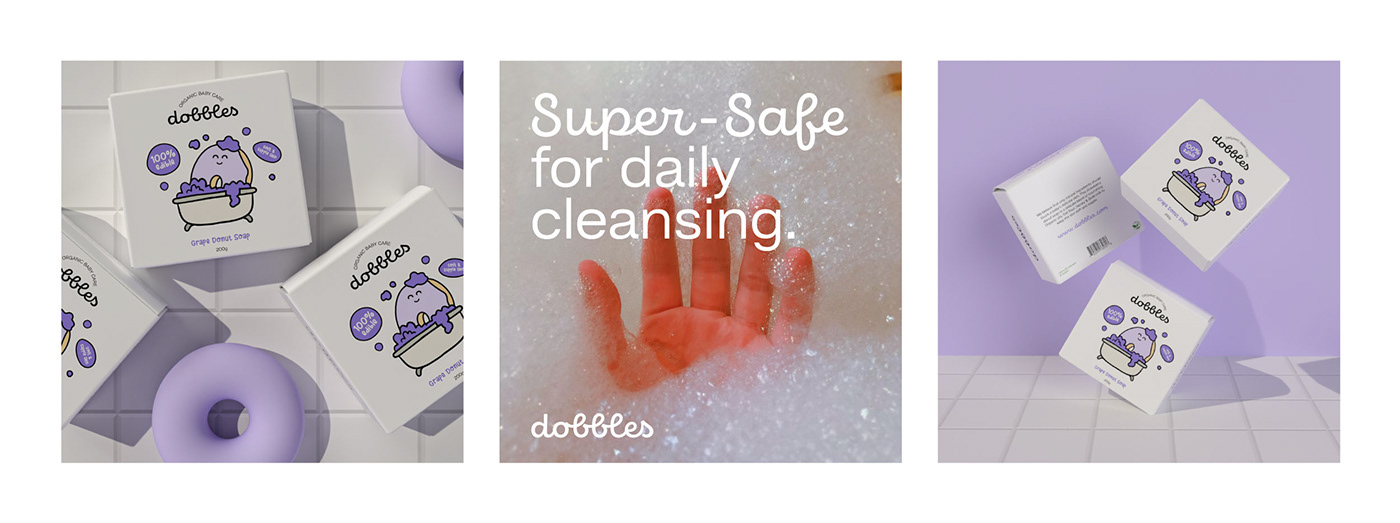
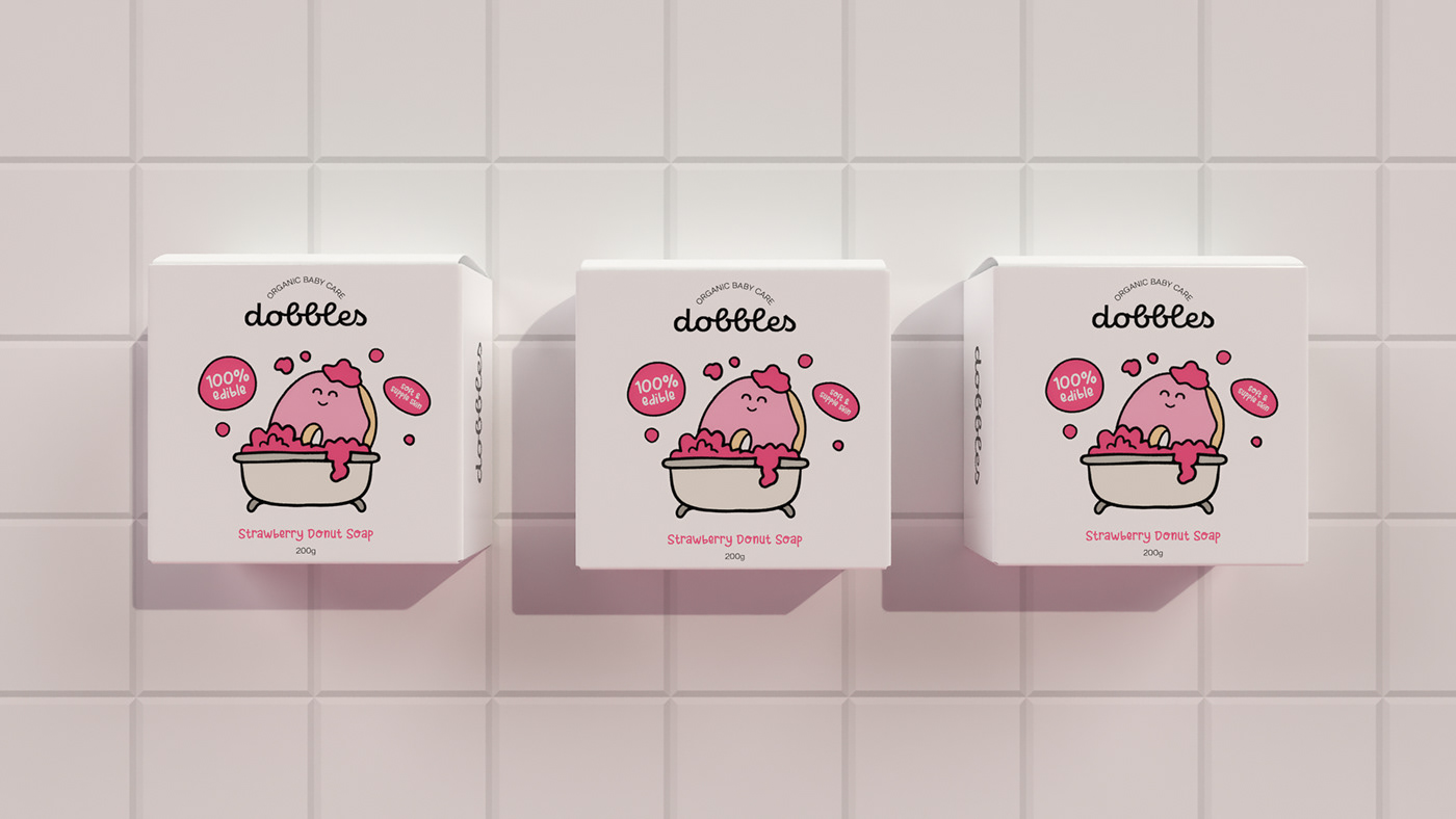
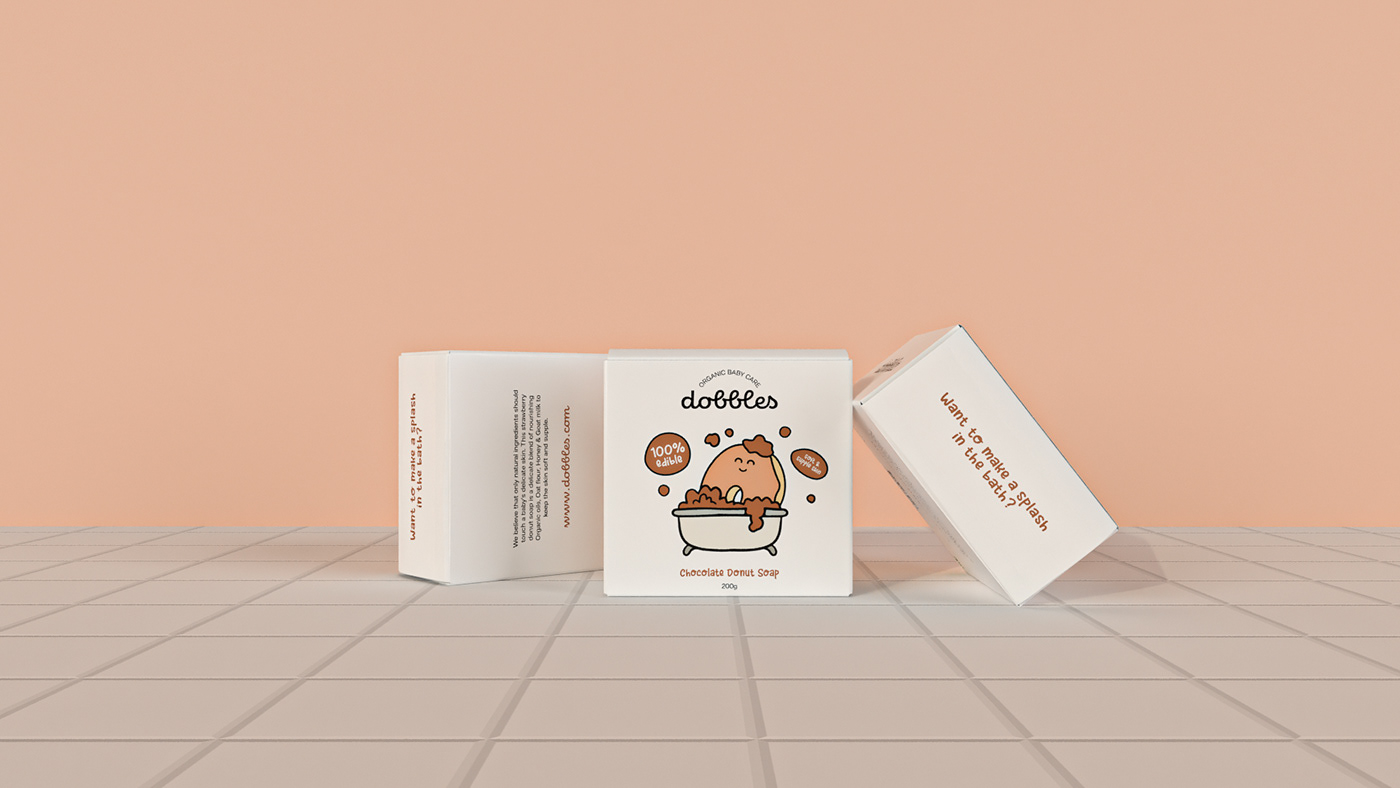
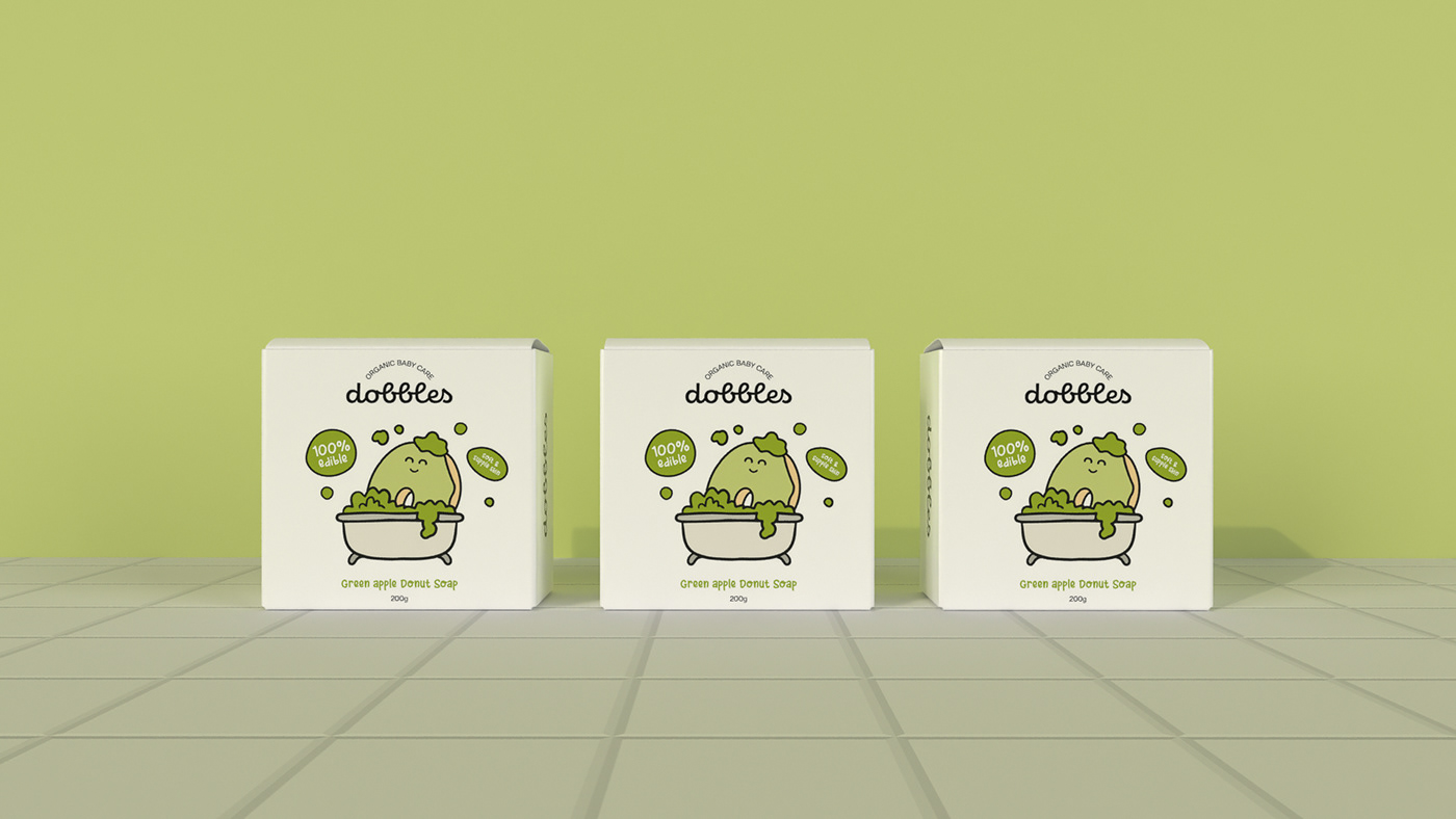
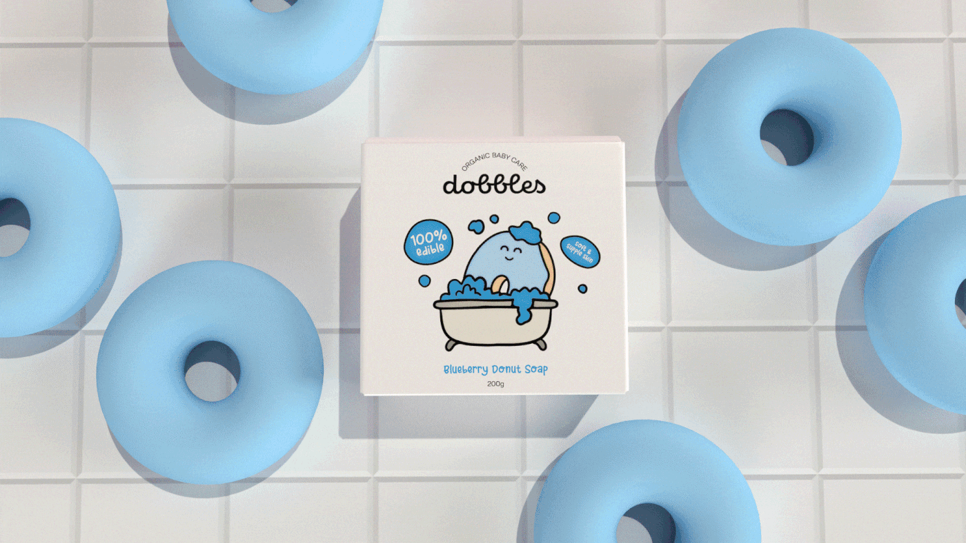
Dobbles is a soap range made of 100% edible ingredients in the shape of a donut.Its one-of-a-kind cleansing and foaming agent derived from all-natural and ethically sourced ingredients will cuddle your baby in its light milky and bubbly foam while keeping their skin supple and soft.
It is specially formulated for delicate baby skin.
The shape of the soap emerges from the need of the market to turn bath-time into an enjoyable activity. Dobbles enhances the bathing experience and makes it an enjoyable activity for kids and while making the task trouble-free for parents.
The brand wants to come across as a fun and playful cleansing product while emphasising the fact that it is not unsafe if consumed. The aim was to give the packaging a friendly and approachable vibe by applying a human characteristic to the donut mascot, encompassed in a pastel colour palette, thereby giving the entire packaging a sense of warmth and adoration.
Naming, Brand Identity, Packaging Design, Creative Direction, 3D Design & Brand Communication.