

VITONI SPRITZ
HOW WE BUILT A NEW LOW-ALCOHOL BEVERAGE BRAND THAT MATCHES VINTAGE VIBES WITH CONTEMPORARY CULTURE.
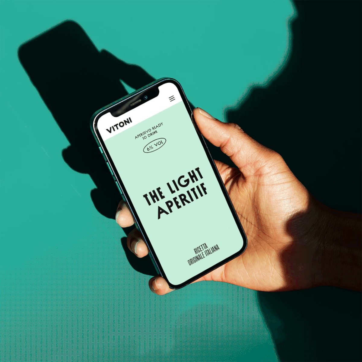
identity, packaging, website, photography

Vitoni is a new ready-to-drink light aperitif inspired by traditional Italian spritz of the 1950s. Made only with white wine and tonic water, its authentic taste is perfect to be enjoyed as
the lighter alternative to usual spritz.
the lighter alternative to usual spritz.


The label conveys the Italian heritage of the brand, presenting it to a young audience sensitive to design, health, authenticity and quality. The simple and clean design, with
a touch of retrò aesthetic, creates a bold personality that stands out in today’s crowded communication landscape.


As part of our strategic consultancy we formulated a straightforward insight: Vitoni values lightness above all: lightness of spirit, lightness of heart, lightness of taste. This concept allowed us to better define the brand essence and its positioning on the market as the Aperitivo Leggero Italiano (the Light Italian Aperitif).

Aside the brand identity and its manifestations, CRSL conceptualized a digital campaign. “Quartiere Aperitivo”, Vitoni’s guide to the coolest neighborhoods in Italy and Europe.
To launch this journey, CRSL produced the imagery and copywriting for the first chapter, Milano Navigli.


