


A Cityscape of Votes
In these oblique views of California, results from the 2020 presidential election are rendered upon the landscape as a 3D bar chart. Data for this model comes from using detailed precinct-level election results and distributing each of California's 17 million votes as points in a GIS program in their appropriate precinct. A rasterized version of this data produces the grid used to generate the bars in 3D in Blender. In addition, simulated sun, water, and land give the illusion of a cityscape of votes. Below, a flyover view of Los Angeles shows each candidate's votes individually.

Lampopleth Election Maps
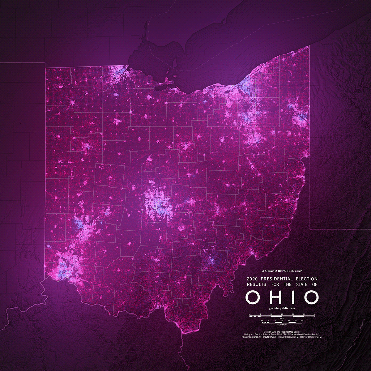
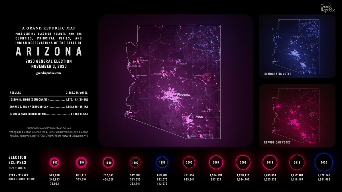
What would it look like if voters shined a colored lamp into the sky on election night to represent their votes? From the greek lámpō for torch and plethos for multitude, these lampopleth maps would be what that might look like from overhead. This type of precision data on election results is not publicly available, so how do we know where to place these votes? A very informed guess. Refining and reshaping hundreds of thousands of census blocks using satellite and geographic survey information produces a map containing only areas in which people are likely to live. Then precinct-level election results are distributed among these refined blocks using a probabilistic formula. Finally, these results are illuminated according to the density of votes and placed on 3D simulated terrain. The result is a highly representative visualization of where voters actually are that eliminates the common misrepresentations of many political chloropeth maps. What remains is a more accurate way of viewing each other that challenges how we think elections are won and lost. The intensity of the voter light shines and reflects off of the terrain; in rural areas, it follows the grid systems of the roads; in the mountains, it snakes up canyons and follows the streets of individual neighborhoods. Above: Colorado's 2020 presidential election featuring inset maps showing Republican and Democratic only votes. Below: 2020 Presidential Election Results for Ohio

Above: 2020 Presidential Election Results for Utah in a cartographic style. Below: Everyone perceives color differently, and some of us who are color blind can have difficulty seeing and distinguishing color. On top of that, the traditional political colors of red and blue are not incredibly well suited for the additive mixing that occurs when combing light. Red has a shallower range of values and shines less brightly. Thes animated GIFs cycle between the results and aid in comparing each candidate's vote.


The Legacy of Racism in Georgia
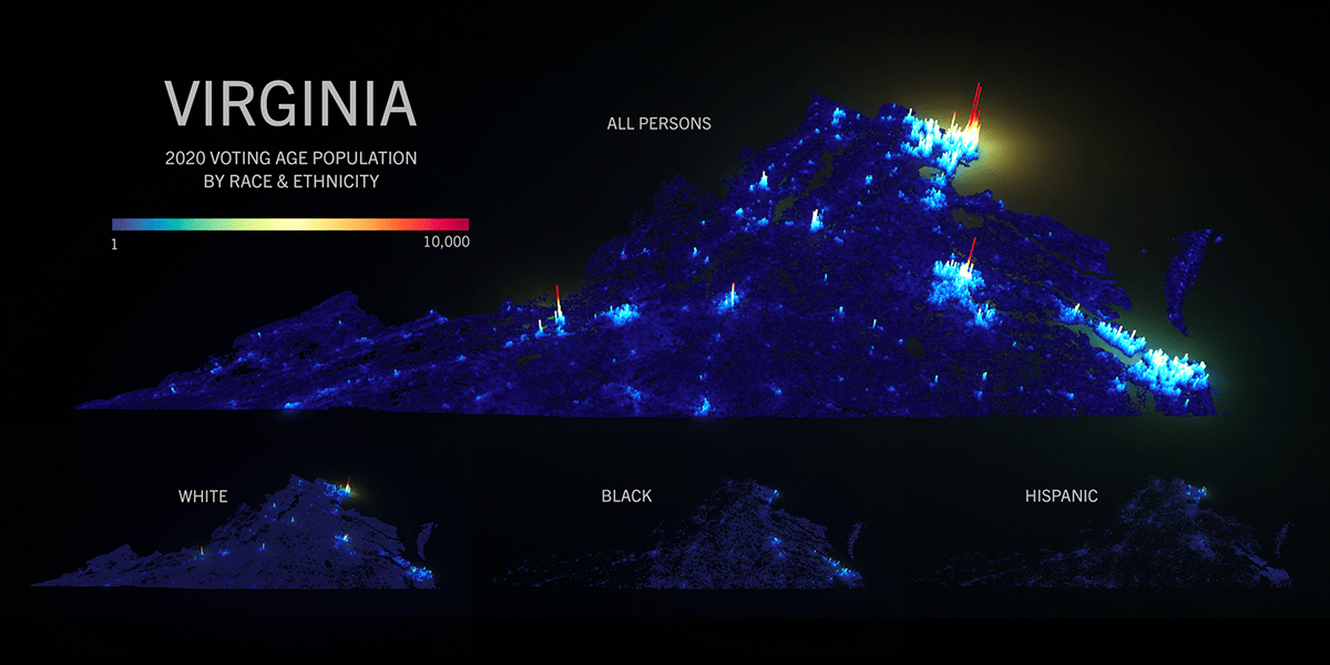
The lampopleth process can also be used to shed light on other demographic features, such as the race and ethnicity of a state's voters. As seen below, in Georgia, the rural cotton belt that was a hotbed of slavery still cuts a swath across the state's center. Over 150 years later, evidence of the Black population's migration from plantations into surrounding towns and cities is still evident. In Atlanta, the Black community in the southern part of the city creates a donut hole in the surrounding white majority areas. Across the state, the Black population abruptly stops at county lines and major dividing highways, is concentrated on one side of town, or is outright absent in the case of the Appalachian foothills. In these areas, you can still see the persistent intersection of racism, policy, and violence from above.

Eclipse Graphs
Eclipse graphs allow the viewer to asses election results simultaneously in both proportional and nominal terms. The outer ring's (the star) area represents the winner's votes. The runner-up's votes (the body) eclipse the winner's star. When used on a map, the size communicates more accurate information than a simple chrolopeth map. Furthermore, the significance of voter turnout (or the lack thereof) is not lost when comparing results across years. These eclipses also cast light in the simulated environment, which helps communicate voter intensity and composition. This concept was also used to represent the "atoms" in the Electoral Table of the 2020 Presidential Election.


Spike Graphs
These maps plot spatial data as spikes and bars in a variety of "neon noir" styles.


Flow Fields
This map is an early concept of using vector flow fields to communicate partisanship in elections. Votes flow directly to the right, or 3 o'clock, in 100% republican areas and directly to the left, or 9 o'clock, in 100% Democratic areas. As support in a Democratic area weakens, the flow bends towards 12 o'clock and in Republican area it bends towards 6 o'clock.
Not Everything is Political
The restaurant E.W. Beck's in Sykesville wanted to put their town on the map, literally. With a large wall in their dining area as the setting, a vintage-style railroad map was created to highlight the town's history as a stop on the B&O Railroad. The added twist was making their stop the "capital" and main star of the state.

A special thank you to the Voting and Election Science Team and NYT's Upshot whose precinct-level election results are the basis for much of the data in these maps.
Thank you for viewing and if you have big datasets which you would like to see illuminated please reach out at arrivals[at]grandrepublic[dot]com.