SOLALA
We create packaging design to remind us to care for ourselves – relax and hum your favorite song – Solala!
When you do something, and do it with passion, you unconsciously start to sing – sing in your mind or sing out loud. It is that one time in the day where we are all alone in the shower, with no care in the world. This is when we are relaxed enough to burst into our favorite song, awakening the unhindered soloist inside of us.
This is our solo time – time for Solala.
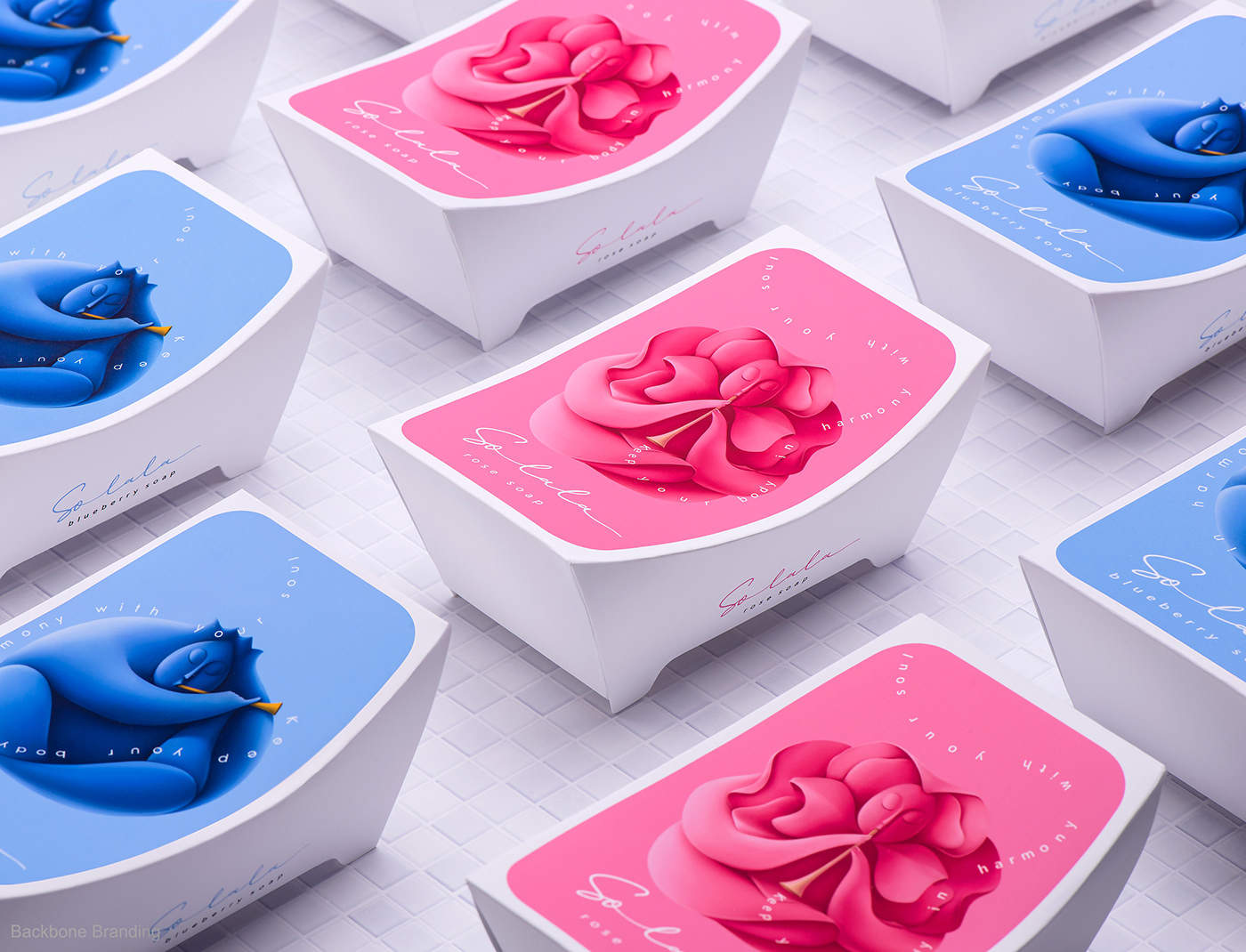
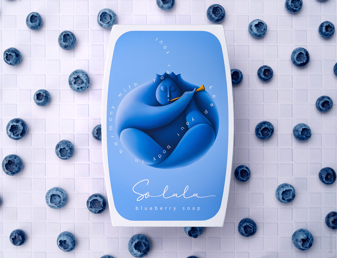
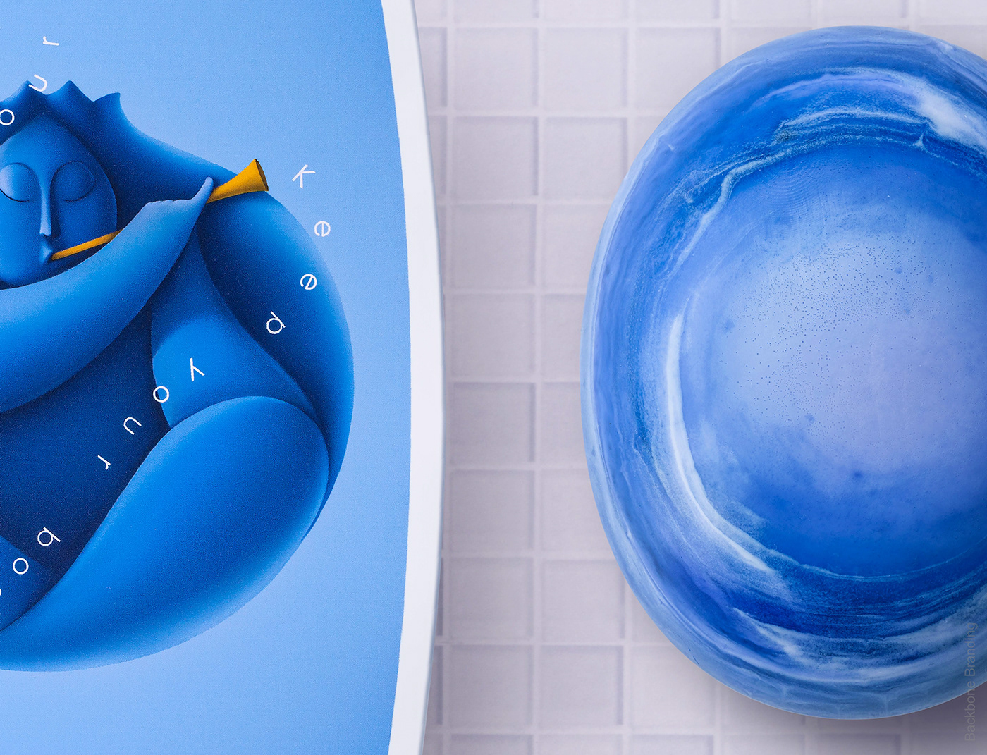
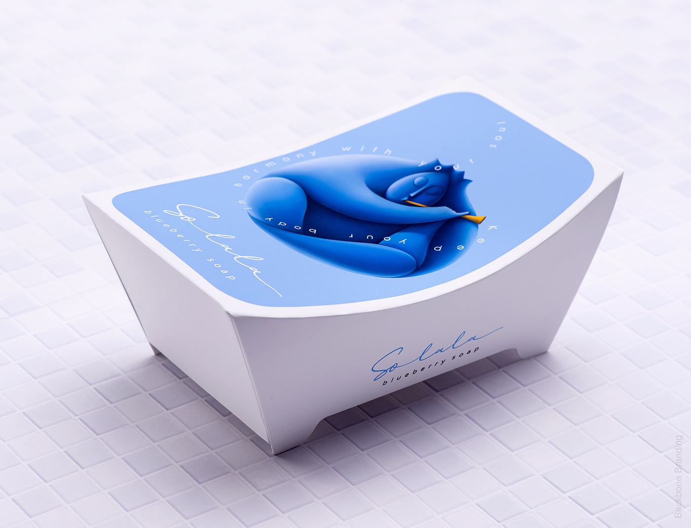
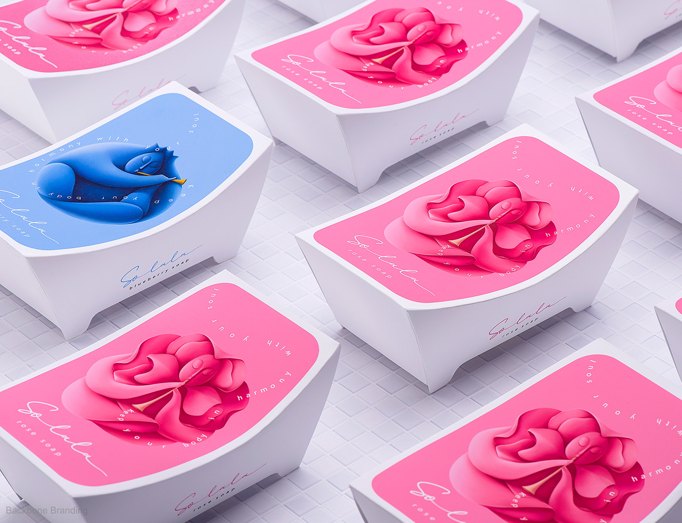
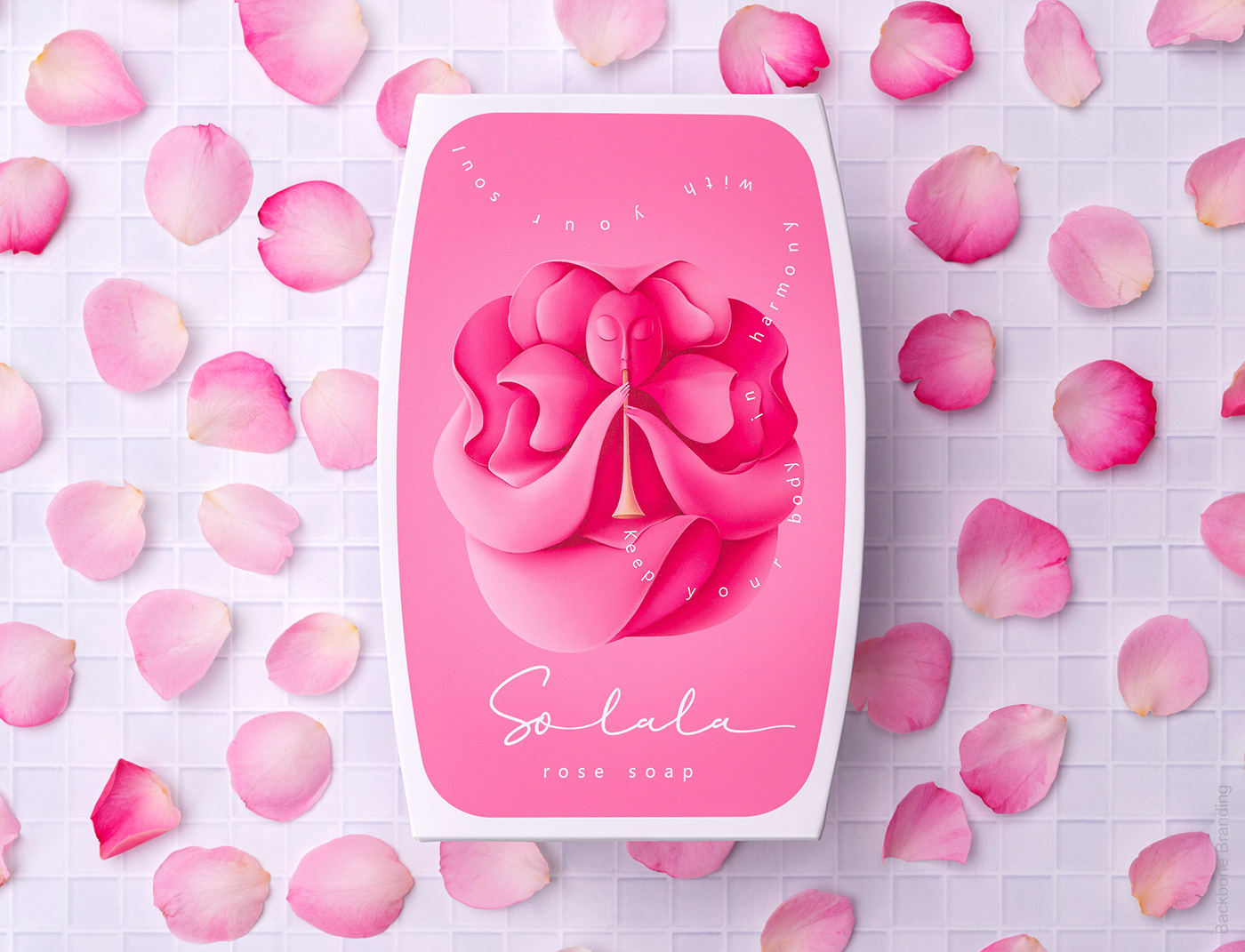
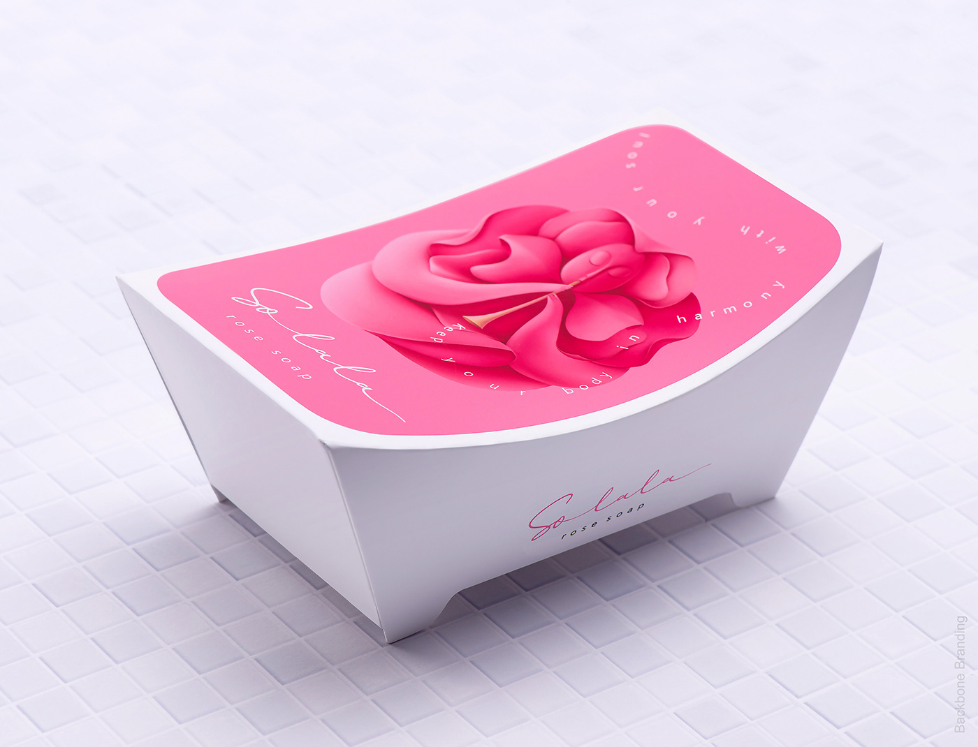
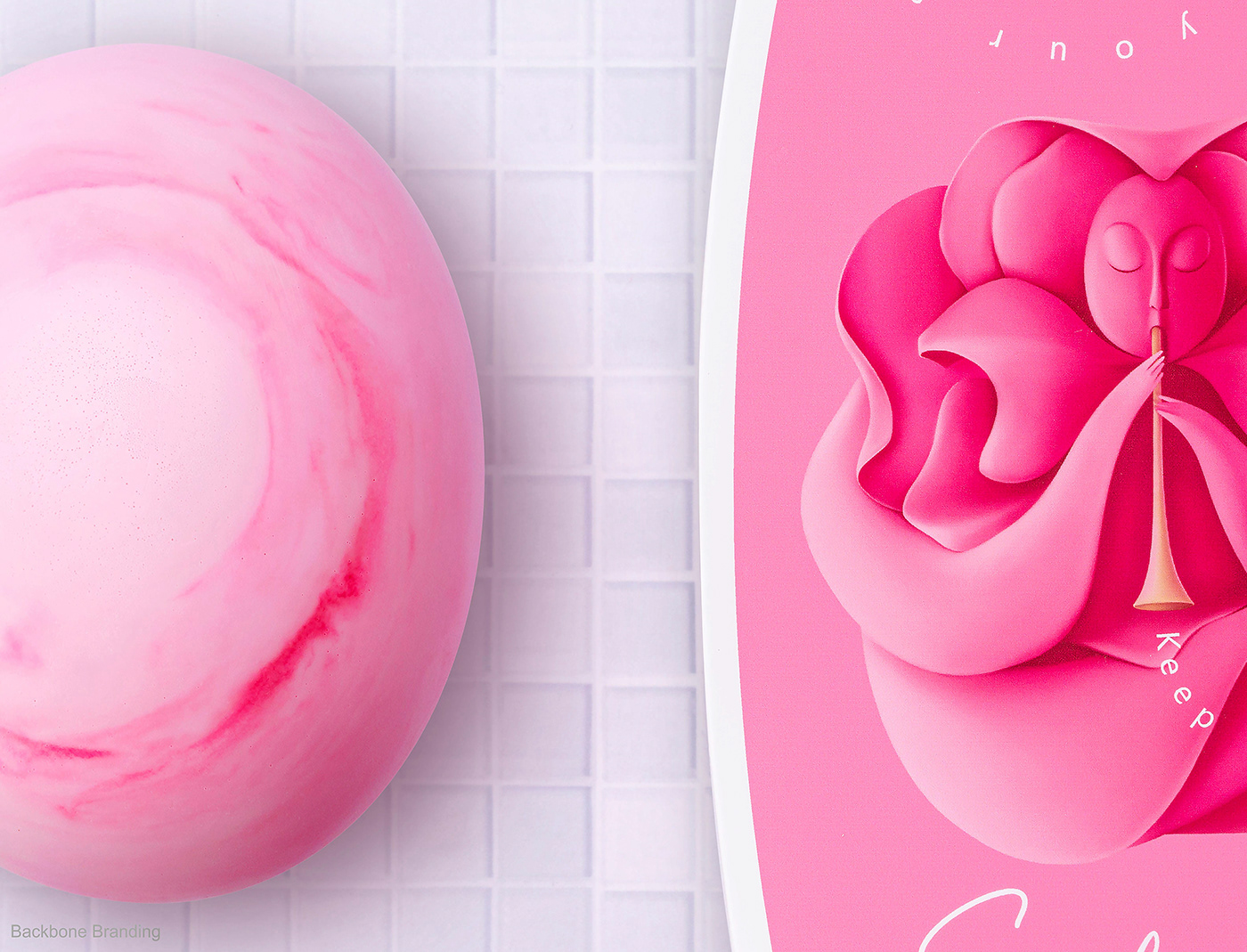
The attractive packaging of Solala soap is in the form of a classical bathtub. It is unique not only for its design, but for being made from one single piece of paper. Each soap type has its own character portrayed on the packaging – olive, rose, blueberry, and orange. These serene characters relaxing in the tub are making music, and you can almost hear the song in the air.
The product category is easily identified by the packaging, which will be a fresh variation to the standard soap packaging familiar in the stores.
Complimented by this beautifully designed packaging, these soaps are meant to add bliss and song to any consumer’s life.
Credits:
Brand Strategist: Lusie Grigoryan
Creative Director: Stepan Azaryan
Art Director&Illustrator: Elina Barseghyan
Junior Designer: Emma Isakhanyan
Creative Director: Stepan Azaryan
Art Director&Illustrator: Elina Barseghyan
Junior Designer: Emma Isakhanyan