Current Brand Identity
Upon being assigned this identity problem, Figleaf immediately came to mind as I am interested in graphically designing within the fashion industry as a full-time career. Figleaf is a women’s clothing boutique that features apparel items, jewelry, shoes, accessories, and outerwear.
I visited the Figleaf boutique located in Kent during the first week of the semester, and took notes on the current brand identity, consumer experience, and marketing tactics.
Some observations that I made include: color organization throughout the store, bright lighting, spacious areas to walk around, various fashion and accessory items strategically placed throughout the store, and employees located at the back of the store. I took some photographs of the atmosphere as well as gathered research of Figleaf’s current brand identity and marketing.

New Logos
I started the re-branding design process by sketching possible solutions for a new logo that better represents Figleaf’s target market, situation analysis, and competitive analysis. I developed an organic, elegant solution by incorporating simple figleafs with a serif typeface.
I then created three versions of the logo to be used for different purposes. The F logo is to be used as a simple representation of the company, the Figleaf logo is to be used as the most common representation of the company, and the Figleaf Boutique logo is to be used in larger formats.

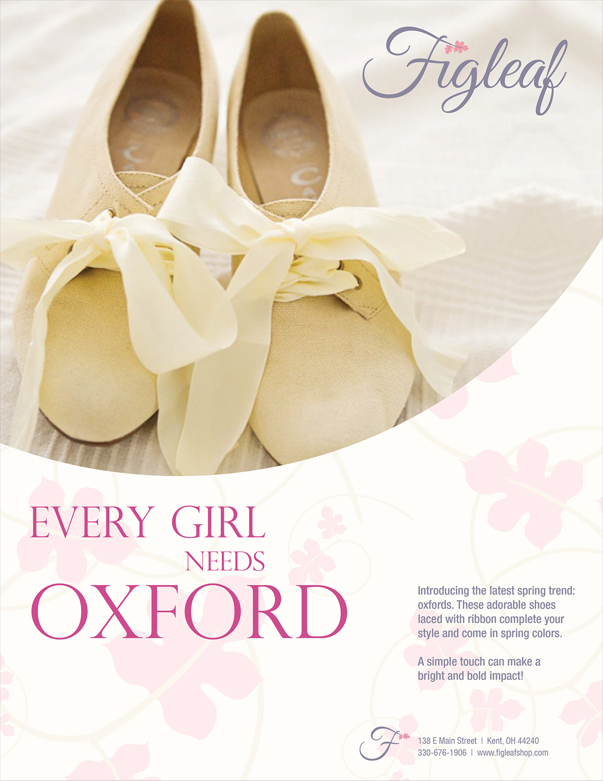
Series of Advertisements for Kent Stater
Upon beginning the design process of the advertisements, I determined typography choices, a color palette, and a media source for the advertisements. I used Great Vibes for my Figleaf logo, Perpetua Tilting for the dominant typeface in the ads, and Helvetica Neue LT Com for my secondary typeface. I chose the colors within my palette because they are a direct reflection of Figleaf’s target market, and could serve as a competitive advantage in comparison to Figleaf’s competition.
My final advertisements include a series of three designs that state a different aspect of Figleaf’s new positioning statement: “A simple touch can make a bright and bold impact!” I applied this statement to each advertisement in a different way as to showcase the extensive apparel options at Figleaf: clothing, shoes, jewelry, and other accessories. I also incorporated an organic, elegant design style to the advertisements as to better accommodate my logo. I chose to still incorporate dominant imagery, but made it more subtle by including it within a circle, incorporating a light background texture, and applied my color palette in a delicate manner.
I chose the Kent Stater for my media source that will feature the advertisements because Figleaf’s target market views this media source often.


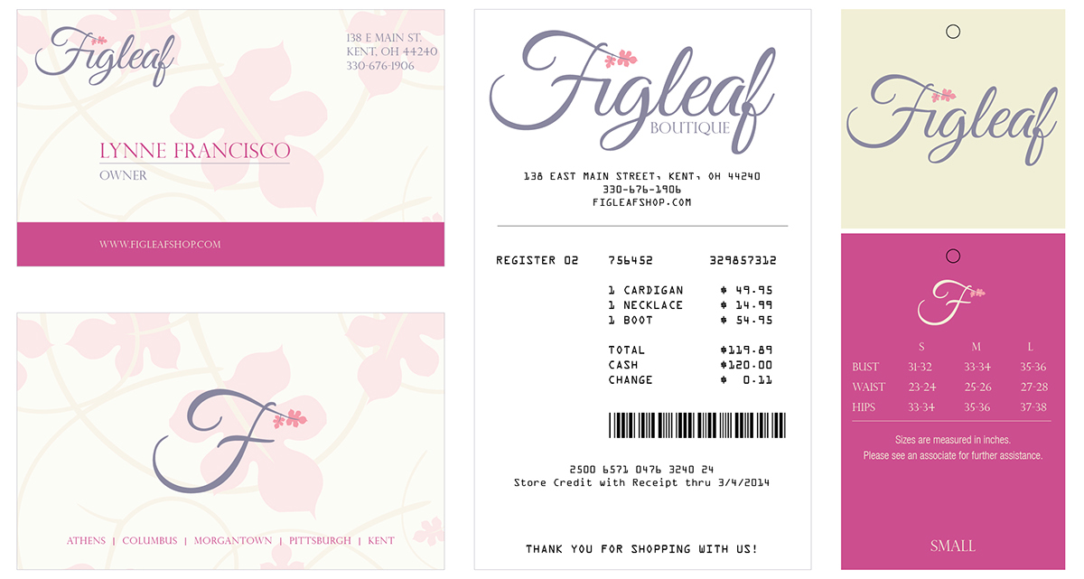
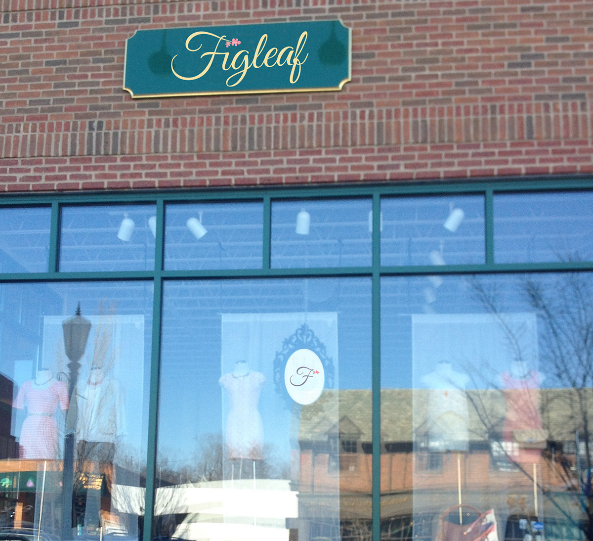
Brand Applications
I applied my delicate, organic design style to a collection of branding applications including: business cards, receipts, clothing tags, shoe boxes, and an outside sign for the store. The applications further support and develop Figleaf’s new brand identity, which continues to differentiate it from competitors and distinguish it as an unique boutique.
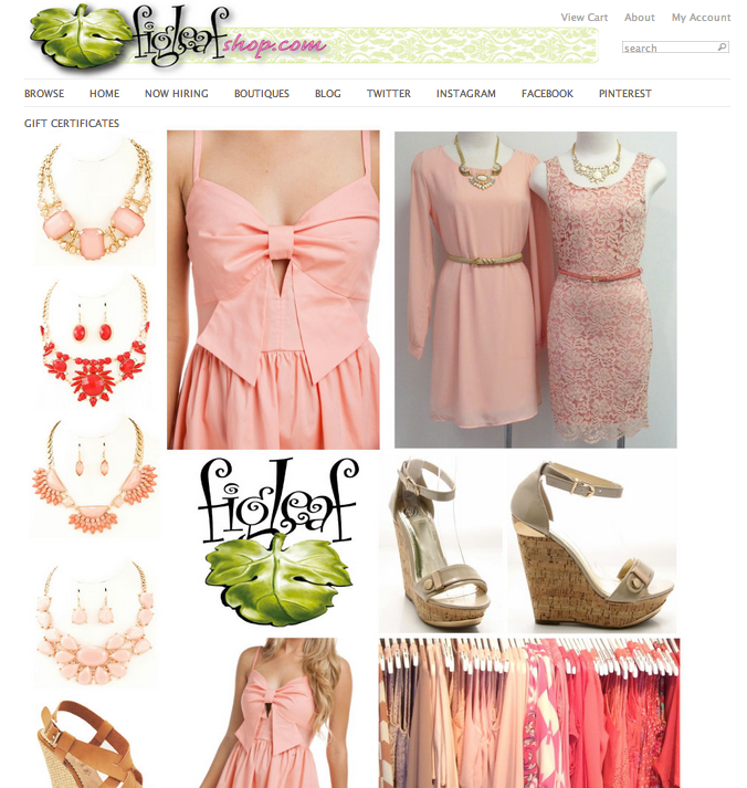
Current Website
Upon beginning the new design for Figleaf’s website, I analyzed Figleaf’s current website as to see what elements are successful and what elements need to be improved upon. I discovered that consumers are unable to shop on Figleaf’s current site, and the navigation simply contains social media accounts. I also took note of the implemented design style, color choices, and typography.
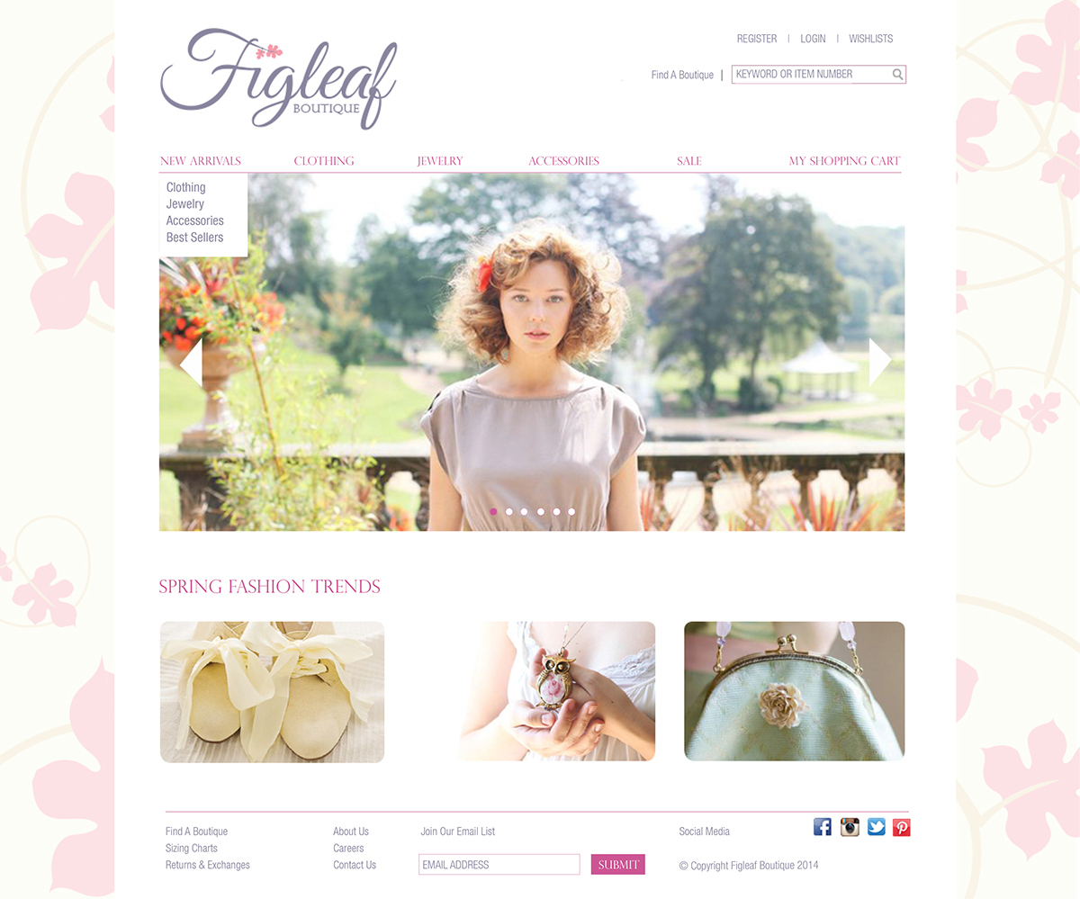
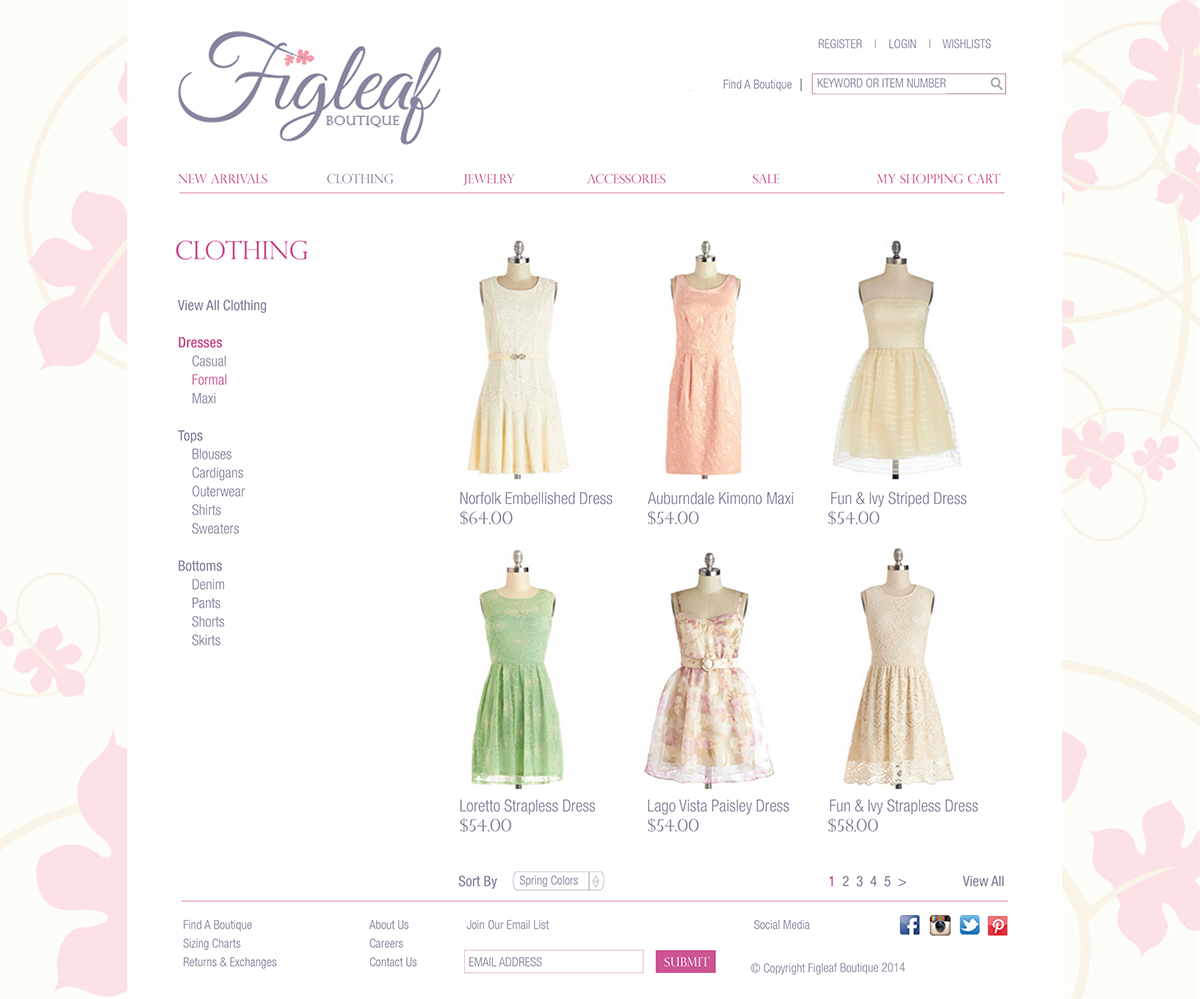
New Website
Throughout the new website, I implemented the same elegant, organic design style. I also incorporated the same typefaces and color scheme as to create consistency across my new brand identity. I also chose to incorporate a new navigation as to improve the consumer experience and make interaction easy to understand. I organized the navigation by new arrivals,clothing items, jewelry, accessories, and sale items. I also implemented a logical checkout system as to continue to improve the consumer online shopping experience.
I utilized dominant imagery throughout the homepage in order to clearly define Figleaf’s identity and target market. This way the consumer immediately understands the purpose of the website upon first glance and interaction.


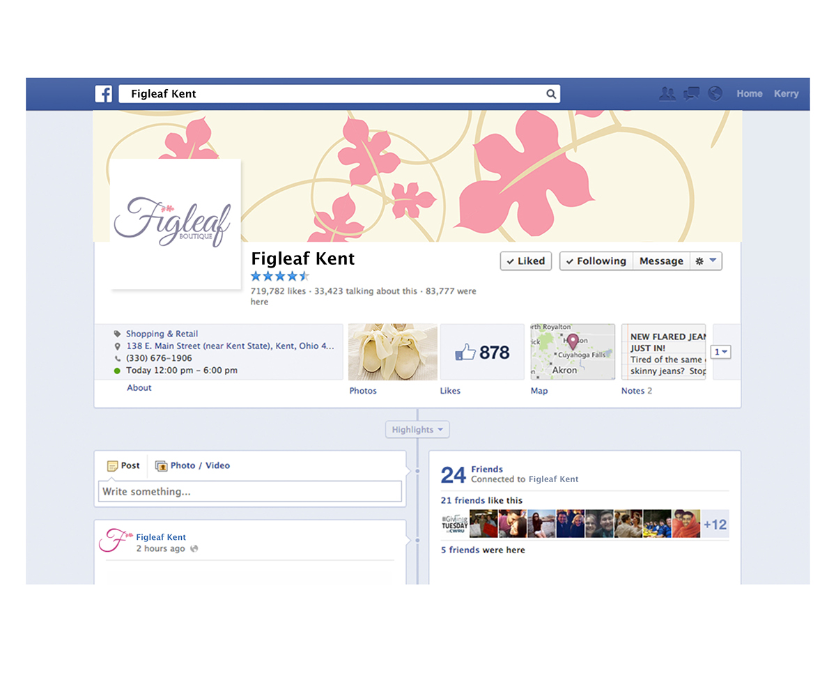
New Facebook page for Kent, Ohio Location
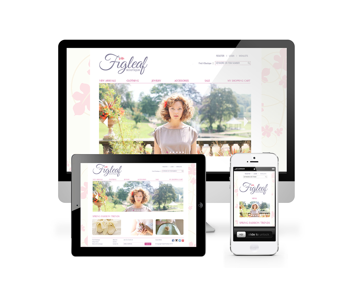
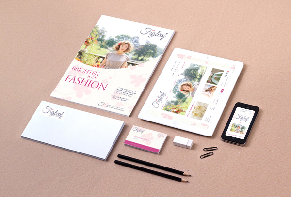
Responsive Web Collection
Photography Sources: Amanda Littler, Figleaf, Modcloth

