
SCOPE OF WORK
Strategy Workshop, Brand Strategy, Writing & Brand Story
Logo Design, Visual Identity Design, Merchandise Design, Social Media Style
Website Design, App UX/UI, Explainer Video, Digital Campaign
Coin Design & Packaging
Logo Design, Visual Identity Design, Merchandise Design, Social Media Style
Website Design, App UX/UI, Explainer Video, Digital Campaign
Coin Design & Packaging
problem
Blockkoin Exchange was an overly complex cryptocurrency ecosystem, that was struggling to clearly communicate its offering. They had no clear positioning or messaging construct and their visual brand was dated, inconsistent and lacked the credibility they needed to attract both investors and clients.
solution
We simplified the business structure, clarified the offering and built an authentic brand story with simple messaging around this. An engaging visual identity and a host of brand applications were created to not only appear professional and credible but to shine amongst its global fin-tech peers.

Our Creative Process
ASSESS > STRATEGISE > CREATE > PRODUCE
Creating an authentic and beautiful brand starts with asking the right questions.
–––––––––––
Phase 1: ASSESS
A thorough brand audit revealed that Blockkoin’s lack of credibility was mainly due to its inconsistent and dated brand identity, as seen below, as well as an extremely complex and fragmented offering.
A thorough brand audit revealed that Blockkoin’s lack of credibility was mainly due to its inconsistent and dated brand identity, as seen below, as well as an extremely complex and fragmented offering.
Our priorities were clear: simplify and clarify the business offering, develop an authentic brand story and completely refresh the brand to be more relevant and compete on a global stage.


phase 2: STRATEGise
In our strategy workshop, we explored the purpose, values, audiences, competitors, personality and positioning of Blockkoin. Based on the results we were able to define the tone of voice, simplify the business offering, remove all unnecessary aspects of the brand and define a clear way forward.
In our strategy workshop, we explored the purpose, values, audiences, competitors, personality and positioning of Blockkoin. Based on the results we were able to define the tone of voice, simplify the business offering, remove all unnecessary aspects of the brand and define a clear way forward.
In an industry where fraud and a general lack of understanding prevail, the strategy of 'informative truth' served to address these concerns head-on.
–––––––––––
phase 3: CREATe
Based on the final brand strategy we developed the brand idea and created a highly customised brand that was thoughtfully considered at every touchpoint. From a colour palette of abundance and growth – lush landscapes, busy pollinators and rich earth carrying the rewards of jade and gold – to bespoke logotype, iconography, unique photographic treatments and collage illustrations.
Based on the final brand strategy we developed the brand idea and created a highly customised brand that was thoughtfully considered at every touchpoint. From a colour palette of abundance and growth – lush landscapes, busy pollinators and rich earth carrying the rewards of jade and gold – to bespoke logotype, iconography, unique photographic treatments and collage illustrations.

Phase 4: Produce
With a robust brand established, we were able to implement the assets and design principles across a variety of print and digital applications with the consistency of messaging, tone and visual identity required.
With a robust brand established, we were able to implement the assets and design principles across a variety of print and digital applications with the consistency of messaging, tone and visual identity required.
–––––––––––
phase 3 – CREATE
Logo Development
We used round coin shapes and blocks, based on the literal ideas of ‘block’ and ‘koin’, to develop a completely bespoke logotype with a consistent line weight for a modern edge. The terminals were rounded for friendliness and uniqueness. Using the same style and concept, we created an engaging and meaningful logo mark.
Creating a bespoke logotype

Using the literal aspects of the brand name to create the mark

CREATE
Visual Identity
In establishing a robust identity for the brand we started with a rich palette of abundance and growth – lush landscapes, busy pollinators and rich earth carrying the reward of jewels like jade and gold. These tones were applied to the photographic treatment and composite illustrations to bring the brand to life with both consistency and energy. Cues from the logo influenced the icon style, fonts and typography.

Colour palette Inspiration

colour palette
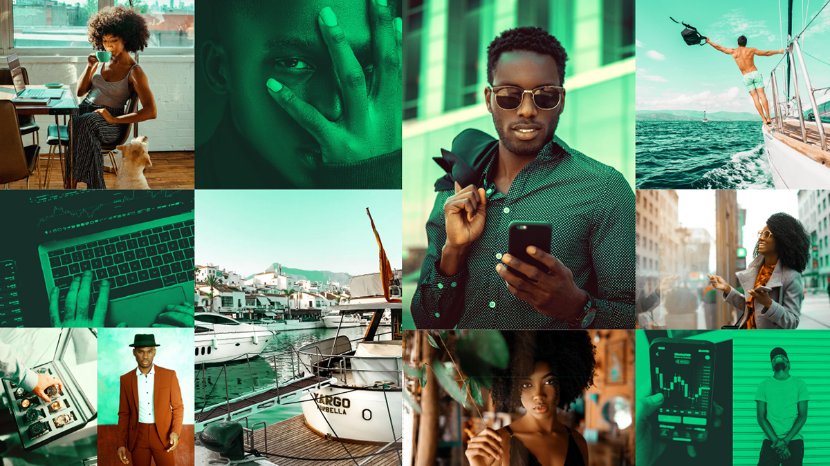
photographic treatments across a range of images

Photographic collage illustration style


Custom iconography takes its cue from the logotype


Font selection and typographic style

phase 4 – produce
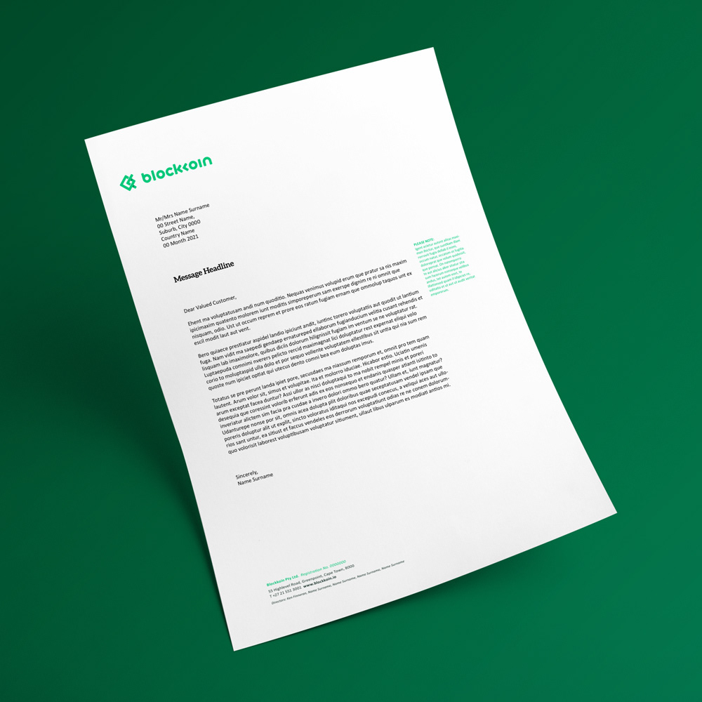
Rollout to Brand Collateral
With all the assets of the brand defined we implemented the visual identity across printed and physical applications such as stationery, patterns, merchandise, a notebook, corporate profile, card design and a minted gold coin with packaging. We also ensured that the digital applications were aligned across the white paper, website, app refresh, UX/UI, social media and an explainer video.


phase 4 – produce
Digital Applications
In addition to designing templates for social media posts, we redesigned the website to be a single page for launch, condensing all the existing content into more relevant information that was on-brand.
The exchange app was also re-skinned to better fit the brand with custom icons, brand colours and fonts. Phase two allowed for new features such as a more visual wallet summary and coloured cryptocurrency icons for ease of use.

Website Homepage

UX/UI for the Exchange App


