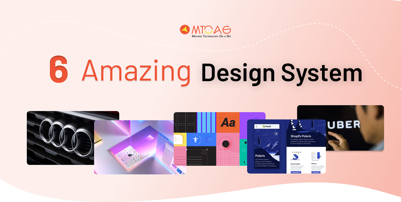
What is a Design System?
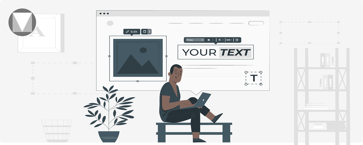
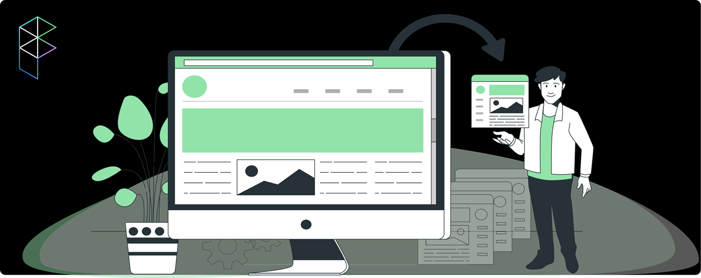
A design system is a collection of standards and reusable parts that employees of an organization may use to create interfaces and interactions. Depending on the size and maturity of design practice and product team requirements, what goes in the design system and how it is executed might differ significantly from one firm to another.
Fundamentally, design systems provide teams with standardized principles for interaction and appearance. For usage in interfaces, a design system could include, for instance: standard components like input boxes, dropdown lists, and menu structures.
It is a guide on using each color and typeface on the list of permitted brand colors.
There are conventional buttons and other interactive features.
The interaction standards include whether to enable expanded pinching to resize photos or employ a slide-out side panel.
A configurable grid system ensures screens are consistently put up, including elements like card design or content separators.
1. Spotify Design
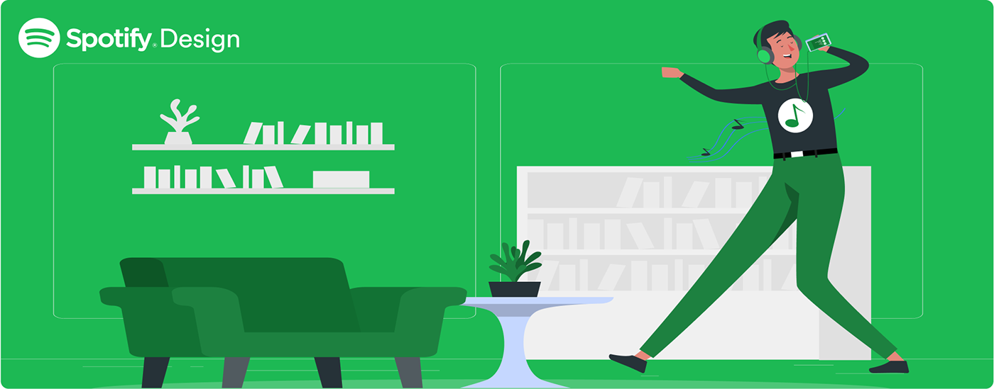
You may use various design solutions accessible online while building applications, websites, or blogs. One of them is Spotify's user–friendly and simple-to-use design system. Spotify is easier to use because of its excellent concepts. Understanding how to use the Spotify design strategy when developing your app or brand is crucial. The cross-disciplinary Spotify design methodology creates a fantastic user experience and forges close bonds between artists and fans. When it comes to music streaming, the system is the best. The Design increases the likelihood that users will engage with friends in more meaningful ways by allowing users to manage the whole live scenario. Using the system, you can quickly discover music on your PC, tablet, phone, and other devices. In terms of streaming music services, it is the best.
2. Audi
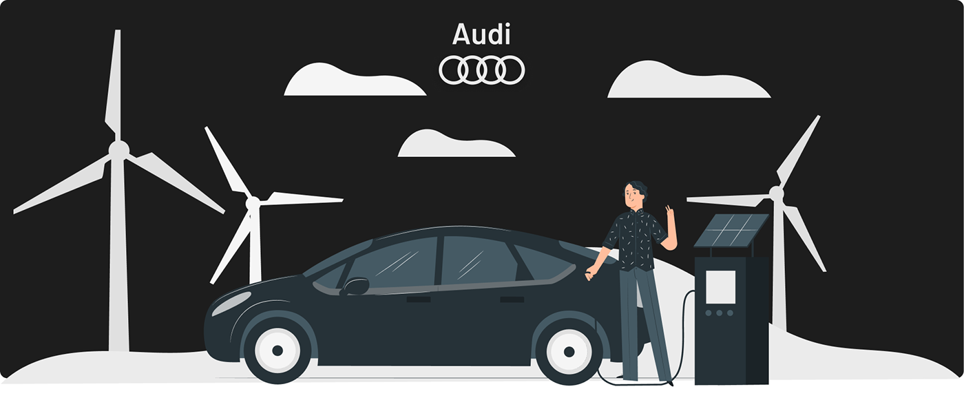
The Audi Design System was developed to assist us in producing goods for our clients more quickly. Audi's Design is the only reliable source of information for product teams worldwide working on Audi products. It has everything from Getting Started to Core Components designed for acceptance inside each product. It makes it possible for product teams to create and build quickly, consistently, and of high quality.
3. Shopify
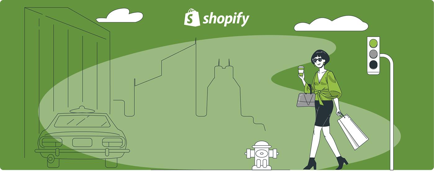
A top e-commerce platform for companies of all sizes is Shopify. It has your cover whether you sell online, on social media, in person, or from the trunk of your vehicle. The goal of Shopify is to improve commerce for all people. Shopify has unveiled Polaris, a new Shopify design system that aids in the creation of a unified user experience for retailers by Shopify designers and partners.
When creating new interfaces and applications, the shoplift Polaris design system helps with using best practices from Shopify's design team. Designers may utilize the Shopify Polaris design system to create applications and channels for Shopify. It is a set of extensive rules and principles. It is accessible to all Shopify partners and provides various tools and building blocks like patterns. Shopify designers can now concentrate on what matters: offering solutions that easily integrate with Shopify rather than building pre-existing pieces and imitating design trends.
4. Uber
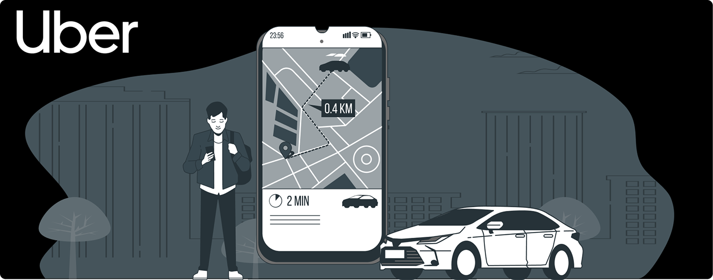
The Uber Design System was established to provide a centralized collection of reusable UI components for designers and developers. It has a flexible and simple framework that will make it easier for designers to get going immediately.
It also comes with a use-documented file. Uber design system is an application that makes it simple to locate services online from the best specialists in every field of expertise. Through the app, you can also book the best local professionals and those close by. Every screen has been thoughtfully titled and grouped according to its content. Any and every aspect of the Design may be changed with ease.
5. Material
Google developed Material design, an Android-focused design language that supports touch screen interactions using cue-rich features and organic movements that mirror real-world items. With 3D effects, realistic lighting, and animation elements in immersive, platform-neutral GUIs, designers enhance the user experience. Material Design aims to consistently offer high-quality output across platforms while allowing users control over clearly marked, aesthetically pleasing, and functionally realistic components.
Instead of representing culturally significant objects (such as trash cans) via skeuomorphism, designers use material design to apply fundamental, natural rules from the physical world, particularly those related to lightning and motion. The objective is to lower users' cognitive demands by simulating the actual environment, paying close attention to layout, visual language, and pattern library, maximizing predictability, and eradicating ambiguity. The "card" idea in Material Design allows for stacking materials and animations and a more individualized experience.
6. Fluent
Microsoft's design language created in 2017 is called Fluent Design System (Codenamed Project Neon), formally presented as Microsoft Fluent Design System. Fluent Design is a revision of the Microsoft Design Language (often referred to as "Metro") that incorporates standards for the interfaces and interactions used in all Windows 10 and Windows 11 platforms and devices. Here are the five fundamental elements –light, depth, motion, material, and scale –from the basis of the system. The new design language uses movement, depth, and translucency effects more often. The switch to Fluent is a lengthy process; the Design elements first appeared in Windows 10 with the "fall creators Upgrade" made available in October 2017, along with an update to the Xbox One system software. Later it was discovered that it has a similar design to Windows 11 and 10X.
To know more, Please have a look on the
- - - - - - - - - - - - - - - - - - - - - - - - - - - - - - - - - - - - - - - - - - - - - - - - - - - - - - - - - - - - - -
Follow Us


