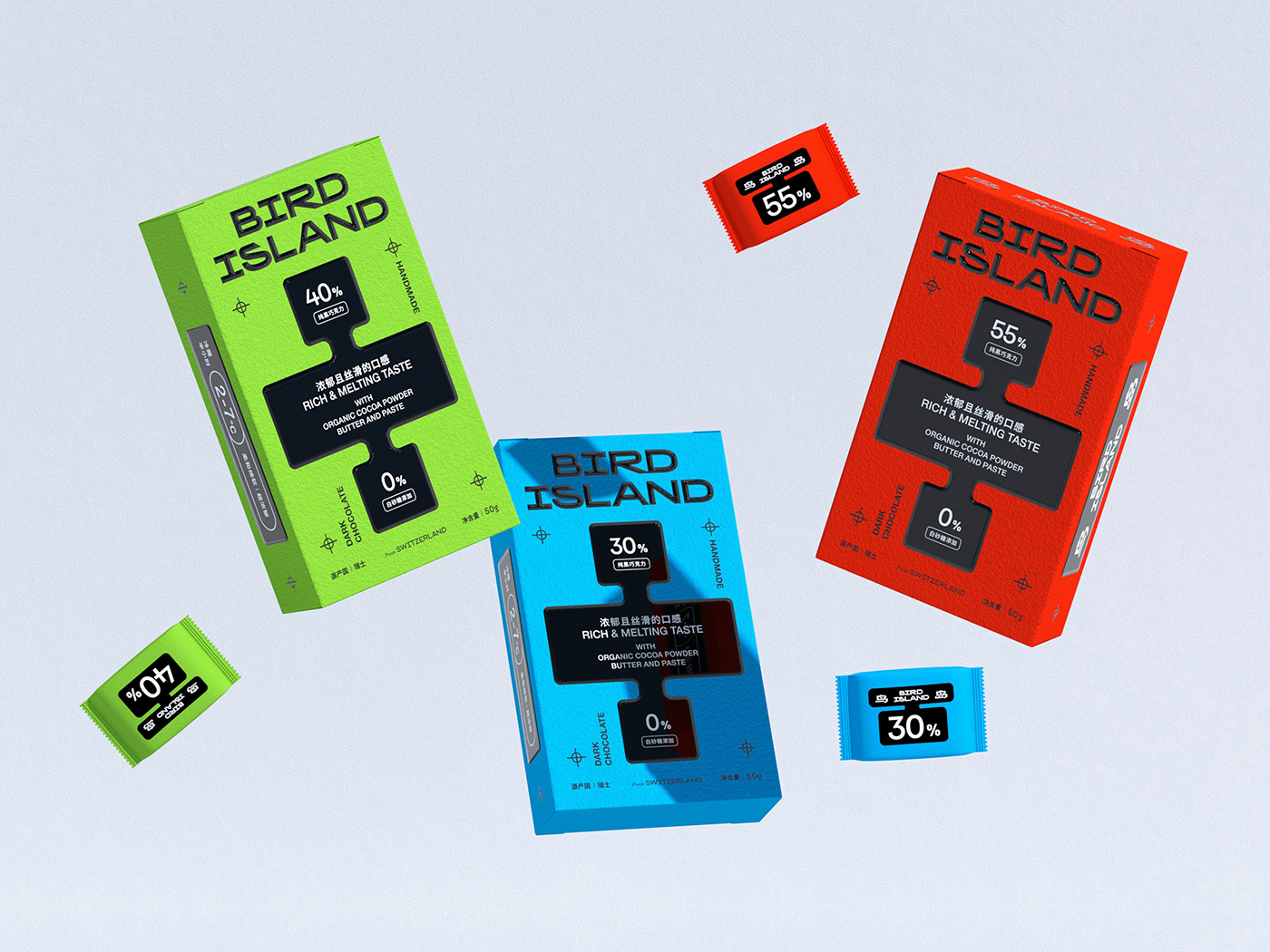
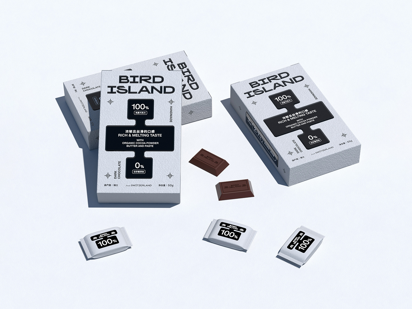
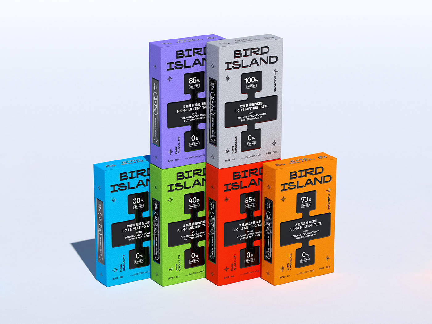
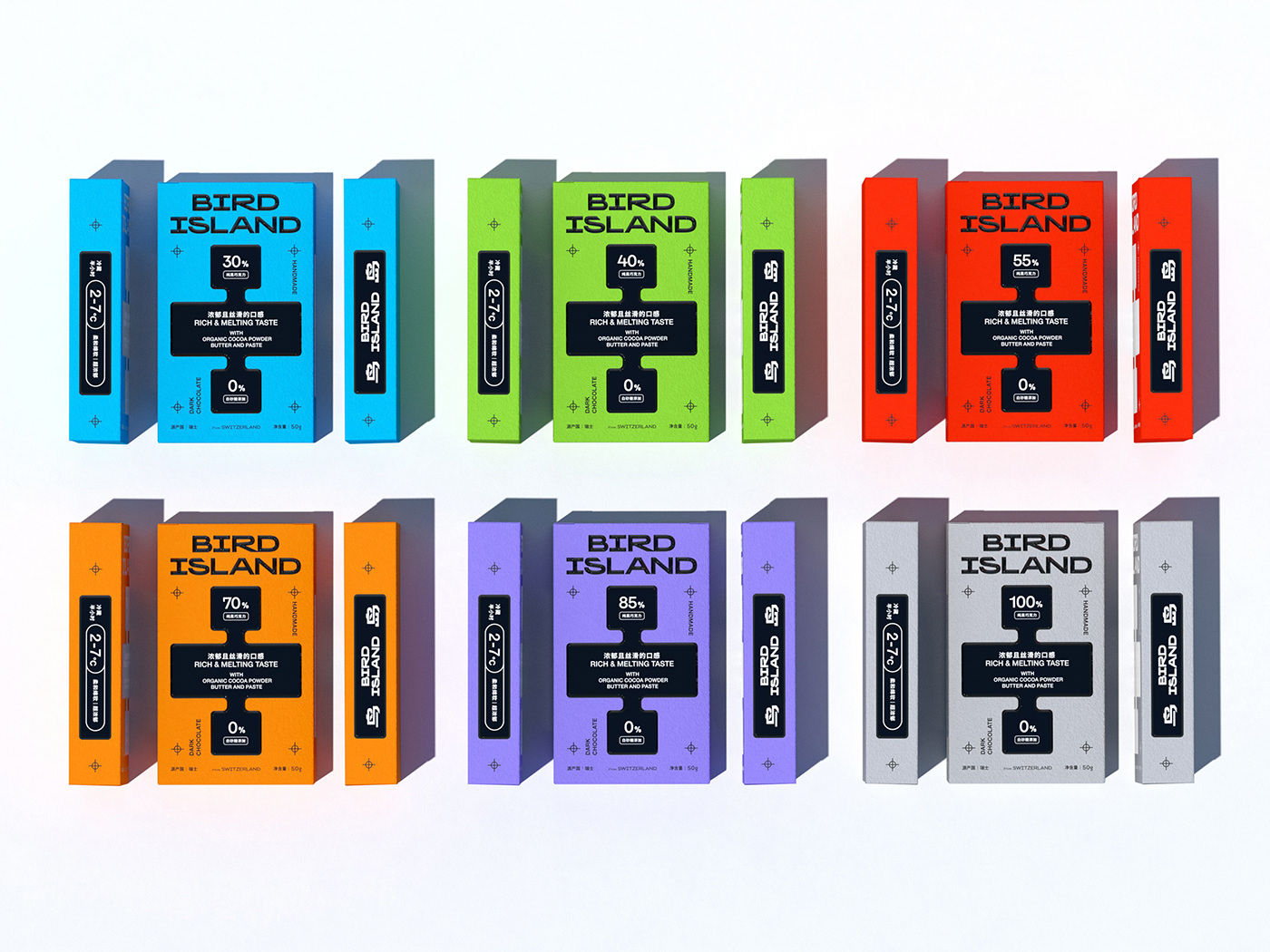
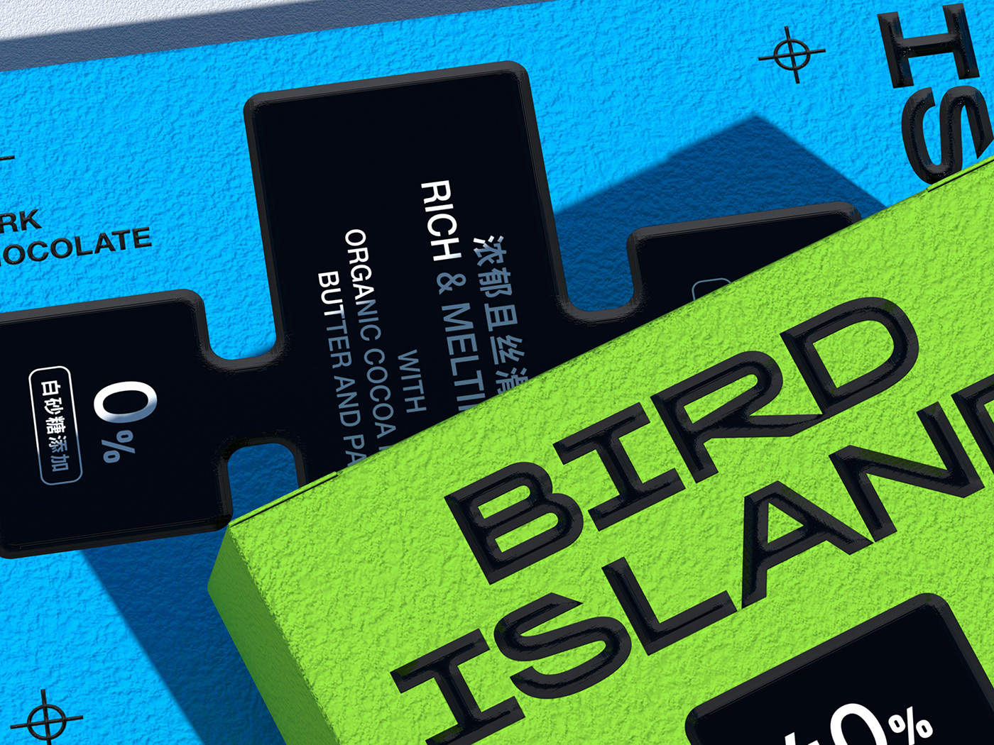
「bird island鸟岛」一直在寻求自我定位,产品专业化,并以精品巧克力为灵感,打造经典形象。因此,工作从品牌定位战略开始,展开成一套与商业意图一致的包装。新的身份和新的包装成为了品牌生命的转折点,并呈现出专业的性格,包装通过颜色明细区分,强调每个产品的个性 。
Bird Islad Has Been Seeking Self-positioning, Product Specialization, And Creating A Classic Image Inspired By Boutique Chocolate. Therefore, Work Begins With A Brand Positioning Strategy That Unfolds Into A Package That Is Aligned With The Commercial Intent. The New Identity And New Packaging Have Become A Turning Point In The Brand's Life And Present A Professional Character. The Packaging Is Differentiated By Color To Emphasize The Individuality Of Each Product.
Brand:BIRD ISLAND鸟岛
Project:全新定位 / 全新包装 / 全新视觉形象
Category:巧克力
Design:DY
Illustration:Circle
本作品由 Round 3 设计工作室©原创出品
Project:全新定位 / 全新包装 / 全新视觉形象
Category:巧克力
Design:DY
Illustration:Circle
本作品由 Round 3 设计工作室©原创出品