ABOUT BRAND
Wazo is an online buy now and pay later platform that provides its users with easy and accessible payment options as well as well-conducted installment payment options for users to access their desired products even with just a 50% down payment and at 0% interest rate. Wazo also has a platform for sMEs to sign up and partner with the brand hence enabling them access to multiple business loans and other fantastic offers to help scale their businesses.
PROJECT OBJECTIVES
1. Analyze the core features that characterize the brand, and transform these features into aesthetically pleasing pieces.
2. Create a common visual language that facilitates emotional memory-based identification, recognition, and social connection.
3. Develop strategies to help the business move into a new digital era and enhance its social media presence.
2. Create a common visual language that facilitates emotional memory-based identification, recognition, and social connection.
3. Develop strategies to help the business move into a new digital era and enhance its social media presence.
CREATIVE SOLUTIONS
1. Visually represent an information source with a contemporary and technological vibe.
2. Assign strong phrase & characteristics that are connected to the agency, thus fostering a relationship between the brand and its clients.
3. Highlight the agency name's concept and use it as the foundation for developing the symbol and other brand elements.

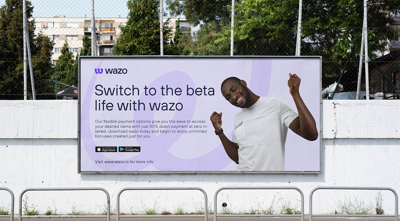
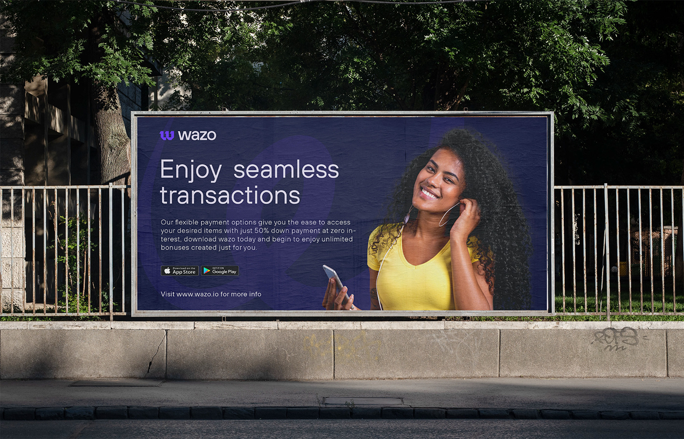
PHOTOGRAPHY
Photography is essential to humanizing our brand and debunking the idea that our services are only available to a restricted group of people. It gives us the chance to illustrate our objectives and show how our service may benefit anyone and everyone willing to modernize their companies and utilize our seamless financial solutions.

GRID
The grid was constructed utilizing several rectangles and triangles, starting with the idea of a specific symbol, with the goal of creating the letter "W," the brand's initial letter, as well as a satisfying and aesthetically attractive outcome. As can be seen on the side, the logomark is perfectly geometrical and distinctly visually represents the brand.


TYPOGRAPHY
The font used to create the logo is a Sans Serif style called "TT Hoves." The typeface was modified while attempting to keep forms that convey the notion of a more contemporary, expert, and adaptable brand. Reading was made more enjoyable by applying the optical adjustment between the letters, which visually formed a fit between them.

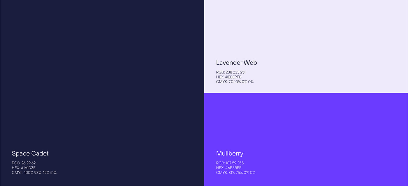
COLOUR PALETTE
The basic color palette chosen to create the brand is supplemented by hues of purple, based on market research and focusing on the brand's existing positioning. These colors were used to create a secondary palette that can be used to help assemble the visual identity, especially in digital media.
BRAND APPLICATION
This is the rollout of our new brand identity across all of our brand assets, including our letterhead, business cards, and other corporate materials, as well as our banners, posters, and other client touchpoints. Interacting with our clients through a consistent brand voice and aesthetic is a significant step toward letting our clients get to know us as an organization.