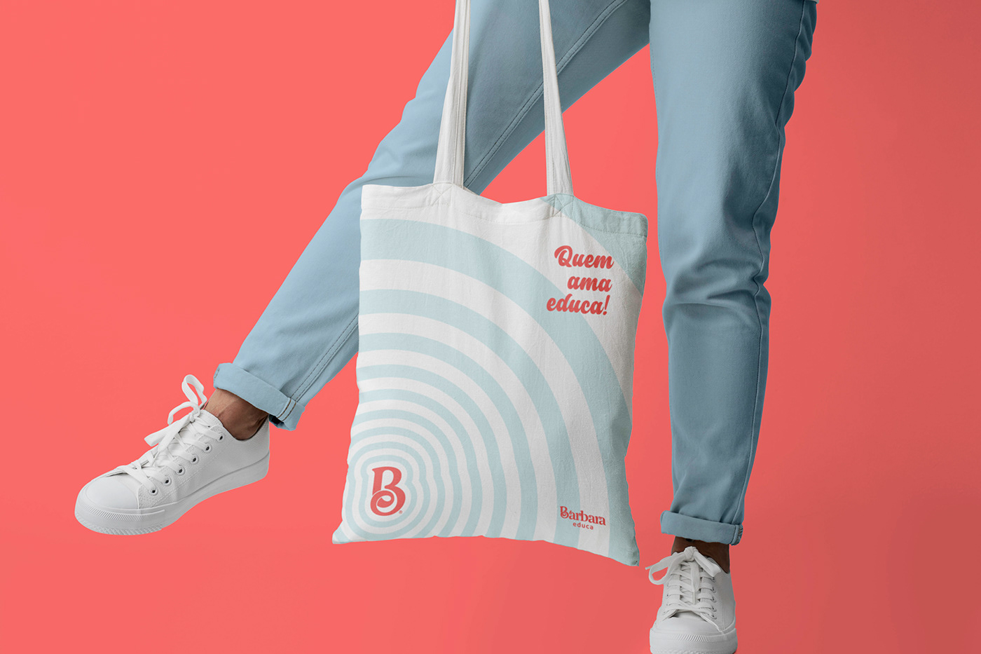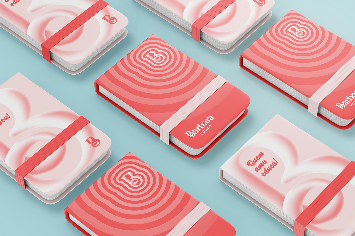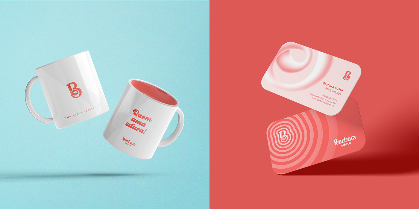
''Quem ama educa!''
Bárbara Educa é uma pedagoga e especialista em Psicopedagogia Clínica, Institucional e Educação Especial que tem o propósito de compartilhar conteúdos voltados para esse universo que é tão atual, apaixonante e necessário. E, oferecer atendimentos e produtos úteis e práticos para o dia a dia do profissional e pais, com o intuito de auxiliar e facilitar o desenvolvimento da aprendizagem do educando.
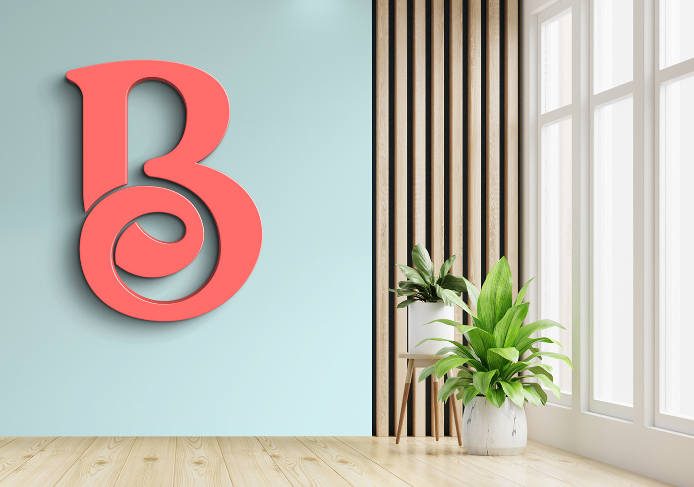
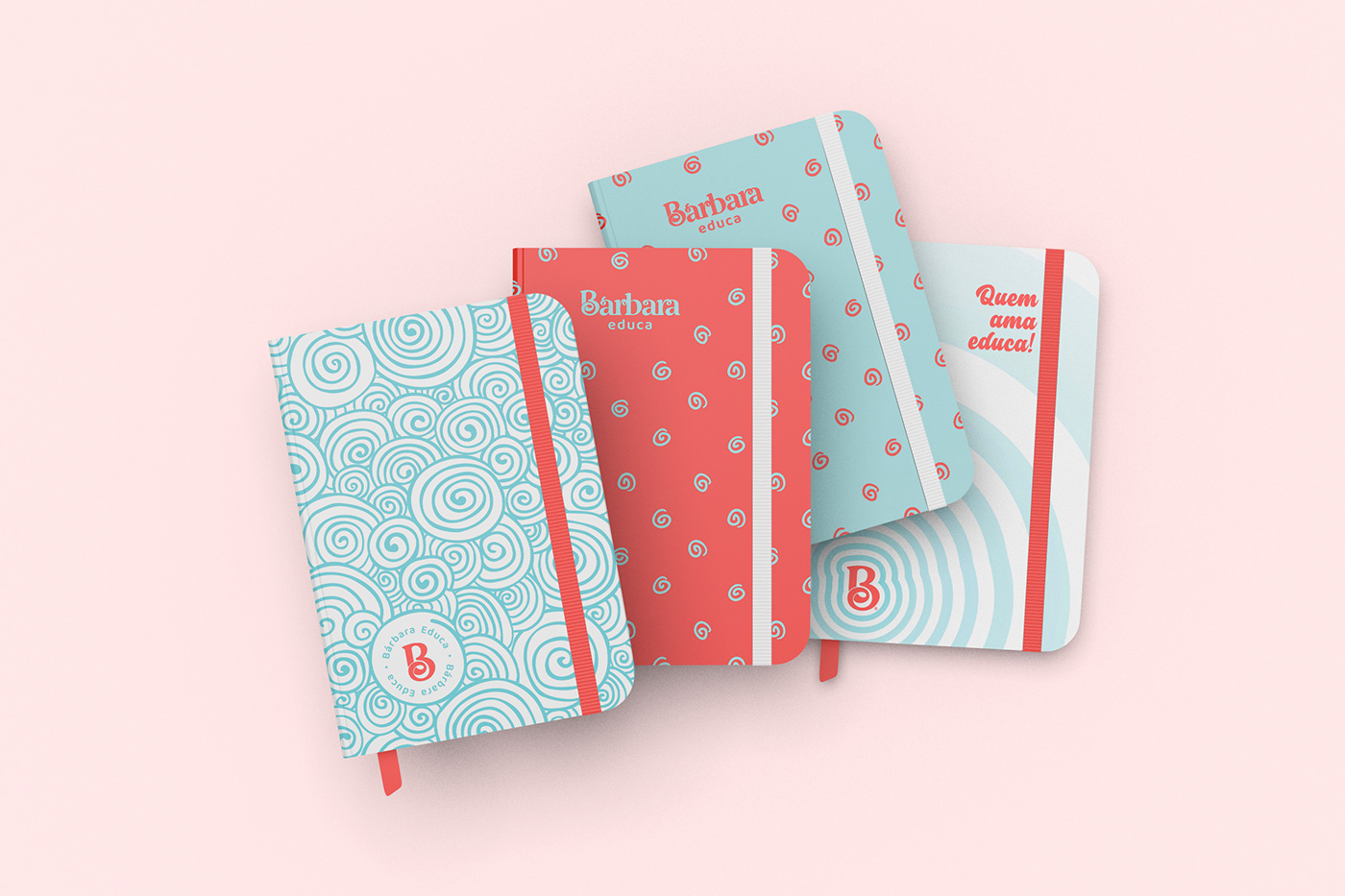
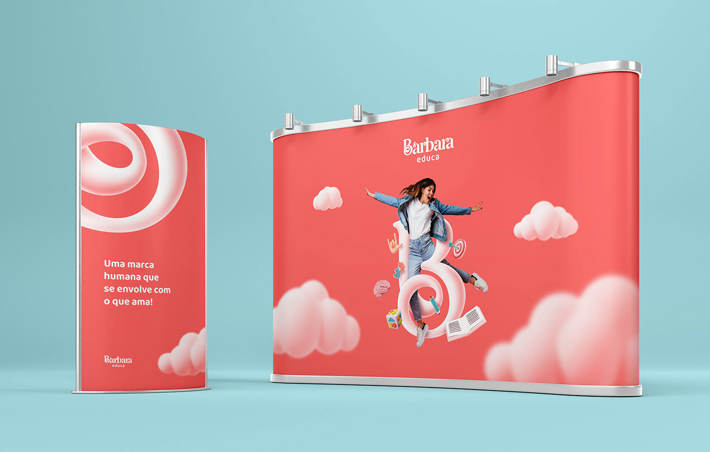
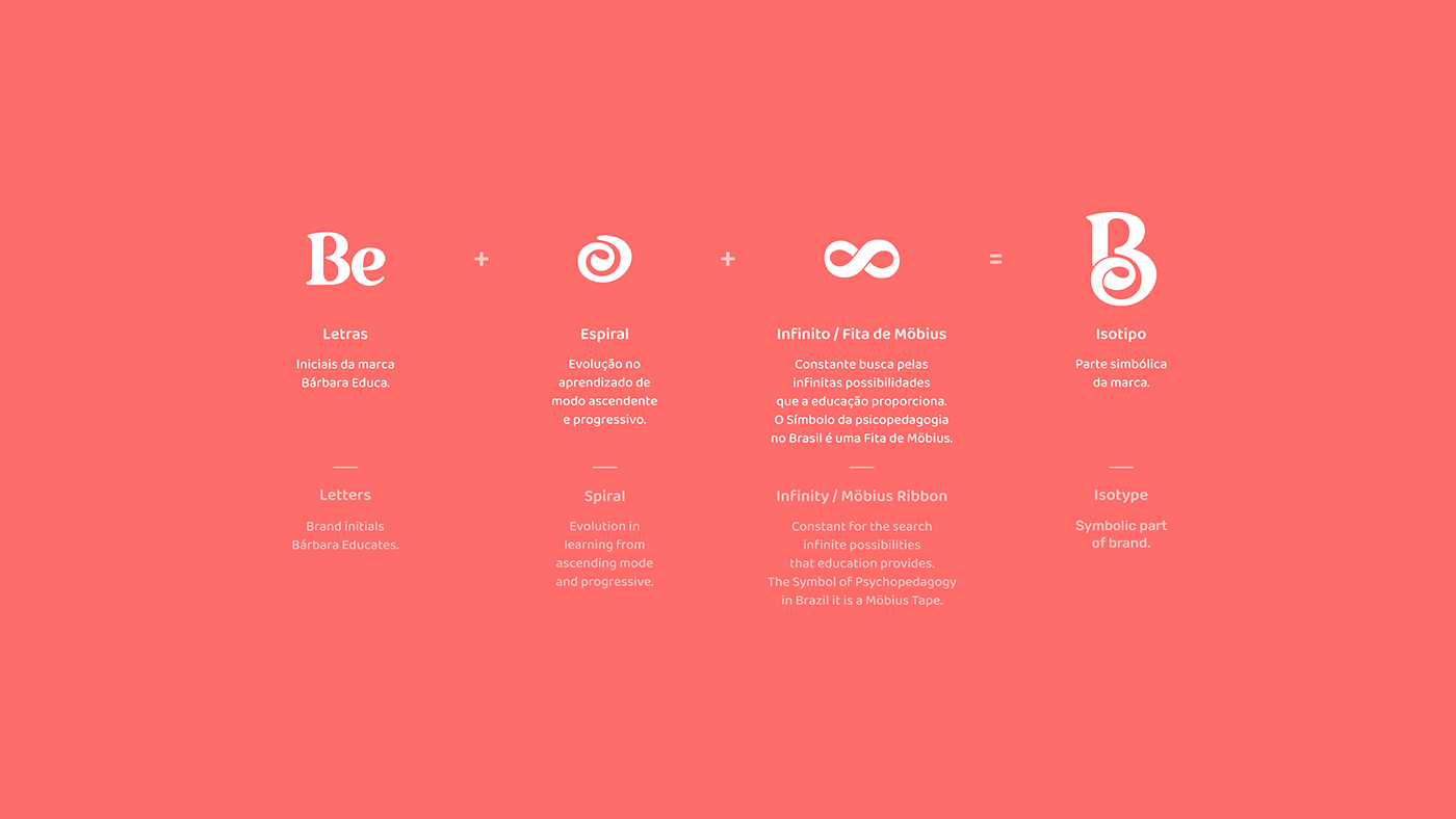
A marca explora o afeto e a proximidade no aprendizado. A identidade é ancorada com referências visuais lúdicas e de carinho. Isso resultou em um logotipo fluido com elementos que se envolve e liga um ponto ao outro, o ato remete carinho. A partir do insight, criamos um isotipo (parte simbólica da marca) a partir da letra ''B'' onde junto forma também a letra ‘‘e’’, das iniciais (Bárbara educa) para poder ser reconhecida sem o logotipo (a parte escrita da assinatura) se tornando uma marca flexível para ser aplicada em diferentes meios.
O objetivo com o design foi criar uma marca humana que se envolve com o aprendizado das pessoas com uma identidade rica em elementos e formas lúdicas, tornando uma identidade global diferenciada em seu campo de prática.
__
''Who loves educates!''
Bárbara Educate is a pedagogue and specialist in Clinical, Institutional and Special Education Psychopedagogy whose purpose is to share content aimed at this universe that is so current, passionate and necessary. And, offer services and useful and practical products for the daily life of professionals and parents, in order to assist and facilitate the development of the student's learning.
The brand explores affection and proximity in learning. The identity is anchored with playful and affectionate visual references. This resulted in a fluid logo with elements that wrap around and connect one point to another, the act reminiscent of affection. From the insight, we created an isotype (symbolic part of the brand) from the letter ''B'' where together it also forms the letter ''e'', from the initials (Bárbara educa) to be recognized without the logo (the written part of the signature) becoming a flexible brand to be applied in different media.
The objective with the design was to create a human brand that engages with people's learning with an identity rich in playful elements and forms, making a global identity differentiated in its field of practice.


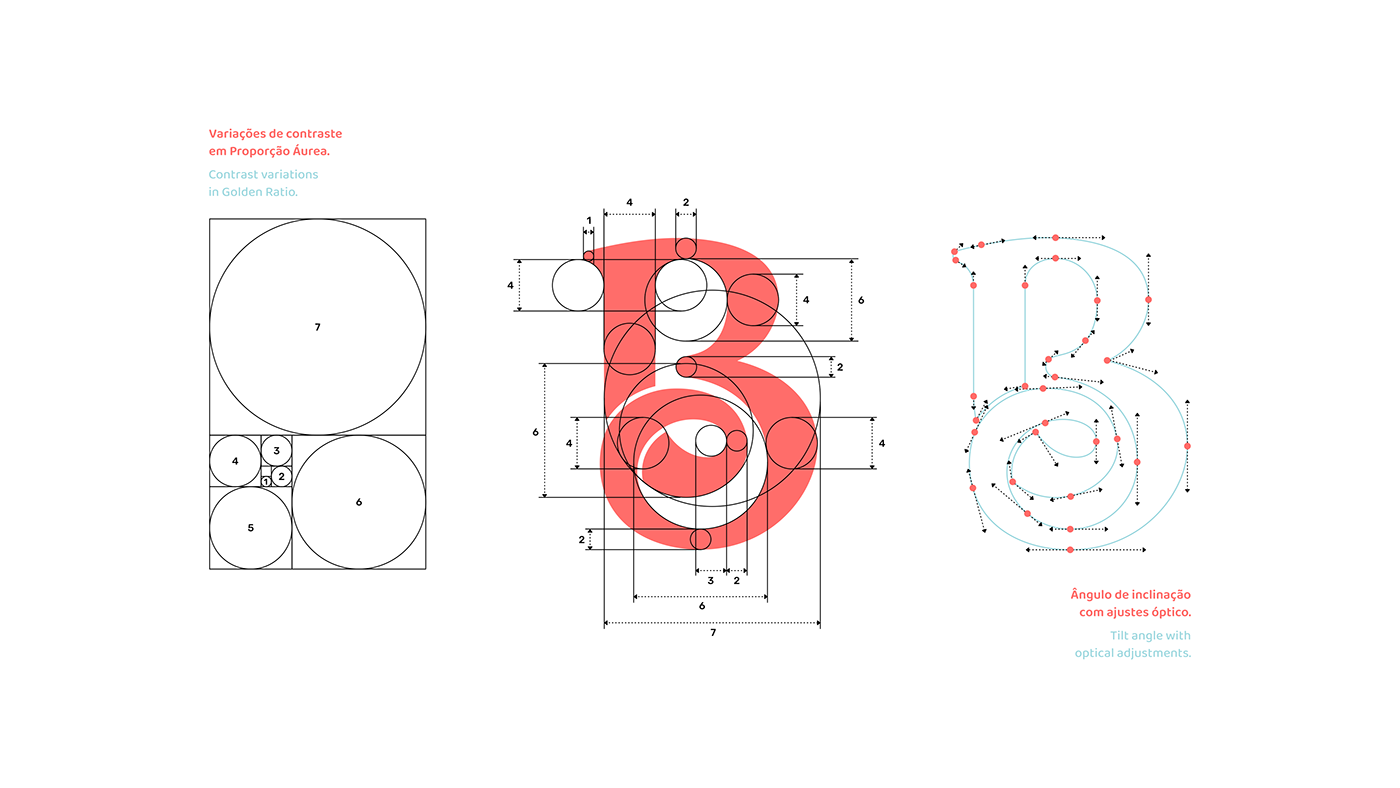
Variações de contraste
Para gerar harmonia entre as espessuras dos traços presentes no logotipo, foram empregada a Proporção Áurea, representada matematicamente pela escala numérica de 1,618.
Para gerar harmonia entre as espessuras dos traços presentes no logotipo, foram empregada a Proporção Áurea, representada matematicamente pela escala numérica de 1,618.
Ângulo de inclinação
Após vários testes e escolha do ângulo ideal de inclinação, o seu eixo foi refinado e feito ajustes óptico nas curvas para trazer mais fluidez.
__
Contrast variations
To generate harmony between the thicknesses of the lines present in the logo, the Golden Ratio was used, represented mathematically by the numerical scale of 1.618.
Tilt angle
After several tests and choosing the ideal angle of inclination, its axis was refined and made optical adjustments in the curves to bring more fluidity.


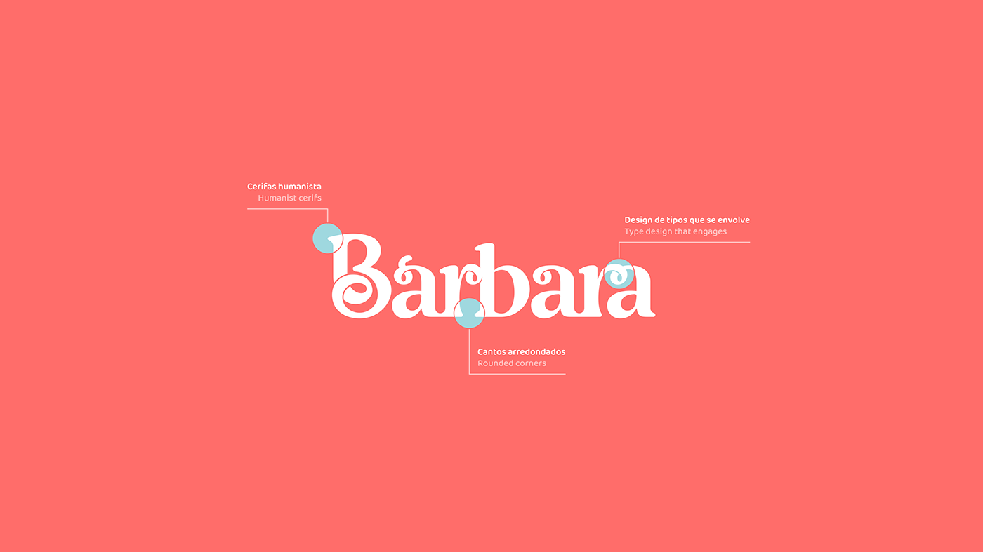
As cerifas humanista tem um conceito histórico muito forte que transmite conhecimento, autoridade, tradição, sobriedade, liderança e sabedoria, os primeiros livros foram feitos com as tipografias humanista. Por todos esses fatores, o estilo de serifa humanista é muito utilizado em livros, instituições de ensino, entre outras coisas ligadas ao aprendizado e tradição.
Os cantos arredondados transmitem segurança, proteção e cuidado. Um exemplo é que quando crianças logo descobrimos que cantos afiados e pontiagudos podem nos machucar, e cantos arredondados são bem mais seguros. É por isso que quando uma criança brinca com uma bola os pais ficam despreocupados, pois sabem que não oferece risco, mas caso a criança esteja brincando com algo afiado, os pais logo retiram para que ela não se machuque. Isso provoca o que a neurociência denomina de “resposta de esquiva”, desta forma tendemos sempre a evitar bordas afiadas, pois por natureza representam uma ameaça.
__
The humanist cerifs has a very strong historical concept that conveys knowledge, authority, tradition, sobriety, leadership and wisdom, the first books were made with the humanist typographies. For all these factors, the humanist serif style is widely used in books, educational institutions, among other things related to learning and tradition.
Rounded corners convey security, protection and care. An example is that as children we soon discover that sharp and pointed corners can hurt us, and rounded corners are much safer. That's why when a child plays with a ball, the parents are carefree, as they know it's not risky, but if the child is playing with something sharp, the parents immediately remove it so that he doesn't get hurt. This causes what neuroscience calls the “avoidance response”, so we always tend to avoid sharp edges, as by nature they pose a threat.
Uma marca humana que
se envolve com o que ama!
se envolve com o que ama!
A human brand that Get involved with what you love!


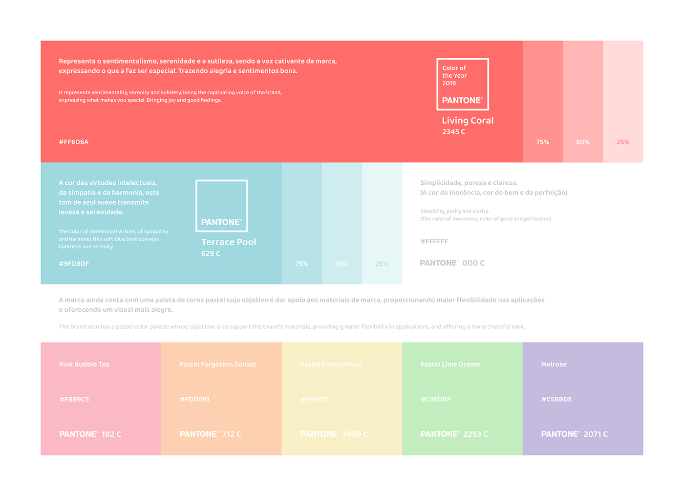
A cor principal escolhida foi a cor do ano de 2019 o Coral Vivo (Living Coral) pela Pantone a maior autoridade mundial em cores. O tom vibrante, segundo a Pantone, é uma resposta social à pressão de estarmos sempre conectados e expostos nas redes sociais.
De acordo com a Pantone, a cor animada e cheia de vida vai inspirar conexões mais humanas.
A tendência do uso desse tom e suas variações é cria uma atmosfera de aconchego, como um contraponto ao caos urbano.
A tendência do uso desse tom e suas variações é cria uma atmosfera de aconchego, como um contraponto ao caos urbano.
__
The main color chosen was the 2019 Color of the Year Living Coral by Pantone, the world's leading color authority. The vibrant tone, according to Pantone, is a social response to always being connected and exposed on social media.
According to Pantone, the lively and lively color will inspire more human.The trend of using this tone and its variations is an atmosphere of urban coziness, as a counterpoint to chaos.
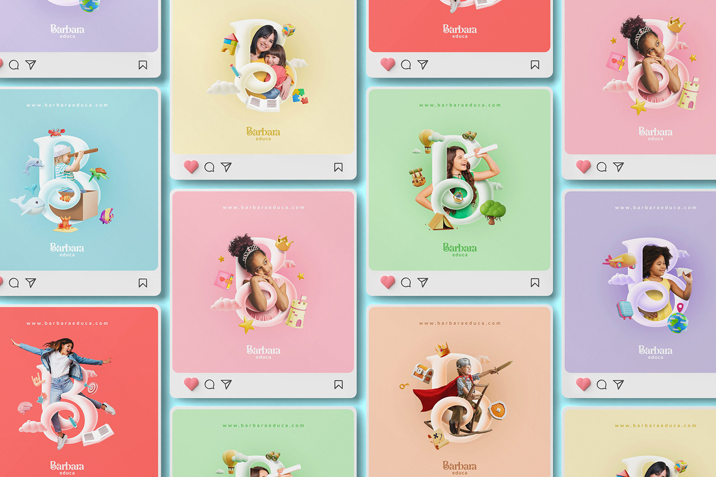
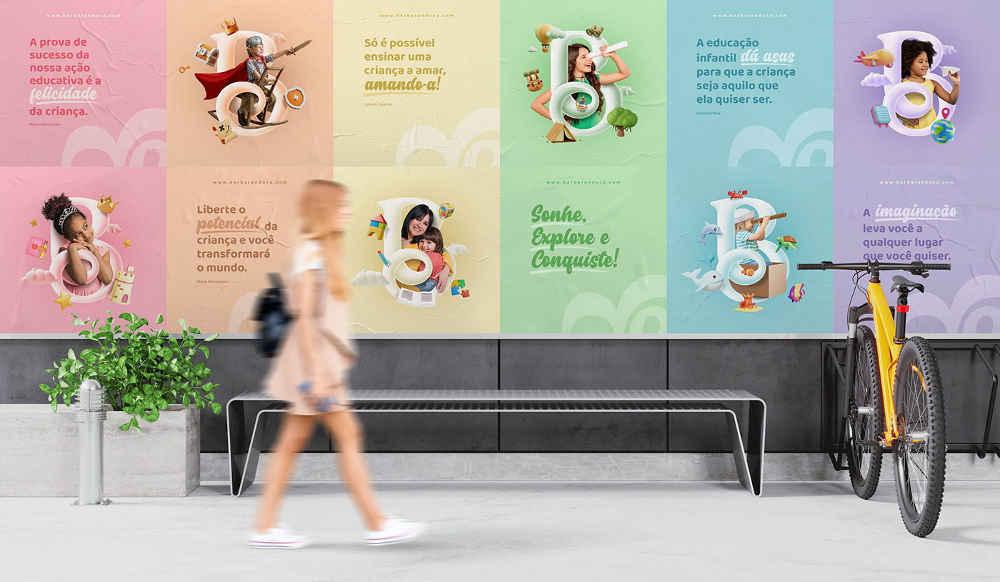
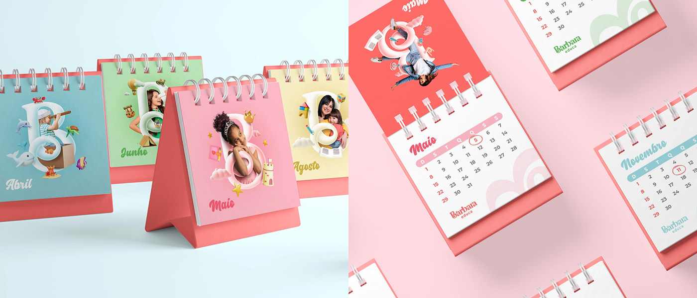
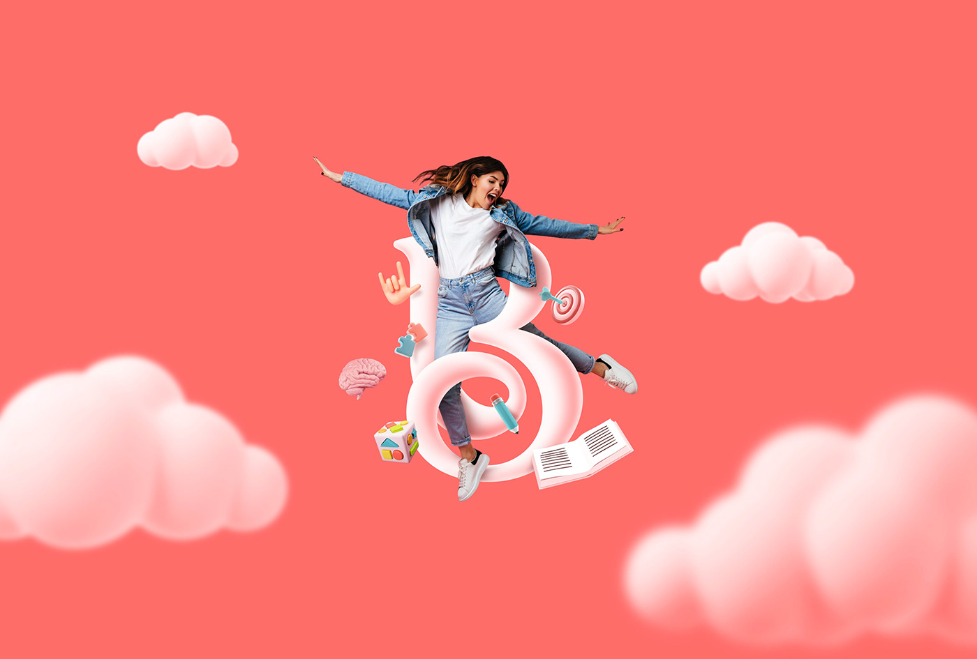
A imaginação estimula a criatividade, influencia o desenvolvimento cognitivo, e contribui principalmente para a resolução de problemas. É com a imaginação que os pequenos atribuem sentido às coisas que aprendem, sentem e observam.
Pensando nisso criamos uma coleção de imagens lúdicas com o isotipo ao centro onde cada imagem expressa uma imaginação e cria suas próprias histórias.
__
Imagination stimulates creativity, influences cognitive development and mainly contributes to problem solving. It is with imagination that little ones attribute meaning to the things they learn, feel and observe.
With that in mind, we created a collection of playful images with the isotype in the center where each image expresses an imagination and creates its own stories.


“A imaginação é a verdade da criança.
Para alcançarmos a criança,
devemos compreender que
a imaginação é um mundo.”
Gandhy Piorski
__
“Imagination is the child's truth.
To reach the child, we must understand
that imagination is a world.”
Gandhy Piorski