Клієнт / client
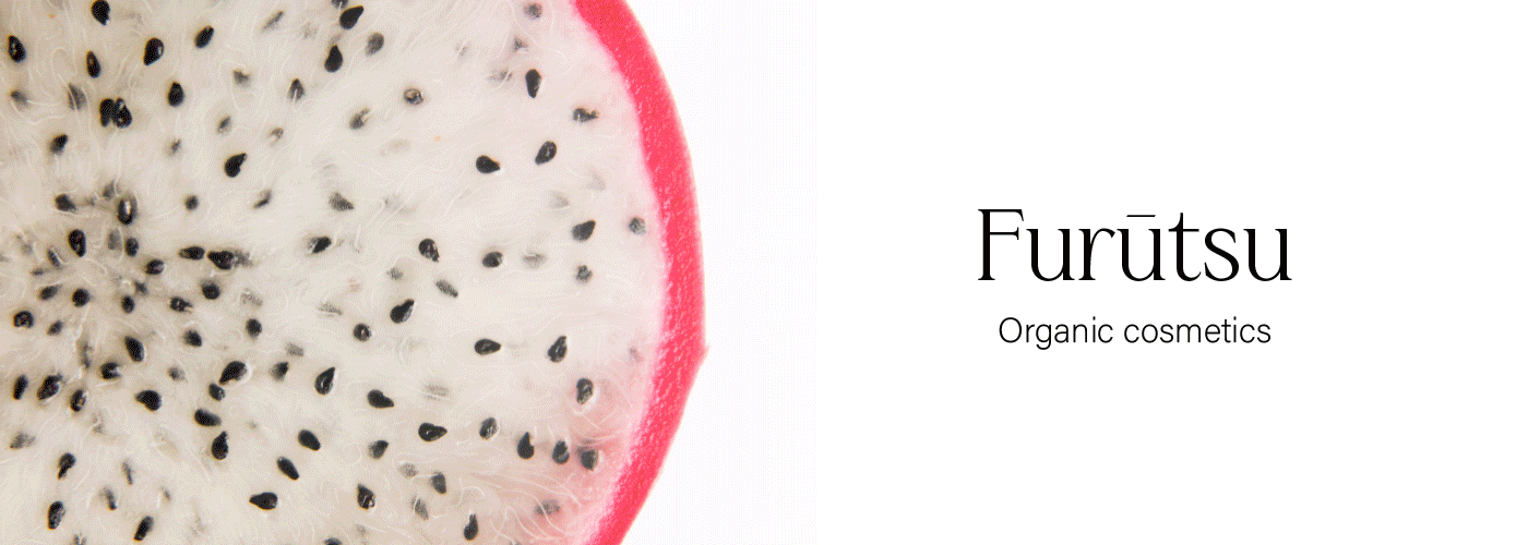
Furūtsu — це український бренд доглядової косметики, який робить ставку на якість
та натуральність своєї продукції. Його відмінною особливістю є те, що вся косметика,
що виробляється брендом, робиться на основі кісточок стиглих фруктів і ягід. В них
містяться безліч вітамінів і ферментів, які корисні для людської шкіри.
Furūtsu перекладається з японської як "фрукти". Бренд не випадково вибрав таку назву.
Виробник посилається на японську косметику, яка відома своєю якістю і великим вибором.
На даний момент бренд вже випустив лінійку кремів, кісточкових масел та скрабів для тіла.
Furūtsu is a Ukrainian brand of skin care cosmetics that relies on the quality and naturalness of products.
Its distinguishing feature is that all cosmetics, what is produced by the brand is made on the basis of seeds
of ripe fruits and berries. They contain many vitamins and enzymes that are beneficial for human skin.
Furūtsu means "fruit" in Japanese. The brand chose this name not by chance. The manufacturer is sent
to Japanese cosmetics, which is known for its quality and large selection. At the moment, the brand has
already released a line of creams, seed oils and body scrubs.


Завдання / task
Розробити логотип, упаковку та сувенірну продукцію для бренду доглядової косметики.
Зробити упаковку мінімалістичною, але водночас яскравою, що відображає
життєрадісність та незвичайність бренду.
Зробити акцент на кісточках фруктів та ягід, так як це головна відмінність Furūtsu
від інших косметичних брендів.
Design a logo, packaging and souvenirs for a cosmetics brand. Make the packaging minimalistic,
but at the same time bright, reflecting the cheerfulness and unusualness of the brand.
Focus on the seeds of fruits and berries, as this is the main difference between Furūtsu and other
care cosmetics brands.
Ідея / idea
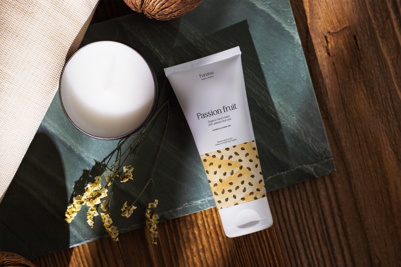
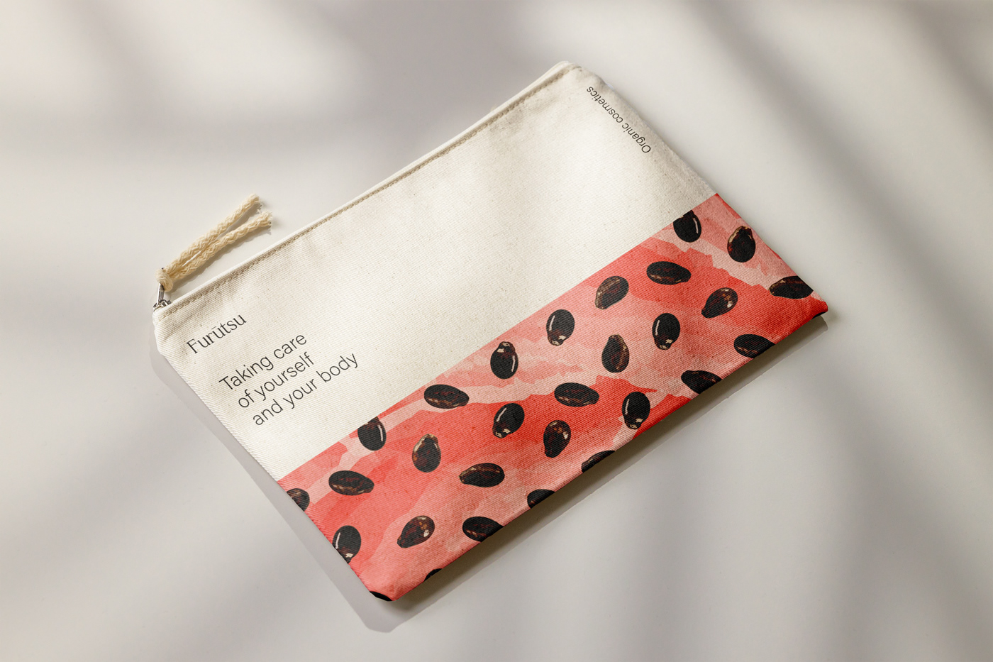
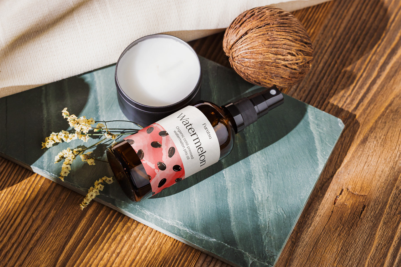
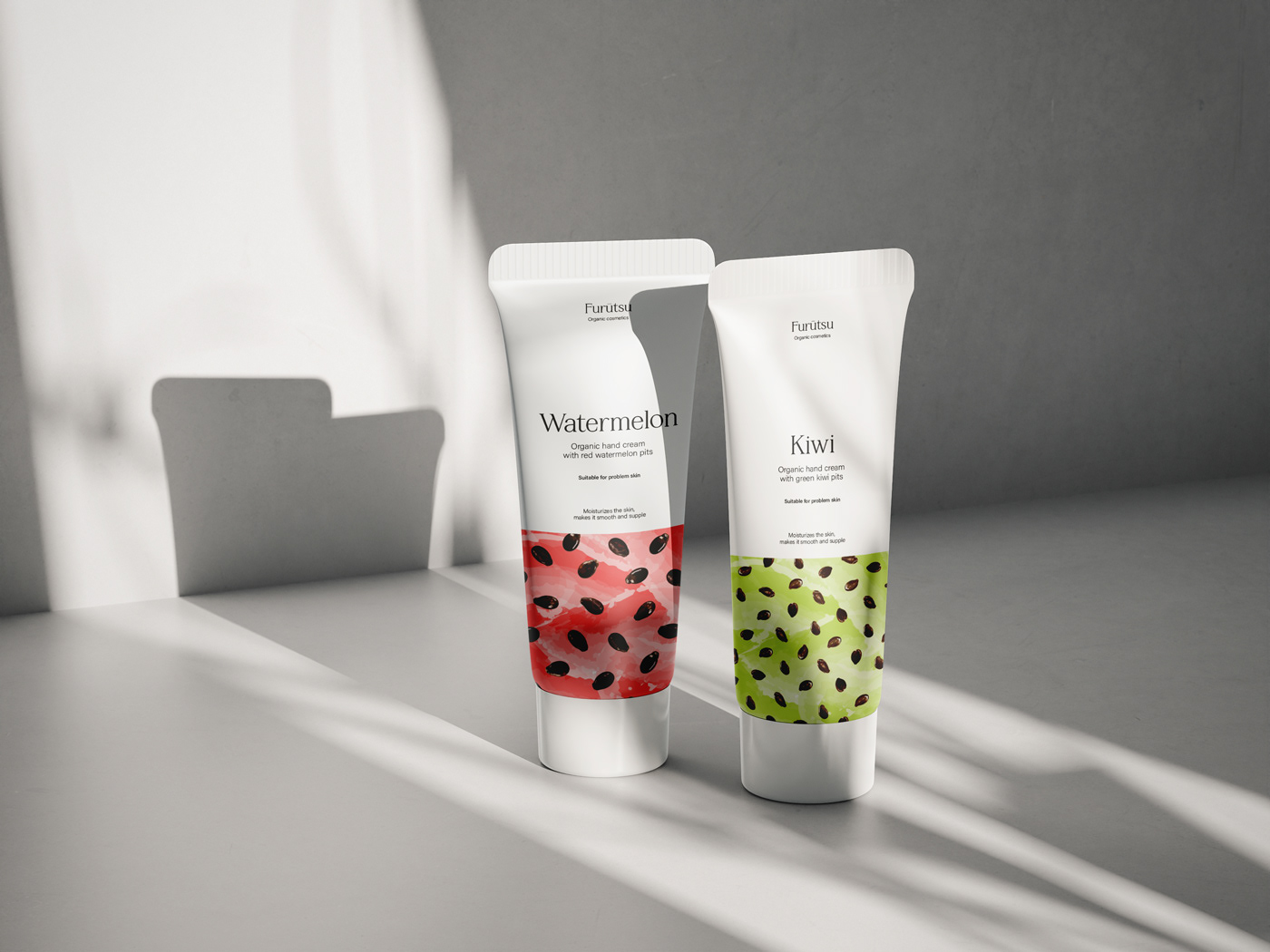
Оскільки відмінною особливістю бренду є виготовлення косметики із кісточок фруктів,
я вирішила розмістити їх на упаковці. Щоб досягти ефекту реалістичності, я сфото-
графувала кісточки фруктів і намалювала їх в ілюстраторі. Кожен патерн індивідуальний,
оскільки кісточки фруктів та ягід мають різну текстуру, кольори та форму.
Упаковки вийшли одночасно мінімалістичними та яскравими. Фоном для ілюстрацій
стали акварельні мазки, які символізують м'якуш стиглих фруктів. Однак головними
об'єктами ілюстрації залишаються саме кісточки.
Since the distinguishing feature of the brand is the production of cosmetics from fruit seeds,
I decided to put them on the packaging.To achieve the effect of realism, I photographed the seeds
of the fruit and drew them in illustrator. Each pattern is individual, since the seeds of fruits and
berries have a different texture, color and shape.
The packaging turned out to be minimalistic and bright at the same time. The background for
the illustrations is watercolor strokes that symbolize the pulp of ripe fruit. However, the seeds
are the main objects of the illustration.