

Above is my initial linework of the frame of hands. The linework is a tracing of the hands og my fellow students who helped shape the candlelight.
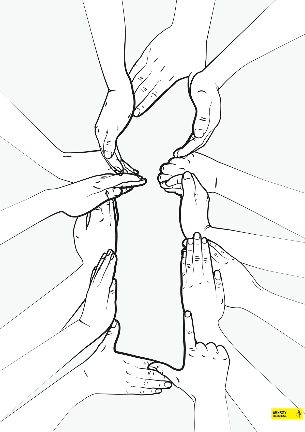
Above is the second iteration. The shape and layers of the hand becomes more clear. I felt the hands needed to exceed the border of the poster instead of fading out in the middle of it, that way the inside weight of the hands and the dynamic lines the hands created inwards would make the moster more poweful and make the candle more visually powerful.

Above is the finished poster submission. The hands are a faint yellow to dim them out compared to the candle and to create fewer colors on the poster. I painted the candlelight Yellow and the background black to use the already powerful colors of Amnesty's logo to carry the message. The Contrast of yellow in the darkness also emphasized the whole point and message of the poster and the logo of Amnesty - to be the fortress of hope in a tough world.


