
#everything'sfine
By Mathew Ly
DVB102 | Persuasive Poster | #oneperday22
TASK: PERSUASIVE POSTER
AUDIENCE: YOUNG - MIDDLE AGED PARENTS
PURPOSE OF #everything'sfine
To help parents prevent and protect their children from being addicted to technology and social media, and to promote a healthy life and upbringing by doing activities with them.
Products Used:
Surface Pro 4
Surface Pro Pen
Surface Pro 4
Surface Pro Pen
Software Used:
Adobe Photoshop 2022
Adobe Photoshop 2022

POSTER CONCEPT #1
The first poster concept is based on the dark idea of parents unknowingly allowing their kids to be sucked into technology and social media to the point where they become a husk that locks themselves away in the darkest corner of their minds, unable to interact with reality and society on the outside, dwelling in a physically and mentally malnourished form.
The first poster concept is based on the dark idea of parents unknowingly allowing their kids to be sucked into technology and social media to the point where they become a husk that locks themselves away in the darkest corner of their minds, unable to interact with reality and society on the outside, dwelling in a physically and mentally malnourished form.
I decided to use contrast as my main visual technique to portray this idea of isolation. This is evident with my use of making the room all dark and silent and only using a bright colour to present the light from the phone of the screen shining in the kids face and around onto the walls. I also wanted to create a focus on the kids malnourished form by giving a hollow body to symbolise emptiness, a red outline to symbolise death, and a darkish red colour to his brain to symbolise rot and a foul smell
My goal with the poster is to make it as scary and as tormenting as possible to have it leave an impact on the mind and perspective of the parents towards online accessibility. And with the use of dark colours, the unholy facial expression and decrepit illustration of an isolated adolescent, and the use of irony in the call to action, I think I have achieved it quite well in this concept.

POSTER CONCEPT #2
The second poster concept is based on the dark fantasy of a child being so manipulated by technology and social media, to the point where is becomes a psychotic and diehard slave to it. For a bigger fear factor to my poster, I went ahead and put a heavy emphasis on the ‘psychotic’ child by illustrating him essentially ripped out his own heart and soul and in some way offering it to the viewer as they no longer need it. While this use of big exaggeration made the poster feel stronger, I think it was a bit too much in terms of showing the dangers of tech addiction. With it being so graphic, I think that while it will leave an impact on the parents, but it might have a quite serious mental effect in the long term, which can then lead to serious legal issues.
Unlike the first concept. I went with a heavy red background to add to that crazed and dangerous feeling that is expressed with the dark illustration of the kid. Furthermore, there are now a lot more things in which the viewer can obtain fear from, the laughing in the background, the kids face, the finger on the phone, and the heart in hand. While more is good, I think there is too much on the page, and the viewer might not no where to focus to get the message of preventing their kids accessibility to technology and social media.
So while this is my favourite designed poster, the poster is unfortunately too graphic and too visually complexing to use as my final design.

POSTER CONCEPT #3
This final concept is based on the depiction of technology addiction and drug addiction, with the common misconception that one issue is not as bad as the other. Initially, my idea for the headline was going to be “it’s just as bad” however that felt more like a statement that was backed by official research, which is not what I wanted this poster/message to be about, instead, “it’s not as bad” plays on a societal belief and or perspective of both the issues. This therefore uses persuasive techniques such as logos and pathos to appeal to the viewer and to go past the illustration in front of them and develop a deeper perspective on the poster and on themselves.
Another interesting thing about this poster is the juxtaposition between the person playing games, and the person drugged out on the couch. While it visually appears that the person on drugs is in a worst state compared to the person on the computer, when you think about how they feel, it’s almost the same, two different situations, yet an identical outcome in terms of mental and physical deterioration.

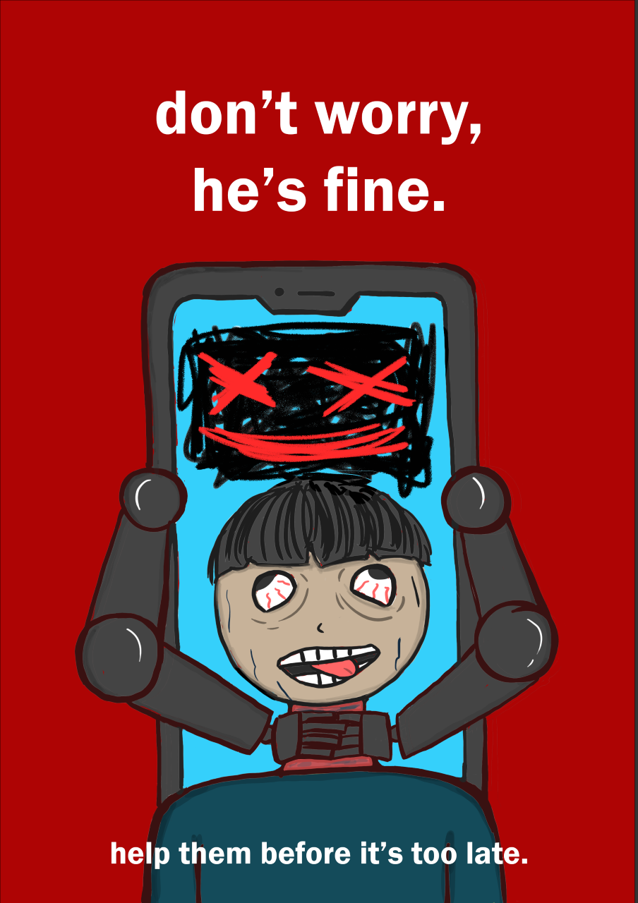
FINAL DESIGN
My final design revolves around society’s belief that technology and social media is slowly choking on vulnerable people (people with mental health, people with not a lot of friends), and so I illustrated a common depiction of what society thinks that might look like. Before settling on this I had a couple of ideas of how the sentient phone was going to interact with the student. These included, having the phone control the adolescent with strings like a puppeteer into choking them themselves, the phones point of view choking the kid, and the phone choking the kid with a necklace that had social media apps, games, and other addictive products that relate to technology addiction.
While disturbing, the kid’s ‘joyful’ facial expression as he’s being choked is referring to the fact that kids love the addiction to technology and social media because once they are so far into its pit, they become oblivious to its dangers and use it to detach themselves from their own mortal body, hence the reason they appear to be so lifeless. For further reinforcement of this issue, I made the kids eyes bulge out in a cartoonish style (evident with Bart and Homer Simpson from ‘The Simpsons’).
Initially I was going to censor the choking with a red charcoal scribble, however I pulled back when I thought about the difference between designing just a gruesome and scary poster with no limits, and a of a poster that isn’t afraid to showcase graphic actions to spread a serious and concerning message out to parents about the regretful choice of leaving their children to entertain themselves with technology and social media.

FINAL DESIGN (COLORIZED)
In terms of color, the only thing i wanted to point out is my idea behind the color of his neck, with it being dark red and purple, it obviously symbolizes the longing pain that these kids are unconsciously going through
In terms of color, the only thing i wanted to point out is my idea behind the color of his neck, with it being dark red and purple, it obviously symbolizes the longing pain that these kids are unconsciously going through
Final Reflection:
This week's task was a lot of fun, and it was also the first time i did a full digital drawing. While I personally think that traditional drawing is better because of how comfortable I am with it, I did enjoy creating different layers and gradually adding more and more detail on each of them. If I had more experience on digital drawings, the outcome of the poster would have been better however I'm satisfied with how this turned out with it being my first time.


