FOX SPORTS
INTERVIEW WITH TAVIS COBURN
Q: How would you describe your style?
I would describe my style as a cross between classic "Golden Era" Illustration from the 30's to the 60's, Pop Art, and Russian Constructivism, with a little vintage comic book sprinkled on the top.
Q: What were you trying to accomplish with this series?
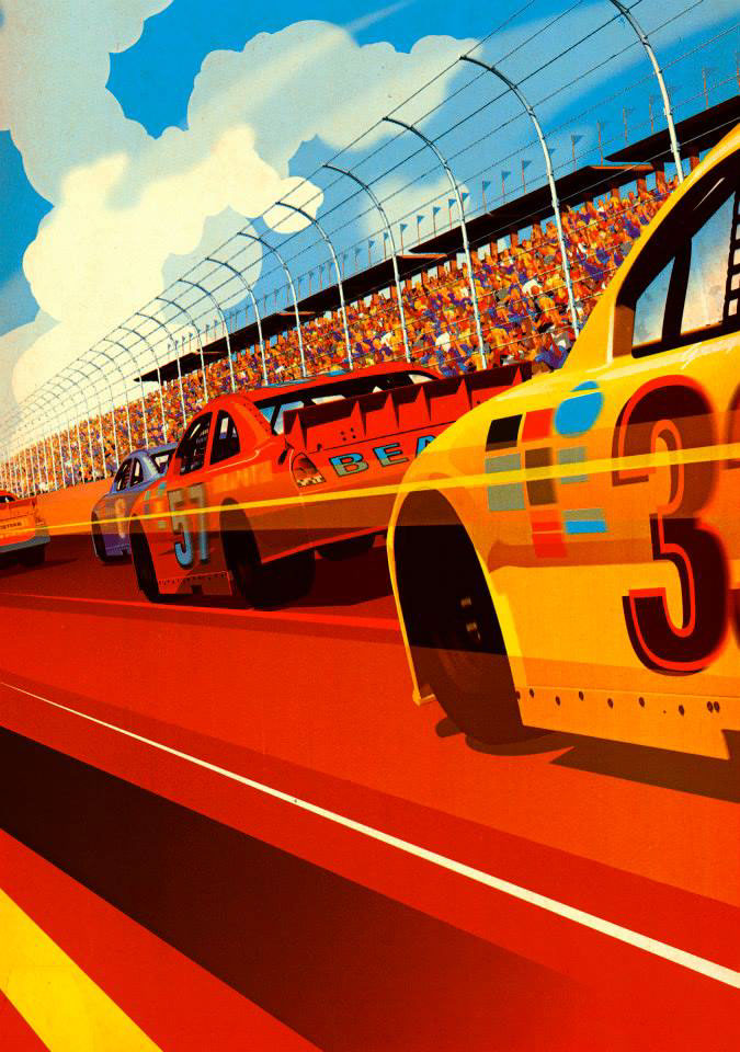
Speed and strength, but I also wanted to have the crowd play a prominent role. . It was a little out of my comfort zone dealing with fairly detailed crowds, and that amount of visual information. I tend to concentrate a lot on the figures in my work and keep the backgrounds fairly simple and graphic. For this series I really tried to have a 60/40 split of athlete to crowd. I also worked on keeping the art feel like it gave a nod to covers of old sport magazines, but with the colors and graphic elements made the pieces feel quite modern. I also really loved the colors that were beign used on the CGW set, and kept the series in that same ballpark pallet wise.
Q: Which of the five sports from the illustrations was the most challenging?
The basketball piece was the most difficult because it had the greatest number of players. Composing figures in a space, and then adding action, and a sense of drama with the lighting all becomes a lot like a very complicated jigsaw puzzle. I've created a digital process for making my art that allows me a lot of flexibility in the initial stages so I can nail down where all of the elements go, and really have full flexibly to move around the figures and environment. Once everything is in the right place I can then concentrate on painting the separate elements, and adding the texture to make the final feel like an old printed poster or magazine, even though 99% of my process is digital.
Q: Art and design seem to be everywhere right now in sports. Why is it such fertile ground for collaboration?
Good question, I think there have been a lot of poor design choices over the years from uniform colors to logos. I think the head offices are realizing that in order to sell merchandise and build a brand you have to spend some time and money to get the look and feel of your team right. A great example is the Brooklyn Nets, they did a nice job bringing in Adidas, to do the on court off court uniforms for the players. The logo and the team colors feels like it will last awhile, and all of that happens with good design. I think a lot of fans forget how much hard work goes into those decisions. Over the past few years in my opinion it's become apparent that building the brands is a big deal for owners. You are seeing a lot more hits than misses with the over all look and feel of most professional teams.
Q: Which teams have the best/worst logos?
Top 5 best. 1. Philadelphia Flyers 2. Detroit Red Wigs 3. Portland Trailblazers 4. Oakland Raiders 5. DC United
Top 5 worst 1. Anaheim Ducks 2. New Orleans Pelicans. 3. Montreal Impact 4. Columbus Crew 5. Colorado Rockies
Q: You've done Formula 1, football and soccer all before. Is there any athlete or sport you'd like to tackle next?
I love basketball, and I think doing something along the lines of what I did for Arsenal with the murals around Emirates stadium would be amazing for the Celtics, Lakers, Nicks. Teams that have a long history, and decades of championship teams makes that kind of large scale project feel very monumental.
The other sport would be tennis, and I have yet to do any work for a tennis client. Nadal would be a fun brand to work on with Nike, he tends to go with the crazy colors, and he's such a powerful athlete, I think it would be a good fit with the style of my work. The equipment companies would be great to work on as well. I'm a huge tennis junkie with two club memberships, one with clay courts and one with hard courts I try and play 3-4 times a week when my schedule allows. I just love the sport, it's a total war on the court at times.