
Client
BK Aviation Consulting
Brief + Execution
Design a new logo and rename business from B Quality Assurance to BKAC. This original logo was basically a “quick fix” at the inception of the business and the client never got around to getting anything that really reflects what she does or what the company is about. She came up with the new name and needed a nifty logo that speaks aviation.
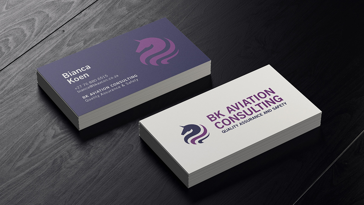
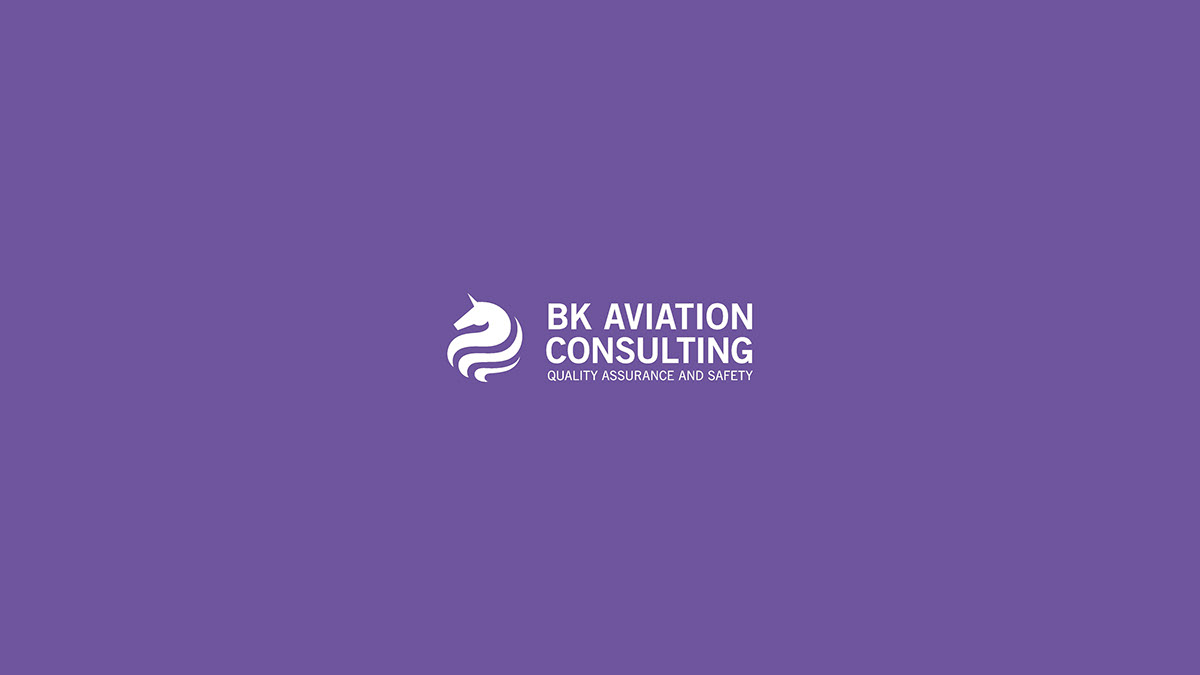
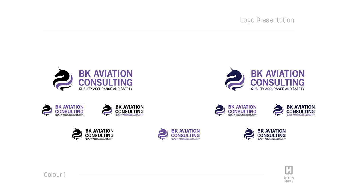
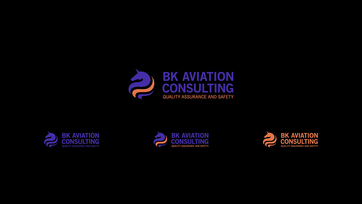
Initial sketch explorations were all centred around ideas incorporating aviation leaning imagery and/or BK monograms but eventually the client decided to go with the winged unicorn logo symbol, because like the unicorn she is one of a kind in an industry largely dominated by big companies and mostly headed by men.
Initial sketch explorations were all centred around ideas incorporating aviation leaning imagery and/or BK monograms but eventually the client decided to go with the winged unicorn logo symbol, because like the unicorn she is one of a kind in an industry largely dominated by big companies and mostly headed by men.
Her unique offering as an independent aviation consultant with the experience to match made her comfortable to go with the bold unicorn motif.
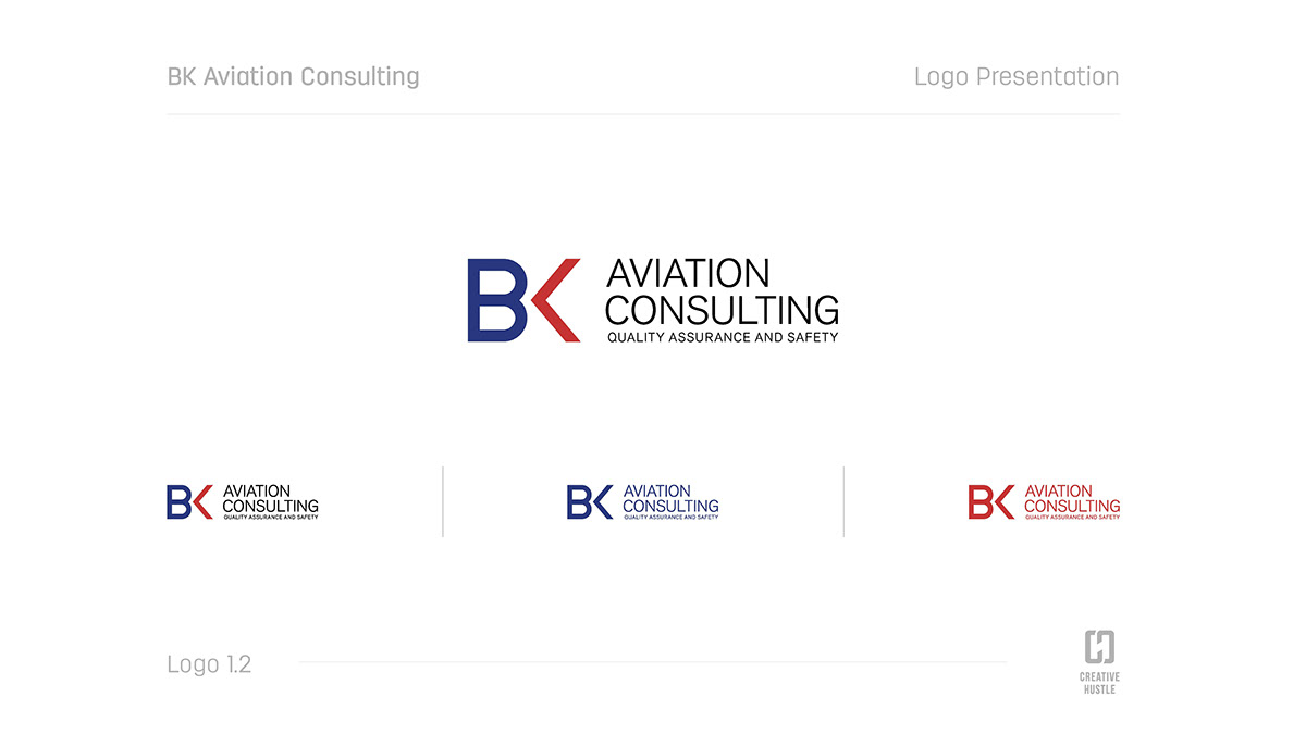
Original Logo

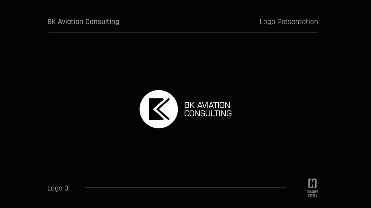
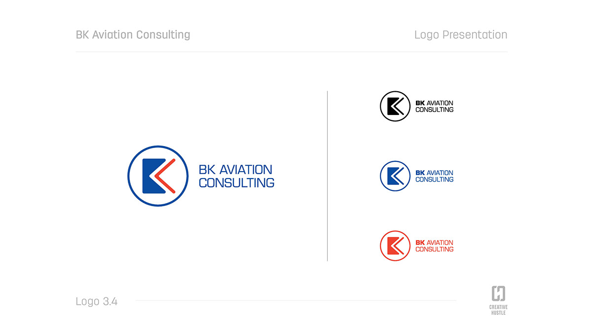
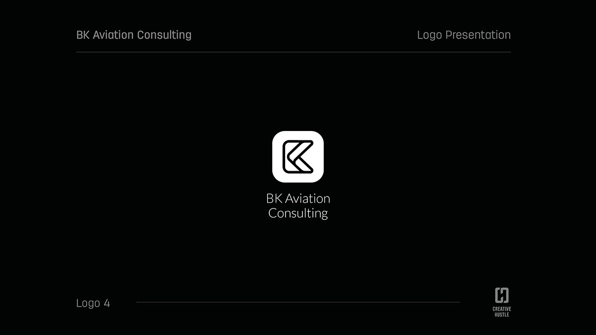
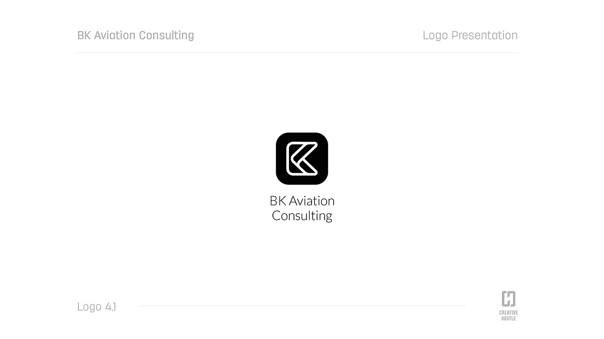
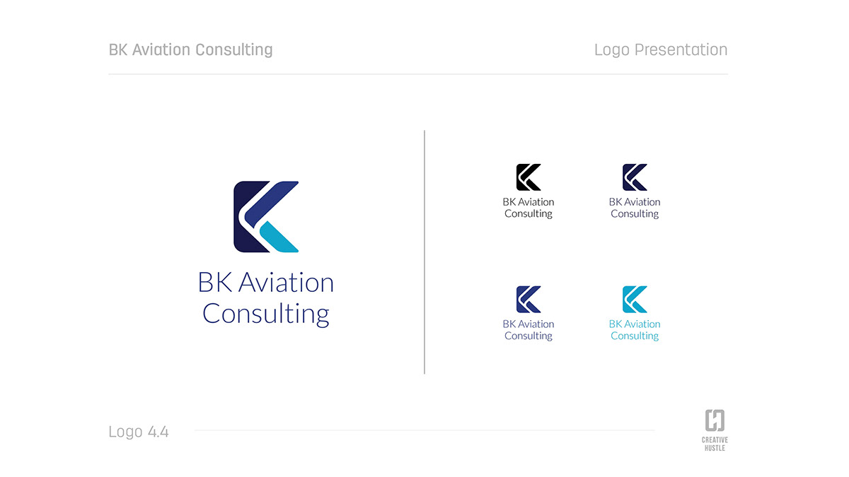
Logo Redesign - Logo Options - Round 1


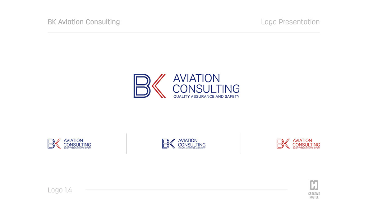
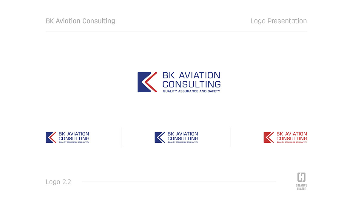
Logo Redesign - Logo Options - Round 2


Logo Redesign - Final Logo - Round 3 - Colour Exploration 1


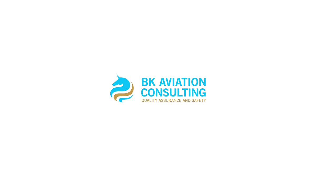
Logo Redesign - Final Logo - Round 4 - Colour Exploration 2

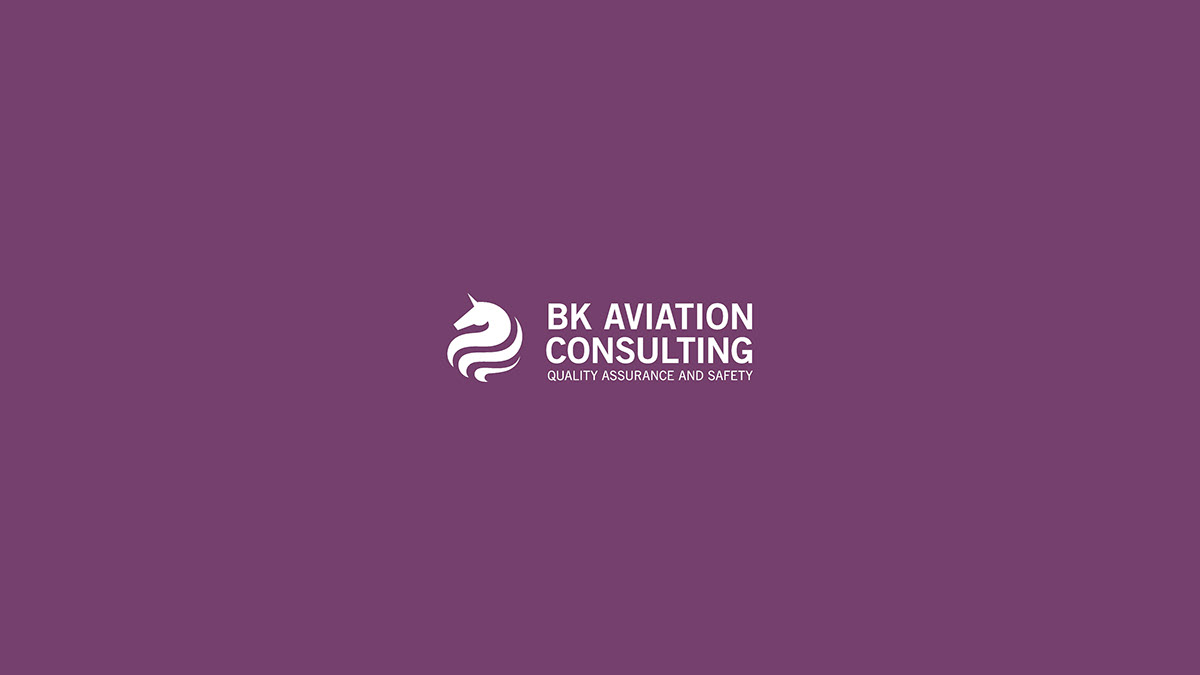
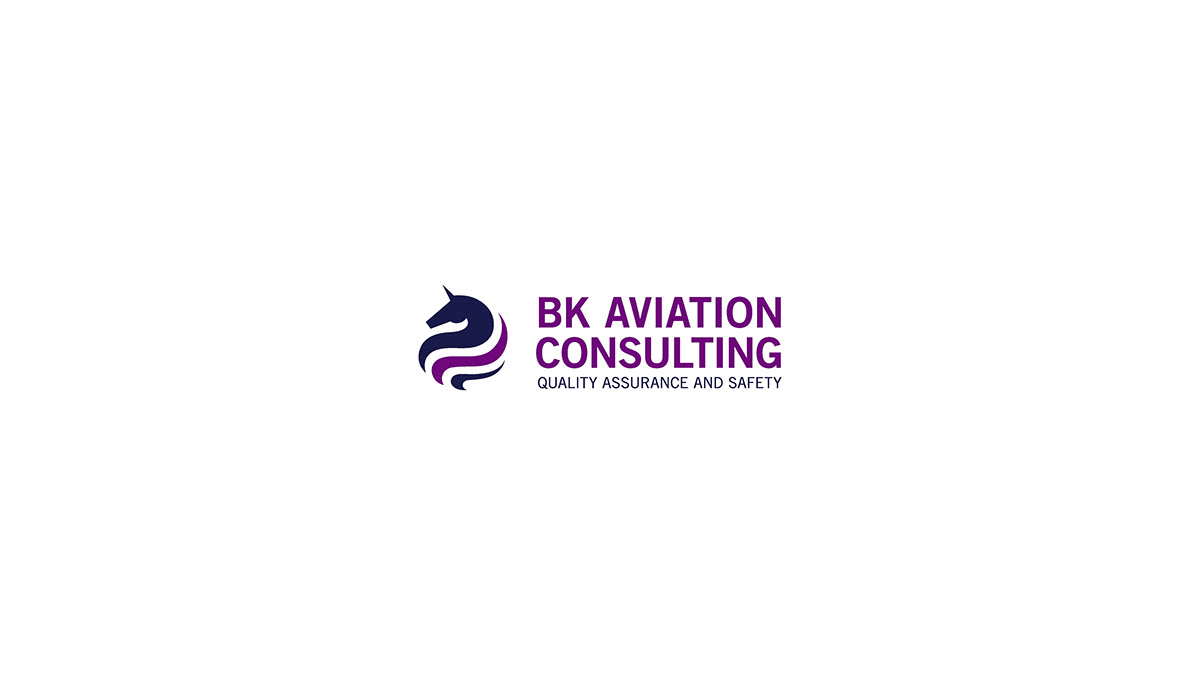
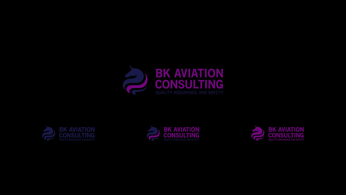
Colour Options + Colour Characteristics


Logo Redesign - Final Logo - Round 5 - Bold Tagline Options


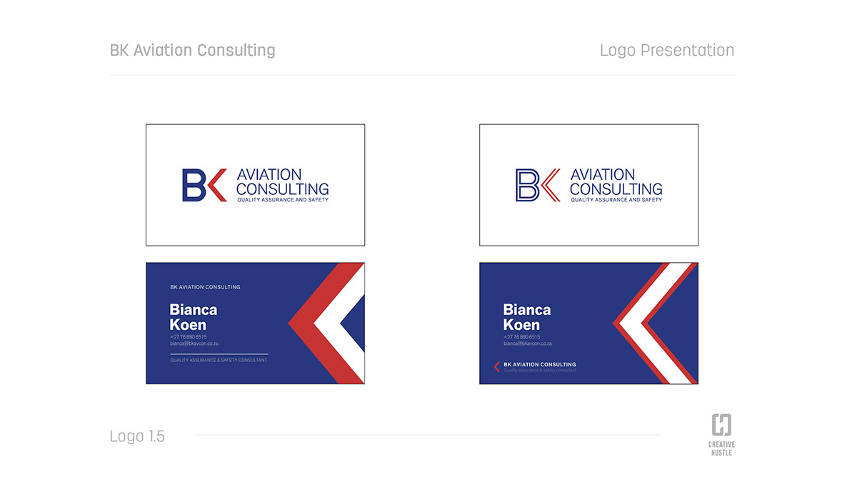
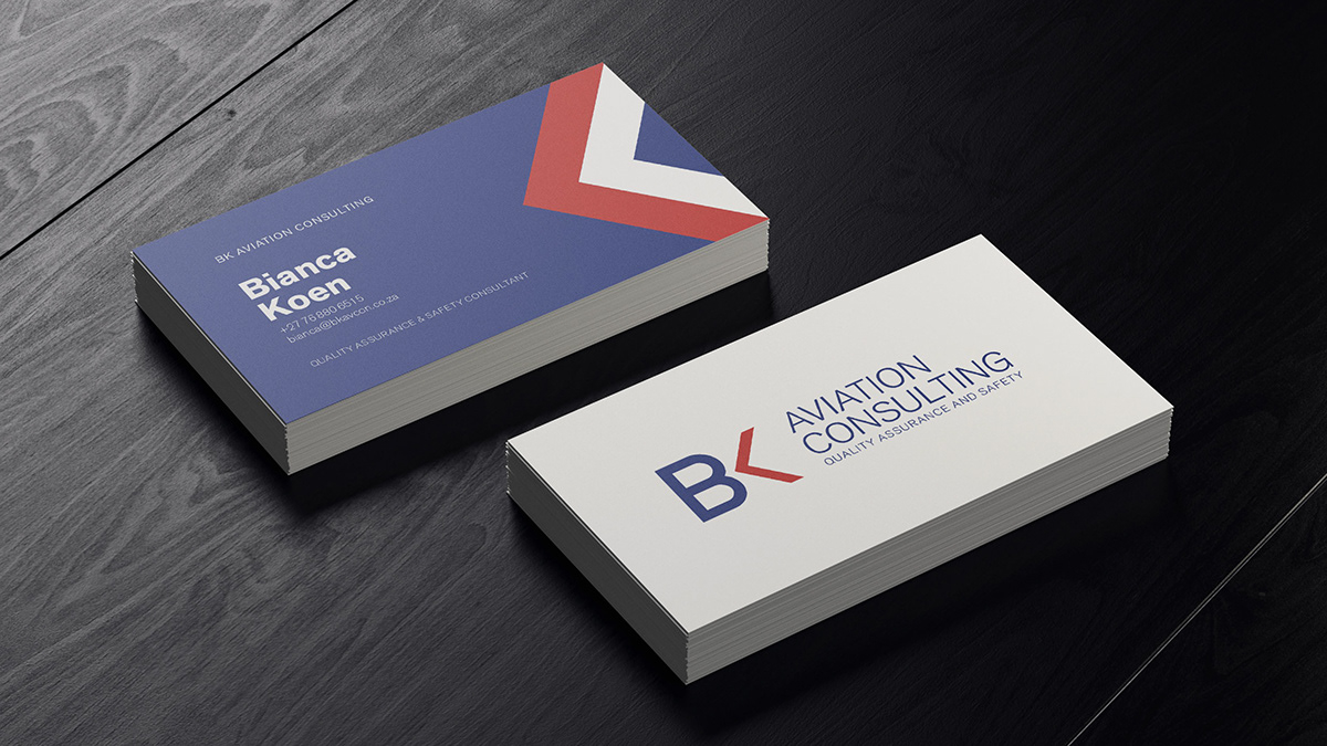
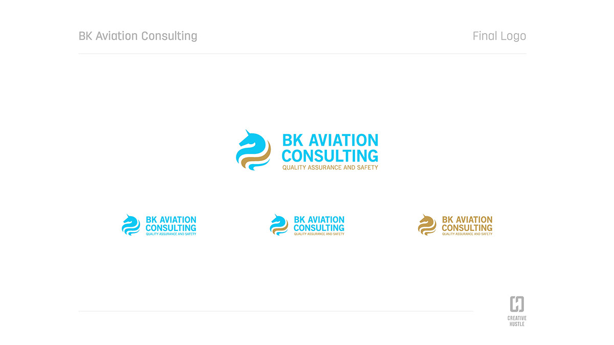
Logo Redesign - Final Logo - Round 6 - Final Business Card Mockup