
During Memorisely UX/UI Design immersive online Bootcamp, I worked with a small team of designers to improve the experience of Maze, a user testing platform to get feedback on design prototypes. Maze's team provided a brief, highlighting pain points they felt could be improved and we designed a solution.

The Problem
It's challenging for the users to navigate and understand how to create usability tasks within the block and to add follow-up questions to the survey. In particular, we noticed a lack on visual hierarchy which causes frustration and confusion of creating a new project.
Our approach
We improved Maze's design, making it more intuitive and customizable.
The drop down menu has been re-designed, to make the user confident in they're choose. Also we wanted to give more space to the edit section to guide the user to focus in the creation of the usability test, so we made the left column responsive. We focused on improving the mission blok experience, making the path selection easier.

Questions & Observations
To help us better frame any problems with the product, we began by forming some questions and observations we have about the product.
1. When adding a new block, users must scroll down on the left panel in order to read all the block type options, which causes excessive scrolling, frustration when keeping track of the blocks they’ve created, and confusion of the purpose of each column
2. When creating a new project, users are required to read all of the information on the screen in order to understand their options due to a lack in visual hierarchy, which causes indecision and delay for users to take their first step in creating a project
UX Research | Survey
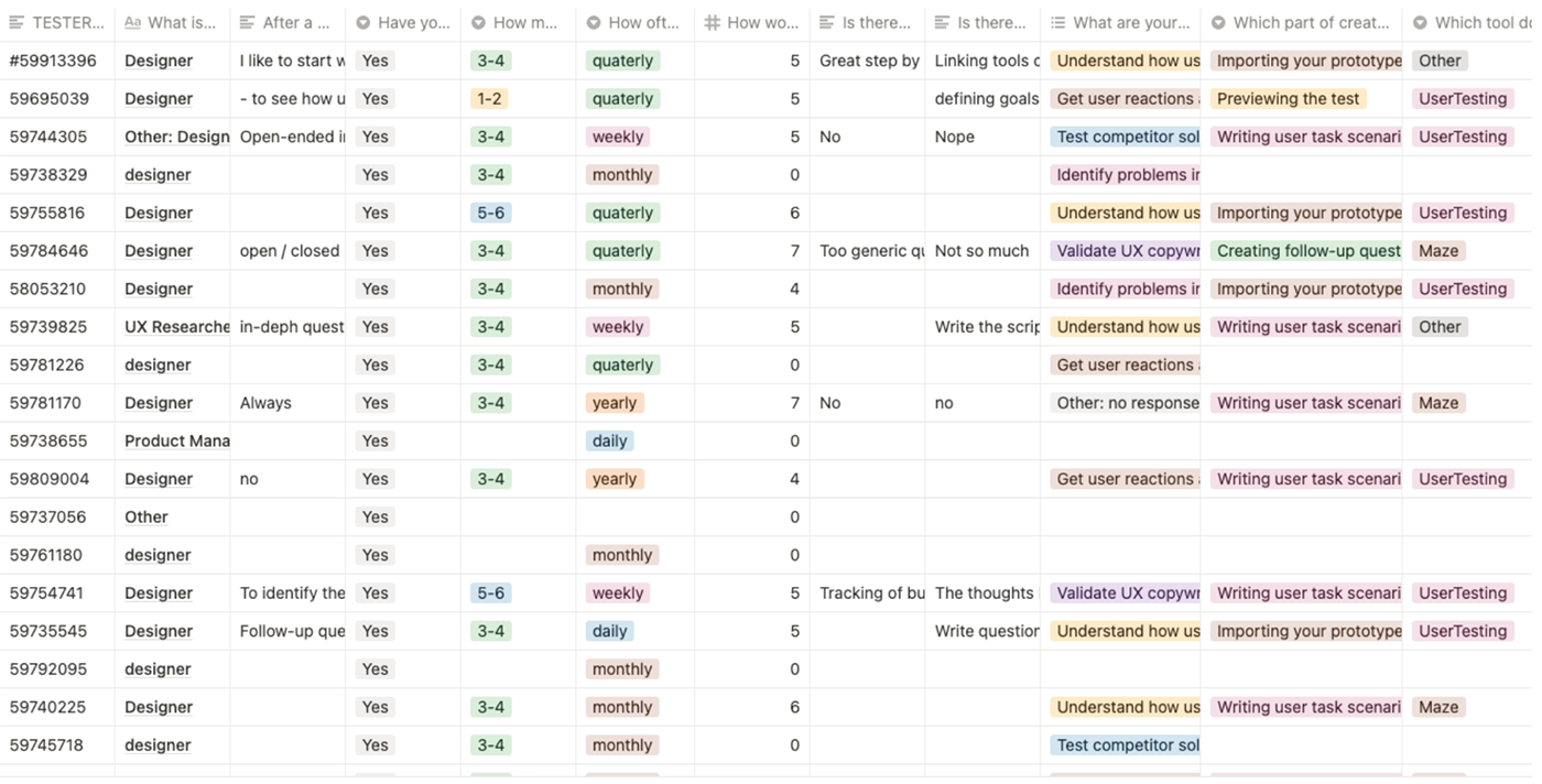
To confirm our observations and begin forming a hypothesis backed by data, we created a user survey to uncover the core problems with the product that I could prioritise for user and business needs.
Survey Results & Grouping Insights
Having shared our survey with users of the product, the next step was focused on synthesizing the data to recognise trends and form a hypothesis. During the synthesis I segmented user responses and used an affinity map to prioritise the problems of users in line with business needs.

Ideation
To avoid following the first idea we conducted a series of ideation techniques. Following ideation we mapped what could be improved, added, and crazy ideas and prioritized them based on user value, business value, effort and time.

User flow
We created user flows of the existing experience and improved the flow based on the idea that fit with business and user goals.

Sketching
Following the creation of our hypothesis I rapidly sketched solutions in lo fidelity. This helped me quickly map and understand the current product and consider options for how I could iterate directly in the product.

Wireframes
I used a neutral color palette to avoid any decision bias and would use this prototype to get feedback internally. I used Autoflow in Figma to help me easily map the user flow between each page ahead of converting the pages into a prototype.

Styles & Component
To create the high fidelity prototype I inspected the products style and followed the 8pt rule to effectively and easily create a prototype that was consistent with the product styling.

High Fidelity Prototype
Below is the final version of the prototype that I created. I included interactions and transitions from Figma to match the products flow.

Thank you for watching!


