


Concept / Logotype / Graphic Identity
Association Branding | Amigos del Archivo
Context
Veracruz was one of the most important cities in national history, due to its strategic location and its direct land connection with Mexico City. Unfortunately, many of its paper treasures are in danger, due to the lack of resources to preserve the historical archive of Veracruz.
Client
Amigos del Archivo is an association that seeks to guarantee the preservation of the historical archive and the library of Veracruz. The members of the archive wanted to formalize the association by having a graphic identity, and start looking for more sponsors and more people to join the cause.

Concept
Inspiration from the books was used to create the graphic identity and brand elements. The concept was divided into three parts; book covers, book pages and bookplates. In real life, book covers protect the pages and capture readers' attention, book pages contain important information and stories, and bookplates bear the name of the book's owner or guardian. The same concepts were taken to carry out the different applications through the design.


Logotype
The logo was created following the idea of bookplates. The emblematic mark combines pictograms to represent the content of the archive; documents, books and minutes, as well as the abstraction of the 11 members of the association. Grouping the pictograms into 4 parts to represent an archive, with a cross in the middle related to the Cross of Veracruz (flag element). The full and legal name of the association was placed in the logo to avoid confusion for the public, while the common name was highlighted in bold.
Graphic identity
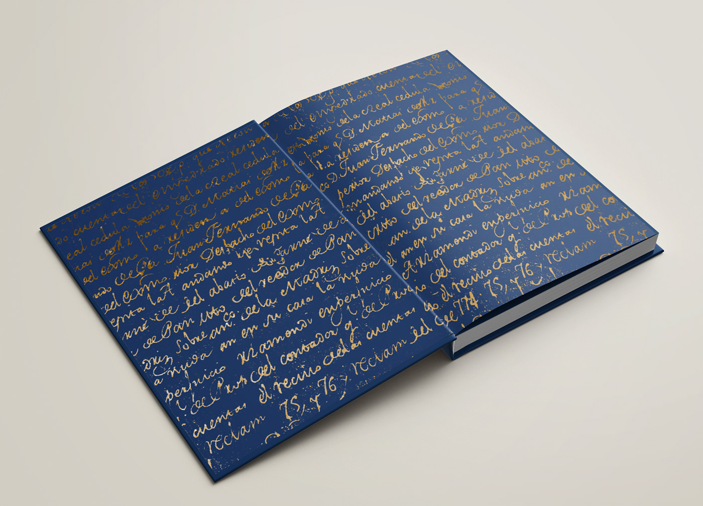
Scanned pages of text from one of the oldest books in the archive were taken as one of the most important elements of the identity design. Following the analogy of books, different design applications use this page of text within them. Decorative elements like dots and lines were also taken from the inspiration of cover books. Tangible items made for the public are designed to have the typography with a gold leaf finish and matte blue paper. The gold leaf finish reflects the relevance of the archive content.


-
Graphic Identity Concept | Creative Direction | Applications Design
Aranza Herce
⁕
⁕
Logotype | Logotype Concept | Elements design | Applications Design
María José Amar Gelly
-
Feel free to reach out to me for branding projects!
Email aranzaherce@gmail.com
Behance behance.net/aranzaherce
Website aranzaherce.com
-
I'm also a design content creator
Tiktok @aranzahercedesign
Feel free to reach out to me for branding projects!
Email aranzaherce@gmail.com
Behance behance.net/aranzaherce
Website aranzaherce.com
-
I'm also a design content creator
Tiktok @aranzahercedesign
Instagram @aranzahercedesign
-


