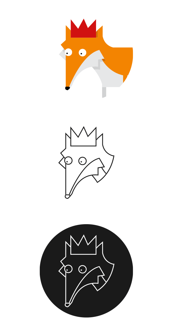
Last summer I redesigned my logo in a more illustrative style using a character that I had created for a picture book, in order to brand myself in a slightly different and memorable way. While I feel that the character and the custom typeface have served me well, I decided to create a more versatile mark that would better represent the direction that my work has taken since then and accompany a minimalist reworking of my website...


This new logo strips the fox character back to a simplified line drawing set in white on black, although this can change depending on its use. I have chosen the typeface Quicksand to accompany the pictogram where needed. The circular shape of the logo makes it much easier to work with than the previous full body image!
I still wanted to keep the fox illustration as a mascot, and created a scene to take centre stage in my site redesign. This illustration also served to better explain the rationale behind the use of this character in my identity, showing the fox's journey from the countryside to the city which mirrors my own.


I opted for a very minimalist approach to my site redesign, using large areas of white space and a mainly monochrome colour scheme with injections of colour from the illustration and my project thumbnails. I also decided to keep text to a minimum on the index page and portfolio. I created my site using salon.io which allowed a lot of freedom in the design.


Thanks for reading! I'd love to know what you think :)


