
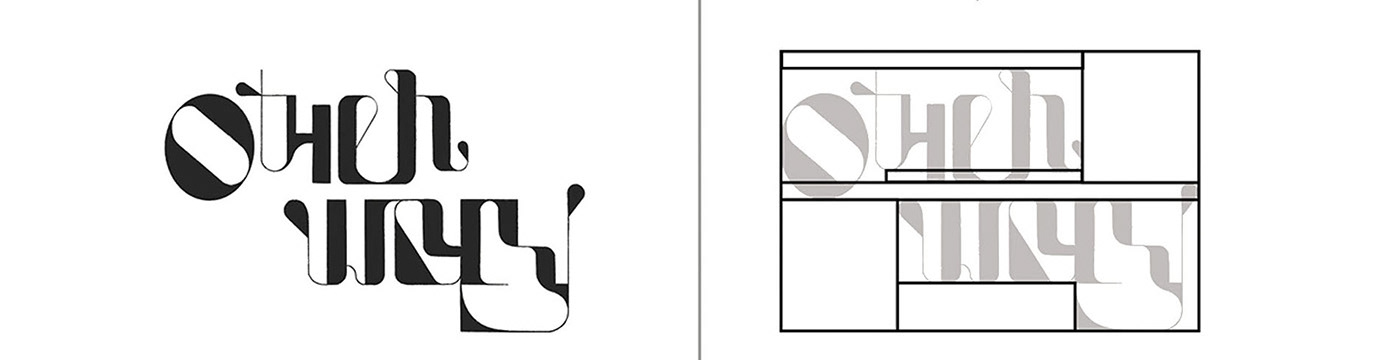
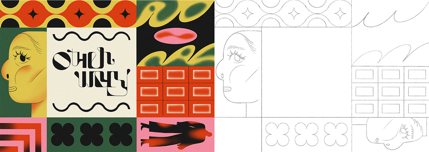
The main aim of this logotype was to create visually compelling shapes while maintaining some readability. I started this project by looking at letters as visual elements, setting the composition as a whole and for individual letters. The final version inspired me to create an illustration mainly based on abstract and quirky shapes. I felt like the logotype and illustration had to be part of a bigger project, and it seemed like a perfect choice to use them on coffee-related products. I imagined 'Other Way' being the name of a speciality coffee retailer fighting slavery.
Final version // Composition
Final illustration // Line art // Colour palette
.

.


