


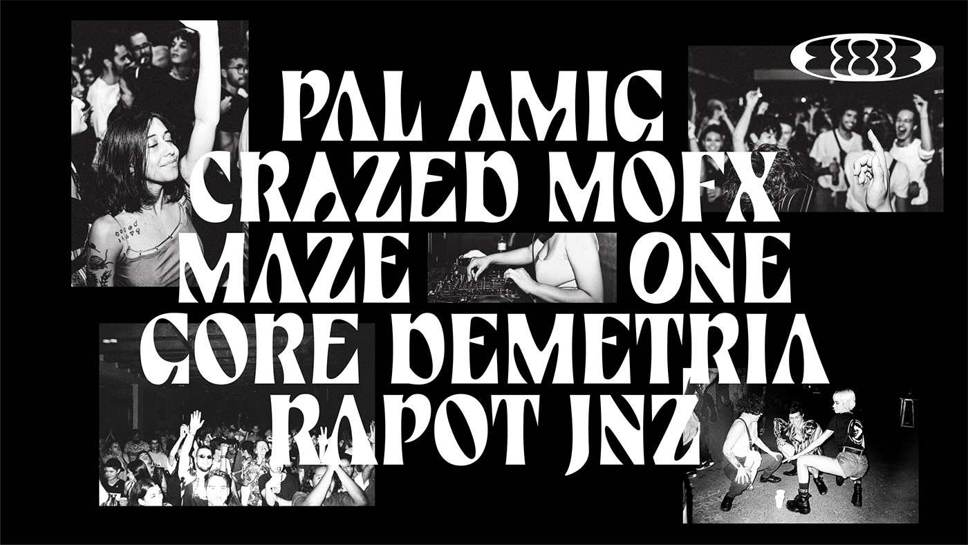
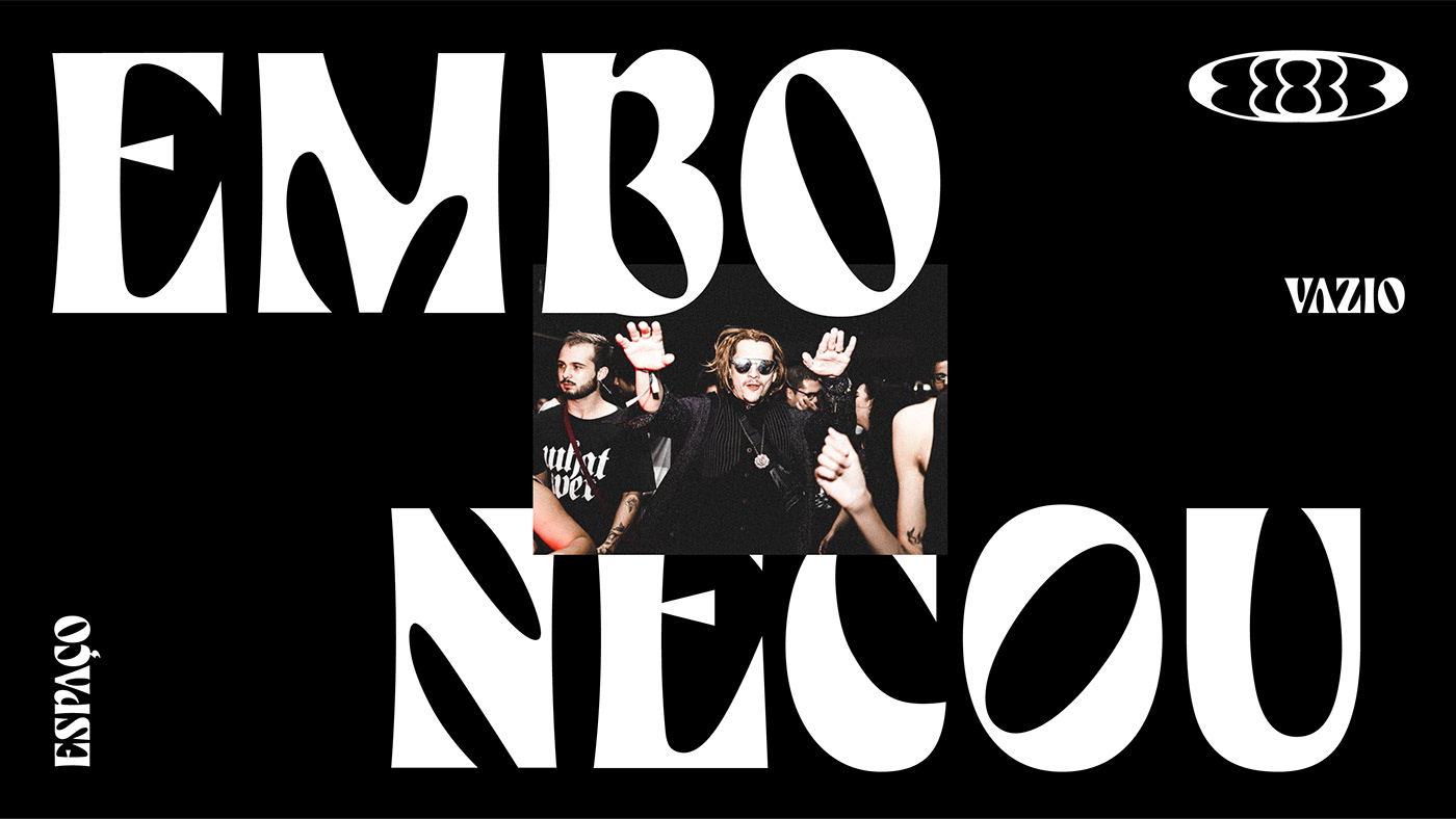
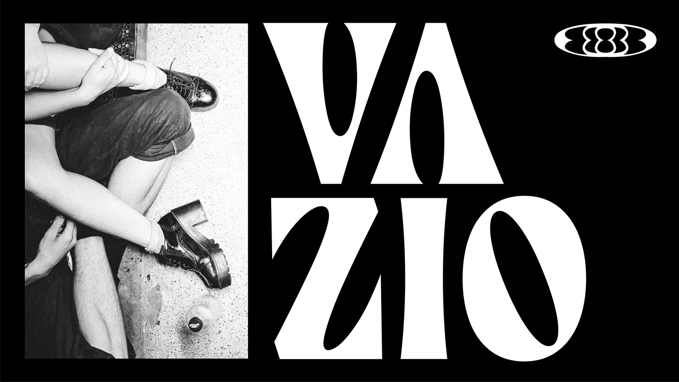
Espaço Vazio is an artist collective that promotes cultural interventions in the public space of Brasilia, especially regarding electronic music. In typography, we explored the brand's musicality, with unorthodox curves and emphasis on counter-spaces (“Espaço Vazio” translates do “empty space", which is what we tried to emphasize on the design).
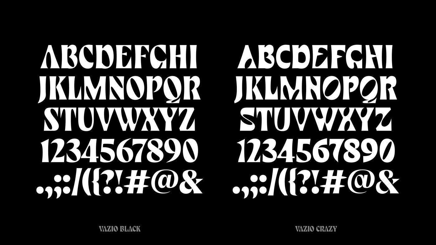
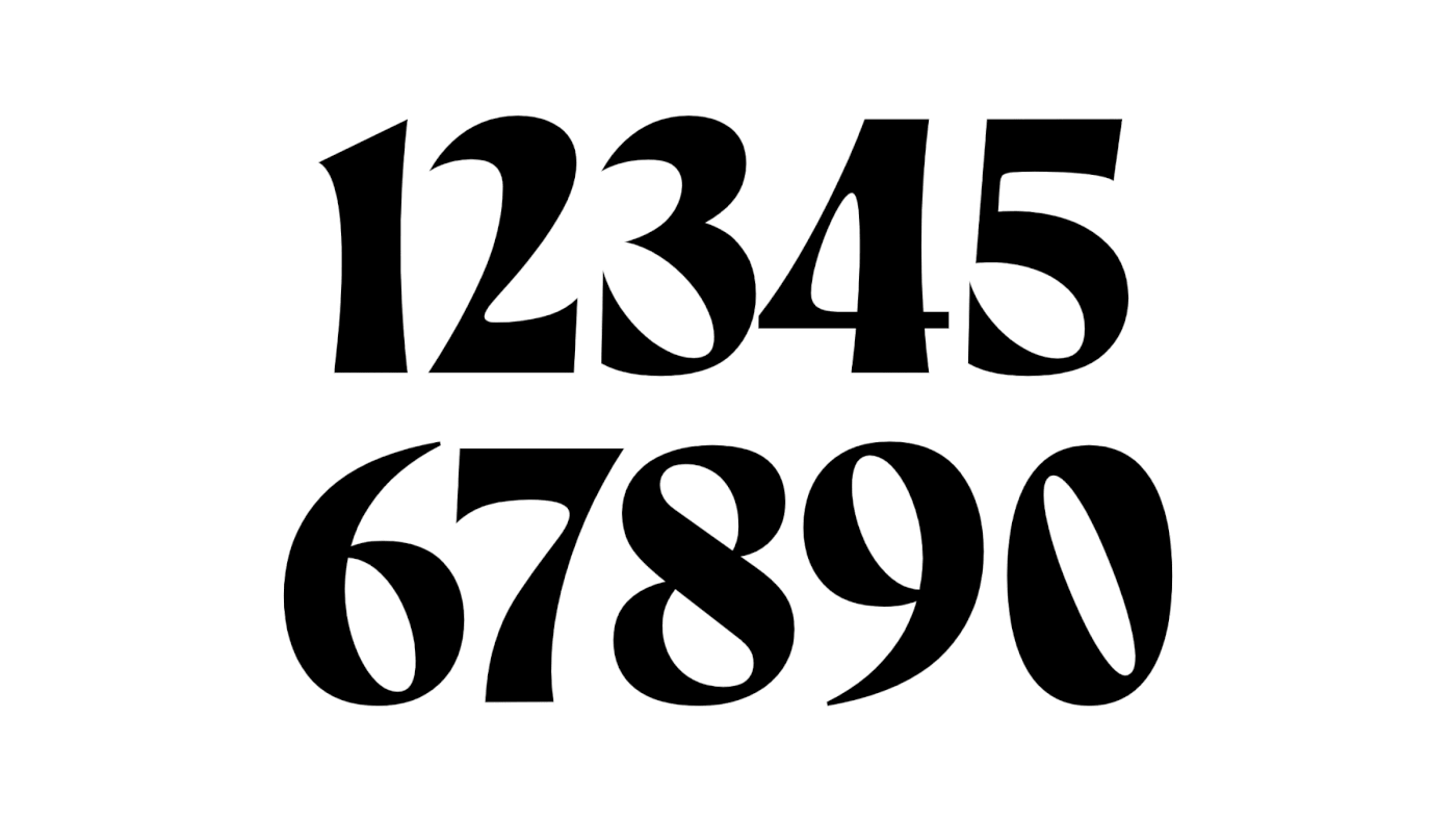
To represent the personality of the brand, we began with a calligraphic structure for the alphabet. Then we gave this calligraphic ductus strokes that flirt with psychedelia, a feature present in the language of Espaço Vazio. It's almost like the letterforms were drawn from the sounds present in Espaço Vazio's music. We also incorporated to it references of natural shapes, which bring the organic tone we were looking for. Oh, and there is not a single straight line in any of the letters, which also makes the font pair well with the collective's symbol.
Espaço Vazio promotes a diverse and inclusive musical language. And these were the attributes we used to conceptualize their typeface. The result was a variable font that goes from a style that is already unusual to an even more expressive and unique version. We wanted to highlight the differences between the rhythms, people and cultures in which the label believes. To represent that, no better solution than fonts that dance. Turn on the music and enjoy ;)


C R E D I T S
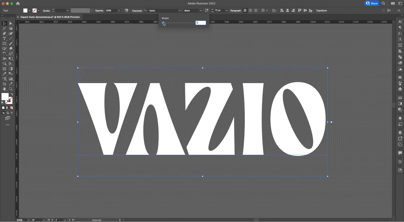
Typedesign: Carlos Mignot
Type production: Carlos Mignot and Rodrigo Saiani
Photography: Espaço Vazio's crew
Photography: Espaço Vazio's crew


