Omooma is an Arabic all female based platform, which is dedicated to coaching and educating women about pregnancy, maternity, newborns, kids education and more..
We designed a bold and impactful typographic logotype with an abstract symbol which elegantly reflects the concept of motherhood and maternity in a nutshell. Also, it is open for interpretation, meaning different people might see it differently, however the end result will always give us a sense of femininity and fertility.
We designed a bold and impactful typographic logotype with an abstract symbol which elegantly reflects the concept of motherhood and maternity in a nutshell.
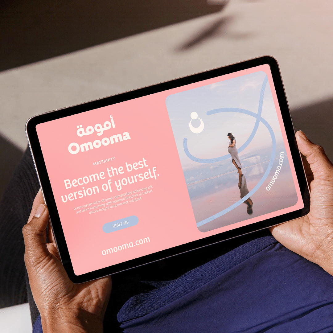
A highly adaptive logo which is versatile and flexible to the various media formats as a digital platform.
The content will showcase gynecologists, doctors, pediatrics, nurses and many other medical experts, giving a lot of advice and tips about women’s wellbeing and health. The platform is mainly targeting the GCC, Levant and Egypt.
As a fully digital platform, we created the full range of digital assets (website, SM templates, billboards & more) Omooma's goal is to become the most trusted educational platform around the themes of pregnancy, newborns, babies and kids health & nutrition.
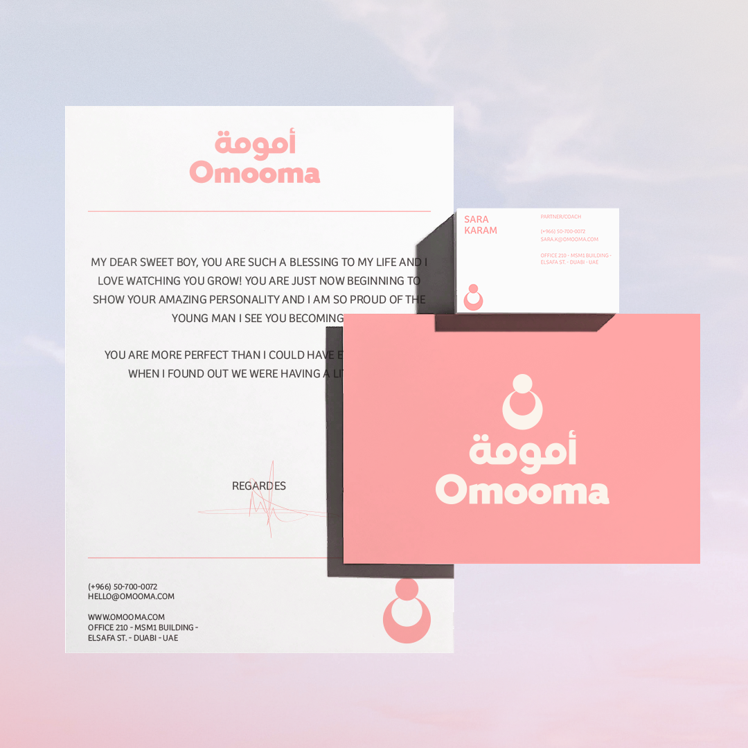
The stationery set we created is clean, light and clear; an extension of the digital assets but in a print form, resulting in a coherent and holistic brand identity which connects with the main brand essence, which always requires certain adaptations/customization in order for it work seamlessly across the various mediums.