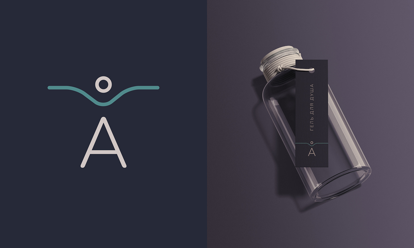
Variant of logo and identity for hotel Asilan in Karelia, that hasn't been chosen. Hotel is based on the place of old watermill at the Asilanjoki River bend.
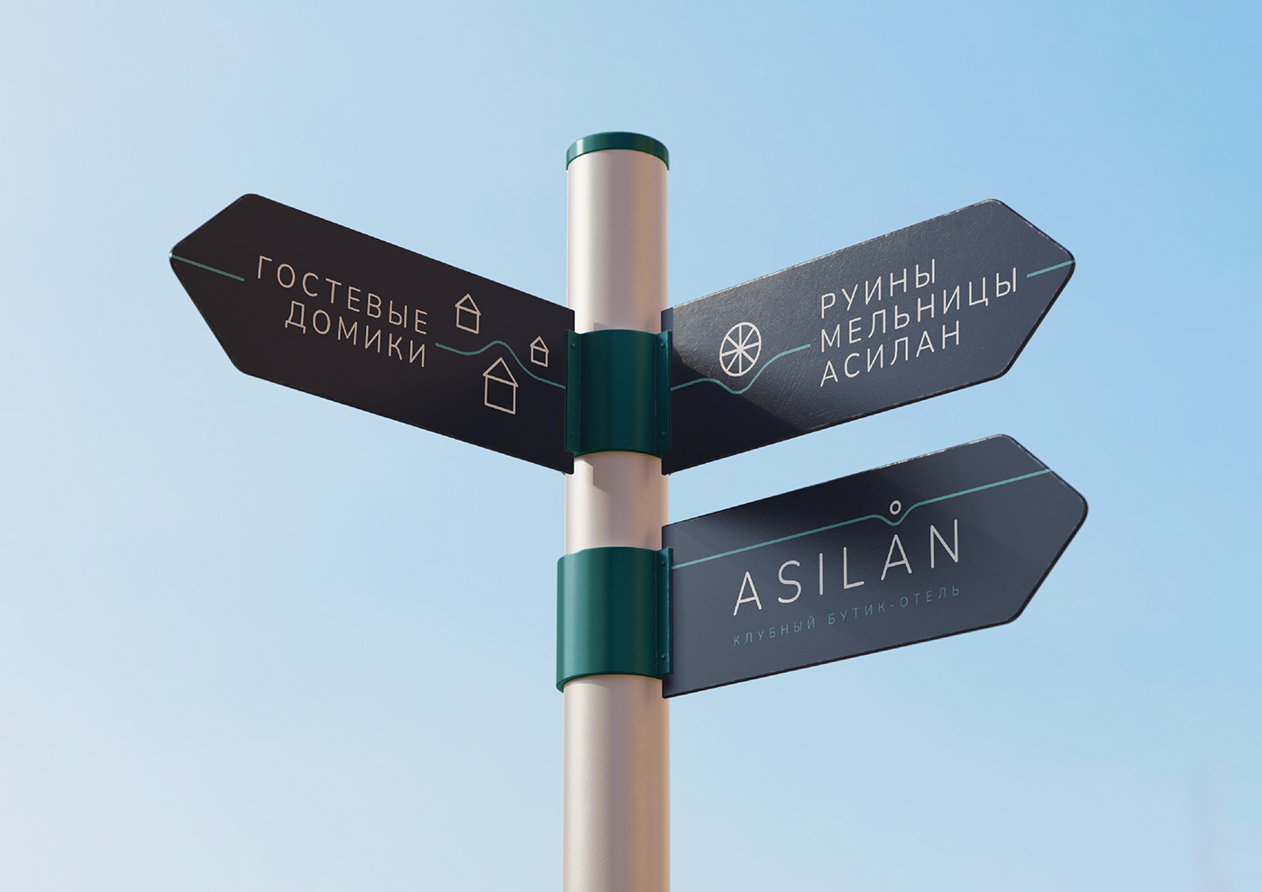
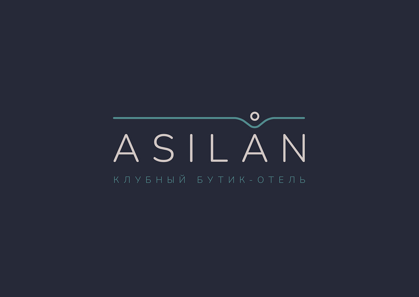
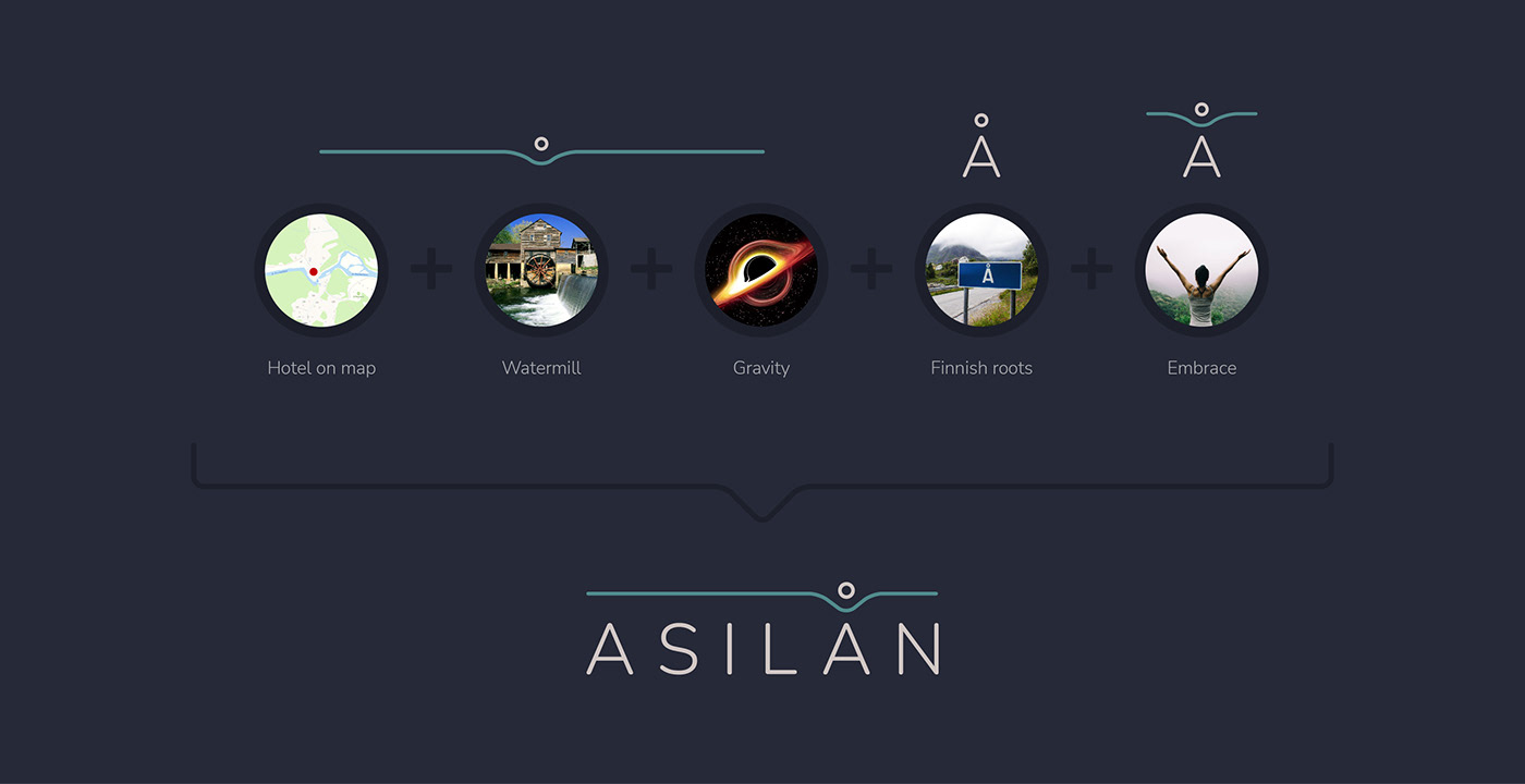
Logo consists of a text block and a corporate line that repeats the bend of the Asilanjoki River, on which the dot marks the location of the boutique hotel ASILAN. The point is made in the form of a watermill wheel, which is located nearby. The dot itself is located above the second letter Å, creating a reference to the Finnish roots.
Additional meanings are encrypted in the logo: the letter A as a symbol of the hotel, which, as a place of power bends space and attracts a point to itself, as well as A along with a mug and a river, forms the image of a person with arms wide open.
Here you can watch variant, that has been chosen: https://www.behance.net/gallery/149687949/Asilan-Hotel-logo-and-identity
The line of the river is transformed to the surface on which it is located: its edges are stretched from edge to edge, creating a unique style that unifies all communications of the ASILAN brand.

Brand symbol can be used separately.