nøt perfect is an accessories brand.
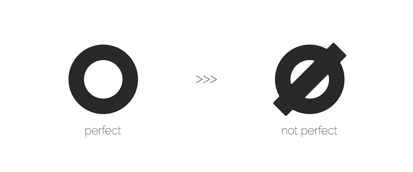
From the beginning, the client wanted the naming to be n_t perfect, but after brainstorming, we decided to use the ø symbol, because it expresses the essence of the brand and at the same time does not interfere with readability.
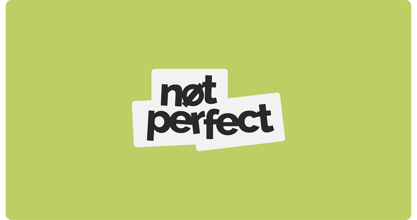
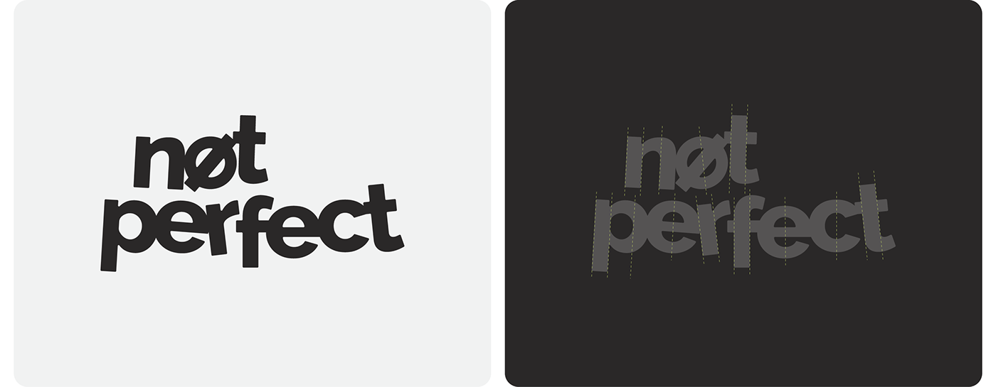
All elements of the logo are offset from their axes and alignment. It is specially made to convey the philosophy of the brand. Also, later, the logic of inequalities is used in the brand identity. Thanks to it, the brand's visual identity is free, light and adaptive.