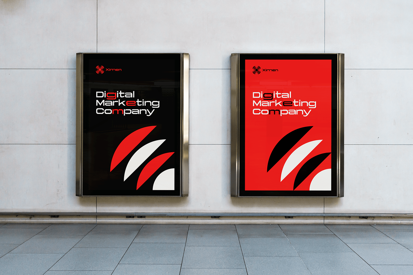


Ximen
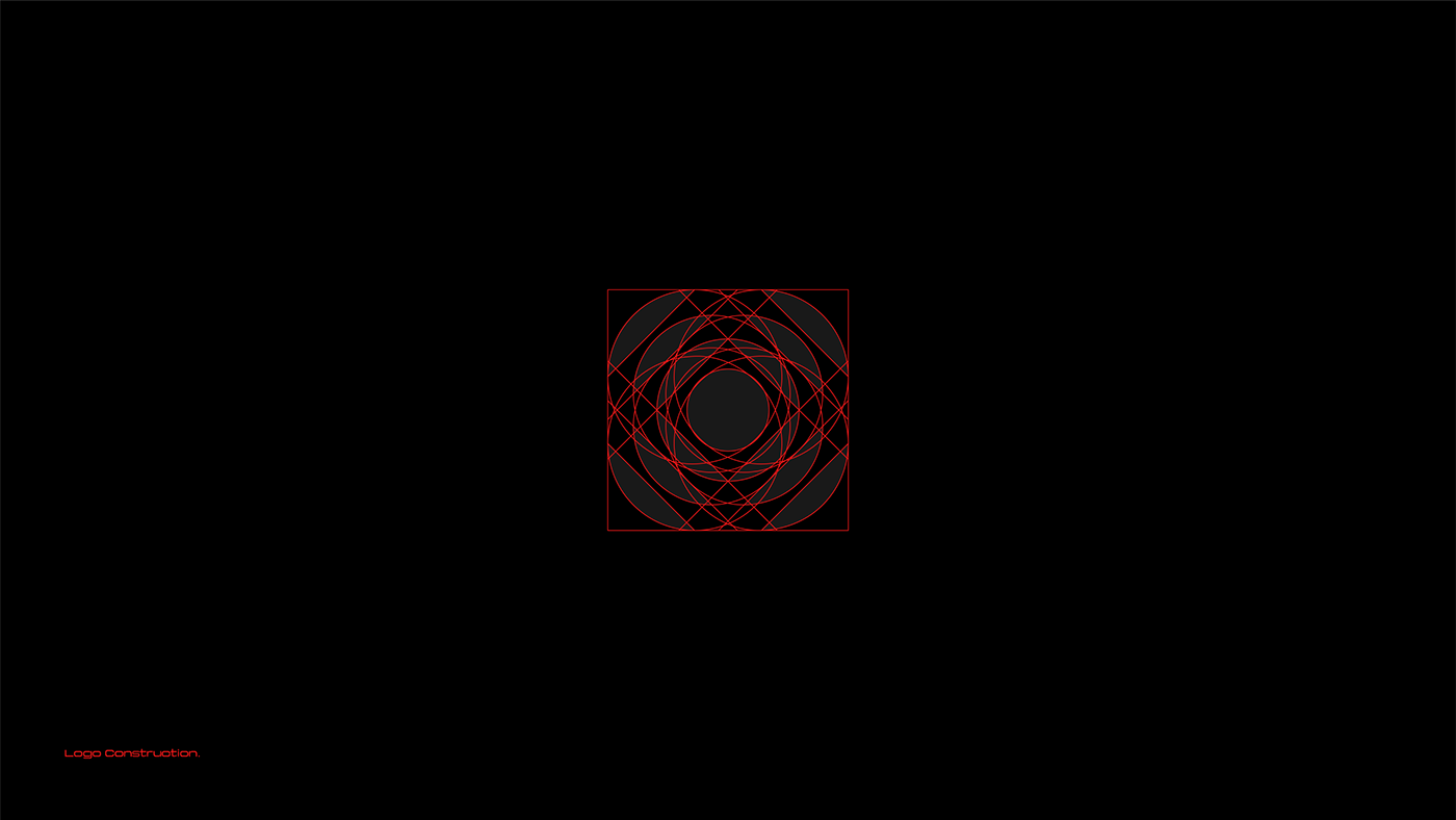
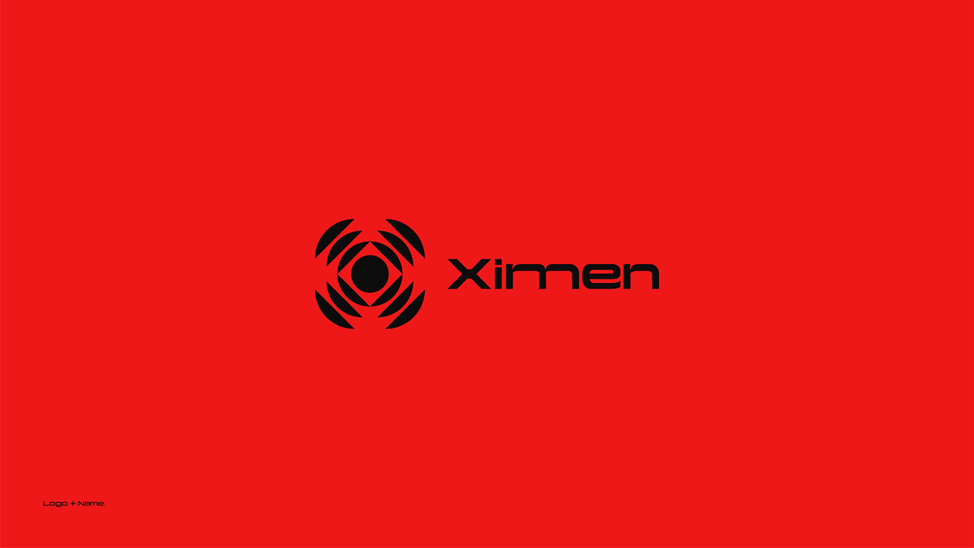
The Ximen logo embodies the essence of this innovative digital marketing company, offering a range of services from problem-solving to revamping ineffective marketing strategies. The logo's foundation lies in the use of the "ellipse" geometric shape, representing continuity and an endless cycle. The symbol features a perfect ellipse with three enlarged, incomplete pieces integrated into the design. This arrangement creates a captivating abstract form, cleverly combining the elements of the capital letter "X" and the pupil of an eye.
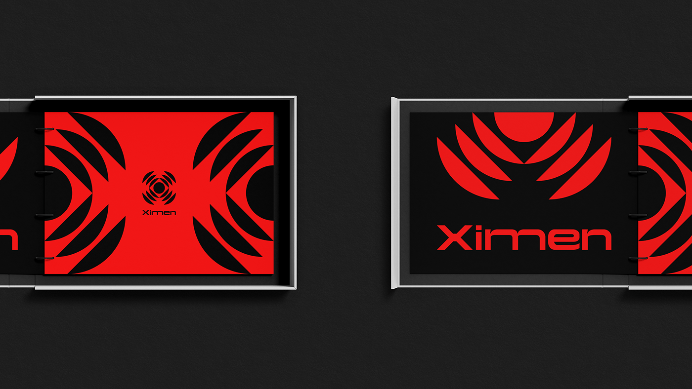
This ingenious fusion signifies the company's focus on attention to detail, vision, and in-depth analysis. Ximen specializes in scrutinizing other companies and discovering solutions to hidden or unseen problems. The selected typography for the logo is "Yapari," a trendy and distinctive font that complements the design flawlessly. With elongated letters and varying thicknesses, is versatile, making it an ideal choice for websites, signage, and editorial design. The color chosen for the logo is a vibrant red (#EE1818), symbolizing activity and power. This red hue reflects Ximen's ability to drive results quickly and efficiently, providing professional solutions to the challenges faced by their clients.