Brand Identity
A quality energy drink that portrays confidence and attractiveness. High-end drink for the hard working man.
Target Group
Men in their early 20's to their late 40's who want to exceed in their careers and become succesful. The working class, motivated people who want to become rich.
Positioning
The energy drink for the working class.
A more flavourable alternative to coffee.
A more flavourable alternative to coffee.
Competition
Coffee brands (#strategy coffee flavoured energy drink - persistence)
Energy drink brands (#strategy targeting the working class instead of athletes)
Coffee brands (#strategy coffee flavoured energy drink - persistence)
Energy drink brands (#strategy targeting the working class instead of athletes)


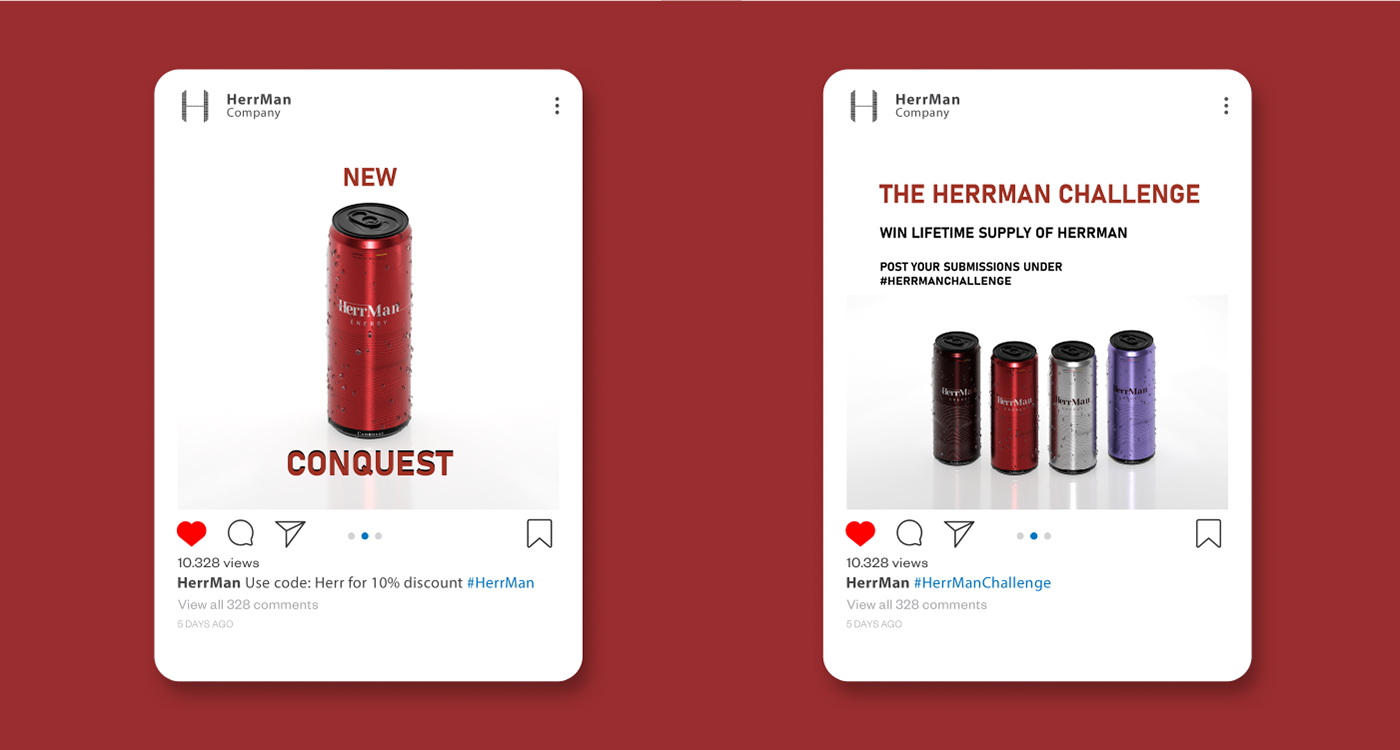
#strategy: Kerning in the lettermark increases letter by letter, indicates acceleration.

#strategy: HerrMan always written with capital H and M.
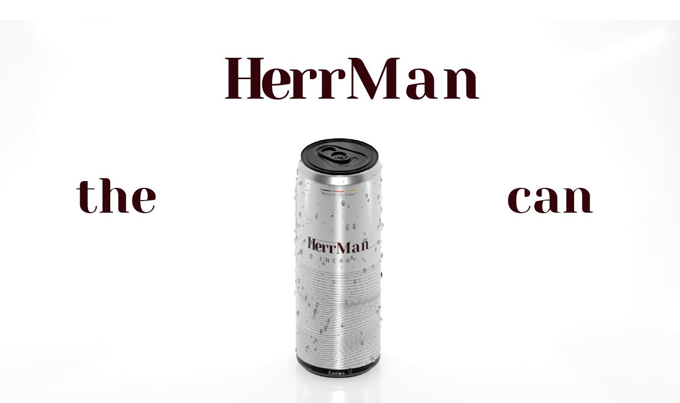
#strategy: The use of "the HerrMan can" this creates contrast because only 'HerrMan' has capital letters, 'the' creates importance.
Hierarchy > the lettermark will always be bigger than everything else, followed by the HerrMan can.

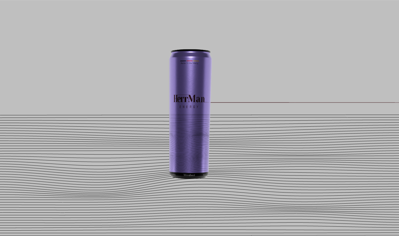
#strategy: Colors with low vibrance to portray confidence and luxury.

#strategy: Flow in the straight lines indicates movement and charm and represents liquid.

#strategy: Straight lines indicating forward movement.


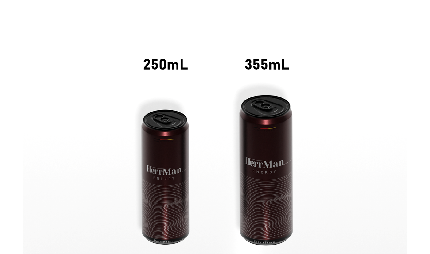
#strategy: Can volume only 250 ml and 355 ml for further assistance of high-end feel of the brand.


#strategy: Short but powerful wording.
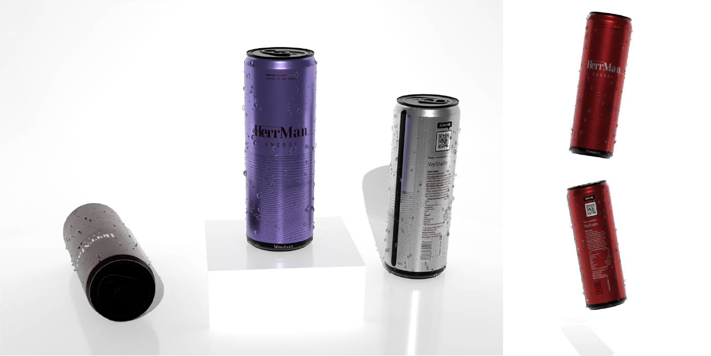
#strategy: Contrast via white backgrounds, increases attention on to the brand and white indicates high-end.
Credits:
Brand strategy - Said Salikhov
3D Modelling - Said Salikhov
Package Design - Said Salikhov
Advertising strategy - Said Salikhov