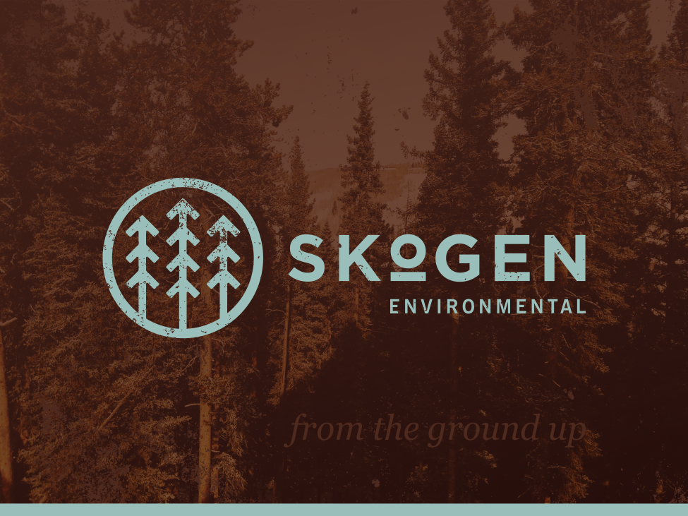
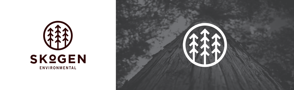
Identity Project
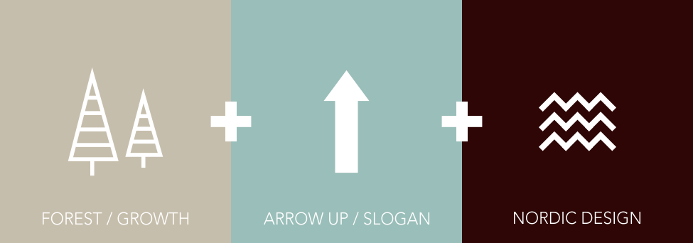
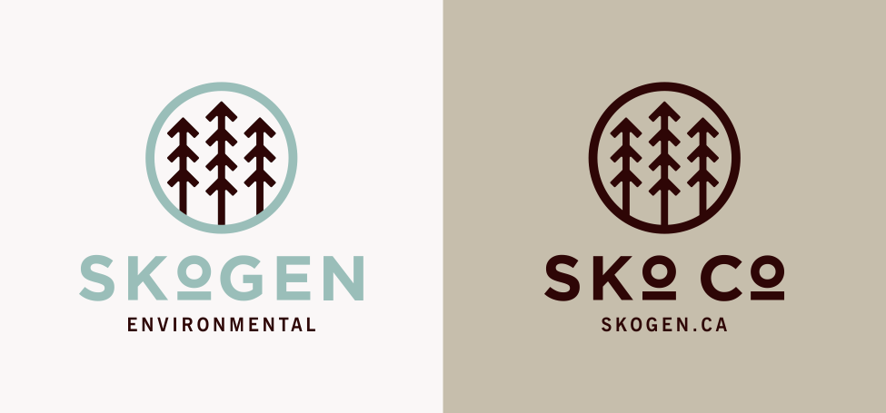
Client wanted a design that was rich in Nordic in style, as the word "Skogen" loosely means Forest. The project is for a tree planting collective that prides themselves in their hands on approach that provides superior quality versus the machine based planting. The challenge was to combine the iconic Nordic style with a modern flare that communicated "life" and "growth" in a rustic, outdoors and masculine way.
Inspiration
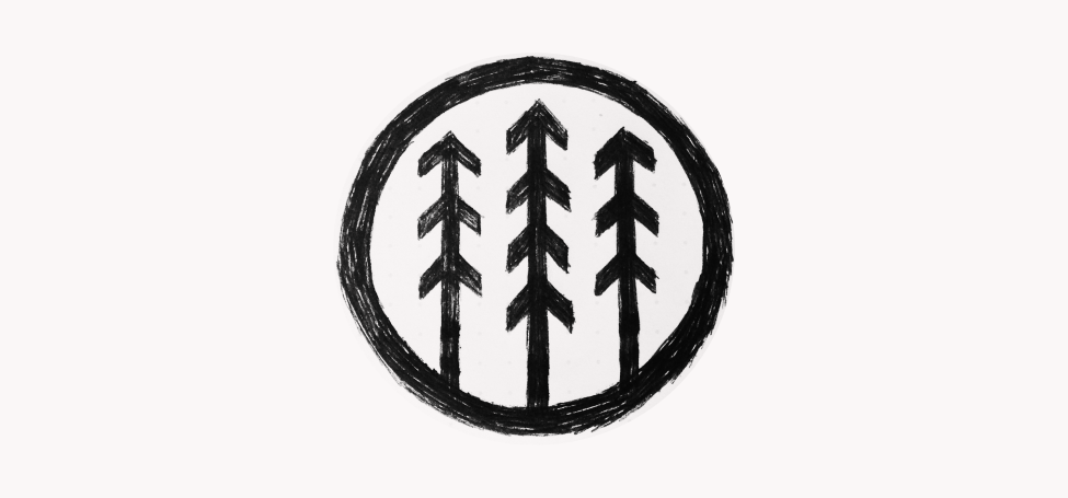
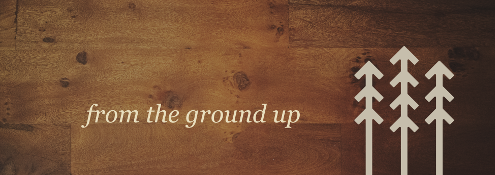
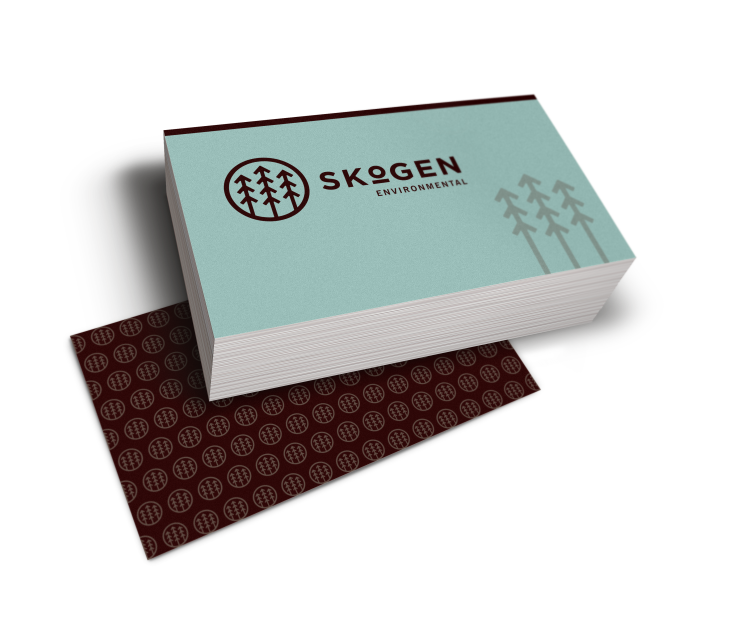
I created the logo with three major elements in mind; trees, arrows and sharp lines. I obviously used trees to represent what Skogen does, but also I made the trees fully grown and mature to reinforce life and the longterm investment of tree planting. The arrows came out of the idea from their slogan "from the ground up." Therefore the clear visual of the trees moving out of the ground was apparent. Overall, I added thick circle contour to tie the mark together and bring unity to the trees. I was very pleased with the subtle Nordic styling that hints and compliments the word, Skogen.


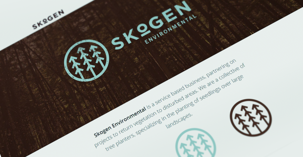
Landing Page
We created a responsive landing page with a contact form to gather leads during the initial launch phase of the project.

Visit Landing Page Here


