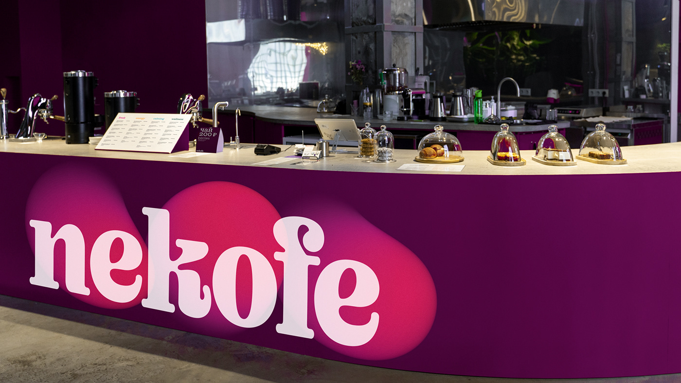
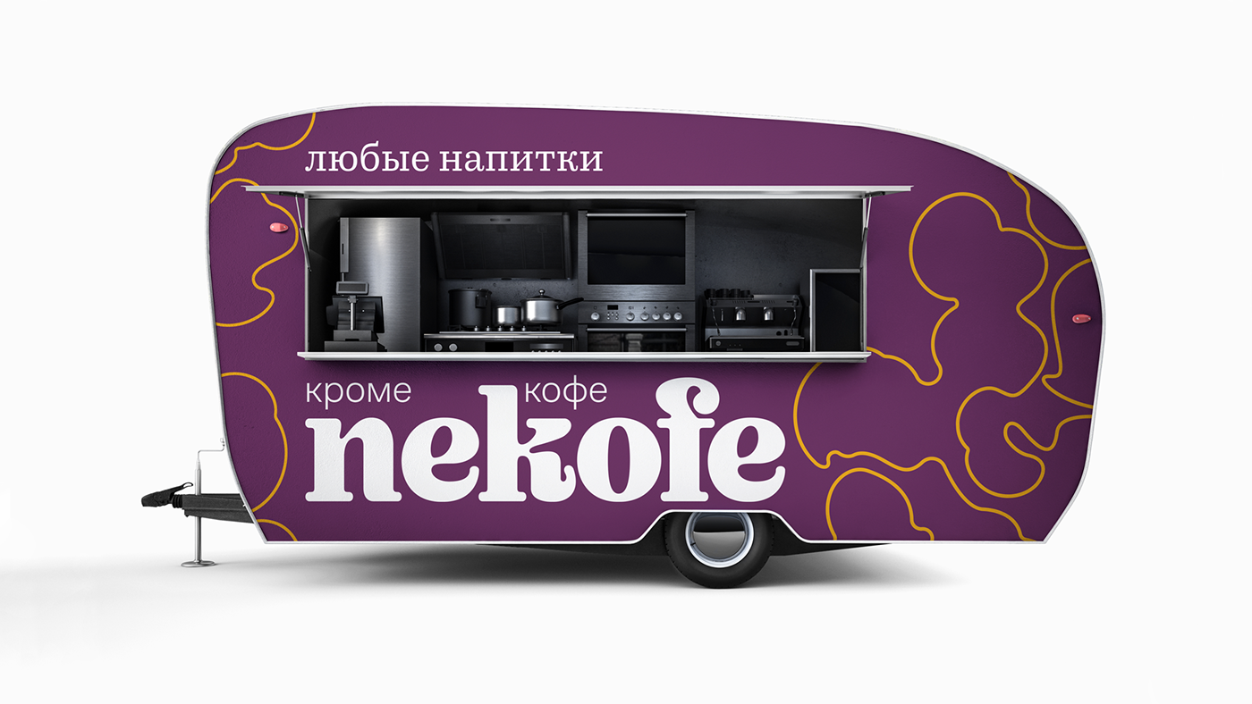
Nekofe is a cafe chain that sells various drinks, but not coffee.
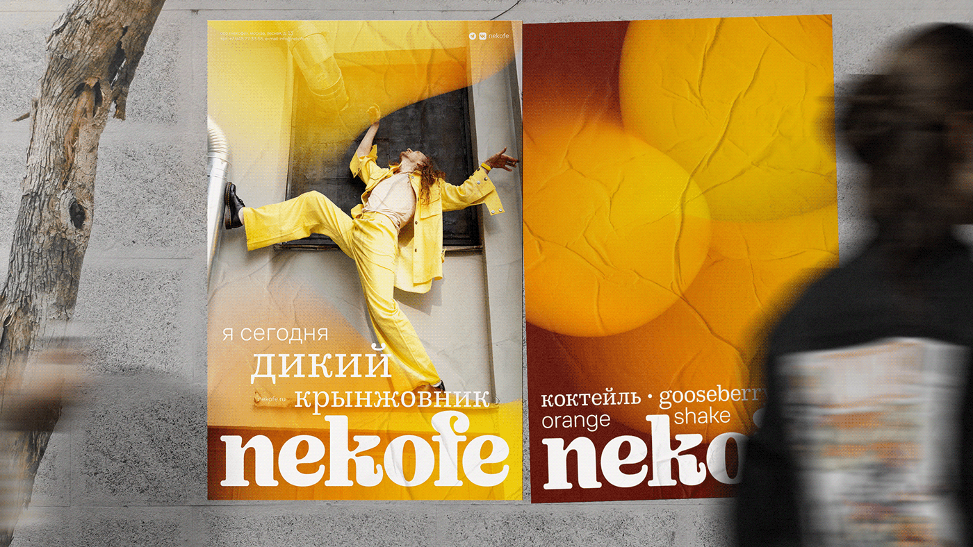
Looking for a visual idea, I noticed that we usually see drinks from the top. Mixing reflected lights in the glass became the key visual. Generative graphic allows to generate a lot of shapes of different colors.


Colors cover the full palette due to gradients. Drinks in menu are divided into 4 categories: freak, energy, calming, wellness. Names consists of strange combinations of adjectives and nouns such as "Invisible Hulk" or "Tender Cactus".


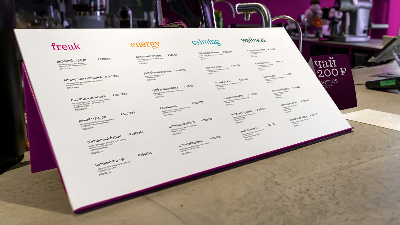


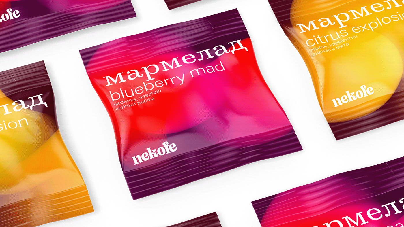

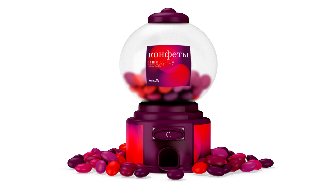

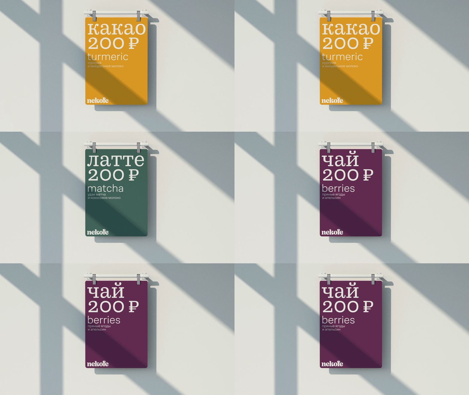
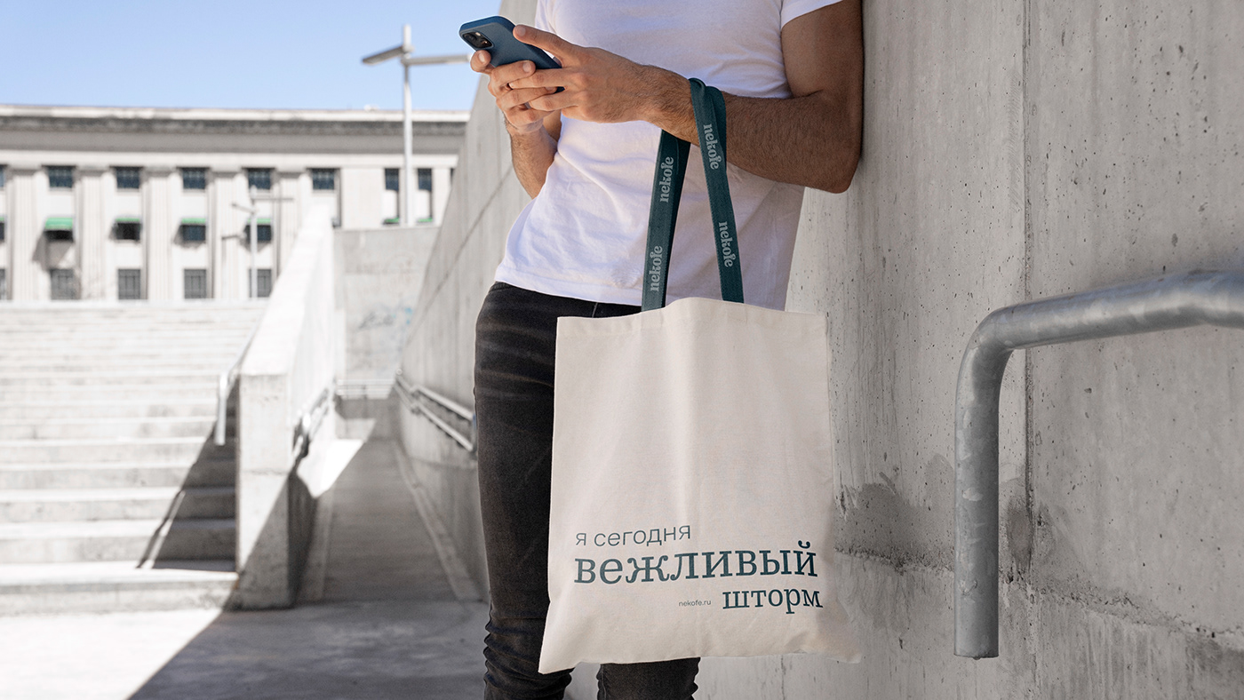
The typography is arranged in layers, in a gradient from larger to smaller type referring to the key visual and the layered structure of drinks. I used the fonts CoFo Sans and CoFo Robert which rhyme with the logo plastique. The typography as well as the logo are always placed on the larger side: horizontally or vertically.
I developed the graphics based on key visual movements for stricter printing conditions.
It is convenient not only for printed products, but also for embossing.
I developed the graphics based on key visual movements for stricter printing conditions.
It is convenient not only for printed products, but also for embossing.




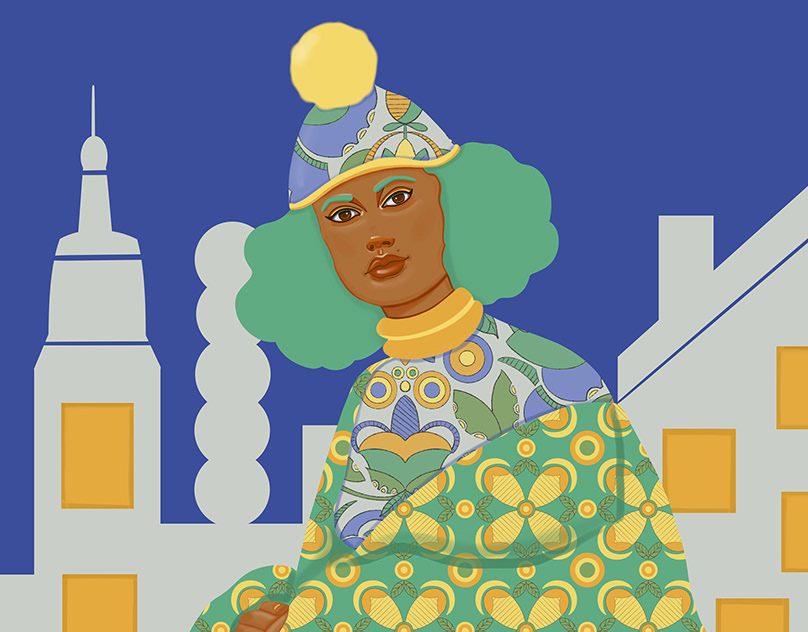
We tried to let the heroes show their individuality in photos. Nekofe is about diversity, and the heroes are different and bright.






I hope you enjoy non-coffee mood!
British Higher School of Art & Design
advisers – Ivan Velichko, Ivan Vasin
photography – Aleksandra Blagova, Maria Vorobieva
looks – Mere, Droid&I, You Wanna
advisers – Ivan Velichko, Ivan Vasin
photography – Aleksandra Blagova, Maria Vorobieva
looks – Mere, Droid&I, You Wanna


