
BRANDING AND WEB DESIGN FOR A PUBLIC COMPANY OF BIOMEDICAL AND IMAGING DIAGNOSTIC NETWORK
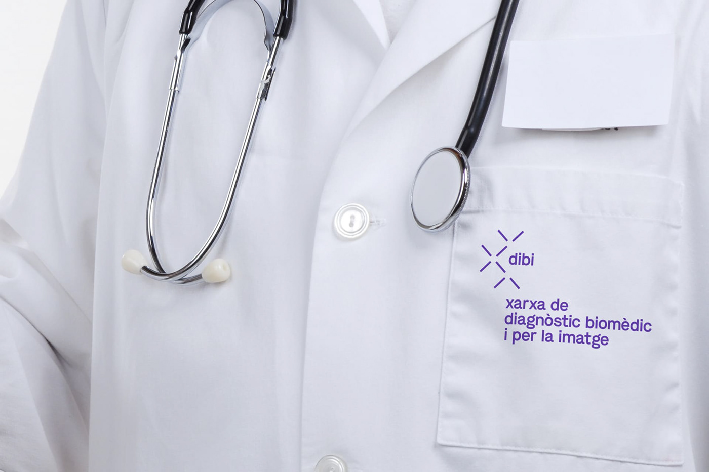
dibi
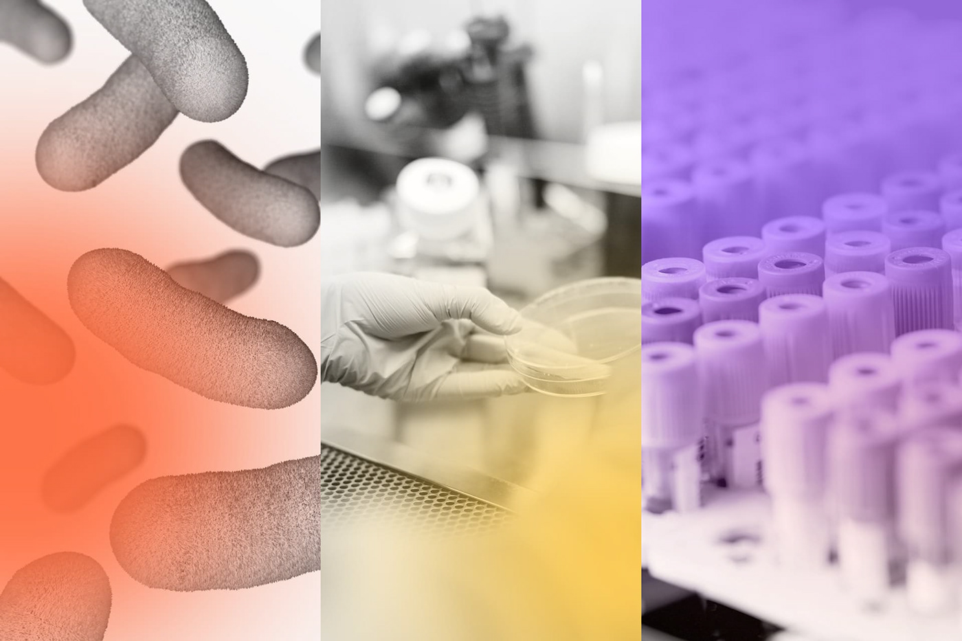
Laboratori de Referència de Catalunya, a public biomedical analysis company that provides services to hospitals and health centres of the Siscat (Integral Health System for public use of Catalonia), contacted us for the development of its new identity resulting from the fusion of public diagnostic services companies: Laboratori de Referència de Catalunya (biomedical analysis), Imatge Mèdica Intercentre (Diagnostic Imaging and Nuclear Medicine) and the Anatomical Pathology unit of Parc de Salut Mar (Hospital del Mar in Barcelona) under a single new company.
The project involved working on everything from the name to the brand launch website, as well as the construction of a brand manual in which the entire graphic system and visual universe was developed, presenting materials, templates and the graphic system to be used by future design teams working with the resulting company.
A workshop was held with the participation of professionals from the three companies in which the specific needs of each of them were analysed, as well as the analysis of the sector and references, the definition of the new company was scrutinised and the values that should govern the brand at a communication level and that should help us in the creation of the name were constructed and identified.
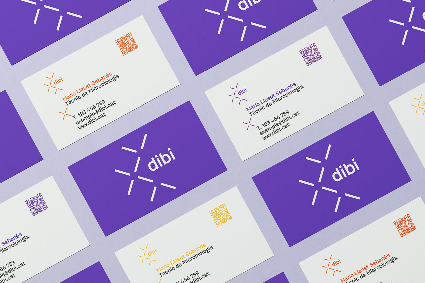
As a result of this workshop and the internal work, the name “Dibi” (an abstract word that mentally places you in the word diagnosis) emerged, with which we wanted to escape from the acronyms so commonly used in the sector and which preceded the new brand. From here, the corporate identity, the graphic system and the new brand architecture can be developed, as dibi is made up of and provides services to several organisations in the health sector.


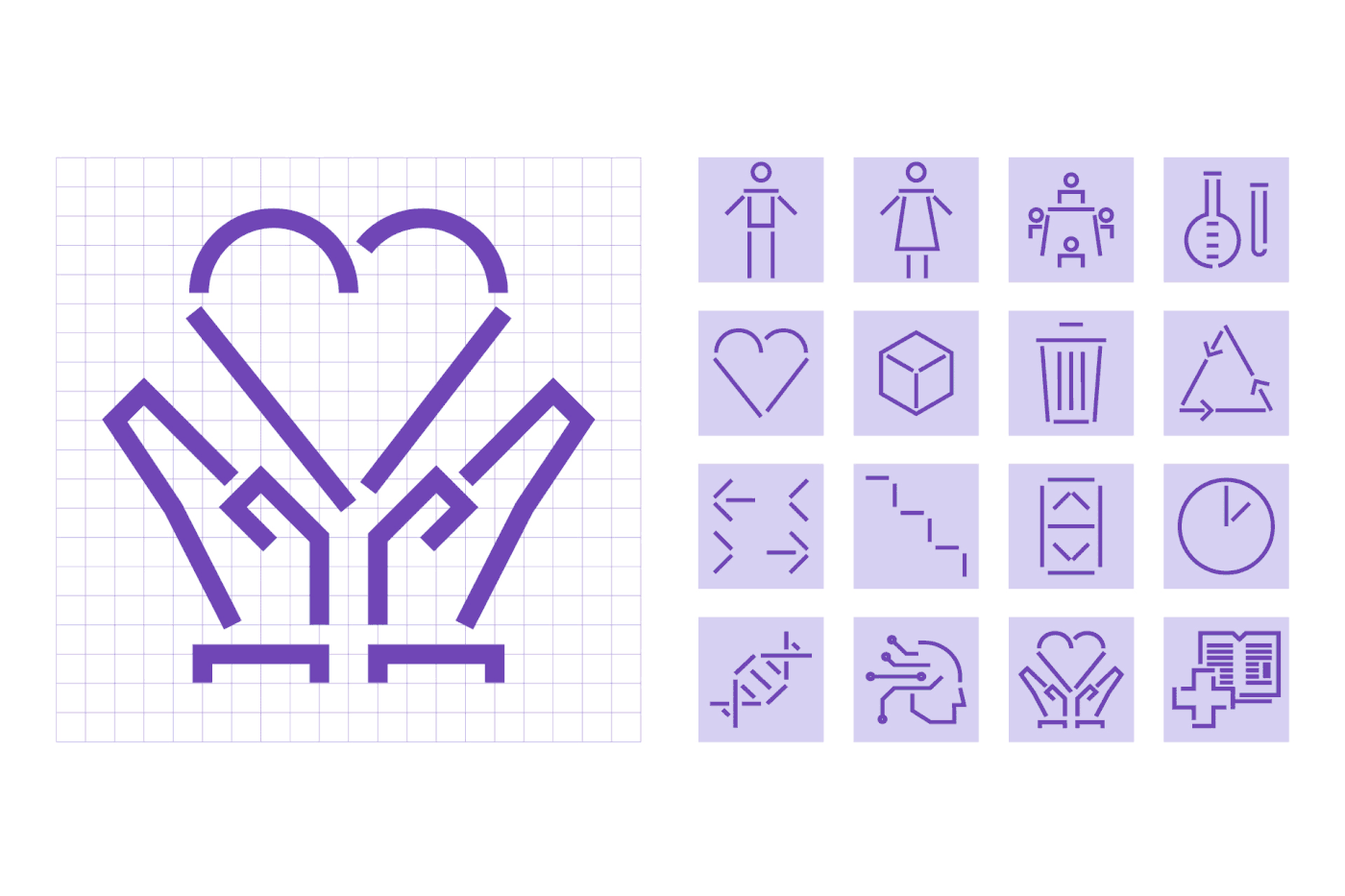
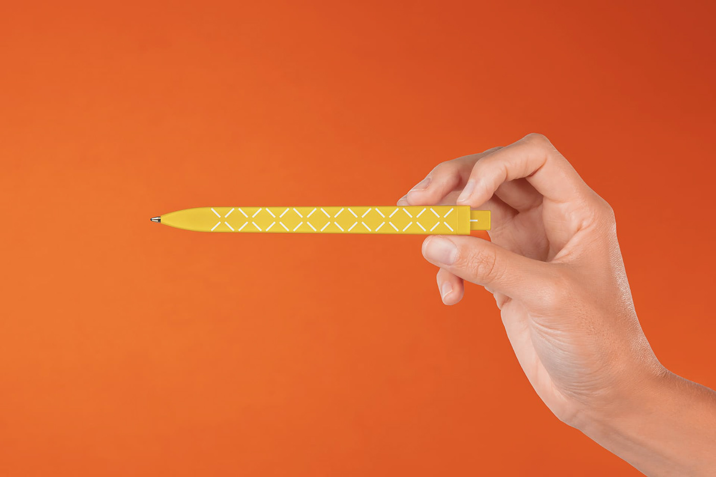
The basic identity is based on the network concept, which represents one of the most important values of the entity: teamwork and data sharing. Based on this idea, a graphic universe that refers to the idea of connection is worked on and a brand architecture is created based on the interconnection of the different care and clinical centers that make up the dibi structure, creating a system of frames that represent all these links and collaborations.
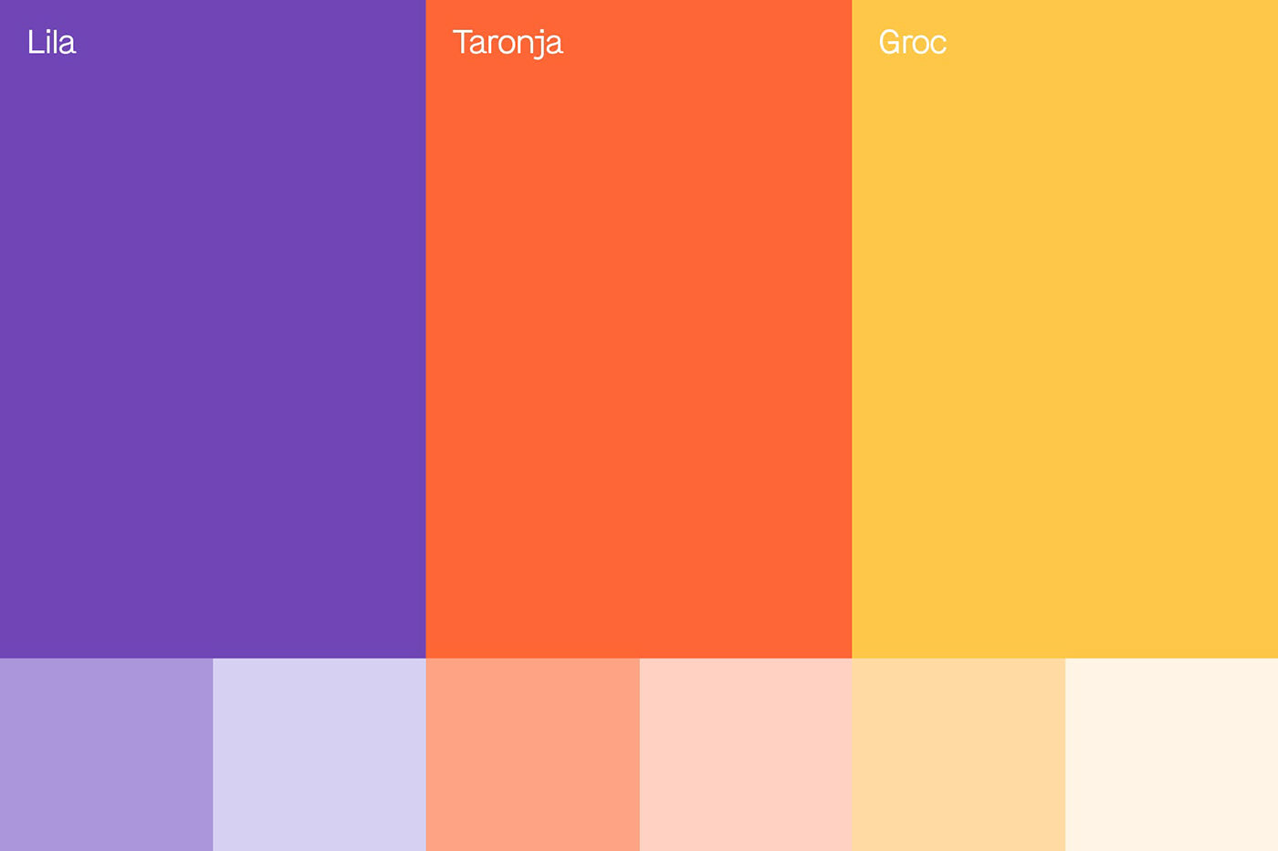
For the choice of colour, it was important to avoid any of the three colours previously used in each of the previous brands: blue (used by LRC and by many entities in the health sector), orange (used by Hospital del Mar) and green (used by IMI) were banned in the process, avoiding any internal friction and trying to find an environment and a colour that would stand out in the sector, which is why a lilac colour was selected, together with the alignment with the new values. For the graphic universe, all the graphic elements are built on the basis of the geometry of the dibi logo itself.


After the construction phase, a large number of materials were developed, basic design documents for different materials that could be used by the internal design team of the communication department as well as presentation templates and documents that could be used by people not familiar with design. All the materials were compiled in a graphic manual for the use of the brand.


Finally, the brand presentation website was designed, which had to be scalable and would be able to incorporate new sections and functionalities in the short term, so that it could go from being a brand presentation website to a company website. To do this, a wireframe was designed in two phases and we planned where to add different elements once the presentation launch date had been achieved, trying to build a website that was as modular as possible, under a bootstrap structure. A website conceived, designed and developed in less than 1 month, which will be gradually growing and changing. Toormix was in charge for the design and development of the front-end html model, which the client’s development team then integrated into their Microsoft 360 system, which had to be managed from the account of the communication department’s staff.


A global brand creation project that includes from the construction of the values, to a new and scalable website passing through the new name, the creation of the graphic universe, an infinite number of templates and documents.


