
Okkio is a lover of the director Wong Kar Wai's films, the philosophies of author Murakami, and the melodies emitted from vinyl records of the 80s and 90s.
In order to create more precise product packaging to put in supermarkets, Okkio want to rebrand to improve recognition and uniformity as well as the desire by telling more about their story.


Okkio's logo is designed based on an eye and a coffee bean shape. The logo rebranding process only edits a few lines of the logo symbol. But still shows the unity and story and ideas of the brand.
The slogan "Found and Be Found", is twisted from a sentence by Murakami: "They had found and been found by their 100% perfect other" The idea of the slogan is that everyone always wants to find a peaceful coffee shop, and Okkio is also always looking for friends who are suitable and comfortable for them.
To succeed in this, we use elements often present on vinyl record covers in the 80s and 90s period when using large, bold, skewed letters to make an impression, along with sub-content elements that are made smaller. In terms of the visual identity, we aim for images that show stretching to show that when arriving at Okkio, time is extended so that people have more time to chat, work.

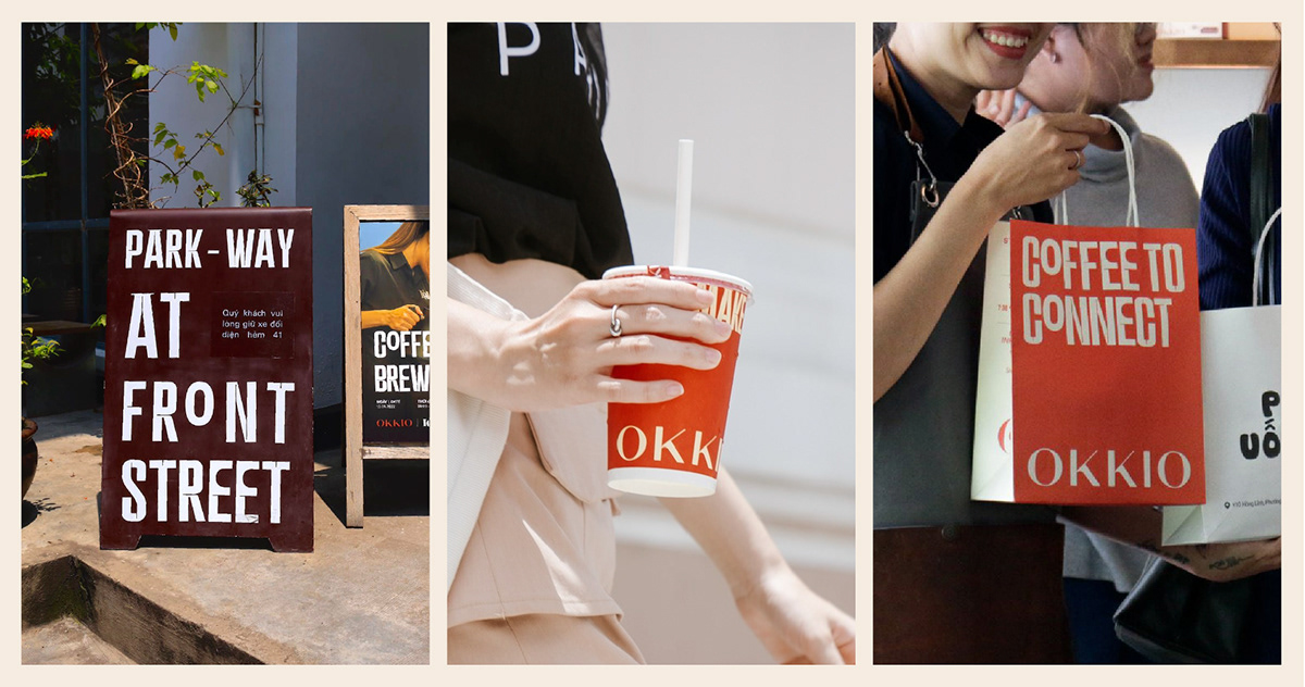
About the typeface which used the condense and bold letters, thereby introducing specific elements in the space and interior that Okkio is using to create uniqueness and make it easy for customers who come to Okkio to recognize even without seeing the logo.


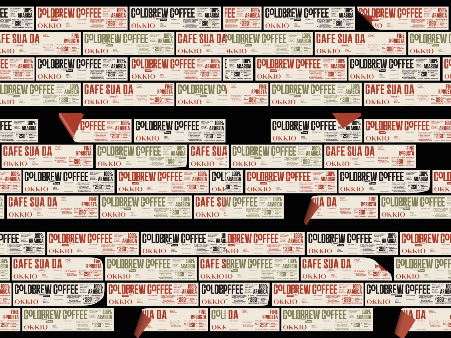
Okkio aims to trade coffee beans from domestic to coffee from many parts of the world, and wants to bring it to large supermarkets in Ho Chi Minh City. So when designing the packaging, we wanted to create a packaging that was still a coffee bag, but covered with a paper lid. This treatment will help the product always lie neatly on the shelf, without distortion. Also, if placed at the bottom of the shelf, the top of the packaging lid will also have a logo so users can easily look down. and identify Okkio's product.


With the success of enhancing recognition and synchronization from the brand identity and store interior design, we have achieved a memorable milestone for society which is the Design Of Yhe Year 2020 - Vietcetera Vietnam Restaurant & Bar Awards 2020 and Top 20 WeChoice Awards 2023. That speaks to our ability to convey stories and ideas to customers which making the connection closer.

Client / Okkio
Location / Vietnam
Location / Vietnam
CD / Chochoi Creative
Story, Tagline / Laint, Khunbleu
Story, Tagline / Laint, Khunbleu
Type Design / Laint, Hieule
Icon Design / Changbe, Laint
Motion Graphic / Khunbleu
Icon Design / Changbe, Laint
Motion Graphic / Khunbleu
Menu Photography & Retouch / Nam Nguyen
Interior & Architecture / Red5studio & Sgnha
Interior & Architecture / Red5studio & Sgnha


