
The brief:
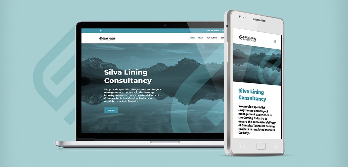
I was approached by Silva Lining Consultancy, a highly experienced project management team, to create a slick, clean brand identity for their business. The company has a plethora of specialised skills that ensure businesses achieve their project targets. They wanted a brand identity that would be timeless, simple, and contemporary without relying on design trends. This identity would also be extended to the company website that I was also responsible for designing and building.
The solution:
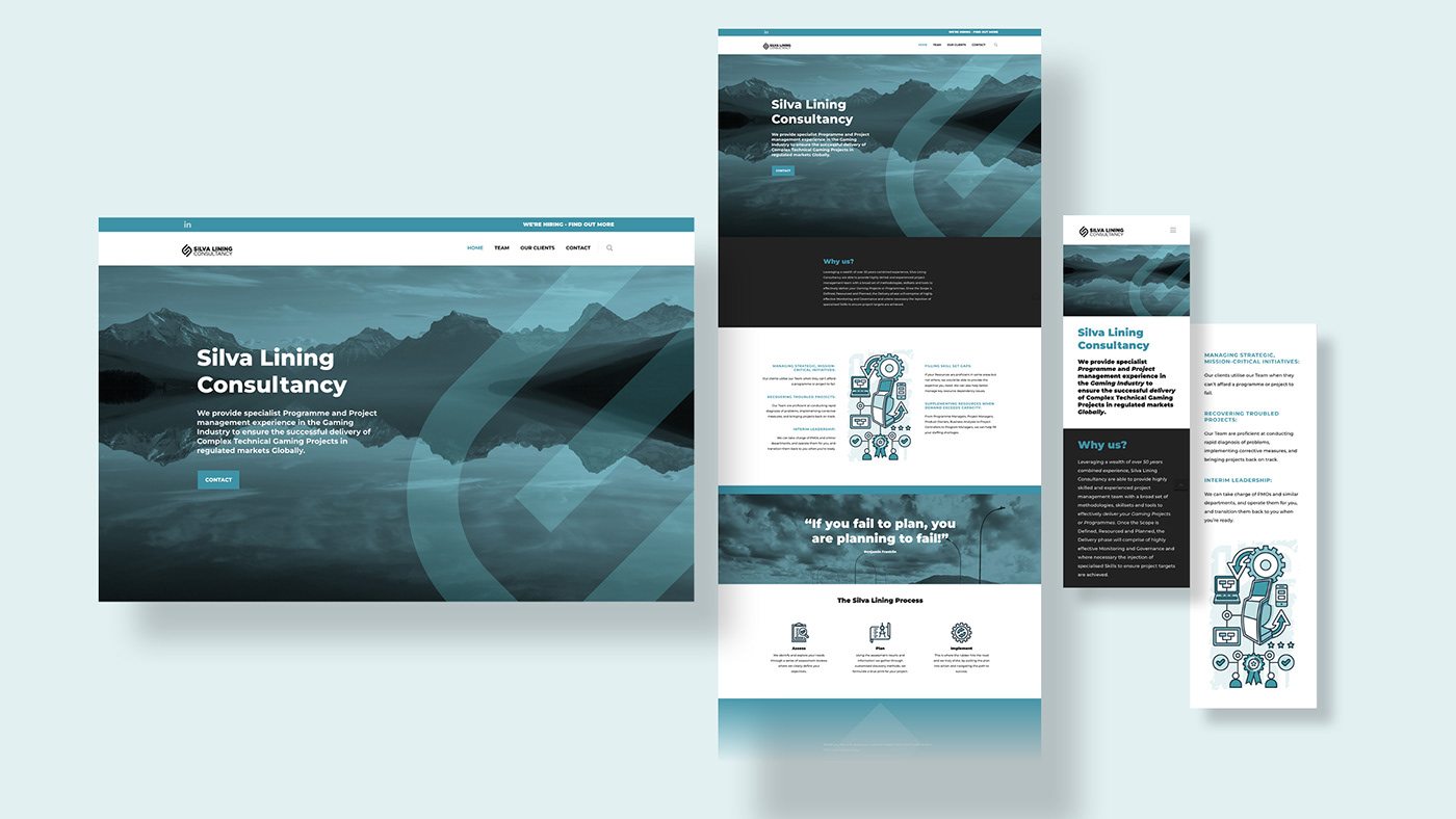
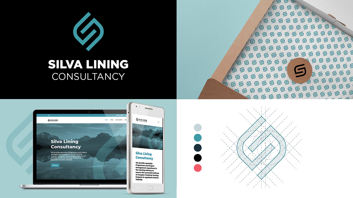
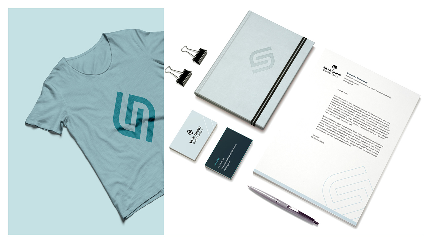
For this brand identity I set out to create a letter S monogram symbol, made up of 2 interconnecting letter "Cs", with an underlying visual concept that depicts 2 hands clasped together, symbolising the personal attention the consultancy provides when assisting the client achieve their objectives.
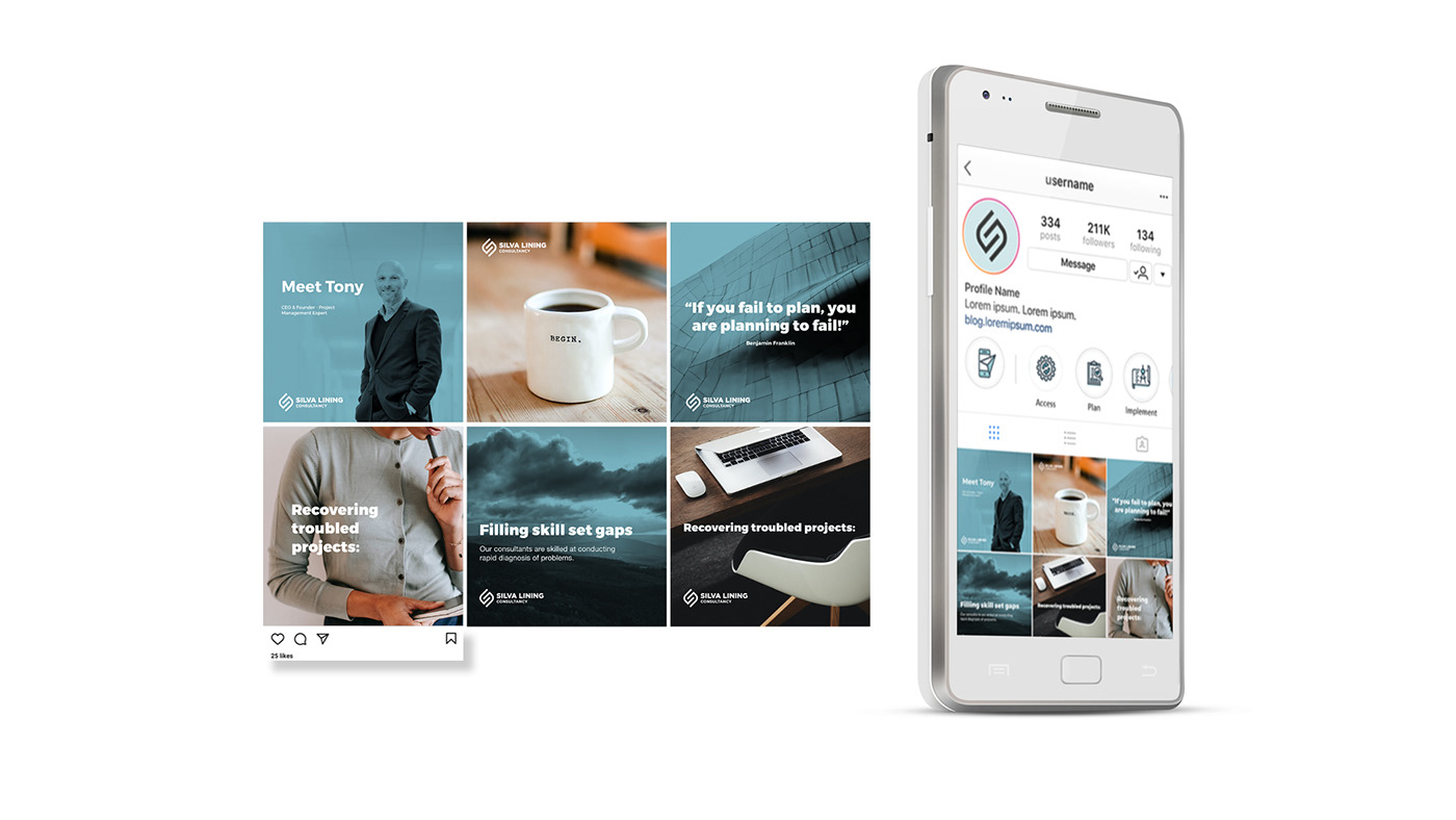
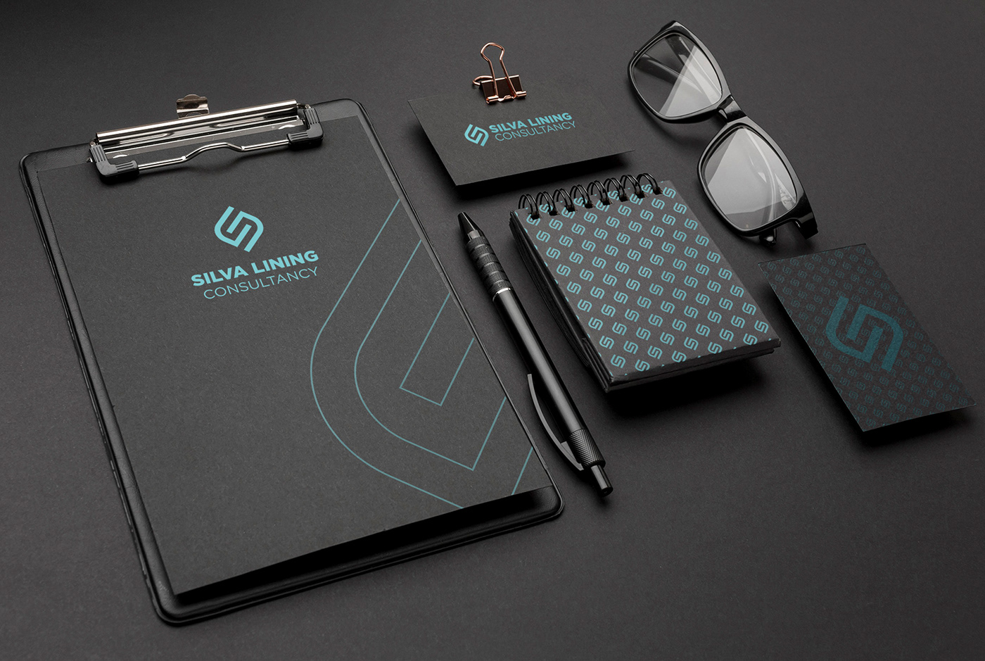
This monogram symbol was applied as a graphic device throughout the digital and print collateral created in the second phase of the project.
I was approached by Silva Lining Consultancy, a highly experienced project management team, to create a slick, clean brand identity for their business. The company has a plethora of specialised skills that ensure businesses achieve their project targets. They wanted a brand identity that would be timeless, simple, and contemporary without relying on design trends. This identity would also be extended to the company website that I was also responsible for designing and building.
The solution:
For this brand identity I set out to create a letter S monogram symbol, made up of 2 interconnecting letter "Cs", with an underlying visual concept that depicts 2 hands clasped together, symbolising the personal attention the consultancy provides when assisting the client achieve their objectives.
This monogram symbol was applied as a graphic device throughout the digital and print collateral created in the second phase of the project.


Surface pattern designs

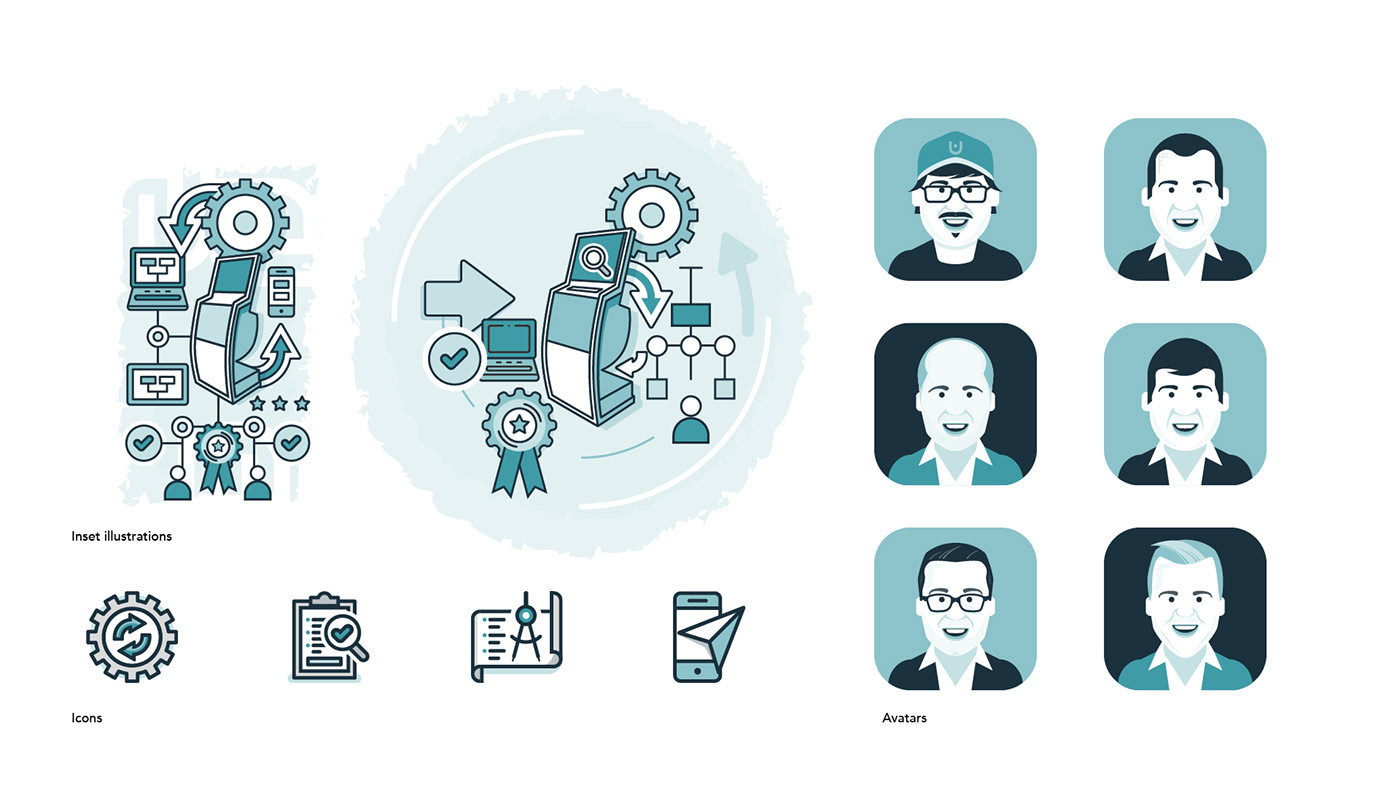
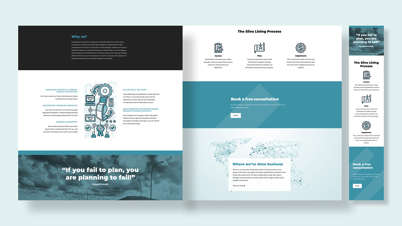
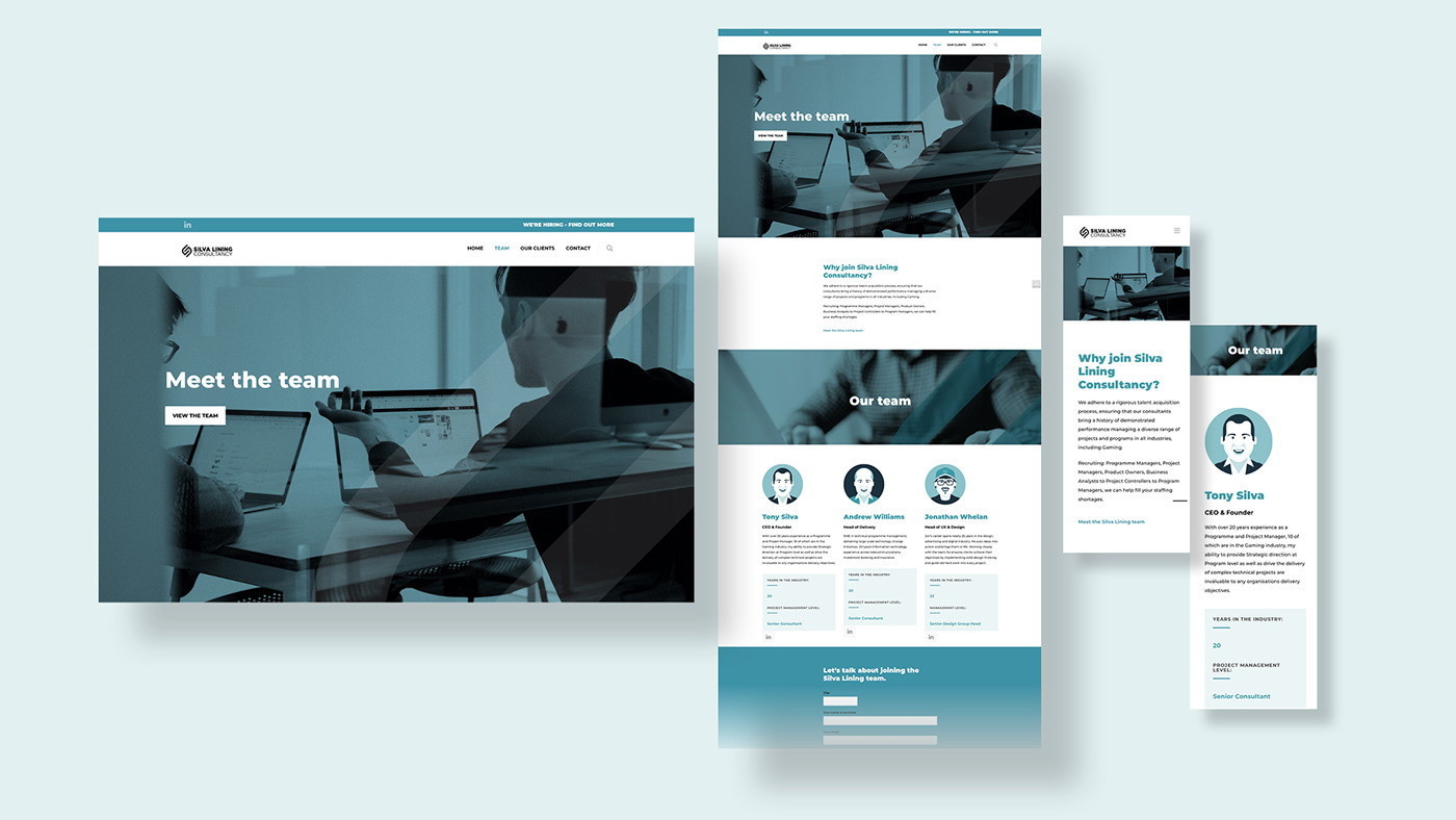
We created custom illustrations and icons for the website. These included avatars of the team.


Digital components