


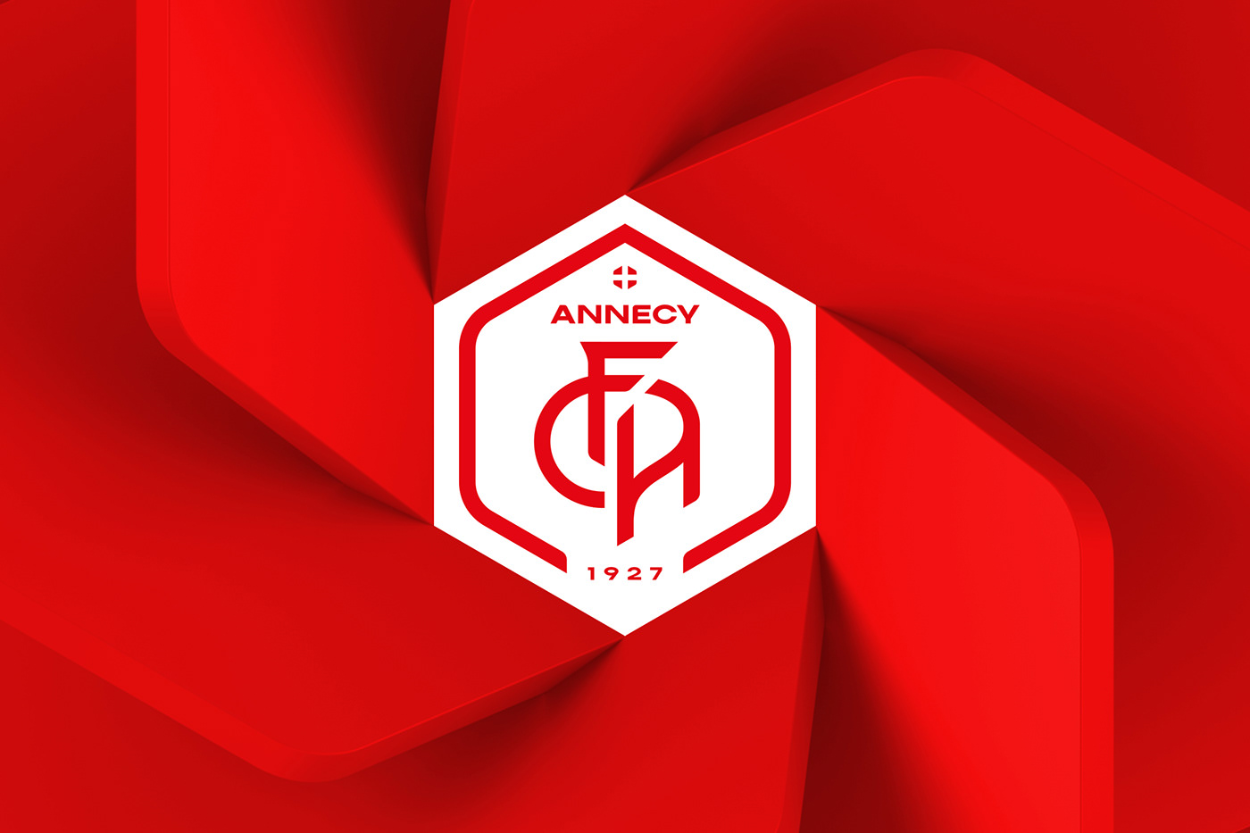
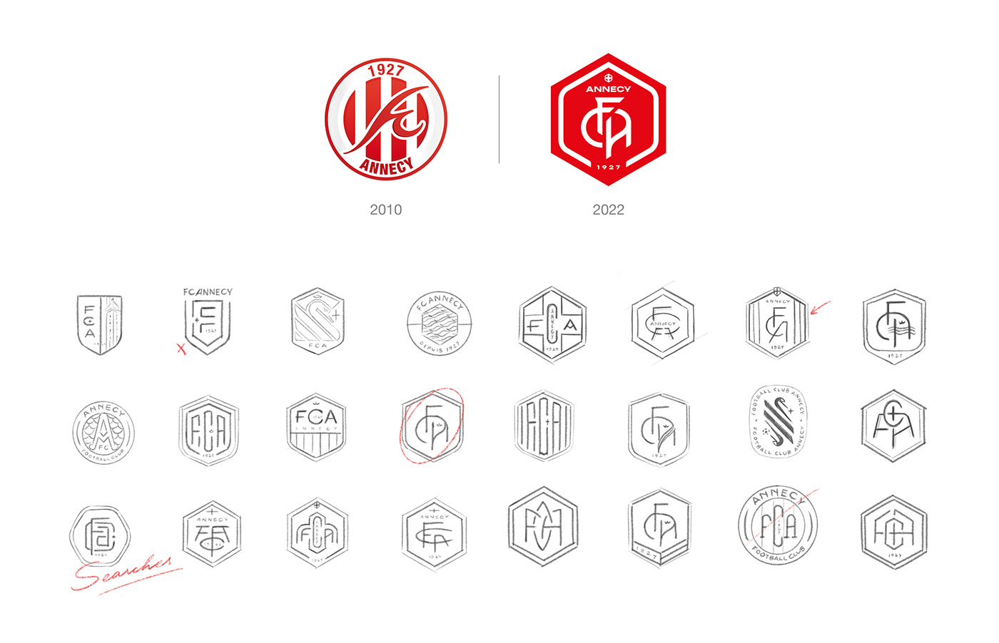
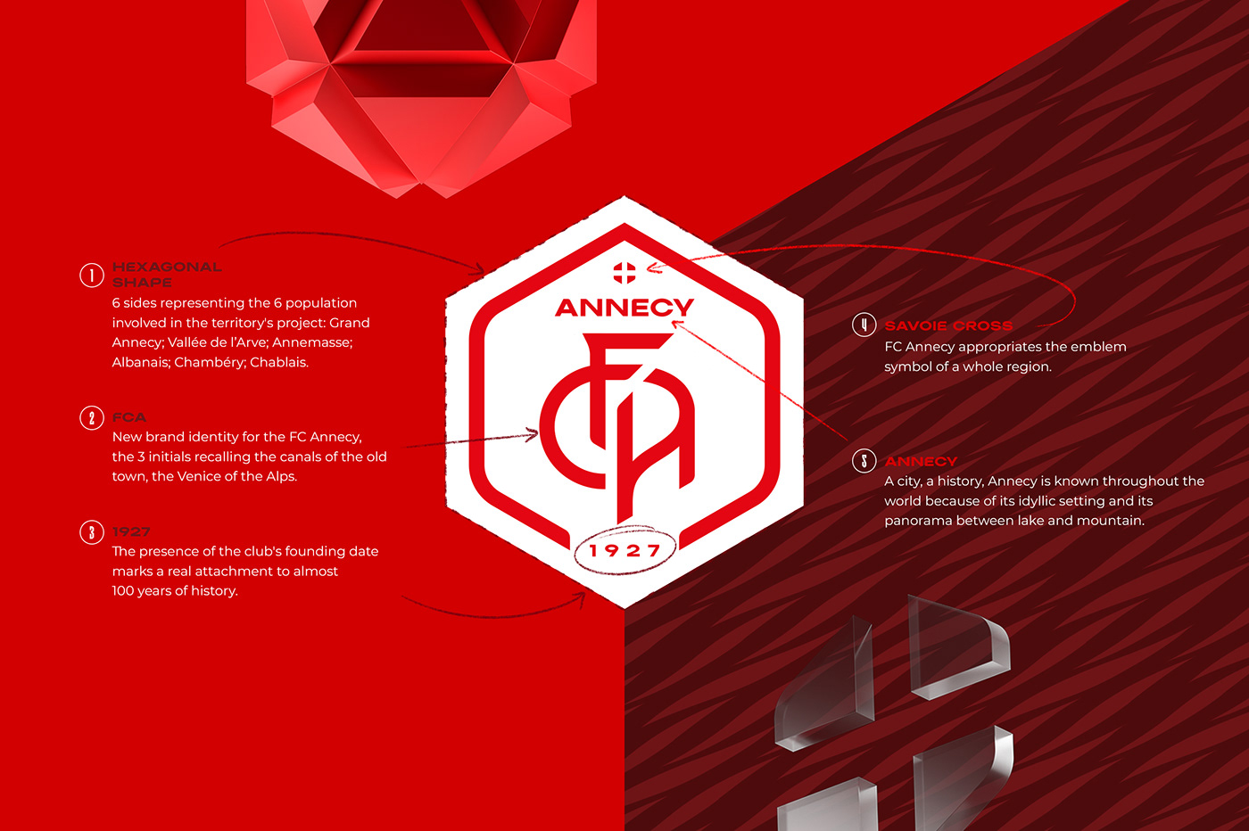
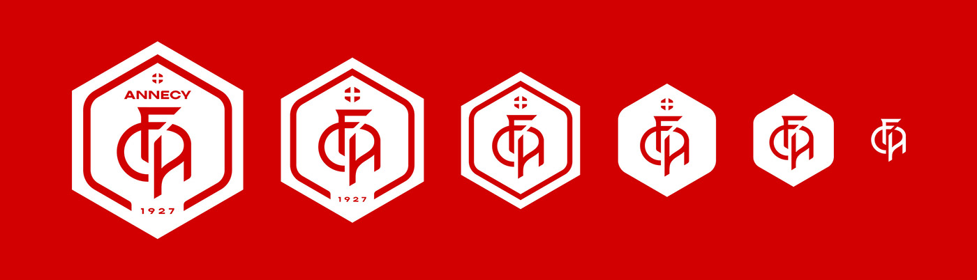
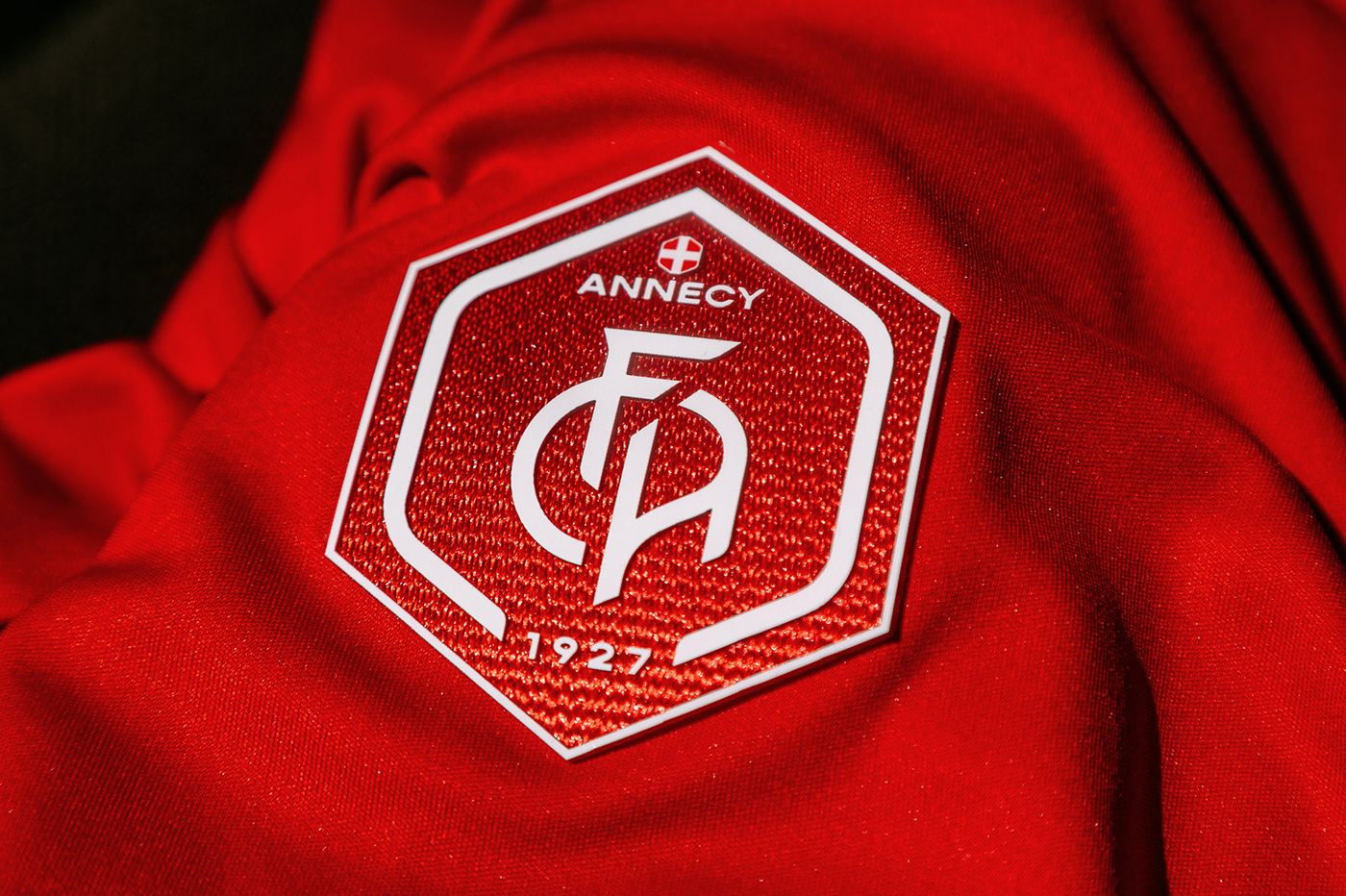
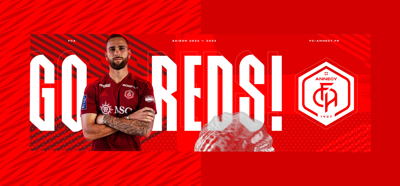
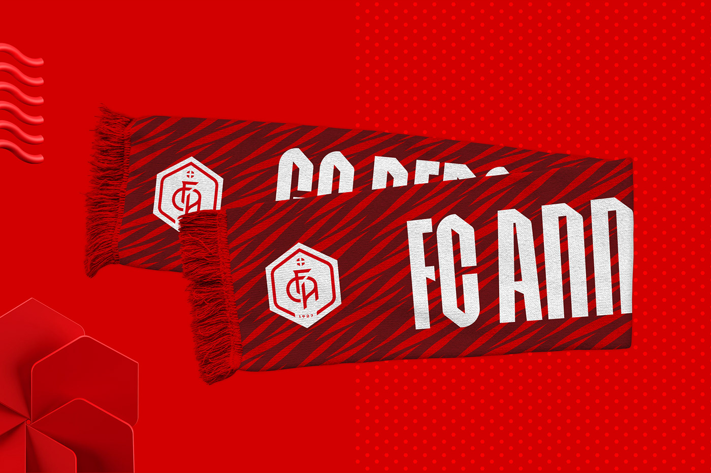
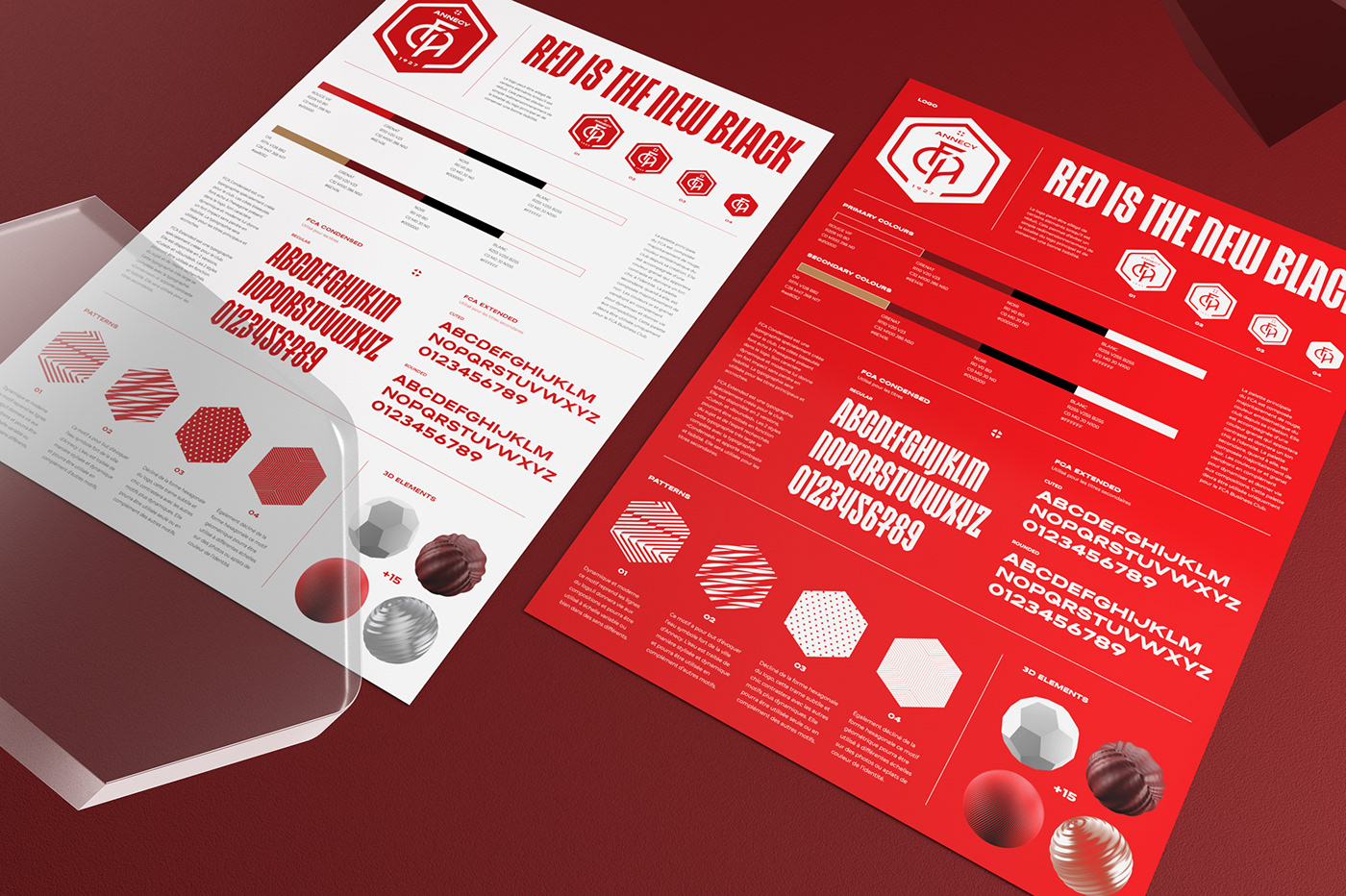
FC Annecy is the soccer club of the city of Annecy since 1927. 12 years after the last redesign of the logo, the club has grown and the needs have changed. The FCA, which will return to the professional world on July 30, 2022, is opening up to a new future in which its historical values and future vision will be put forward. FCA's new identity, which will play a key role in the club's evolution and development, is intended to be innovative, while respecting the rich history of the Red and White. This historical aspect is notably marked by a return to the roots with the acronym "FCA" in the foreground of the new logo, as was the case in 1927. Another historical and unique sign is the return of the Savoy Cross, symbol of a whole territory and dear to the fans of FC Annecy. Designed in the modernity while respecting the past, this logo fits everywhere, for everyone. In the digital era, FC Annecy is once again among the first to develop a responsive logo that adapts to all formats while maintaining perfect legibility. The acronym "FCA", at the center of this change of identity, remains visible until the smallest version.


2022
Agency : Almarena Creative
Art Direction : Romain Billaud
Graphic design : Romain Billaud & Jérémie Gauthier
Typography : Jérémie Gauthier
FCA official photographer : FootballCampagne
Special thanks for Maxime Mathieu, Hugo Durand and all the communication and marketing team of FC Annecy.


