The University of Copenhagen's Spring Festival (KU's forårsfestival) is a yearly recurring event, that will take place for the first time this May.
I've designed a visual identity for the festival - including logo, posters, T-shirts, responsive webdesign etc.
I've used light colors in order to give a folks that spring-feeling. The logo is a swallow, representing the coming of spring.
The main idea is a pennant that takes it's starting point from the main building of The University of Copenhagen, and grows towards the sky. The pennant is made up of words - on the line-up poster, the names of the bands - on the main poster - info about the festival.
I've kept the main poster in inviting, bright, pastel, soda-pop colors. I vary the color scheme in each poster - although still remaining in the same climate and style.


Website. Check out the live site here.


T-shirt for the volunteers at the festival.


Logo. The swallow represents the coming of spring.
Below are images from the actual festival - all by Philip Davali.

Program - map - introduction to the performing artists. Front page.
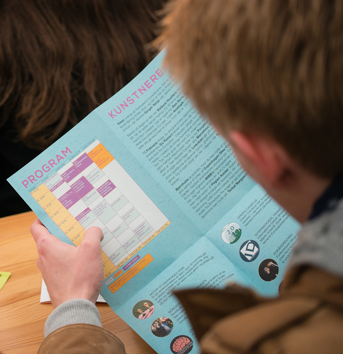
Program - map - introduction to the performing artists.
The inner spread.

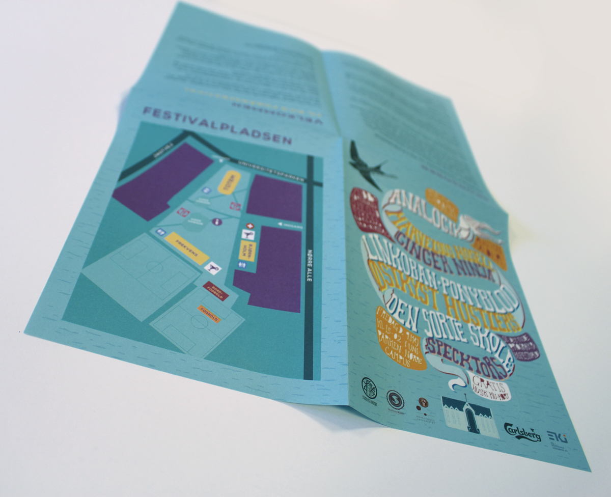
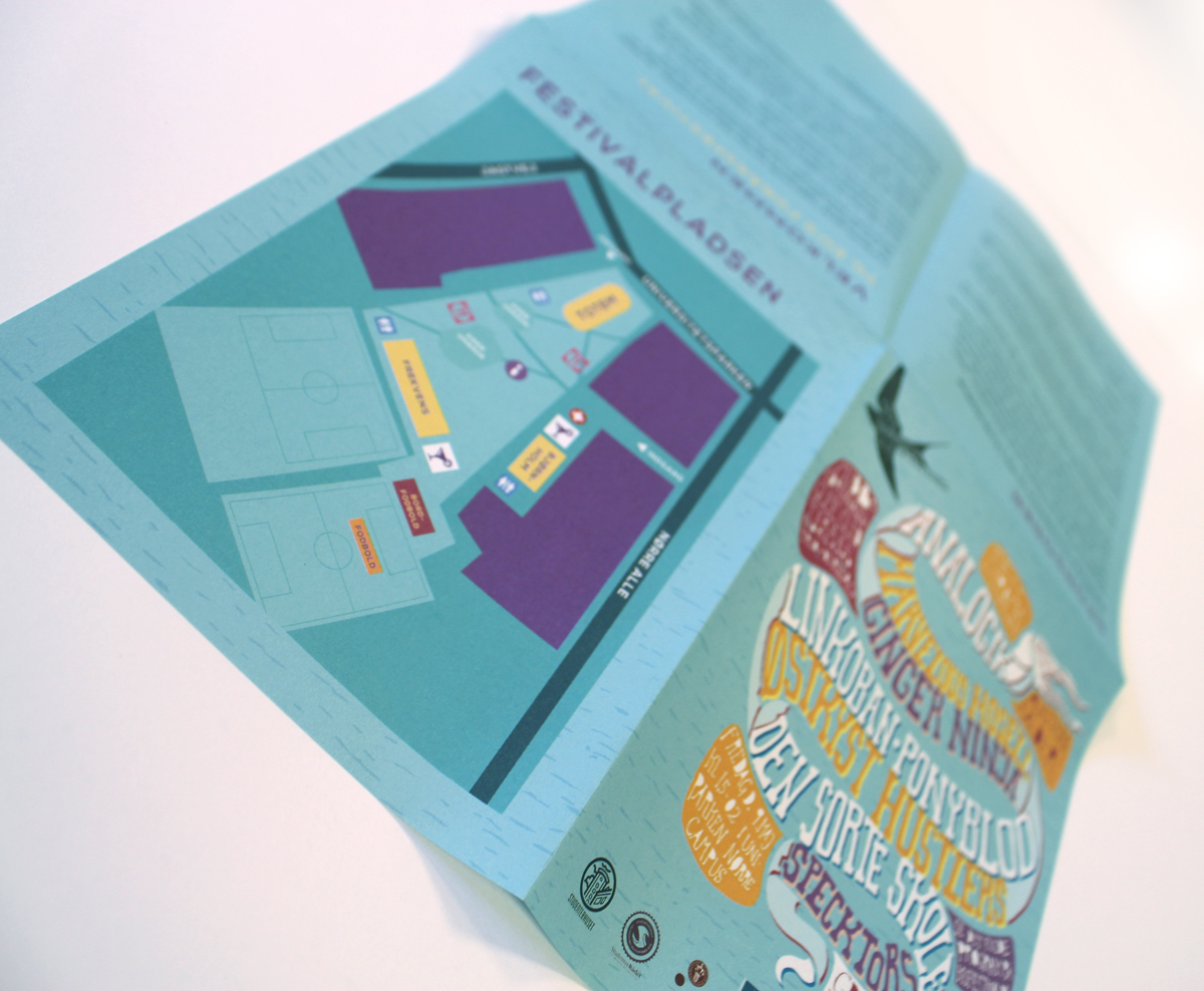
Program - map - introduction to the performing artists. The back spread.


Volunteer t-shirt.


