{eco&more} is an artisan range of plant-based, home and personal care products that have all the goodness of nature without compromising on product integrity.
We believe that change begins with the little things in life, and little changes begin with you.
Our products as part of a balanced life that includes a healthy diet, sensible exercise, a moderate intake of red wine, and a regular dose of good book.
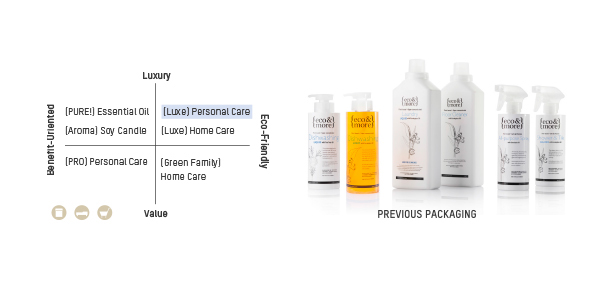
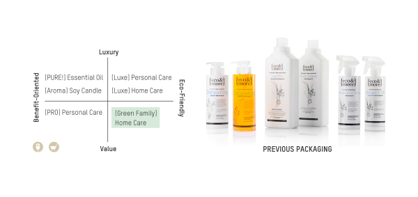
Pure, natural, authentic. Luxury starts at home.
STRATEGY


LAUNDRY LIQUID
Brief
Promote a star product in home care range. Emphasize its benefits both on home cleaning and environmental protection aspects.
Solution
Overall packaging is simple and understated, so that the focus naturally falls on the elaborated illustration. Create icons to visualize the benefits of the product. Utlize a roundel to highlight chemical-free feature on packaging.
Overall packaging is simple and understated, so that the focus naturally falls on the elaborated illustration. Create icons to visualize the benefits of the product. Utlize a roundel to highlight chemical-free feature on packaging.

Icon

Size Variation

LOTTEMART
Brief
Packaging for LotteMart own brand product line aims to differentiate from {eco&more} existing products.
Solution
Build a different look from {eco&more} exisiting line. Colourful life style picture to convey primary message quiclkly and in a way that enables them to stand out distinctly from rival competitors. Using bilingual copy to create a friendly purchasing experience for local market.

WASTONS LINE
Brief
Wastons opts for eco-friendly solutions on their sheleves.
Solution
Avoid pervious dark bottle, using fresh and clean colour instead, to attract younger customers, while keeping the original bottle shape to maintain the consistency of the product image. Modern serif fonts(Trade Gothic) brings out a professinal and reliable impact.


SPECIAL EDITION
Brief
Aim to fully open up local market by penetrating young market, tap into youngsters internet culture to create something relevant to their life and people around them.

Solution
Inspired by cosmetic packaging from 70's China, this retro style with modern illustration brings out a nostalgic yet trendy image for brand. Rather than repeting eco-friendly philosophy as the brand usually did, the copy is chosen from popular internet slang that have come about in Chinese youth culture.


PET CARE
Brief
New design for pet care product requires a clear visual for bot expat and local market, featuring a genuine love for pets and concern for the enviroment.


AROMA CANDLE
Brief
New Soy Candle box packaging requires a classic look to reflect product attributes, and more space to contain required information.

Solution
Add colour to existing illustration, develop them into pattern. The packaging is covered with these botanical patterns as a visual shorthand to indicate the Soy Candle are enriched with nature essential oil, which also gives consumers the “luxury” finish.


