


about project
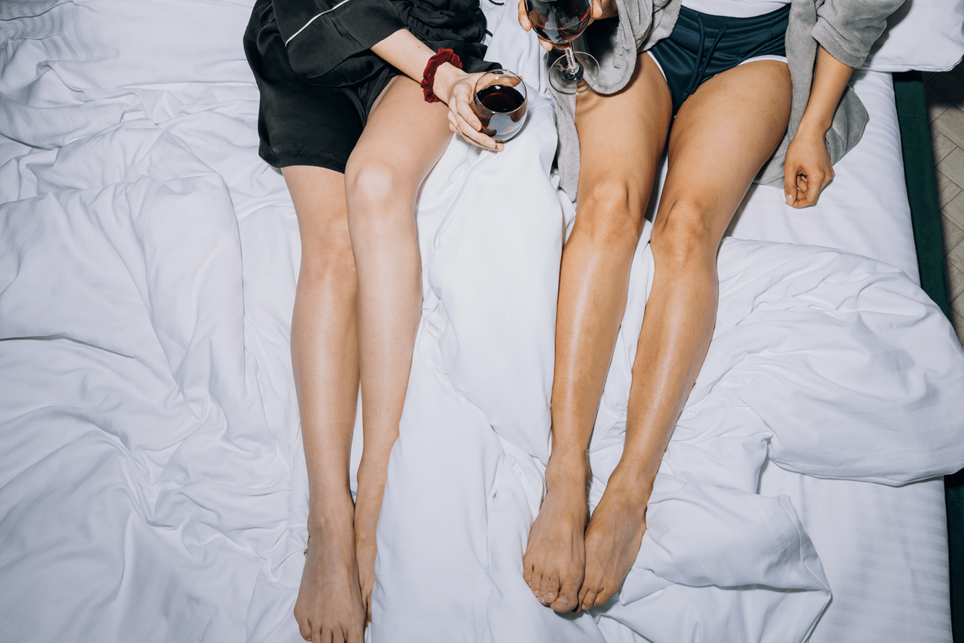
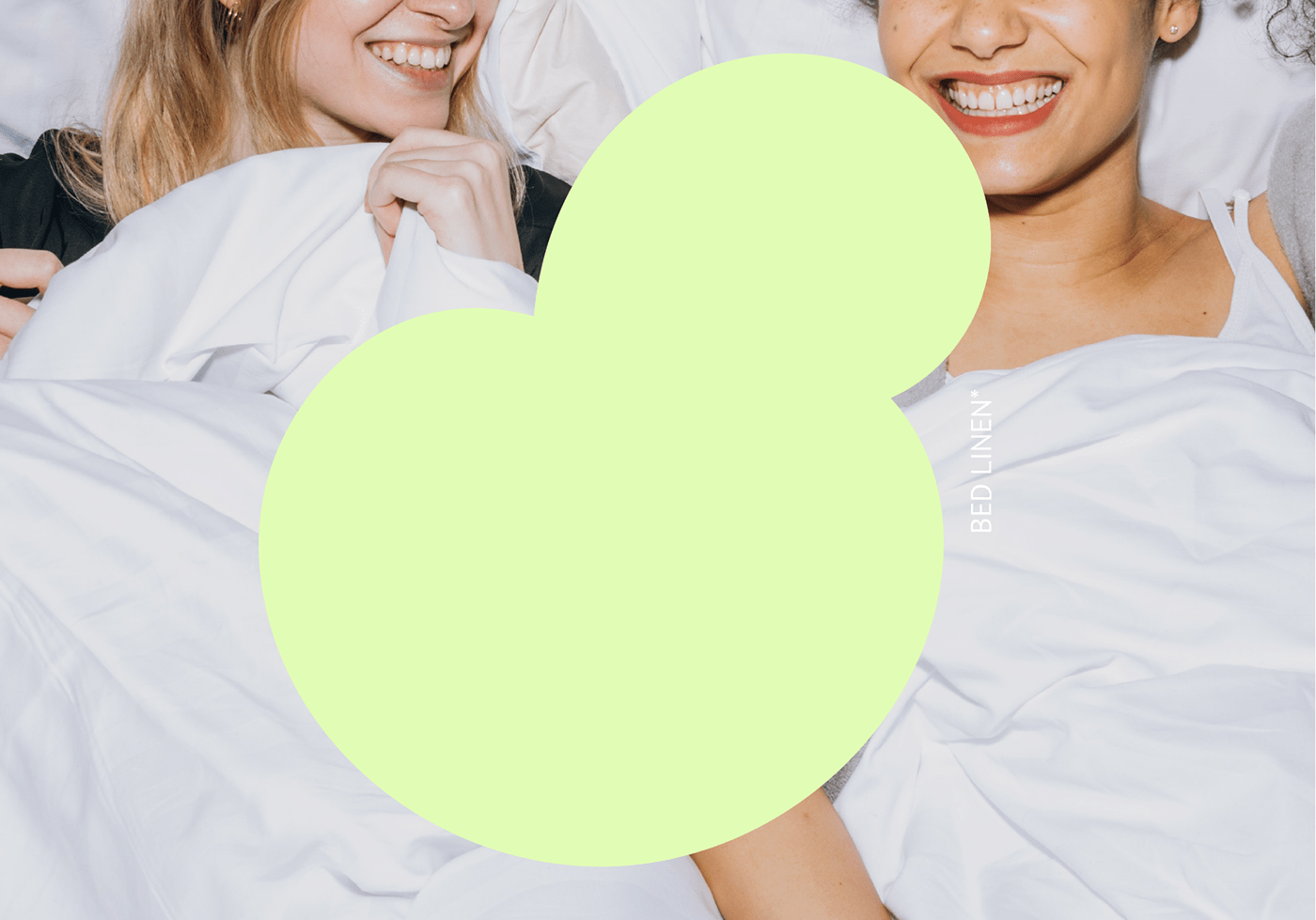
Soown (soft soft + own own). Soft as a cloud bedclothes, blankets and pillows. Created by a special technology, making it easier for people with insomnia to fall asleep.
Soown (soft soft + own own). Soft as a cloud bedclothes, blankets and pillows. Created by a special technology, making it easier for people with insomnia to fall asleep.
о проекте
Soown (soft мягкий + own собственный). Мягкое, как облако, постельное бельё, одеяла и подушки. Создаются по специальной технологии, облегчая засыпание людям с бессонницей.


Idea
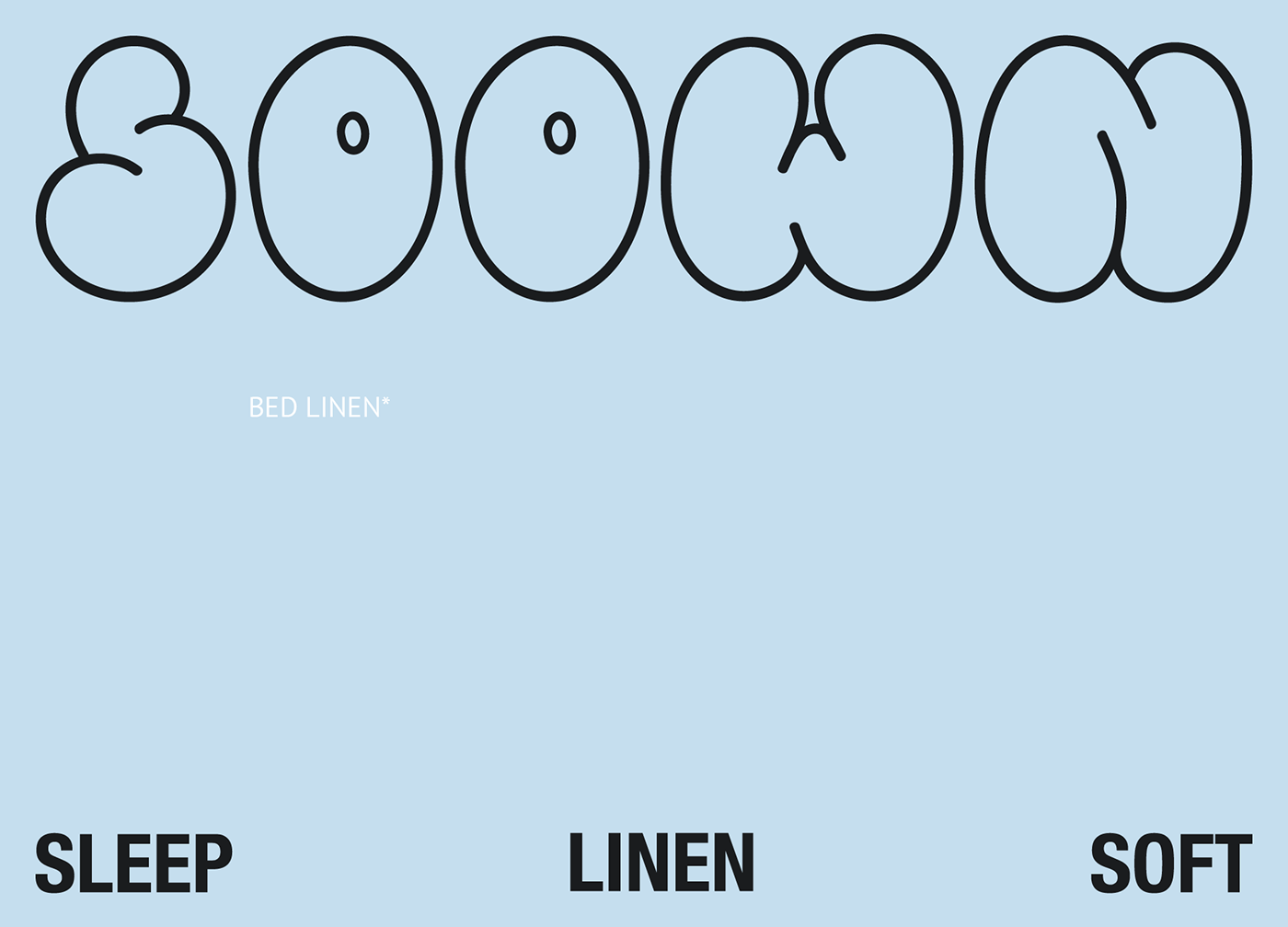
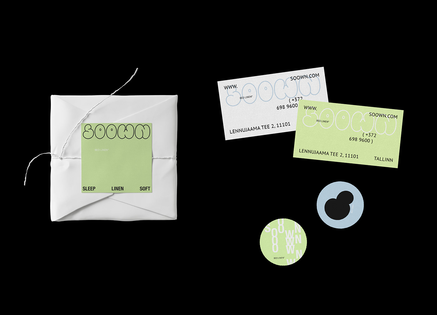
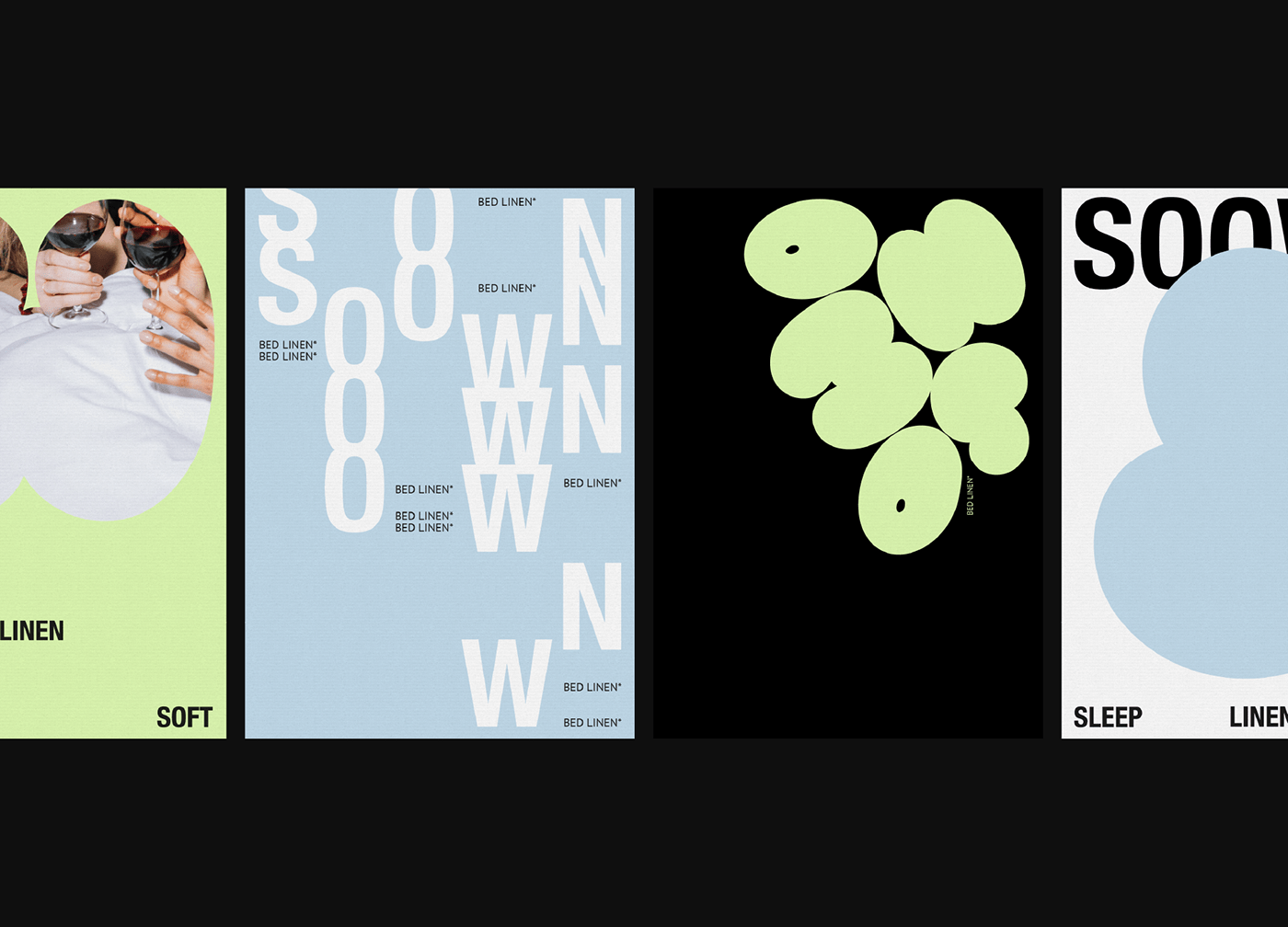
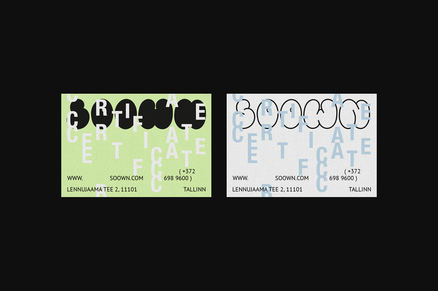
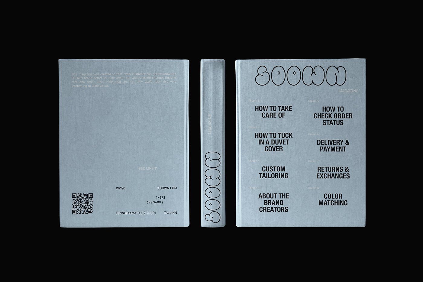
The logo is hand-drawn. The rounded letters look like clouds, they seem to envelop with their lightness.
The logo is hand-drawn. The rounded letters look like clouds, they seem to envelop with their lightness.
Blue is considered to be the color of spiritual purity and awareness, so it fits perfectly to the bedding brand, just like white.
The brand identity is supplemented with a light shade of lettuce, which characterizes harmony, calmness, equilibrium, life and development. In addition, the color green means safety in psychology.
The whole identity is built on light airy forms of letters used in the logo. The clouds are always up, so the logo on all the layouts is at the top.
идея
Логотип отрисован вручную. Округлые буквы напоминают облака, они как будто окутывают своей воздушностью.
Голубой цвет считается цветом душевной чистоты и осознанности, поэтому идеально подходит к бренду постельного белья, ровно так же, как и белый.
Айдентика бренда дополнена лёгким салатовым оттенком, который характеризует гармонию, спокойствие, уравновешенность, жизнь и развитие. Помимо этого, зеленый цвет в психологии означает безопасность.
Вся айдентика построена на лёгких воздушных формах букв, использованных в логотипе. Облака всегда поднимаются наверх, поэтому и логотип на всех макетах находится сверху.


SOOWN
Brand identity development
Brand identity development
DESIGNER: Anastasia Vagner
e-mail [ aanvagner@yandex.ru ]
©2022


