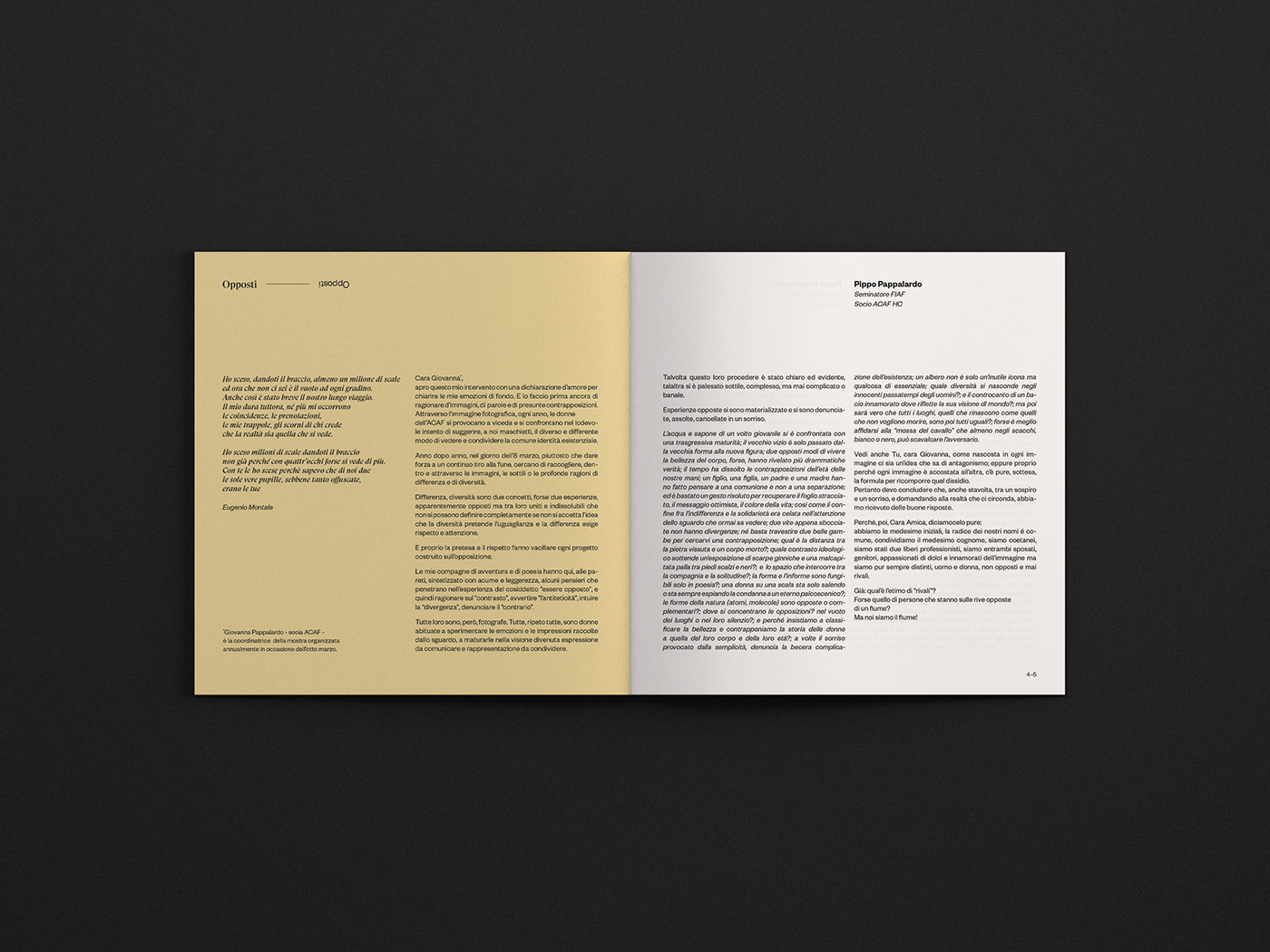
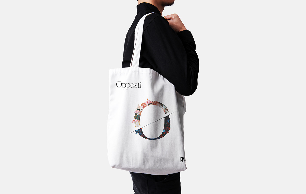
Opposti
Since 2019, ACAF (Associazione Catanese Amatori Fotografia) organizes for the Women's Day on March 8th a photographic exhibition with the help of its women members. In 2020 the exhibition was entitled Opposti (Opposites), ACAF asked us to design the graphic for the event.
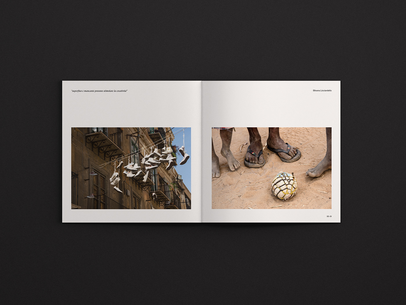
Our task was to create a visual communication expressing the theme of opposition. After looking at the photos in the exhibition we realized that this theme encompassed several sub-themes, including gender opposition man/woman, natural/artificial, poverty/wealth, loneliness/socialization and others.
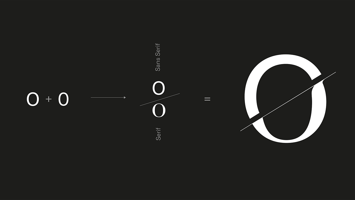
First we designed a symbol composed mainly of the initial O, dividing the letter into two parts divided by a space and a central line. In this way the letter O also becomes a zero, two typographic characters that often get confused with each other, but with the opposite meaning. We filled both parts with a texture of plants, the upper part using flowers of various kinds with light and natural colors, the lower part using a fat plant with opposite colors, darker with a visible intervention of man. Finally we contrasted the two figures, the woman and the man, merging them. In the common imagination the figure of man is opposite to that of woman, we decided to merge them because we strongly believe in gender equality and we wanted to convey the meaning that man depends on woman as woman depends on man. In order to make sure that neither of the two halves prevailed over the other, we made the prints so that by rotating them 180° the inscriptions and the Artwork would always remain legible.
In the common imagination the figure of man is opposite to that of woman, we decided to merge them because we strongly believe in gender equality and we wanted to convey the meaning that man depends on woman as woman depends on man. In order to make sure that neither of the two halves prevailed over the other, we made the prints so that by rotating them 180° the inscriptions and the Artwork would always remain legible.
We have also maintained this sense of opposition in the catalogue layout, using different colours, textures, recycled and coated papers.