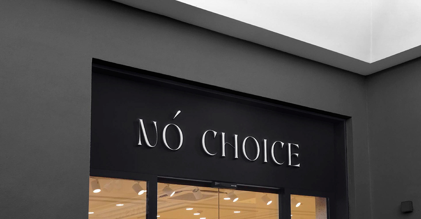
A font logo was developed for the studio. With the font, I wanted to convey an individual approach to each bouquet. Thanks to the elegant and atypical lettering, it was possible to achieve the elegance of the image. The emphasis on the "O" emphasizes the main feature of the brand: the uncertainty and trust of the final choice to florists