


Project White is a campaign, focusing on HIV/AIDS, done by my final year project team called PLACID. We want to educate and eliminate the stigma that is instilled within many Singaporeans when the topic of HIV/AIDS is brought up. This issue is usually seen as a scary and taboo subject. Project White believes this should not be so and instead approaches it in a manner which is much more gentle and welcoming.
Project White aims to educate the audience and help eliminate any misconceptions and stigma they might carry with them in hopes that with a better informed society, a more empathetic and loving community will be formed.
We did not only design, but also did production and interactivity as well. We designed 10 sets of everything: An A5 informative booklet, a plain A6 notebook (that comes with a pen), a painted tote bag, stickers, badges, and also a CD consisting of a PDF version of our booklet, as well as our short films.
We made four short films, including trailers and they are all on our Project White website, that we have designed from scratch using Adobe Muse, publishing it through Adobe Business Catalyst: http://projectwhite.businesscatalyst.com/

When the topic is mentioned, different people will have different perceptions regarding the topic. Hence, we wanted Project White to have a symbolic shape yet still remain unique on its own.
Some people will think about sex and the use of condoms, while some will think of abstinence, and the use of celibacy/purity rings. The circle also represents the close-mindedness of people who believes that HIV/AIDS only happens to a secluded group of people. Hence we wanted to leave the logo to represent a similar basic shape – so that different people can decipher different meanings from it. We wanted Project White to be something that encourages acceptance, no matter the differences. The splashes represents life, trying to break free from all the stigma.
Initially we wanted to use colours in our logo, but after considerations, we decided to keep the logo and the main colour to be white, so that it can go with any background colour. Simply because HIV/AIDS, just like the colour white, is present in our daily lives but the society are simply oblivious to it - which is also the reason why we name this campaign 'Project White'. We want to change the society's perception towards this topic - that just because we ignore it or do not mention of it, does not mean it does not exist or is of less importance than other important issues like human trafficking and more.

These are some of the pages from our booklet.
For more of our booklet, go to: http://projectwhite.businesscatalyst.com/
We wanted our booklet to not only clarify myths, but to also educate the audience regarding HIV/AIDS. We felt that a majority of the audience are misinformed hence the reason behind the stigma and misconceptions. We wanted to educate the public not only on what HIV/AIDS is, but to make them realize the seriousness of the issue – that it should not be taken lightly, and that it is an existing issue that majority of us have been ignorant about.
To educate the audience, we had to provide basic information regarding the topic, like the definition of HIV/AIDS, the different stages, statistics in Singapore, signs and symptoms and more.

This is an insert (front) for our booklets.

This is an insert (back) for our booklets.
Going back to our target audience (teenagers and young adults), we feel that the collaterals we have chosen will appeal to them. Not only will our collaterals help educate and inform our target audience, it will also help to entertain them in a way.
The target audience will be able to emblazon the project logo on them with the tote bag, badges and stickers and will be able to interact with the booklet, CD and notebook that we have provided for them. Aside from that, the tote bag and notebook also has practical use for itself.
With this, we hope to create a dynamic experience for the audience.
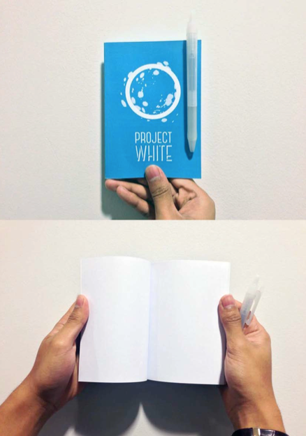
This is one of the notebooks that we made.

This is the CD that contains a PDF (interactive) version of our booklet, as well as our short films.
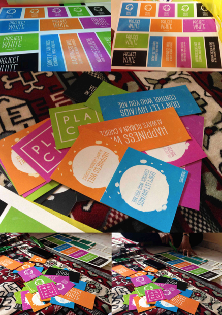
Stickers that we designed with quotes from our short films, and also our logos.
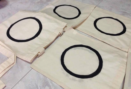
We painted these (slightly bigger than) A5 size tote bags from scratch using fabric paint.

Front and back of the tote bags.
As this was a final year project, we had to submit 3 copies of our work, with the main collaterals labelled. Since our work is an actual 'bag of collaterals', we submitted all of them together, including an envelope each, consisting of our submission CDs and Reports.

Our bag of collaterals.


What was inside every bag.

Submission CDs.

Final Year Project Reports.
Here is a trailer for one of our short films.
For more, go to: http://projectwhite.businesscatalyst.com/
Our film is a series of intimate interview sessions, where the setting for the short film was the subject matter sitting against a white backdrop while facing the camera. We wanted the short films to evoke emotions out of the audience to create psychological and emotional impacts on the audience. A “confrontational”, one-on-one point of view would allow the audience to relate and place themselves in the subject’s shoes.
Therefore, the audience would more likely be captivated to watch the entire film as they would be interested in knowing the message that we are bringing forth.
Here is a short video of our website, just to show how the website looks like and how it works.
For more, go to: http://projectwhite.businesscatalyst.com/
Keeping our entire project consistent, we kept our website concept similar to our design concept; which was to have a minimal, clean look, and also using our four colours and elements from our logo.
We wanted our website to be straightforward and direct, hence no elaborate graphics but simply to direct the audience straight to what the project is all about. We kept the website to a one-page website to give it a modern look and feel, using navigation and also sub-navigation to ensure that the information is easily accessible for the audience.
For more, go to:


