


✨ REBRAND'S CAN BE TRICKY,
But brands have a destiny of their own, SO...✨
After 19 years, the owner of this well loved and established business had a new vision.
The original look was kitschy, fun, and playful, with dark grey, red, and some blue. Much like being inside of an aesthetic and comfy "Garage" for cars, but for "fixing bodies".
The tagline was "We Fix Bodies" and the logo was a license plate.
The messaging and positioning was basically; good massages done cheap without all the fuss.
It did really well, but evolved over the years and had aged out of this premise on most every level.
The rebrand goal was to shift the experience from being inside a "Garage", to capturing the feeling of driving along the open road, from sea to dessert, with an emphasis on the dessert and notes of Palm Springs.
The idea being; when on the road, there's always garages along the way to support your vehicle. Much like on life's journey, The Massage Garage is here to support your body.
SO!
We did:
• A whole new logo (primary & secondary)
• Brandmark
• Icons
• Messaging
• Interior brand consultation
• Signage,
• Some marketing pieces.
The new tagline is "RESTORING BODIES SINCE 2003"
It all came together really well and the long time customers loved it, which is always a big sigh of relief 🫠

BRANDING GRID CHEAT SHEET
I created this cheat sheet for the client to have on hand for quick reference, and to support those everyday decisions she'll be confronted with everyday.

EVOLUTION MOODBOARD
NEW LOGO & TAGLINE


SECONDARY LOGO + BRANDMARKS
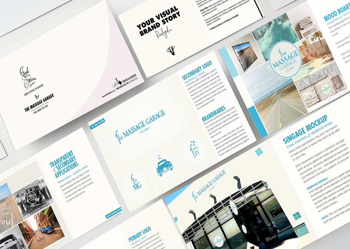
15 PAGE FINAL BRAND STYLE GUIDE

MARKETING PIECE + INTERIOR BRANDING
I came across this photo during the discovery and mood board stage. SO GOOD! We just loved it! So I created a marketing piece around it, and now we're considering blowing it up and framing it for the front desk area.

SIGNAGE
The previous color of the building was dark grey. To incorporate the full branding experience, the building had to be repainted. We opted to use the secondary logo for the top placement, and the circular for the foot traffic placement. This worked really well for a few reasons; cream can be a difficult color to match over different processes, so going this route eliminated that issue altogether. It also offered the opportunity to introduce the full rebrand experience across all aspects of exterior, and most importantly, it fit the space perfectly.


