Can an exhibition catalog capture and provide the physical excitement of a moment while honoring tradition, the showcased typographic artistry and artists individual conceptual narratives? By taking a UI approach to the book's design we capture the physical energy of being one of the 1000+ attendees discovering new works at the opening reception.
Each year Firebelly redefines this task by guiding the reader's attentiveness in an effort to honor and celebrate each of the canonized artists. The studio’s third Typeforce catalogue explores new heights in fundamentals by uniting history with the discovery of contemporary methods. Honored typographic traditions, simple mark making and hand-carved stone forms are complementedwith emerging glimmers of light, moments of resounding reflection and bursting brilliance.
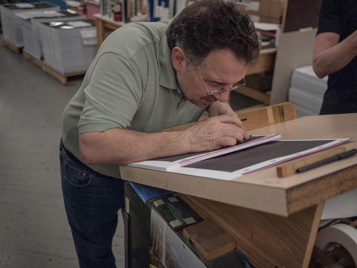
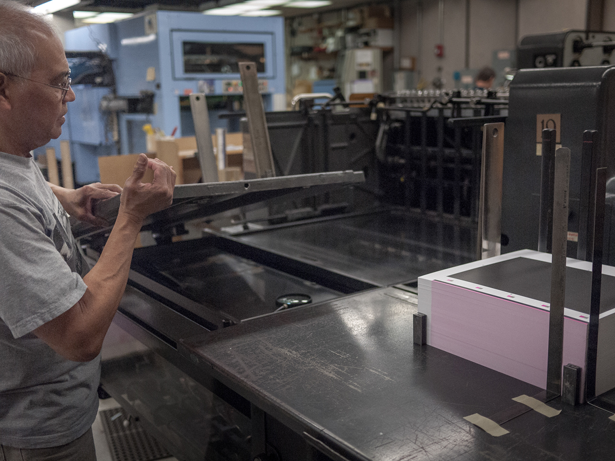
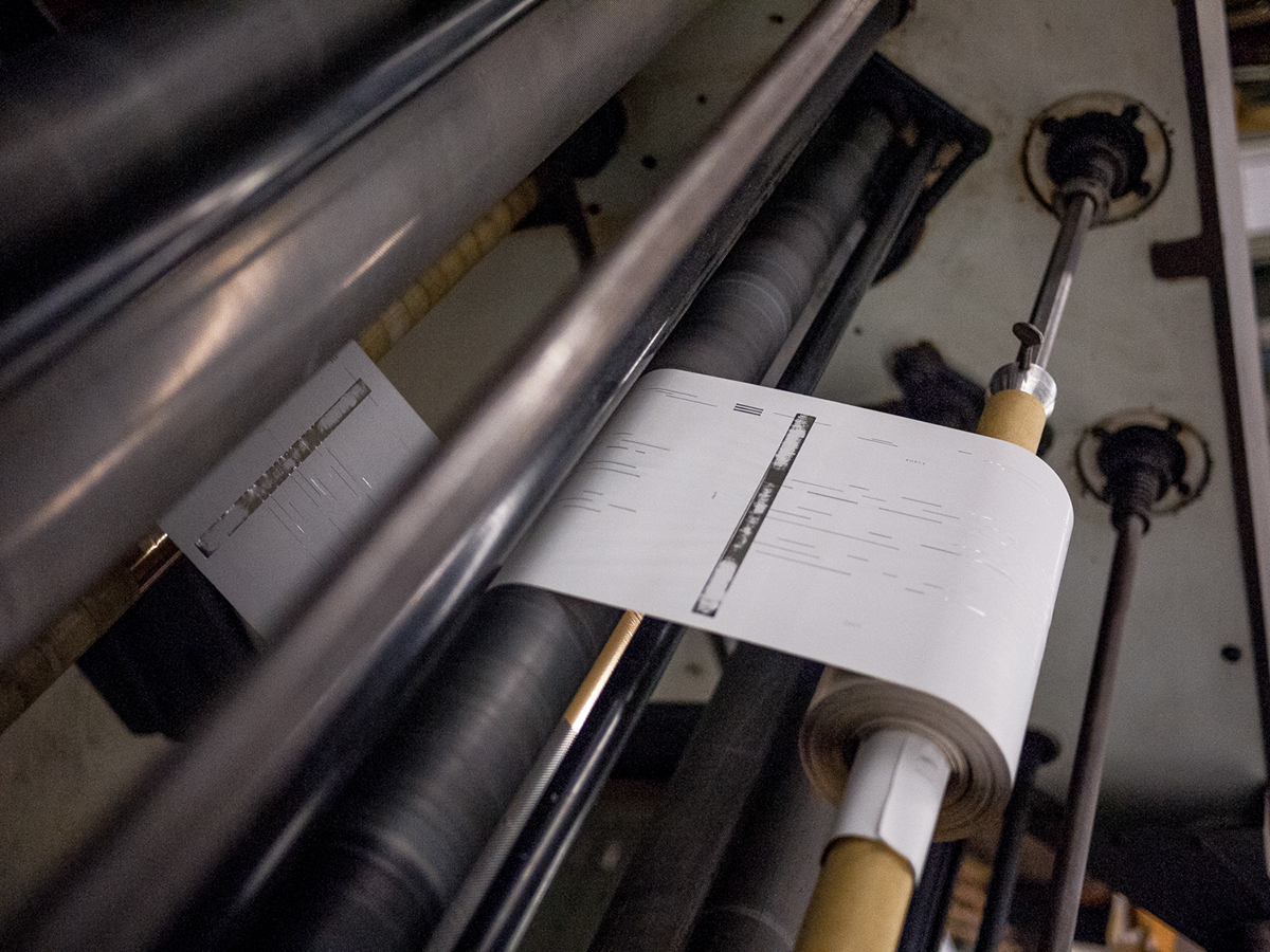
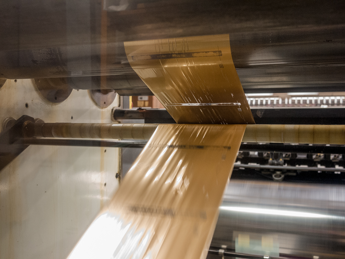
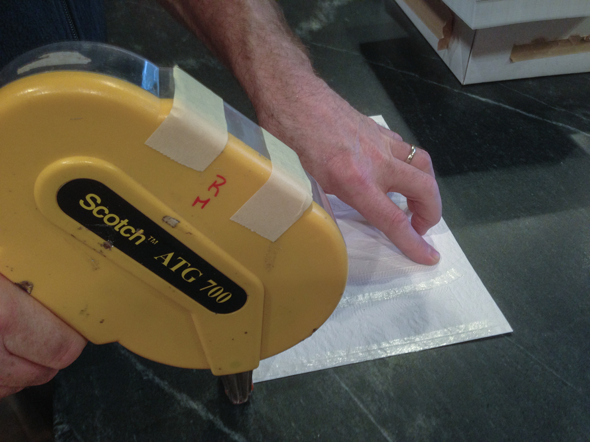
Typographic and design attention, conceptual and craft vigilance, production and paper effects used throughout this volume; these maneuvers were meant to inspire, challenge and encourage a stronger connection across a designer's ideas and the material production.
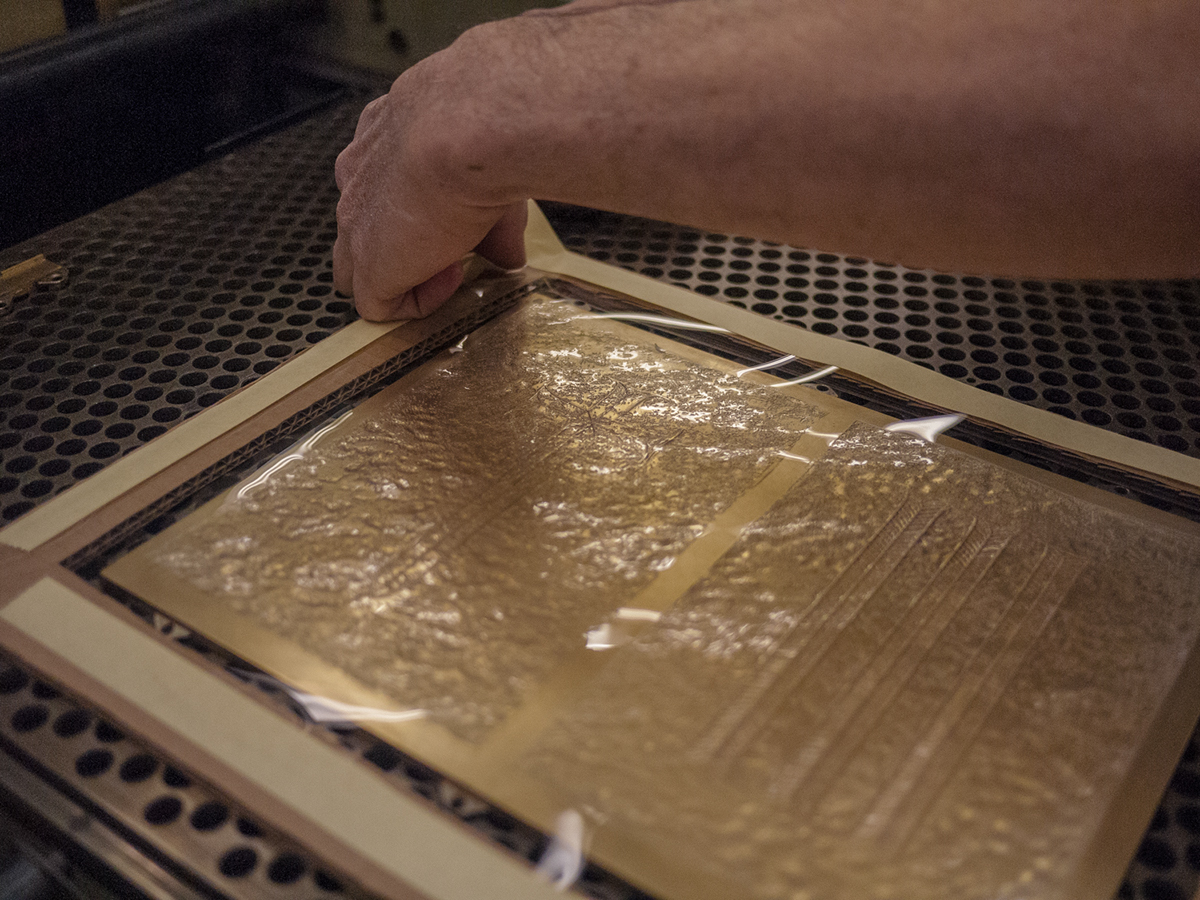
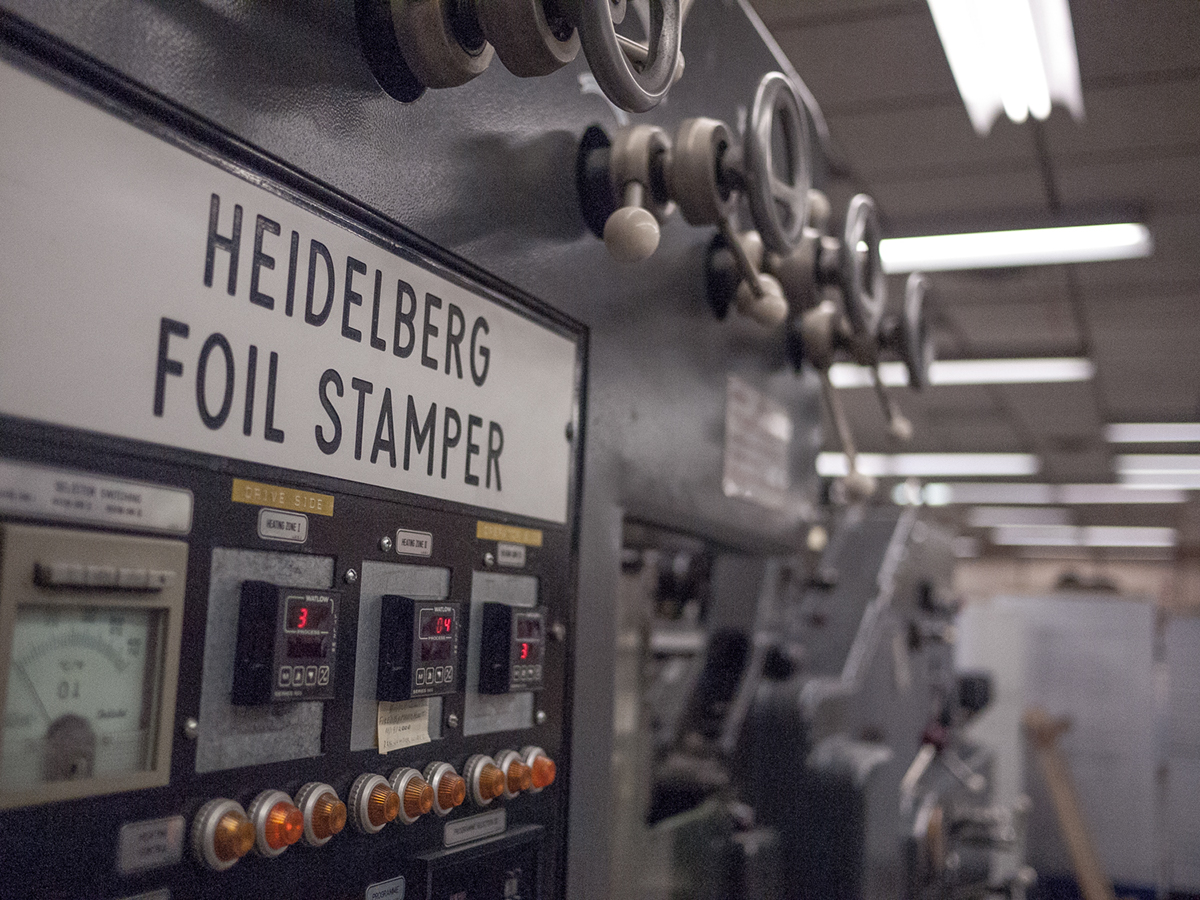
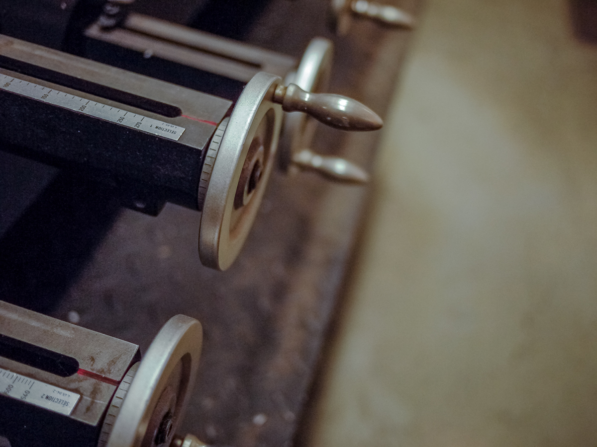
This piece was designed in-house at Firebelly, printed and produced by Graphic Arts Studio with finishing support from Delta Press Inc. and high quality paper stocks generously donated by Domtar with suport from Unisource Worldwide.
Designers and Artists Showcased in Typeforce 3:
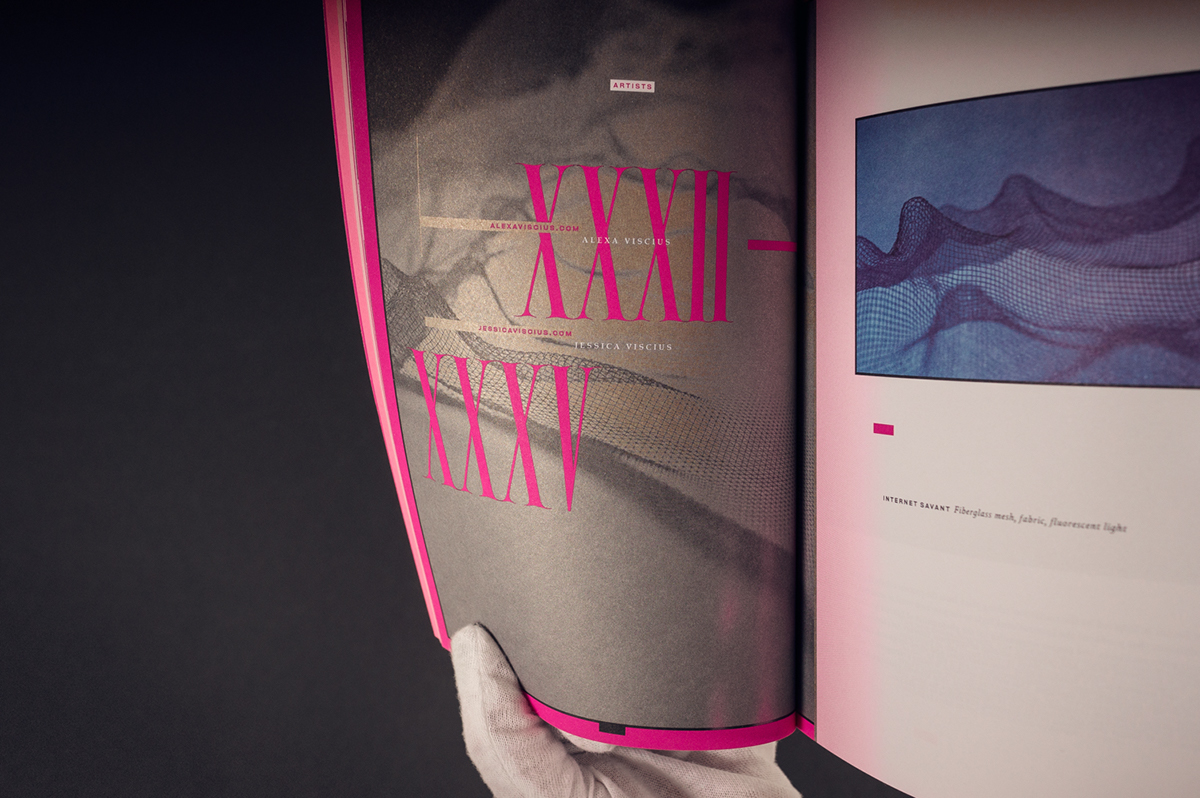
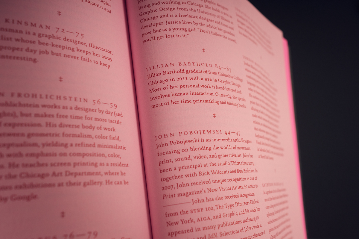
Abby Christensen, Alex Fuller, Alexa Viscius, Andy Luce, Brandt Brinkerhoff, Cameron Brand, Cristina Vanko, Dave Pabellon, Derek Olson, NosE, Elaine Fong, Gregory Calvert, Jana Kinsman, Jason Frohlichstein, Jason Lazarus, Jennie Li, Jessica Viscius, Jillian Barthold, John Pobojewski, Jonathan Duncan, Jonathan Petersen, Jordan Martins, Juan Chavez, Kady Dennell, Katherine Walker, Kyle Fletcher, Lauren Connoll, Matthew Hoffman, Meaghan Burritt, Mike Wilgus, Nathan Legsdin, Nick Adam, Ranee Wu, Rick Valicenti, Ryan Duggan, Thom Snels, Tom Burtonwood, Vida Sacic
If you're interested in purchasing a copy, you can order one here.

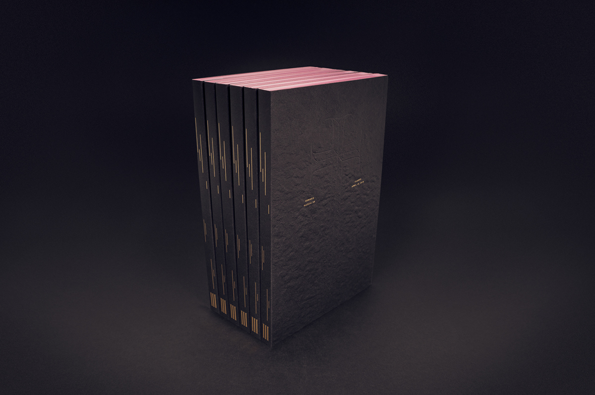


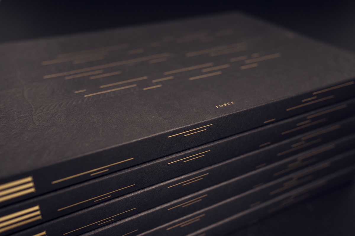
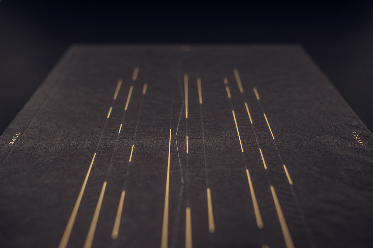
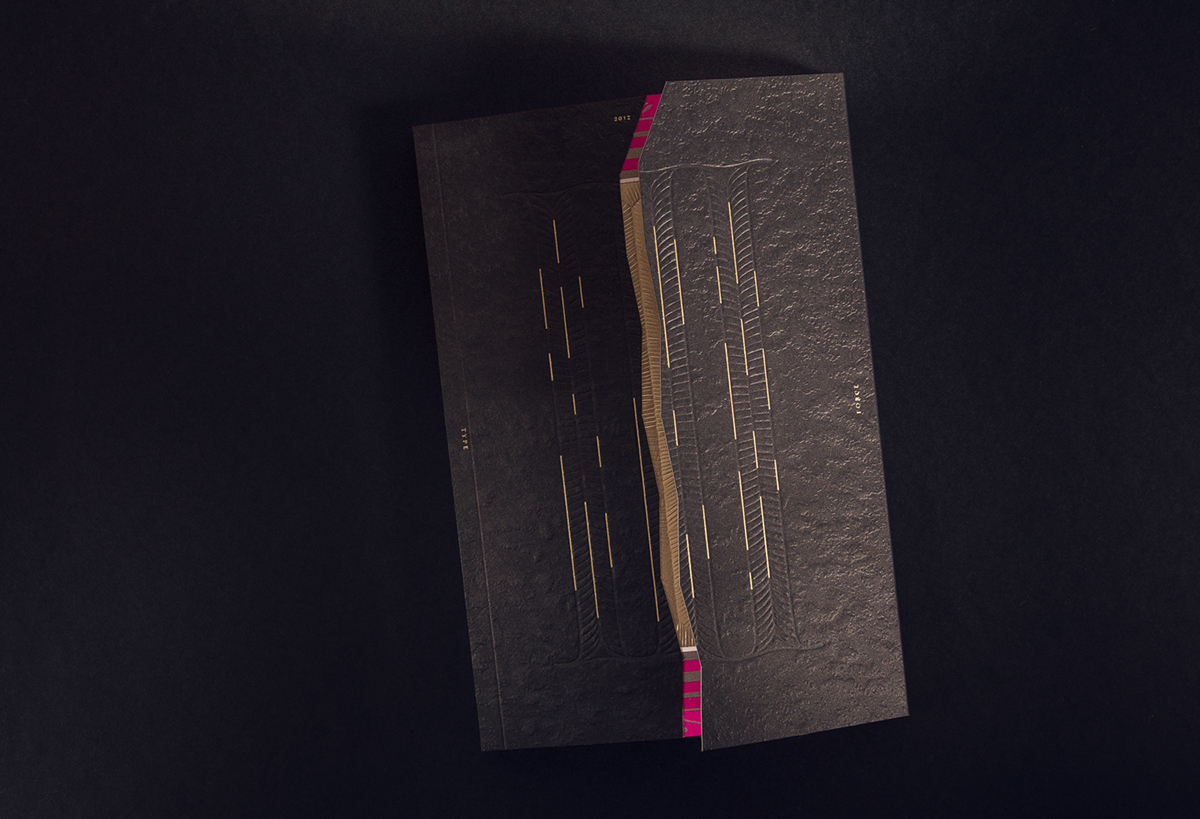
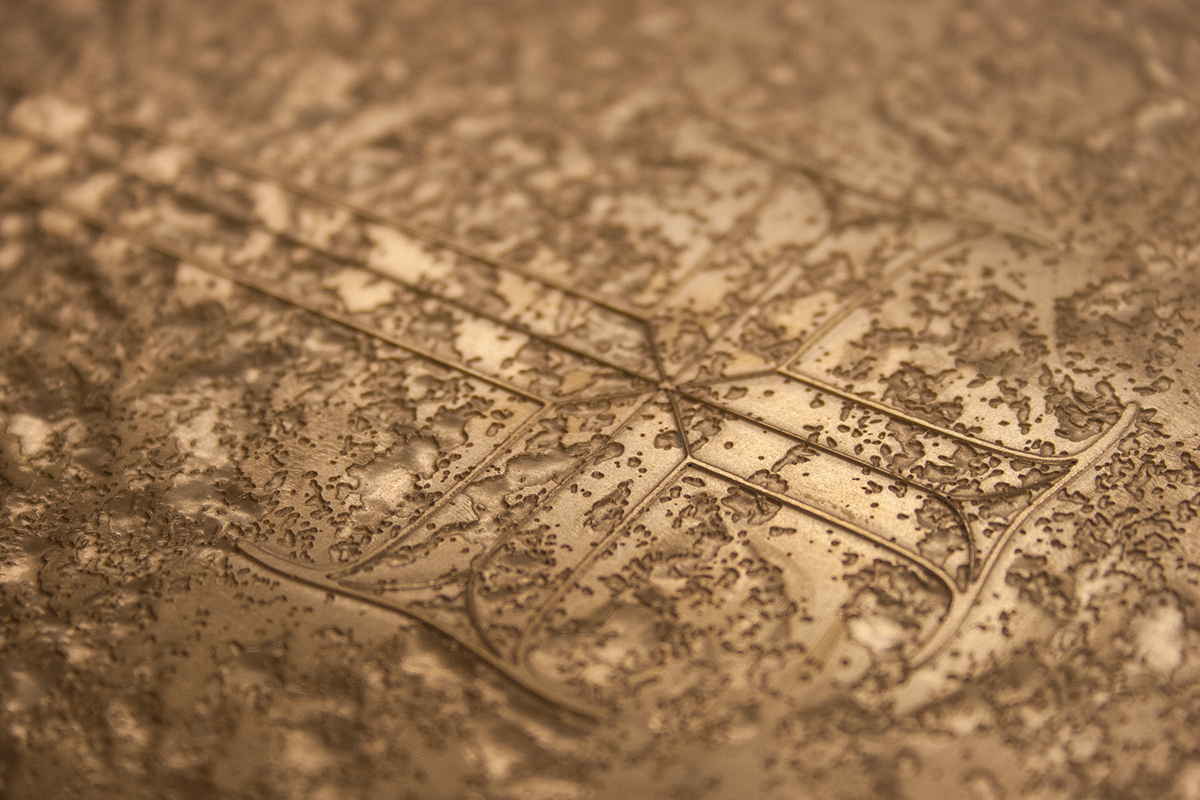
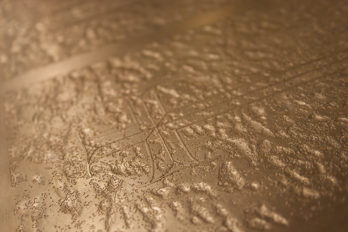
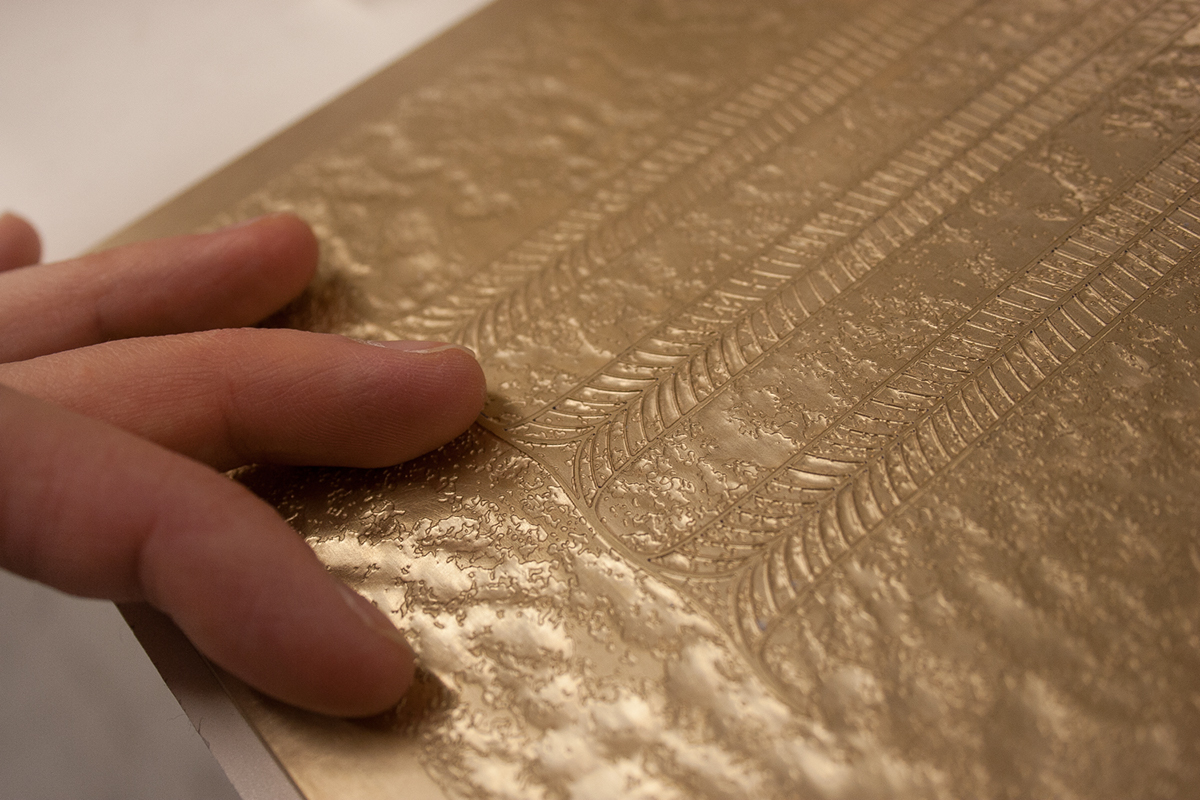
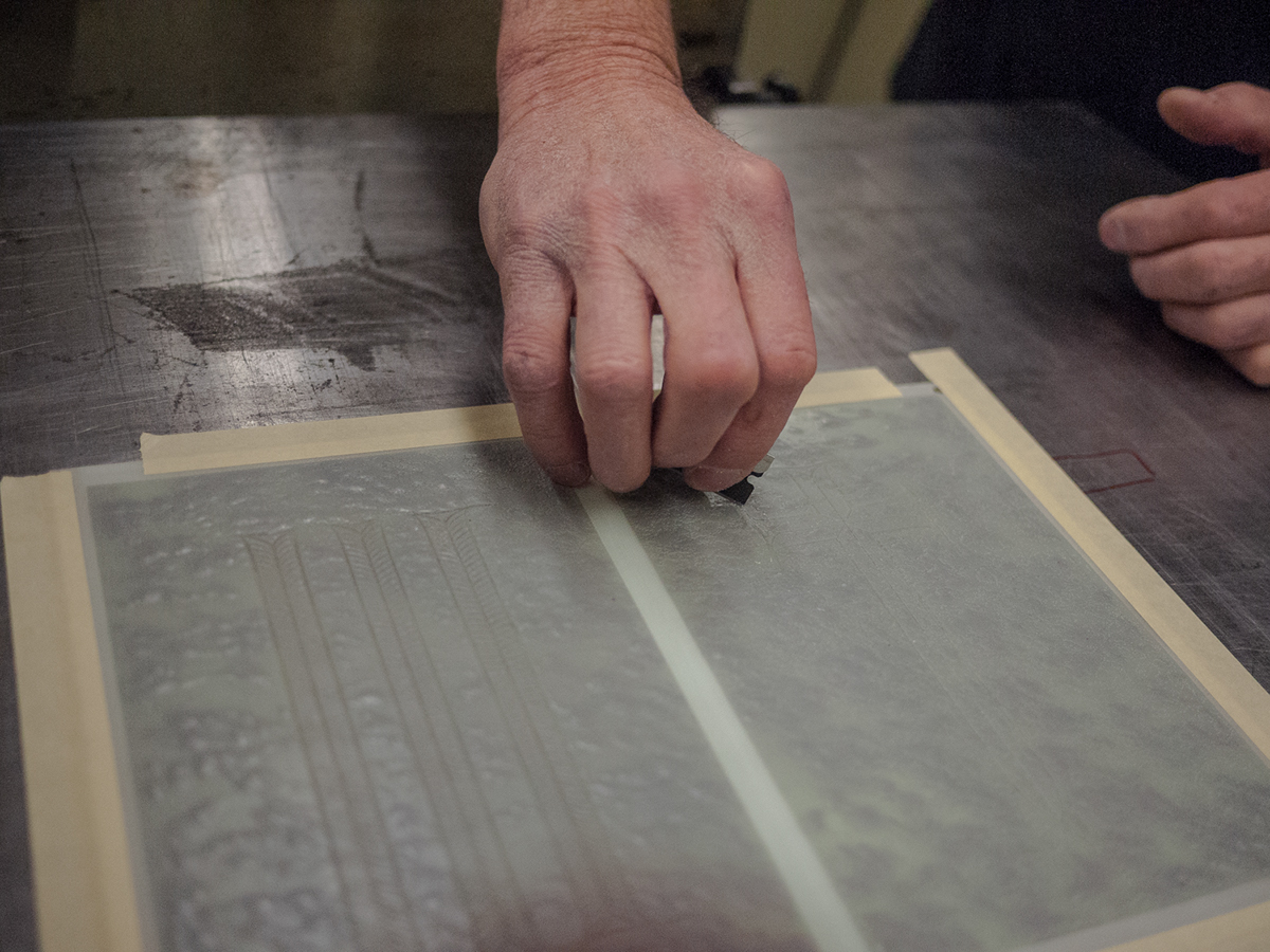
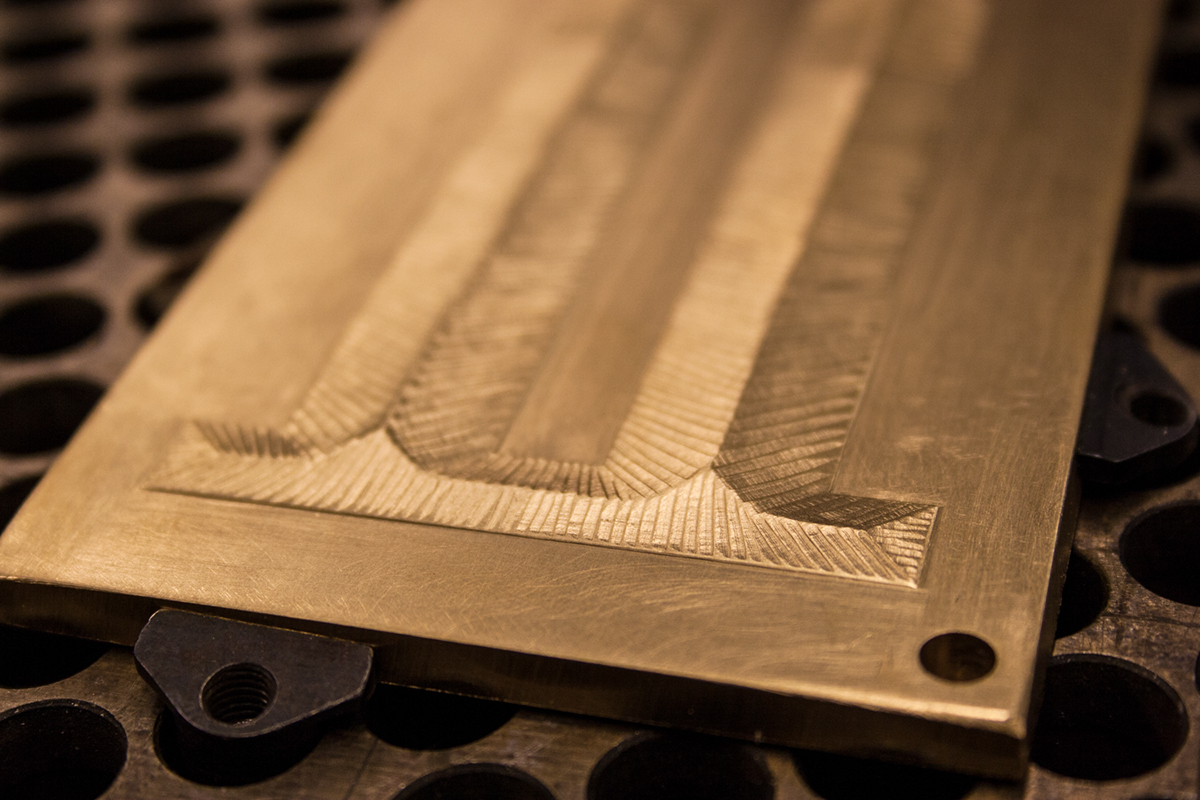
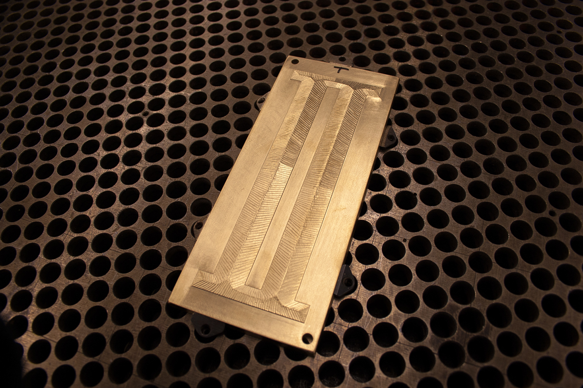
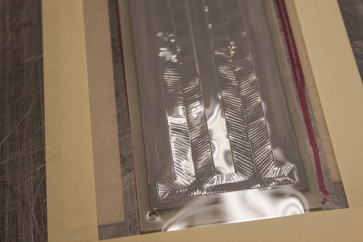
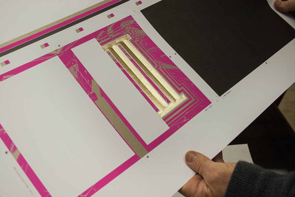
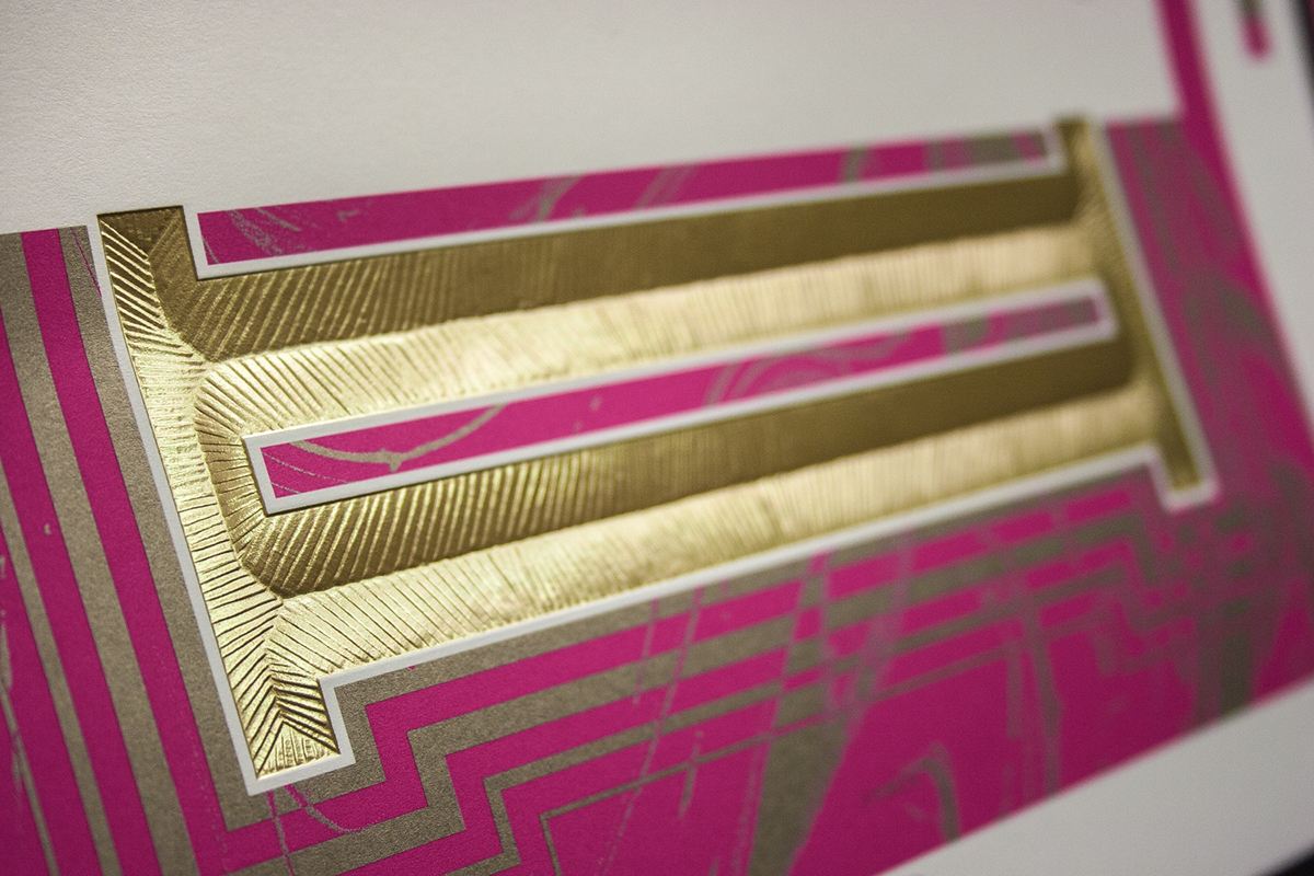
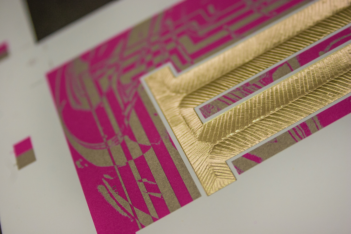
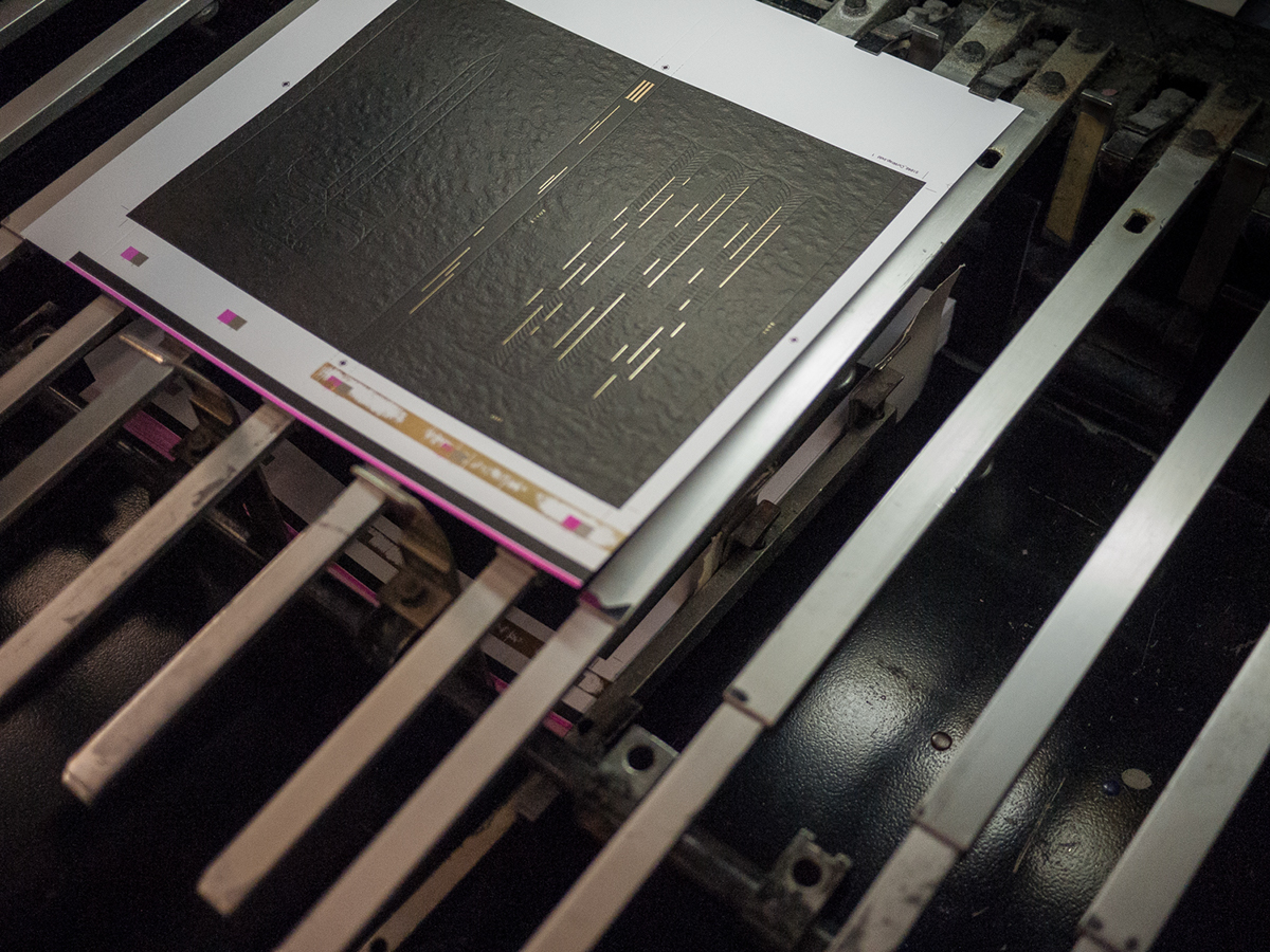
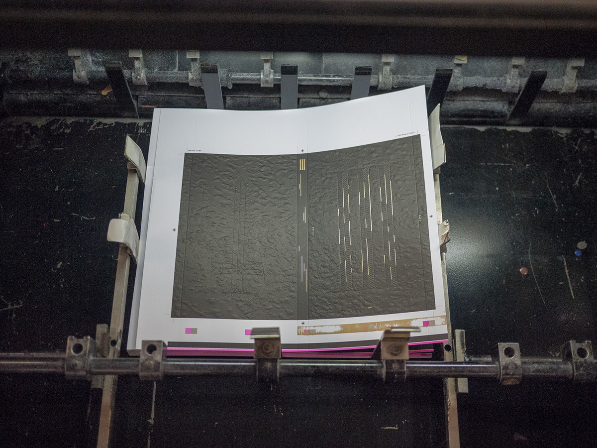
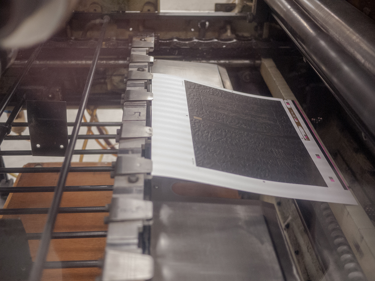
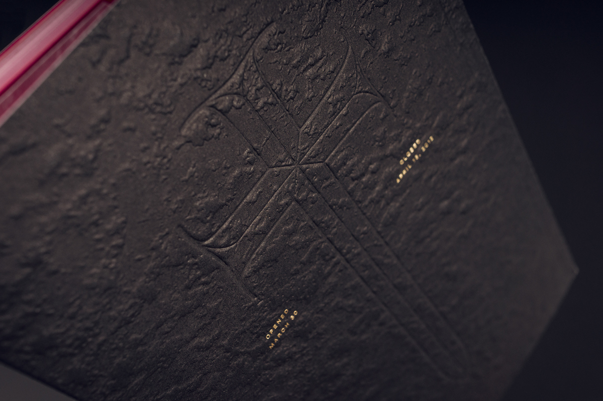
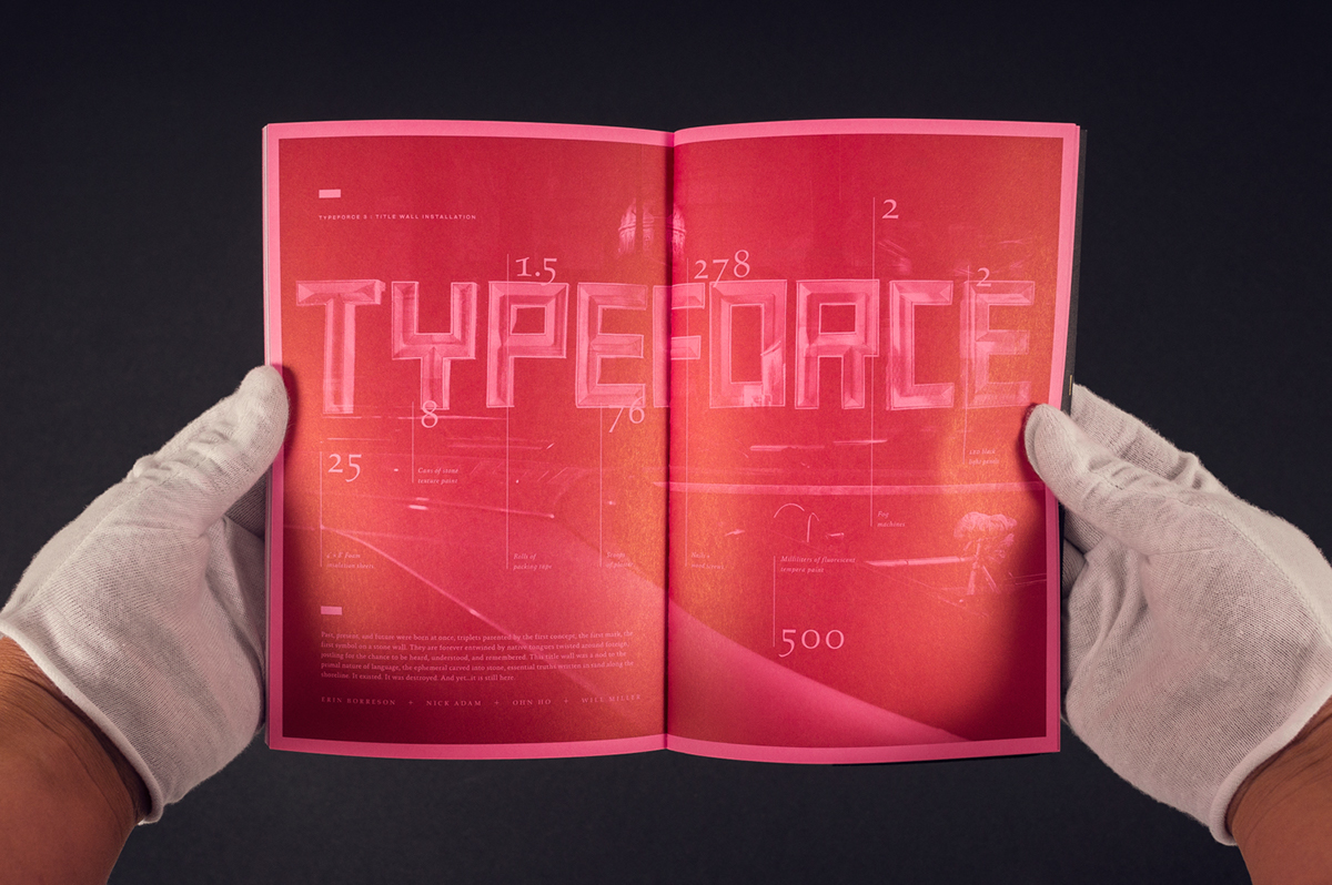
From the cracking open of the stone wrap to the vibrant interior, this catalog is a sensory adventure. To produce the piece, we worked to push the power of paper and teamwork to it’s limits. The hand-affixed wrap was created with a custom tooled plate to simulate the feel of rough stone. Within the wrap small striations and type details are gold foil stamped hinting towards emerging talent and discovery while blind embossed forms depicted an inscriptional numeral III.
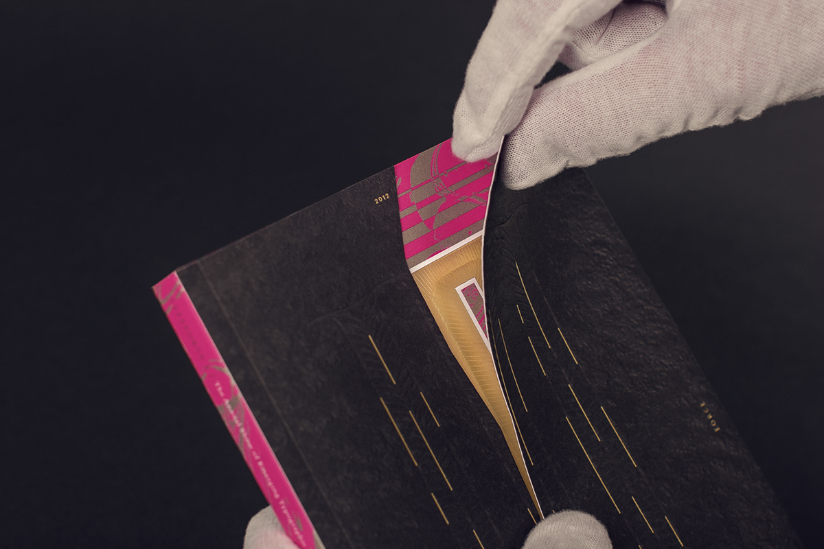
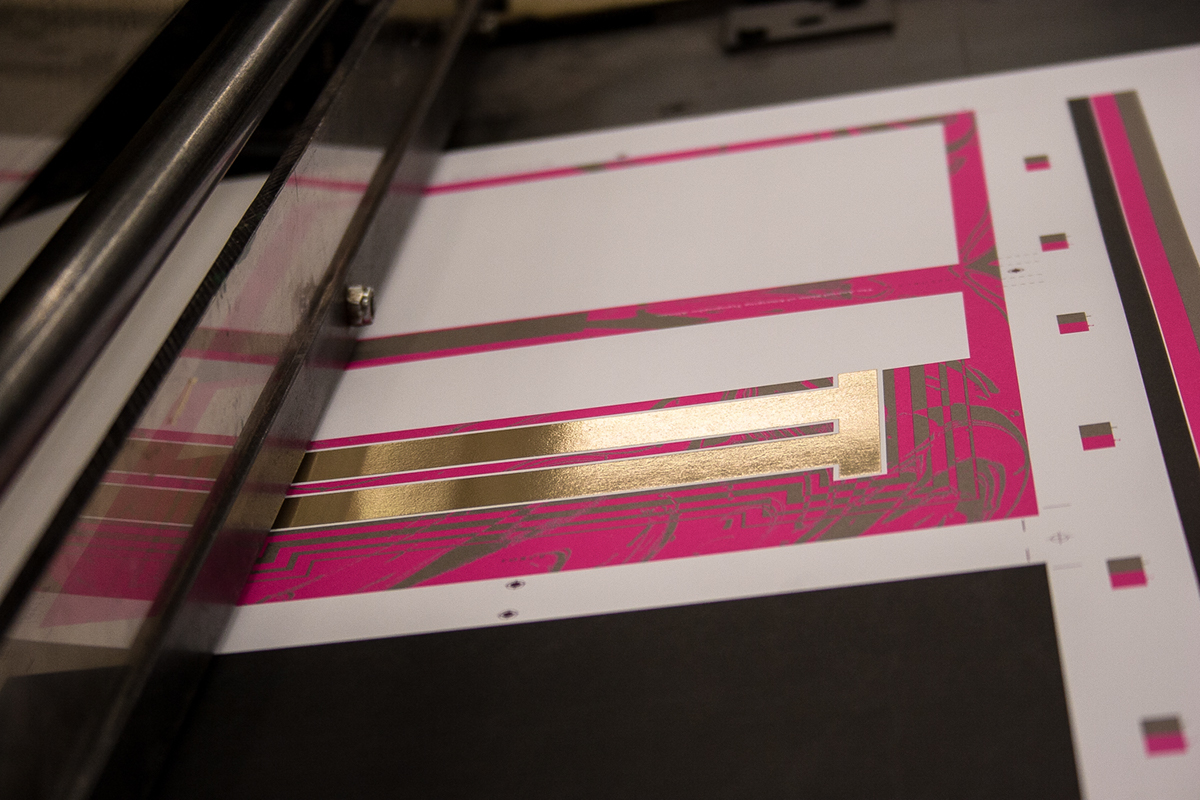
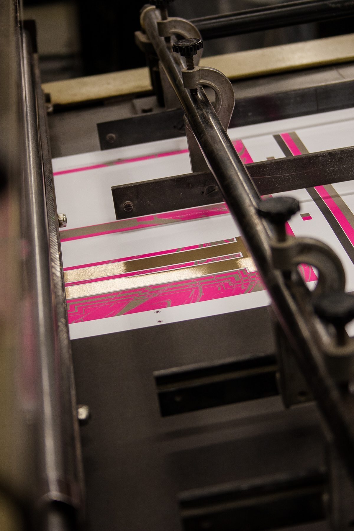
To open the book a reader cracks the cover down the center, this is aided by strategically placed die cuts. This cracking reveals the true cover and a powerful moment where solid gold foil is hit with a hand-tooled plate illustrating the proper technique of letter forms chiseled into stone, the metallic and fluorescent inks display a reverberated reflection.
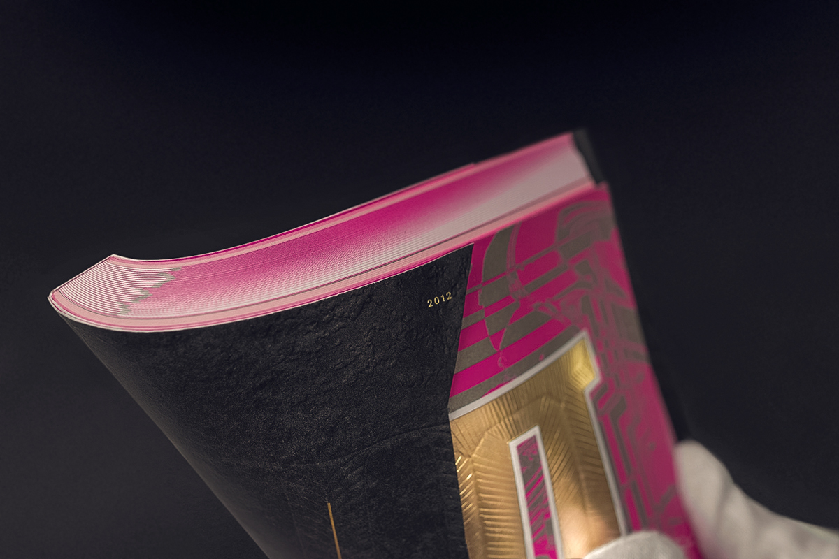
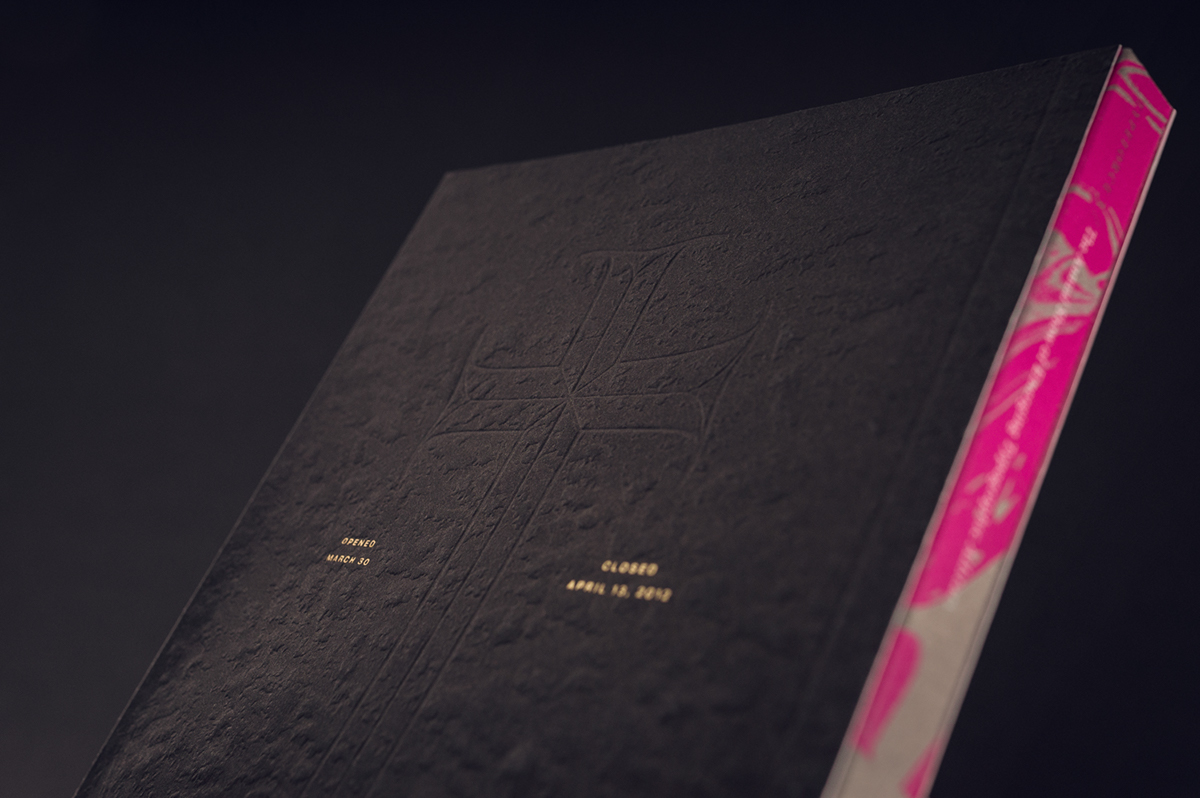

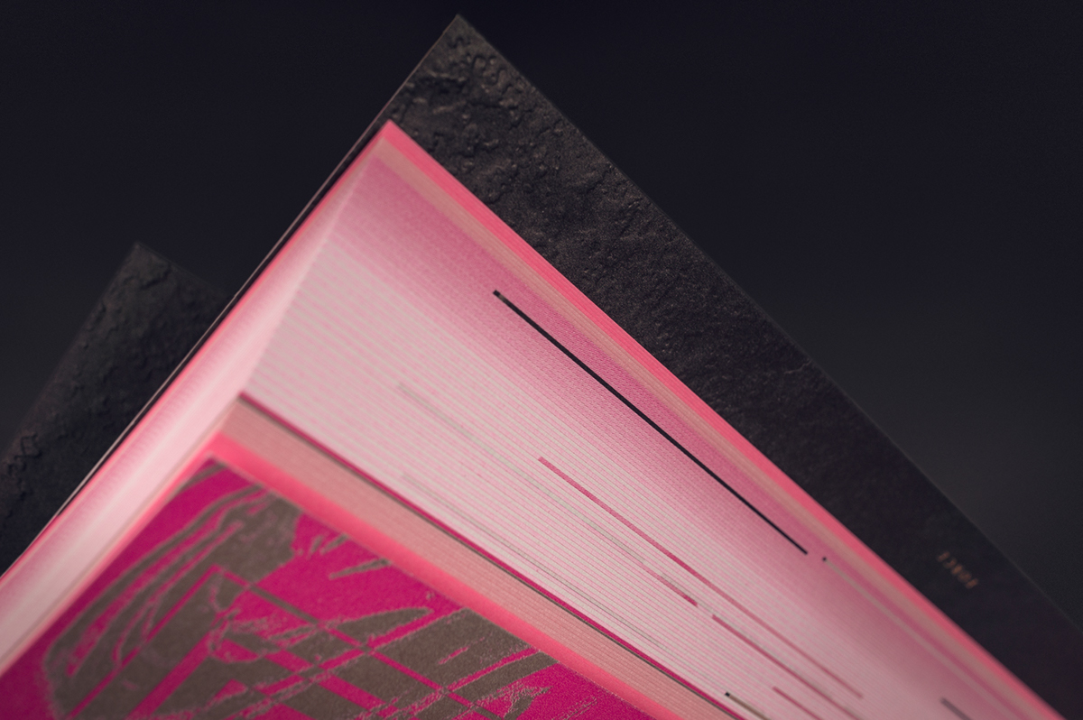
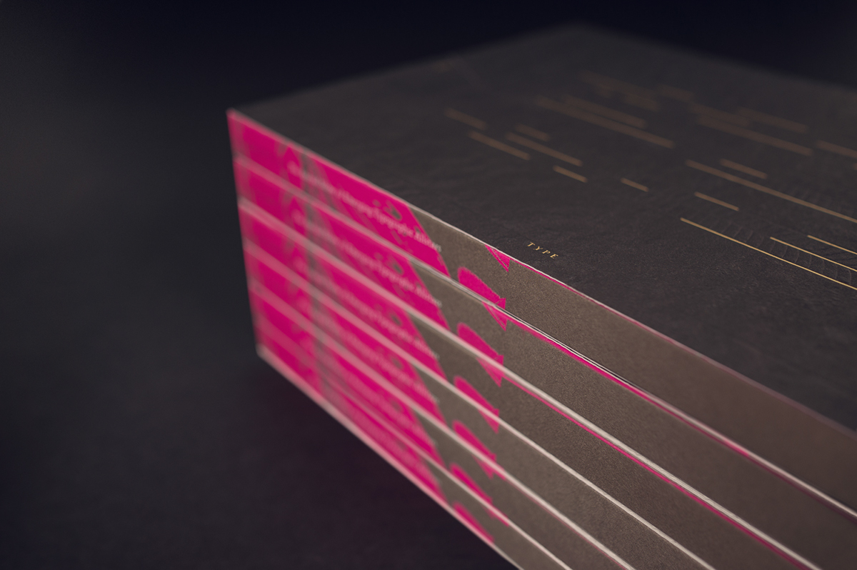
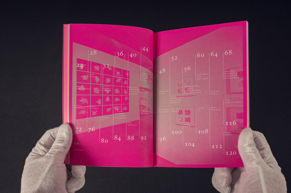
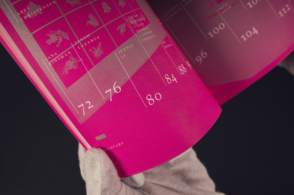
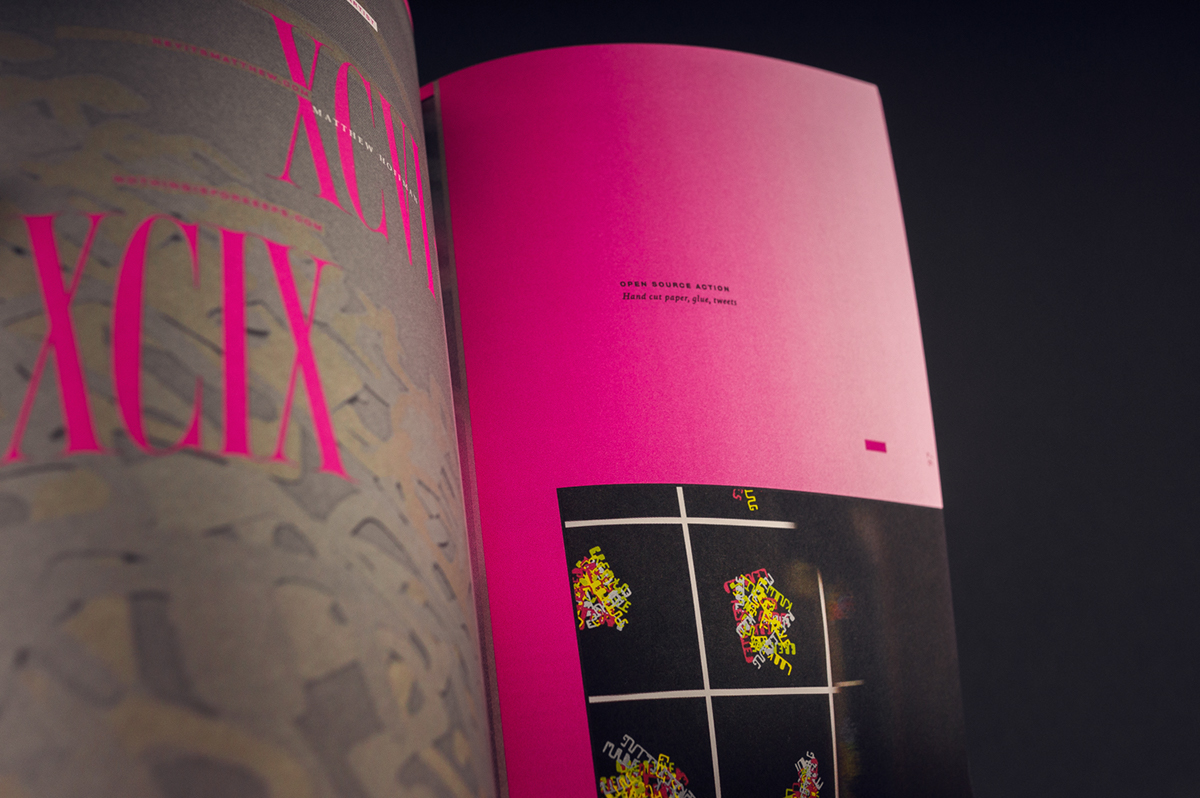
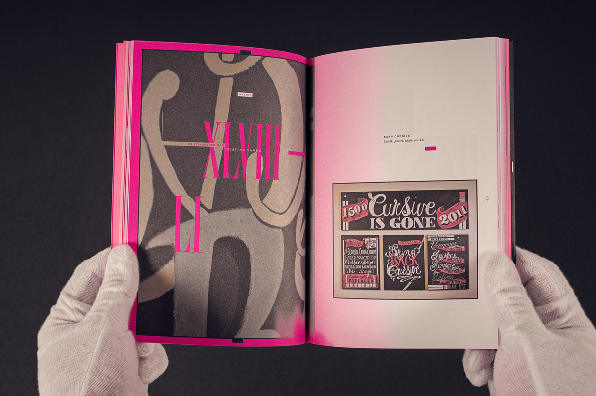
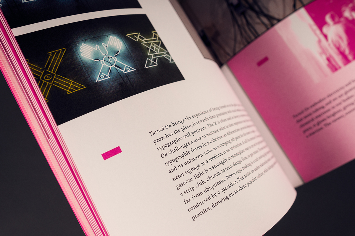
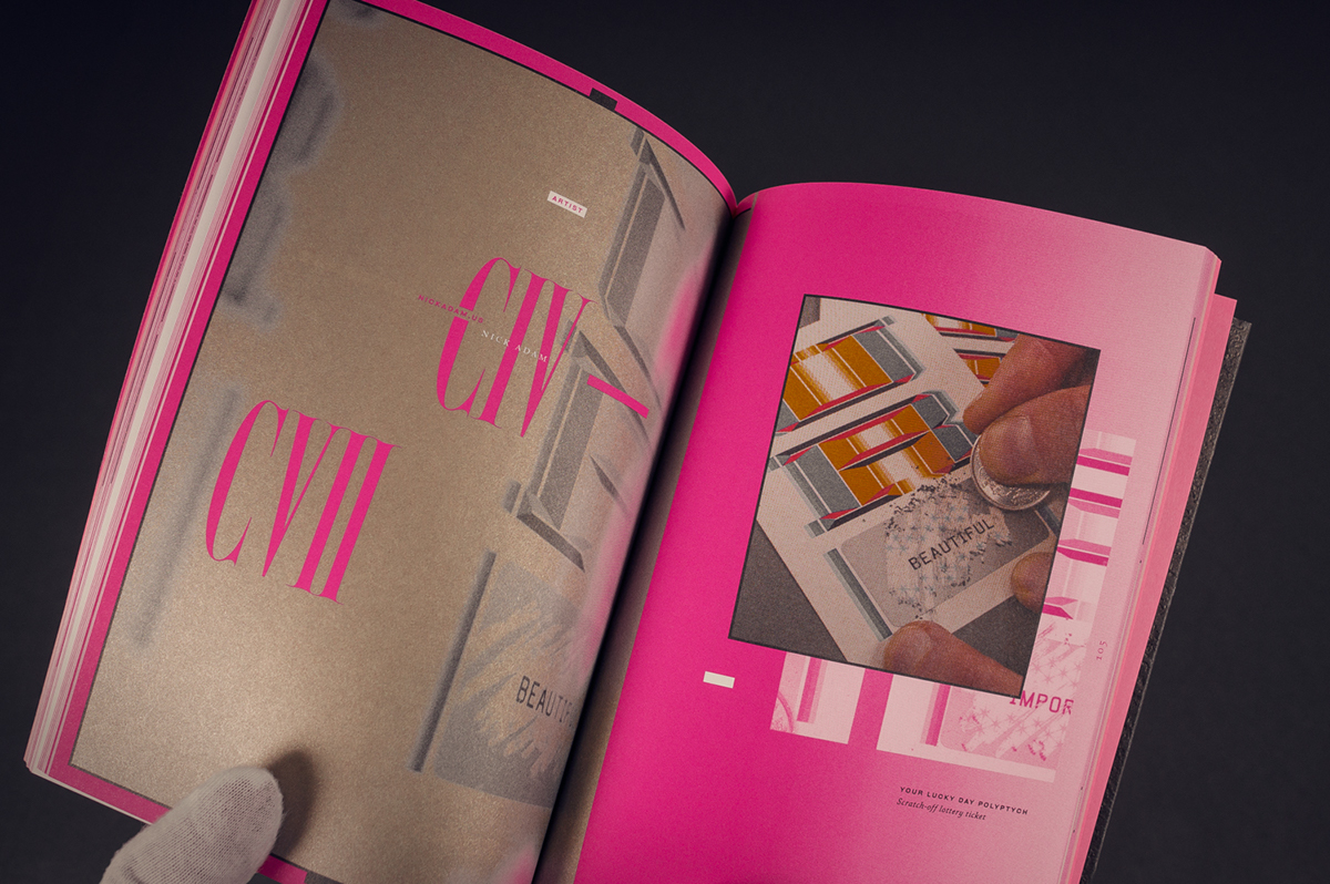
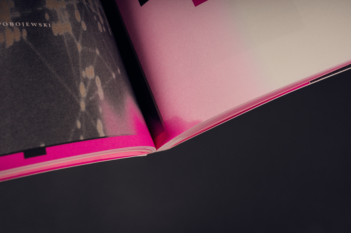
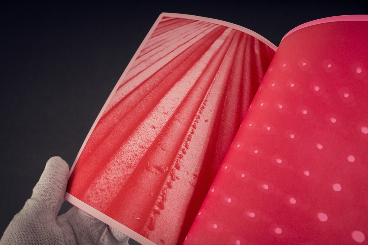
The interior is paginated by content types, using multiple paper stocks gives visual cues guiding the reader across sections.
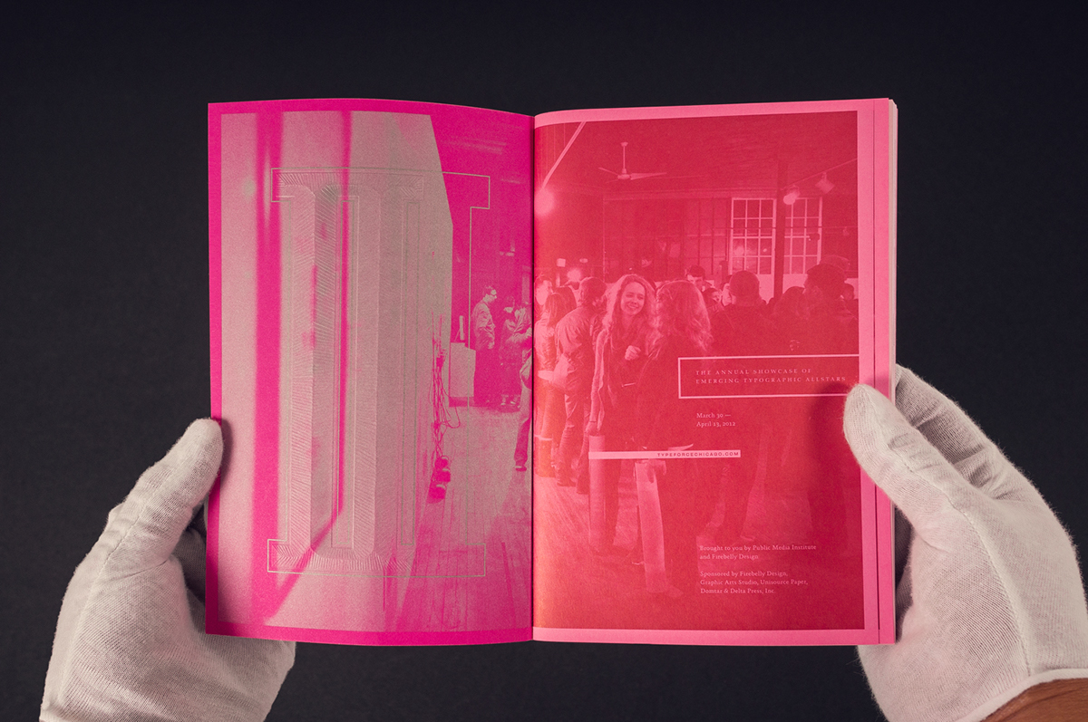
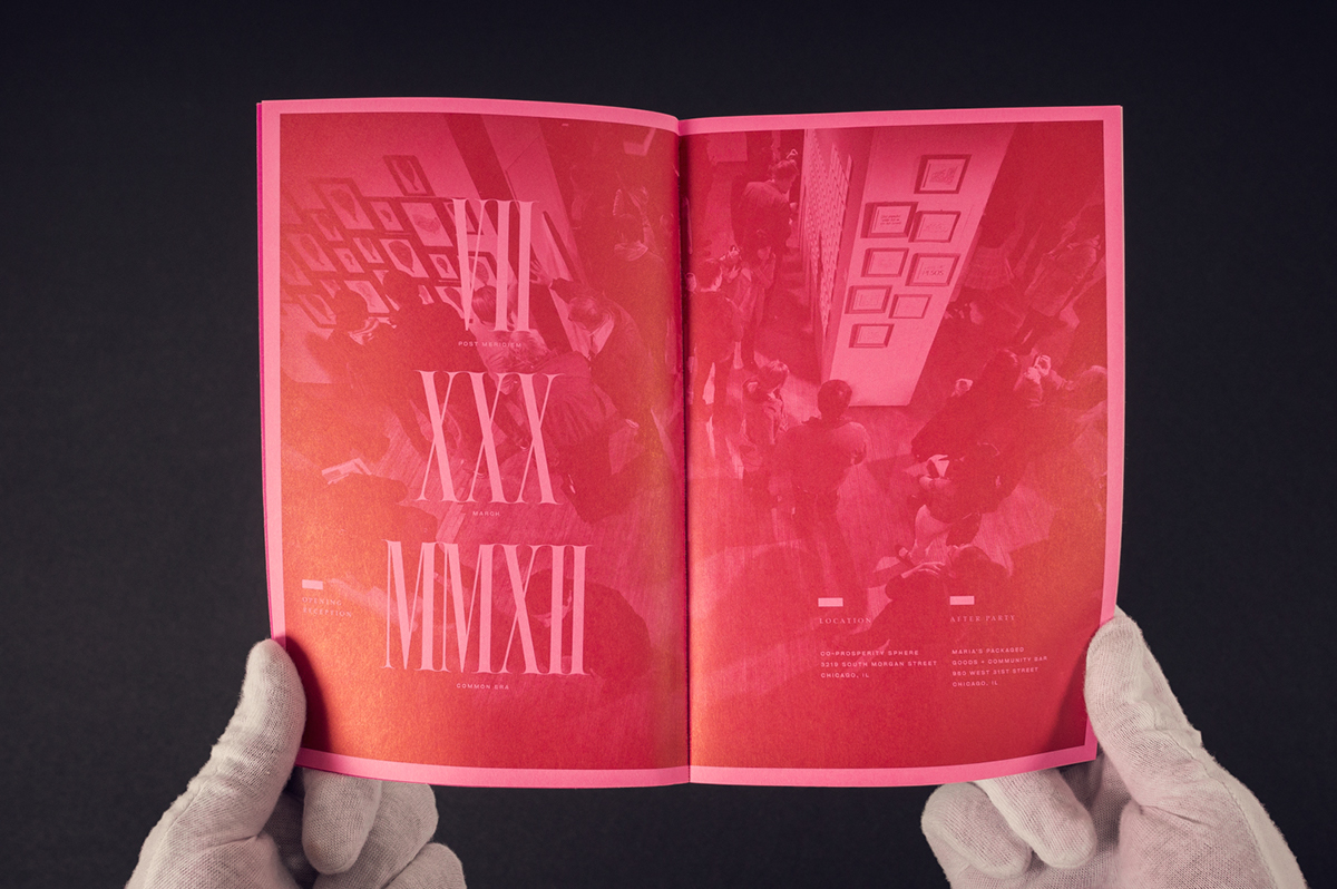

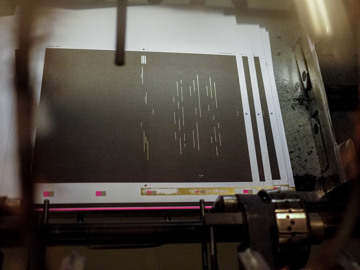
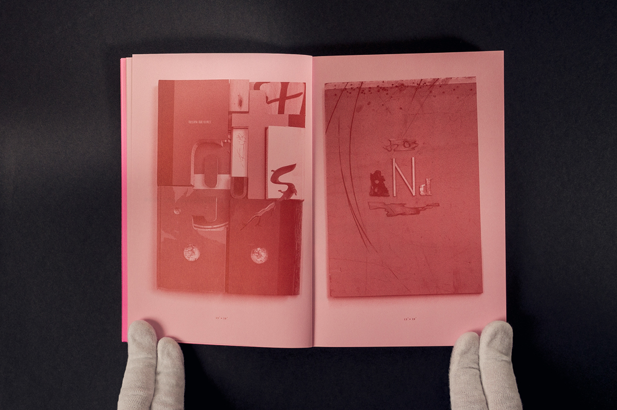
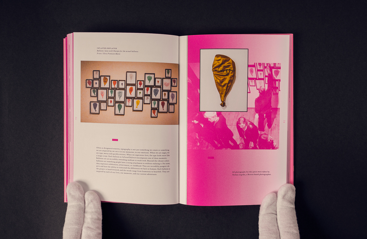
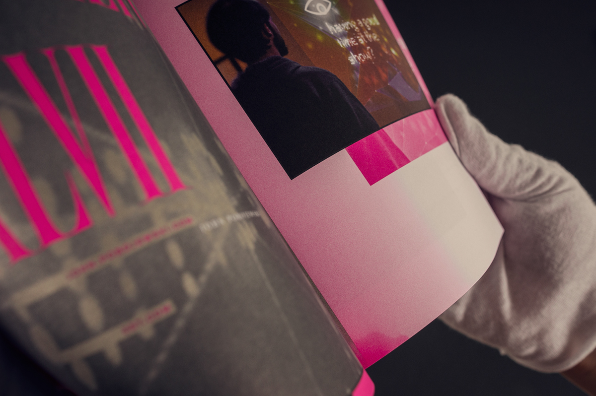
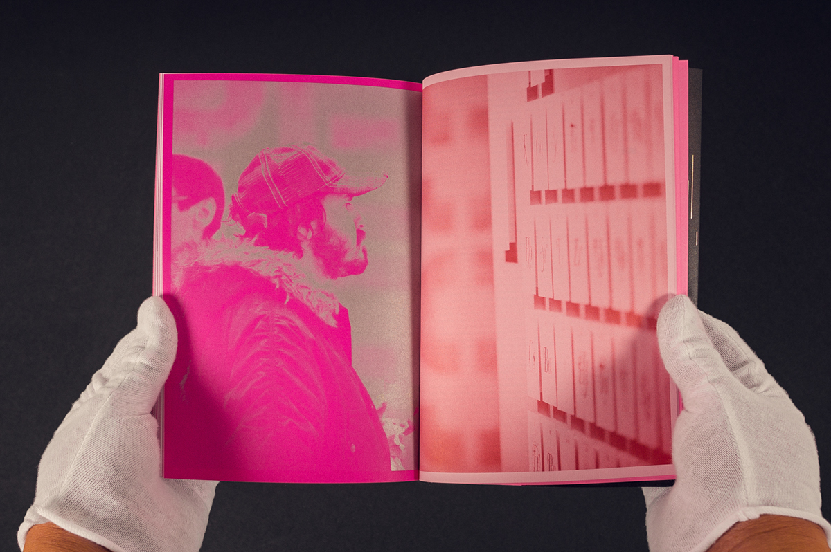
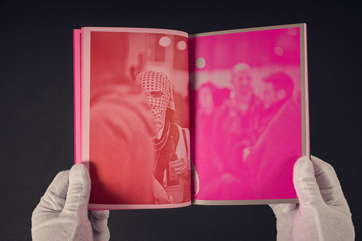
Aside from the metallic and flourscent spot colors we used three different CMYK mixes to ensure our reds were identical across the three paper types. Photography from the opening reception alongside images of the artists’ works displayed the exhibit in it's entirety. A custom numeral set to lead off artist title introductions and announce page numbers. Being inspired by carved traditional forms achieving hairline, this font became lovingly known as “Hard Times”.


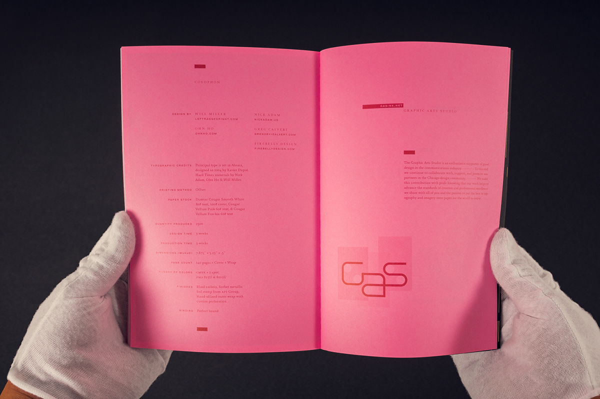

Production Details