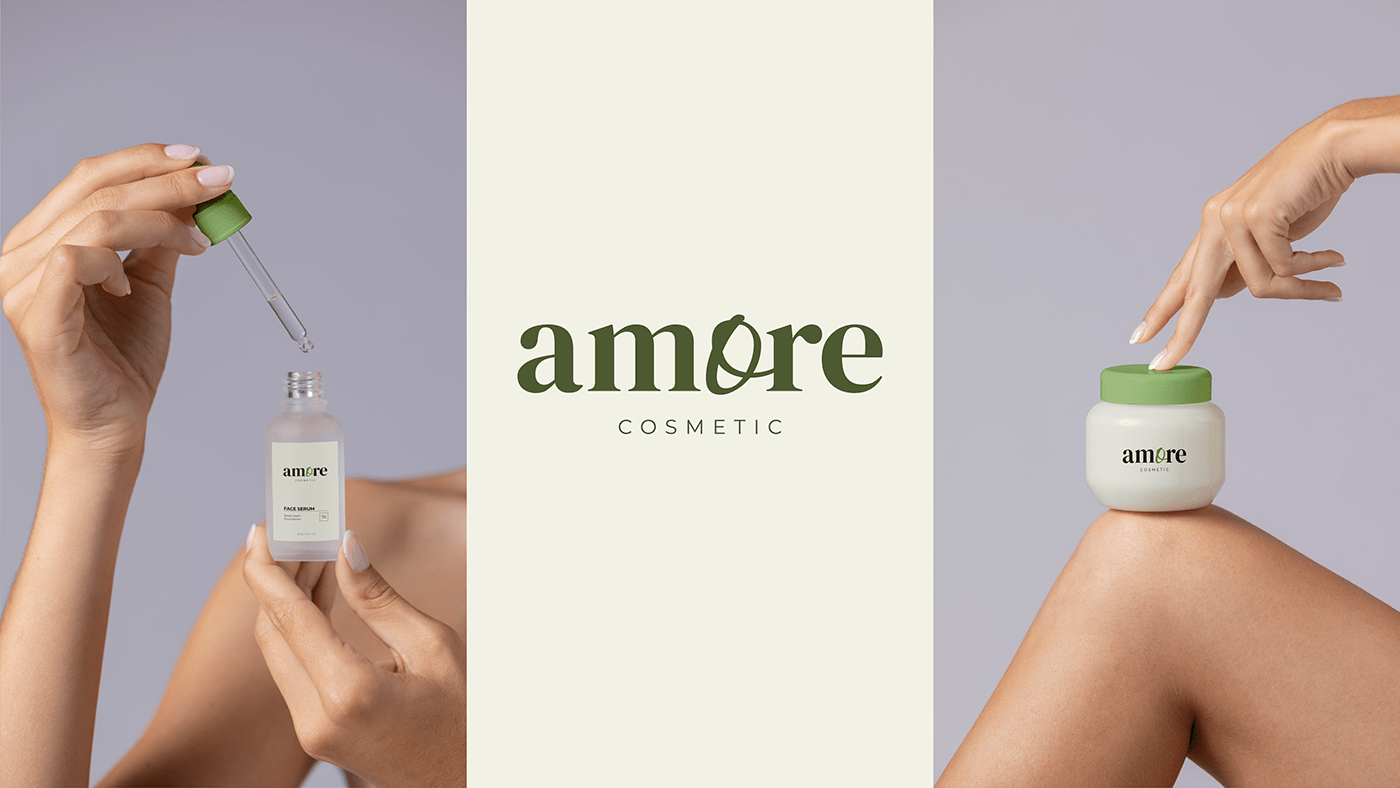
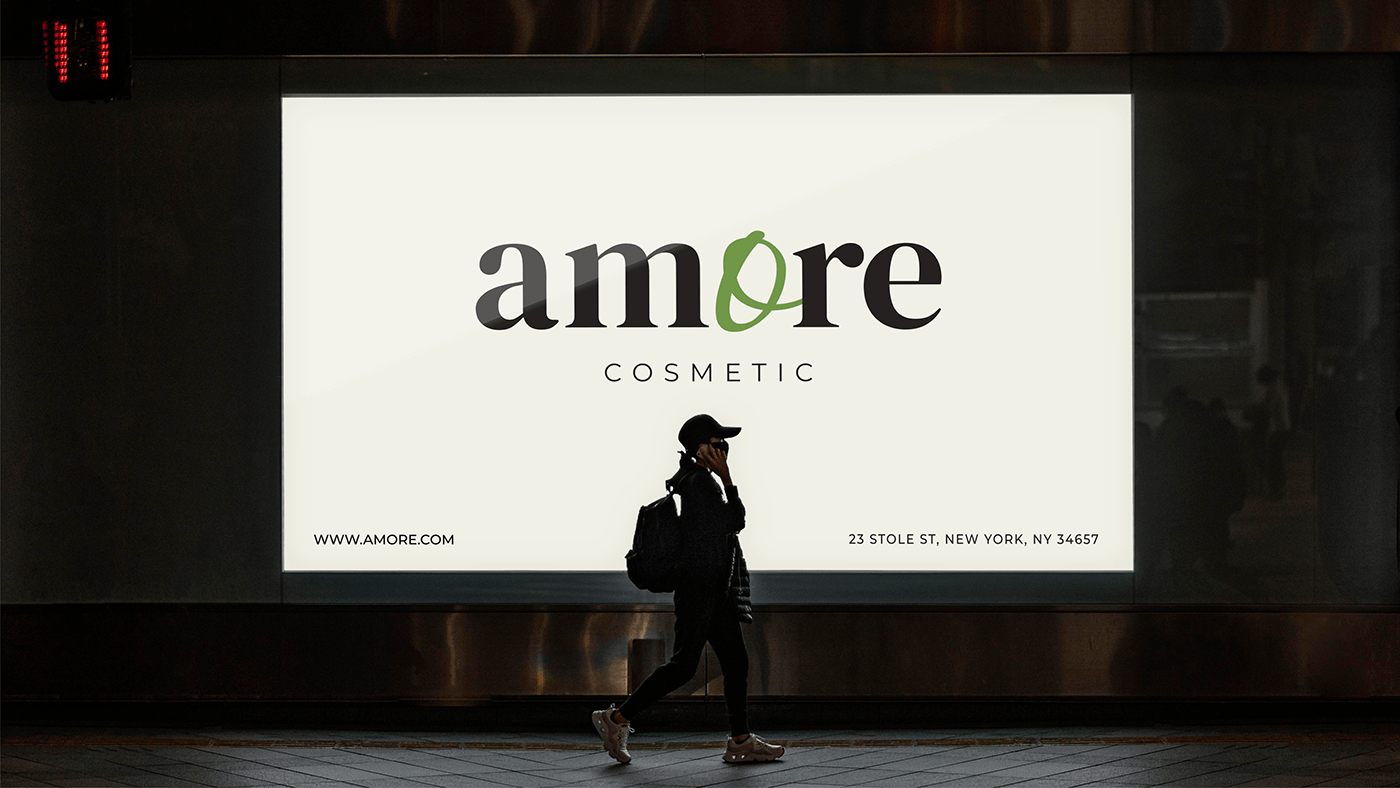
Что за проект?
Amore - это магазин натуральной косметики. Тут продают товары для лица и тела. Клиент хотел элегантный, но в то же время строгий логотип.
What is the project?
Amore is a natural cosmetics store. They sell products for the face and body. The client wanted an elegant, but at the same time strict logo.

Был разработан шрифтовой логотип. Основной шрифт DM Serif Display придает логотипу элегантности и строгости. Но буква "о" использована из другого шрифта - Aquarelle Regular.
Ее рукописное начертание придает логотипу легкость и натуральность. А так же завиток в этой букве намекает нам на текстуру продукции, производимой этим брендом (крема, шампуни и т.д.).
A font logo was designed. The main font gives the logo elegance and rigor. But the letter "o" is used from another font - Aquarelle Regular. Its handwritten style gives the logo a lightness and naturalness. And also the curl in this letter hints at the texture of the products produced by this brand (creams, shampoos, etc.).