


КАНТЕЛЕ. ФИРМЕННЫЙ СТИЛЬ ТУРИСТИЧЕСКОЙ БАЗЫ В КАРЕЛИИ
В основе концепции айдентики данной туристической базы лежит идея погрузить посетителей в историю и культуру региона, дать возможность проникнуться эстетикой древних традиций и преданий, сохранившихся до наших дней.
Так, фирменный знак напоминает архаичный карело-финский музыкальный инструмент – кантеле, давший название самой базе. С незапамятных времен кантеле занимает важное место в жизни местных жителей, из-за чего его значение выходит далеко за рамки понятия музыкального инструмента. Сейчас это символ, объединяющий в себе такие понятия, как культура, трудовая деятельность и историческое развитие многих поколений представителей северных народов этих территорий.
KANTELE. CORPORATE IDENTITY OF THE CAMPSITE
The concept of the identity of this tourist base is based on the idea of immersing visitors in the history and culture of the region, giving them the opportunity to feel the aesthetics of ancient traditions and legends that have survived to the present day.
So, the brand name resembles an archaic Karelo-Finnish musical instrument – the kantele, which gave the name to the base itself. Since time immemorial, the kantele has occupied an important place in the lives of local residents, which is why its significance goes far beyond the concept of a musical instrument. Now it is a symbol that combines such concepts as culture, labor activity and the historical development of many generations of representatives of the northern peoples of these territories.

Легенда о создании этого музыкального инструмента сохранилась в карело-финском эпосе «Калевала», в котором кантеле выступает как звучащий символ культуры Северного края. Своей музыкой этот самобытный инструмент с многовековой историей притягивает к себе всех живых существ, некоторые образы которых станут элементами фирменной графики.
Для шрифтового блока вдохновением послужили древние руны стран Скандинавии
и Северной Германии, исследовались разнообразные бумажные, каменные и пергаментные носители этого вида письменности. Здесь было важно добиться хорошей читабельности, несмотря на декоративность проектируемого шрифта. При этом стилистика выполнения шрифтового блока не должна была вступать в спор с изображением иконического знака.
The legend of the creation of this musical instrument has been preserved in the Karelo-Finnish epic "Kalevala", in which the kantele acts as a sounding symbol of the culture of the Northern Region. With its music, this original instrument with a centuries-old history attracts all living beings, some of whose images will become elements of branded graphics.
The font block was inspired by the ancient runes of the Scandinavian countries and in Northern Germany, various paper, stone and parchment carriers of this type of writing were studied. It was important to achieve good readability here, despite the decorative nature of the designed font. At the same time, the style of execution of the font block should not have entered into a dispute with the image of the iconic sign.

Выбранная графическая константа была отстроена по модульной сетке. За единицу модульной сетки построения фирменного знака была принята толщина вертикальных буквенных элементов. Чтобы константа смотрелась гармонично, построение графем велось параллельно с построением знака, дорабатывались детали, визуально дополняющие друг друга. Так оси эллипсов, применяемых при построении иконического знака, рефлексируют
с осями построения букв логотипа. Также в знаке перекликаются толщины, округлые
и скошенные элементы, что создает гармоничное взаимодействие всех его элементов.
The selected graphic constant was built according to a modular grid. The thickness of the vertical letter elements was taken as a unit of the modular grid for building a brand name. In order for the constant to look harmonious, grapheme construction was carried out in parallel with the construction of the sign, details that visually complement each other were refined. So the axes
of the ellipses used in the construction of the iconic sign reflect with the axes of the construction of the letters of the logo. Thicknesses, rounded and beveled elements also echo in the sign, which creates a harmonious interaction of all its elements.

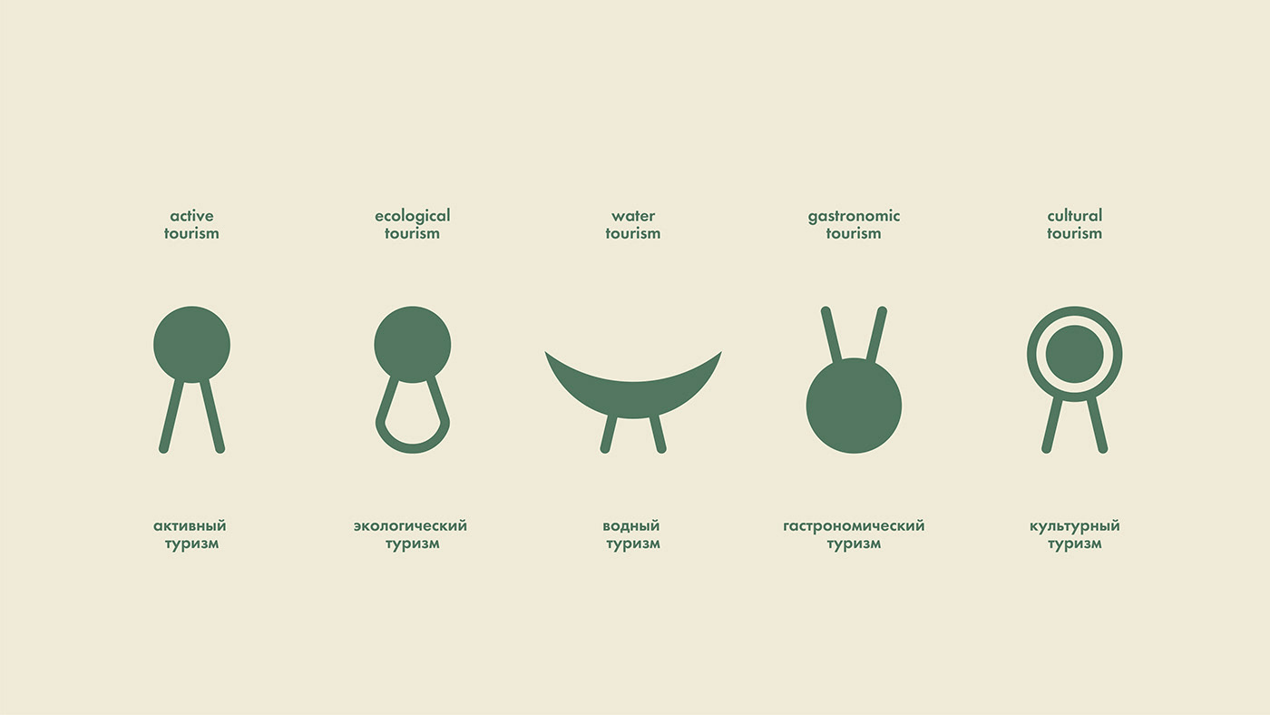
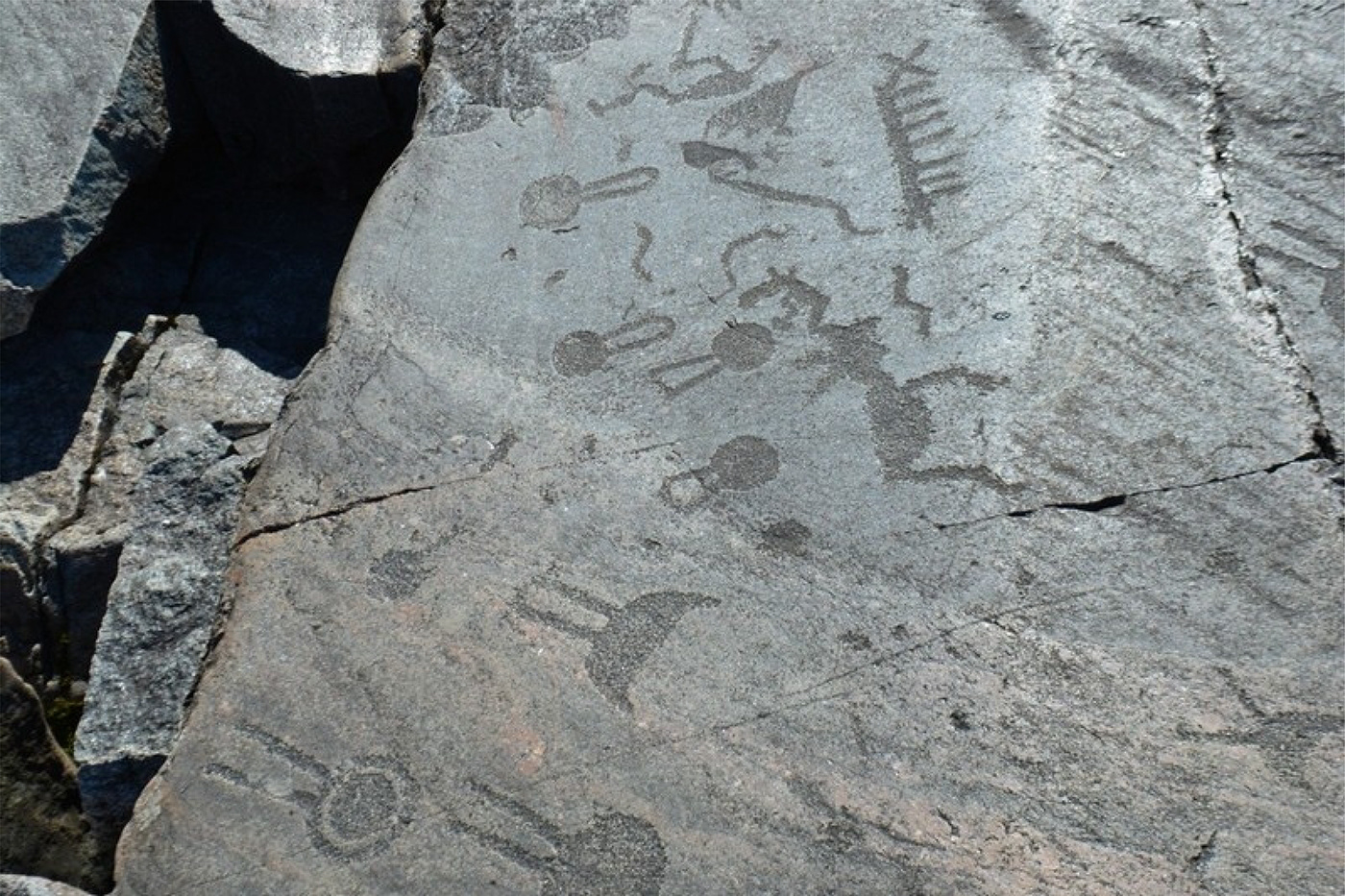
Минималистичные графические элементы вдохновлены наскальными изображениями карельских петроглифов. Спроектированные знаки символизируют виды туризма, характерные для данной локации, а именно: активный, экологический, водный, гастрономический и культурно-познавательный.
The minimalistic graphic elements are inspired by rock carvings of Karelian petroglyphs. The designed signs symbolize the types of tourism characteristic of this location, namely: active, ecological, aquatic, gastronomic and cultural-educational.

Поиск фирменной цветовой гаммы было принято начать с составления мудборда, содержащего фотографии локации, на которой расположена туристическая база, и передающего цвета, характерные для этой местности в разное время суток. Таким образом были выявлены сине-зеленый оттенок лесной хвои и серо-бежевый оттенок, почти белый, с налетом архаичности, одновременно отсылающий к побережьям карельской территории, оттенку прожилок рускеальского мрамора, визитной карточки Карелии, а также к цвету льняных тканей, характерных для этнических элементов здешних народностей.
It was decided to start the search for a corporate color scheme by compiling a moodboard containing photos of the location where the tourist base is located and transmitting colors characteristic of this area at different times of the day. Thus, a blue-green shade of forest needles and a gray-beige shade, almost white, with a touch of archaism, were revealed, at the same time referring to the coasts of the Karelian territory, the shade of the veins of Ruskeala marble, the business card of Karelia, as well as to the color of linen fabrics characteristic of the ethnic elements of the local nationalities.


Выбранная стилистика графического языка была вдохновлена лаконичной выразительностью архитектурных элементов эпохи Северного модерна, образцы которой можно встретить на улицах Выборга и в городах Финляндии. Также на фирменную графику было спроецировано впечатление от эстетики скандинавского графического дизайна.
The chosen style of the graphic language was inspired by the laconic expressiveness
of the architectural elements of the Northern Art Nouveau era, samples of which can be found
on the streets of Vyborg and in the cities of Finland. Also, the impression of the aesthetics
on the streets of Vyborg and in the cities of Finland. Also, the impression of the aesthetics
of Scandinavian graphic design was projected on the corporate graphics.

Одной из акцентных идей концепции была мысль объединить богатые историко-культурные пласты территории, на которой располагается выбранная туристическая база, в следствие чего эскизные поиски продолжались до тех пор, пока не была создана серия изображений, близкая по стилистике к изысканной лаконичности барельефов Северного модерна
и графики скандинавского дизайна.
One of the accent ideas of the concept was the idea to combine the rich historical and cultural layers of the territory on which the selected tourist base is located, as a result of which the sketch searches continued until a series of images was created, close in style to the exquisite conciseness
of the bas-reliefs of Northern Art Nouveau and Scandinavian design graphics.

Однако изображения животных имеют двойственное значение. С одной стороны, это тотемные животные, которых почитали древние жители этих территорий, с другой – персонажи из карело-финского эпоса «Калевала», пришедшие на звук игры кантеле.
However, images of animals have a dual meaning. On the one hand, these are totemic animals that were revered by the ancient inhabitants of these territories, on the other – characters from the Karelo-Finnish epic "Kalevala", who came to the sound of kantele playing.

Так фирменная графика погружает посетителей в историю и культуру региона, предоставляет возможность проникнуться эстетикой древних традиций и преданий, сохранившихся до наших дней.
So branded graphics immerses visitors in the history and culture of the region, provides
an opportunity to feel the aesthetics of ancient traditions and legends that have survived
to the present day.


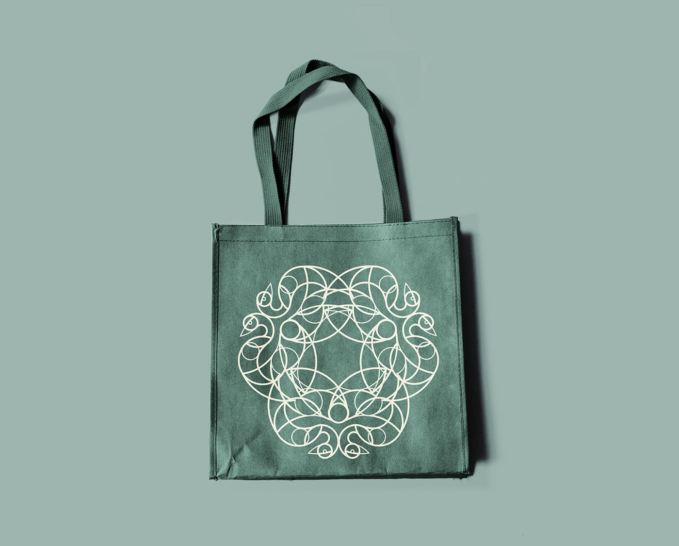

Разработанные элементы фирменной графики, проявляют себя в разных аспектах фирменного стиля. Лаконичные петроглифы деликатно вписываются в корпоративный набор туристической базы. В то же время стилизованные изображения животных становятся основой для оформления сувенирной продукции и фирменных постеров.
The developed elements of corporate graphics manifest themselves in various aspects
of corporate identity. Laconic petroglyphs delicately fit into the corporate set of the tourist base.
At the same time, stylized images of animals become the basis for the design of souvenirs
and branded posters.


