

JIFF (JEONJU Intl. Film Festival) Branding and Digital Design Renewal | April. 2022
Brand Overview
JEONJU Intl. Film Fetival respects the diversity of vision, embraces segmented tastes, and supports freedom of expression without any external pressure. And The JIFF introduces alternative trends in contemporary film art, works at the forefront of independent and experimental films, discovers future filmmakers' talents, and provides opportunities for film writers from all over the world to meet and unite. The JIFF is held every year, starting with the first festival in 2000. It is currently an ongoing film festival that is becoming an international film festival beyond Asia.
The copyright of all movie images used belongs to JEONJU Intl. Film Festival.

Project Goal
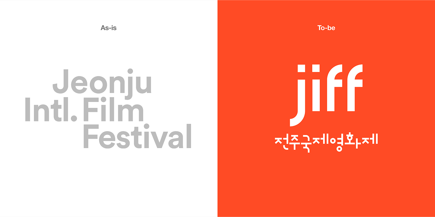
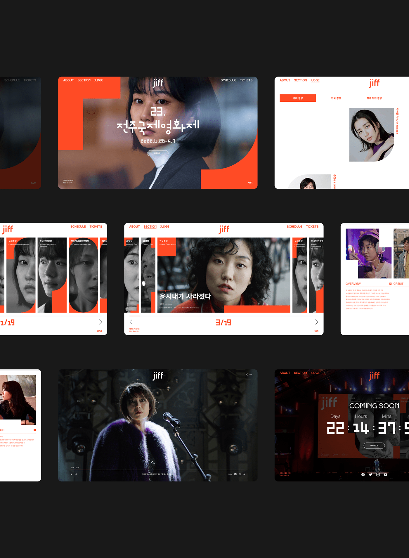
We want to create Korean and English fonts and use them to express our typography-based brand identity. We used typography to create wordmarks that can be used in a variety of environments, and used them to build the identity of the festival while designing a landing page for ticket sales and promotion of the festival.
Design Concept
The ideology of the film festival was embodied as a motif and applied to the brand identity. The three motifs were derived from the square frames of various proportions in the movie, the focus of the viewfinder focusing on individual objects, and the prototype of the camera lens that captures various viewpoints freely. And this was used to develop a production typeface and brand identity.


Brand Color
The main color ‘JIFF Orange’ is a color that symbolizes the diversity of perspectives that JIFF pursues in films and the freedom of expression of film creators. By using ‘JIFF Orange’ together with the sub-colors Black/White/Gray, a strong contrast was made to increase visual perception in both online and offline environments.

Typography
Helvetica Neue, a concise and clear English typeface, and Yoon Gothic 700, a Korean typeface, are used for high readability and easy information delivery when used with the jiff-specific font created by applying the design concept.


Key Visual
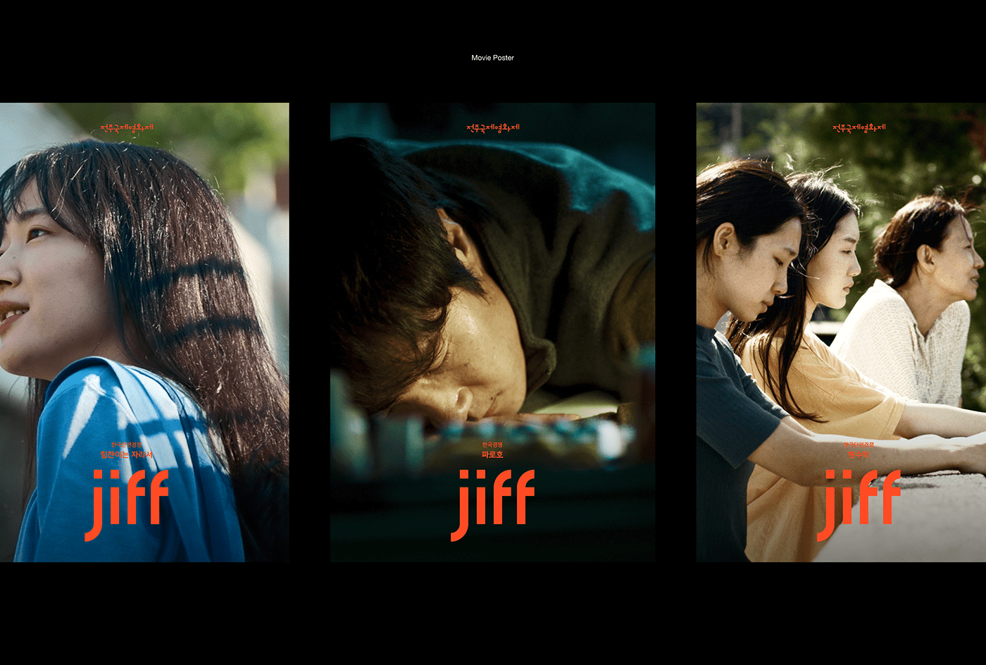
The key visual of jiff is a graphic element that is applied to the expansion in various media of jiff by utilizing the motifs (square, curve, circle) applied to the brand wordmark production. Key visuals are combined with videos and photos in the UI environment of the online platform to expand into various interactive elements, and are also applied to various applications on the offline platform.


Brand Overview
전주국제영화제는 시각의 다양성을 존중하고, 분화된 취향을 수용하며 어떠한 외압에도 흔들림 없이 표현의 자유를 지지해온 영화제입니다.
전주국제영화제는 동시대 영화예술의 대안적 흐름과 독립•실험영화의 최전선에 놓인 작품들을 소개하고, 미래 영화인들의 재능을 발굴하며, 전 세계 영화 작가들이 만나고 연대하는 기회를 제공합니다. 전주국제영화제는 2000년 제1회를 시작으로 매년 개최되고 있으며, 아시아를 넘어 국제적인 영화제로 발돋움 중인 현재 진행형 영화제입니다.
모든 영화 이미지의 저작권은 전주국제영화제에 있습니다.
-
Project Goal
국문•영문 서체를 제작하고, 이를 활용하여 타이포그래피 기반의 브랜드 아이덴티티로 표현하고자 합니다. 타이포그래피를 활용해 다양한 환경에서 쓰일 수 있는 워드마크를 제작했고,
이를 활용하여 페스티벌의 아이덴티티를 구축하는 동시에 영화제의 티켓 판매 및 홍보를 위한 랜딩 페이지를 디자인했습니다.
-
Design Concept
영화제가 가지고 있는 이념들을 모티브로 구체화하여 브랜드 아이덴티티에 적용했습니다. 영화가 담기는 다양한 비율의 사각형 프레임들과 개별적 객체에 집중하는 뷰파인더의 포커스,
그리고 자유롭게 다양한 시각을 담는 카메라 렌즈의 원형 3가지를 모티브로 도출했고, 이를 활용해 제작 서체와 브랜드 아이덴티티 전개에 활용했습니다.
-
Brand Color
메인 컬러인 ‘JIFF Orange’는 JIFF가 지향하는 영화가 담아내는 시각의 다양성과 영화 창작자들의 표현의 자유를 상징하는 컬러입니다.
서브 컬러인 Black/White/Gray와 함께 ‘JIFF Orange’를 사용하여 강한 대비를 이루어 온,오프라인 환경 모두에서 시각적 인지성이 더 높아지도록 했습니다.
-
Typography
디자인 컨셉을 적용해 제작한 jiff 전용 서체와 함께 사용했을 때 가독성이 높고 정보 전달에 용이할 수 있도록, 간결하고 명료한 영문 서체인 Helvetica Neue와 국문 서체인
Yoon Gothic 700을 사용합니다.
-
Key Visual
jiff의 키 비주얼은 브랜드 워드마크 제작에 적용한 모티프(사각형, 곡선, 원형)를 활용하여 jiff의 다양한 매체에서의 확장물에 적용되는 그래픽 요소입니다.
키 비주얼은 온라인 플랫폼의 UI 환경에서 영상, 사진등과 결합하여 다양한 인터랙션 요소로도 확장되며, 오프라인 플랫폼의 다양한 어플리케이션에도 적용됩니다.


