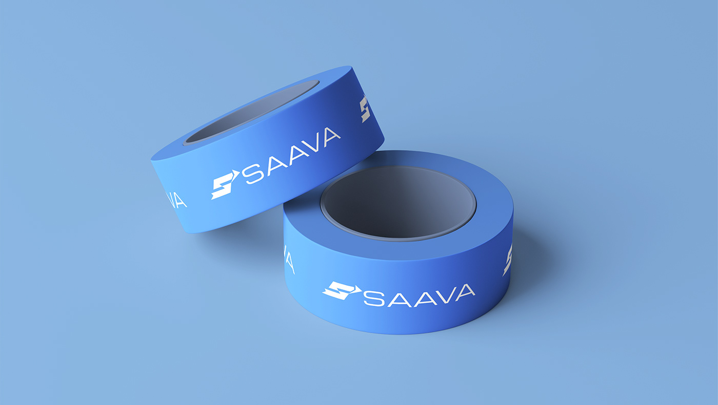
ЛОГОТИП | ФИРМЕННЫЙ СТИЛЬ
SAAVA - транспортная и добывающая компания, предоставляющая услуги по транспортировке большегрузной техники в горнодобывающей отрасли. Основной задачей было отобразить, что большегрузная техника при транспортировке разбирается и собирается на месте. Знак логотипа - буква S трансформируется в стрелку, что олицетворяет движение и дорогу.
SAAVA a transport and mining company that provides services for the transportation of heavy equipment in the mining industry. The main task was to display that heavy-duty equipment is disassembled and assembled on the spot during transportation. The logo sign - the letter S is transformed into an arrow, which represents traffic and the road.