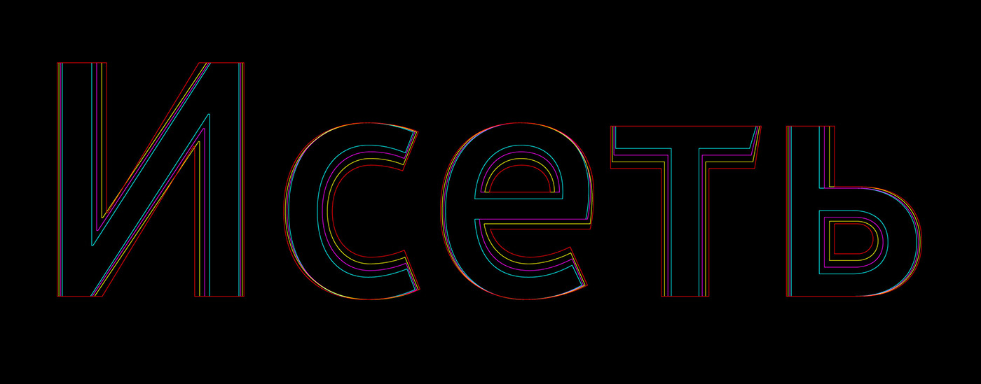
In 2017, we designed a signature font Iset — the voice that Ekaterinburg uses to speak to its citizens and guests.
Idea
It’s been a long time since Europe and the USA started developing their special fonts for cities. Moreover, there are already technical standards formed for such fonts. However, there are some linguistic nuances. For example, in German the words are too long whereas in Czech there’s a big amount of diacritics. Moreover, such countries as Russia have to write texts in two languages. Having studied the experience of other countries and specific features of using fonts in urban environment, we started the development of the font family for Ekaterinburg.
We identified the character of the font, the number of typefaces, as well as essential and extra signs so that our font can fit any purpose, for example, address plaques, navigation, public transport etc. Other cities use various fonts for different occasions but we aimed to preserve the uniformity in everything.
Principles
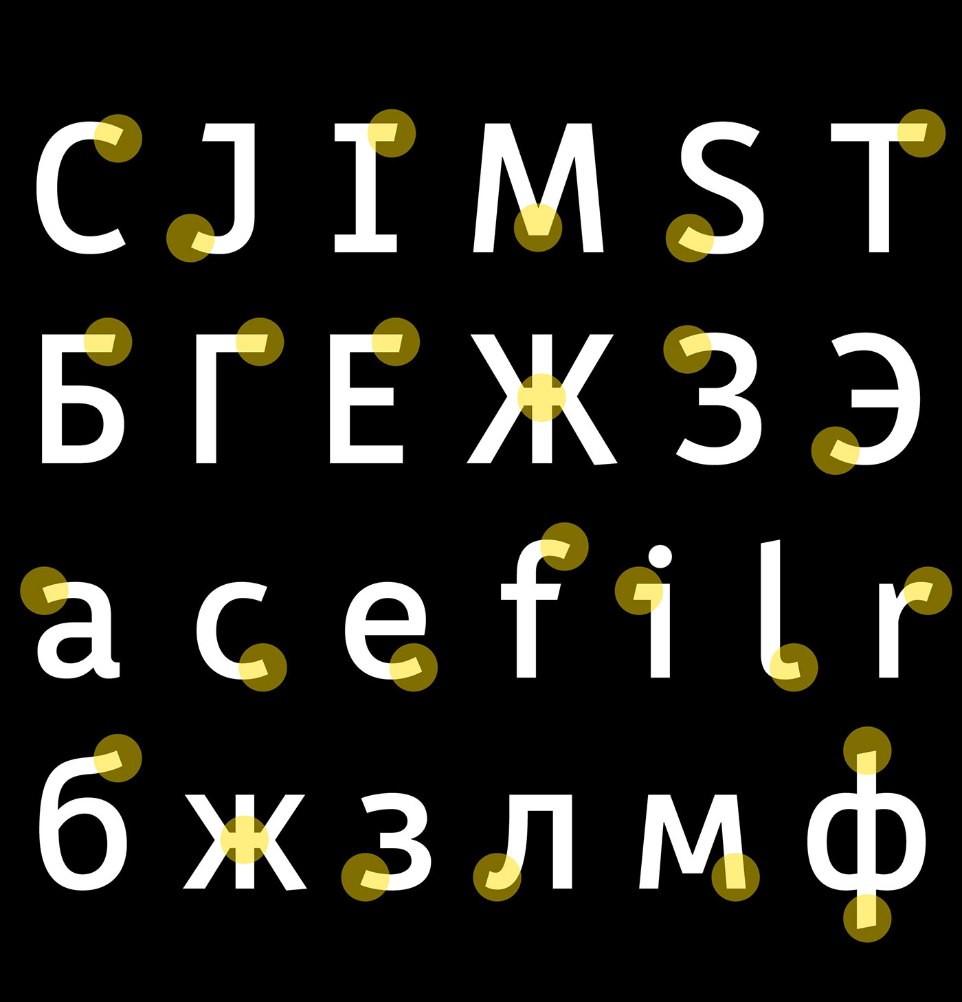
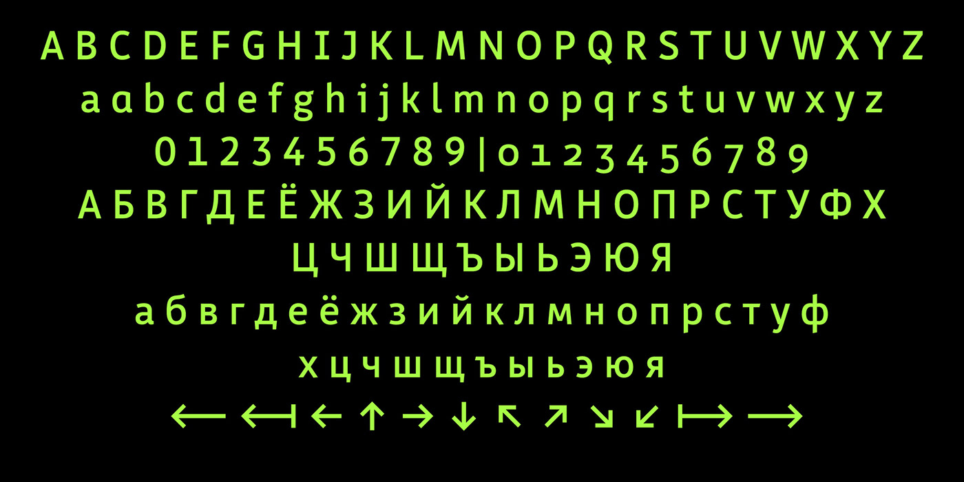
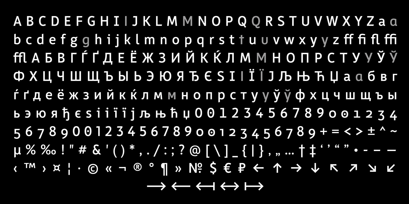
We articulated the major principles of designing the city font. First of all, it must be an open and contemporary grotesque with friendly and recognizable signs. Secondly, we need all the basic signs of the Cyrillic and Latin alphabets as well as complementary signs such as arrows, tabular and text or non-lining figures.
Outcome
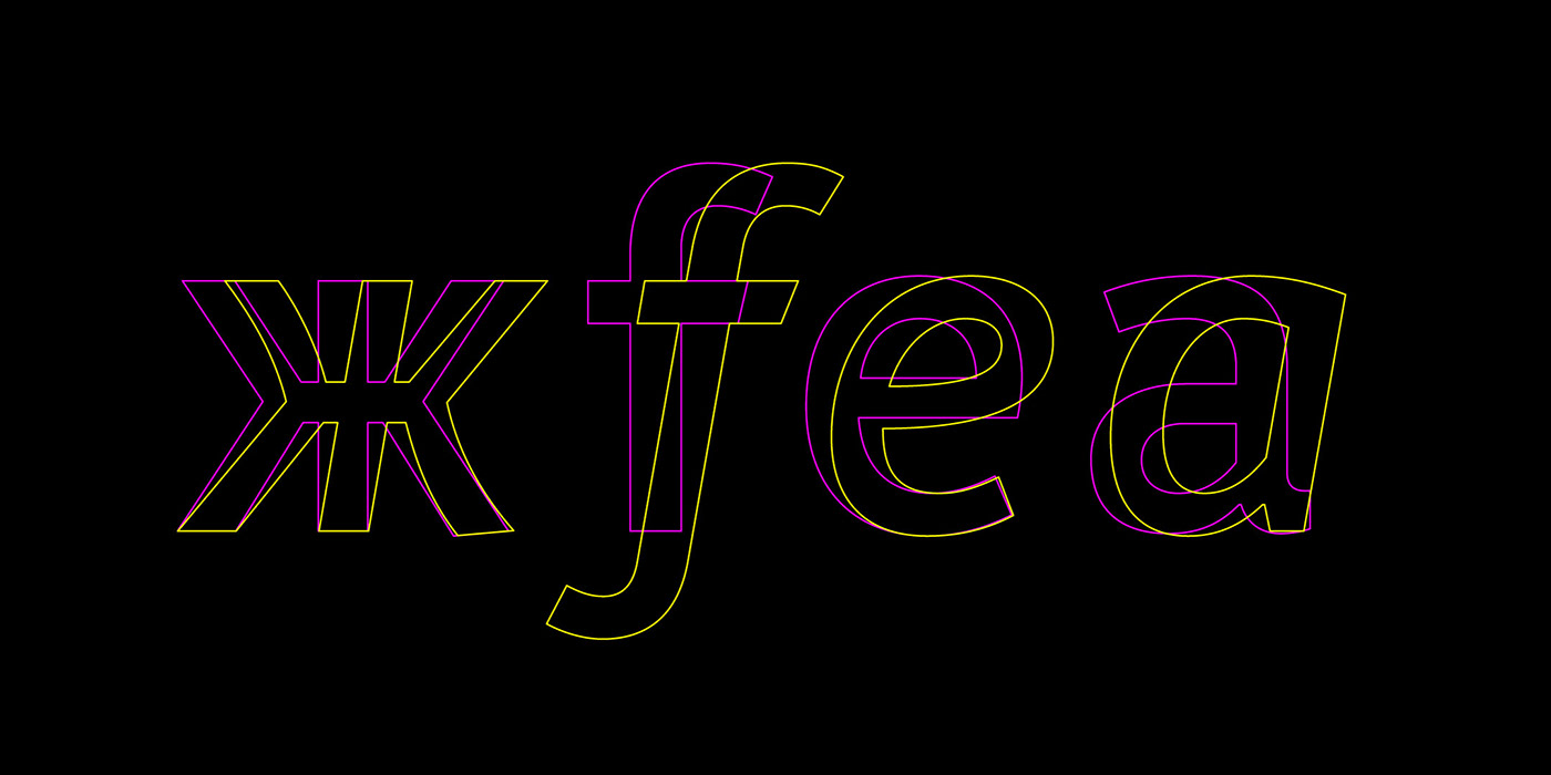
As a result, we created a compact humanist sans serif font which has clear and recognizable forms with a high level of distinctiveness.
Typefaces
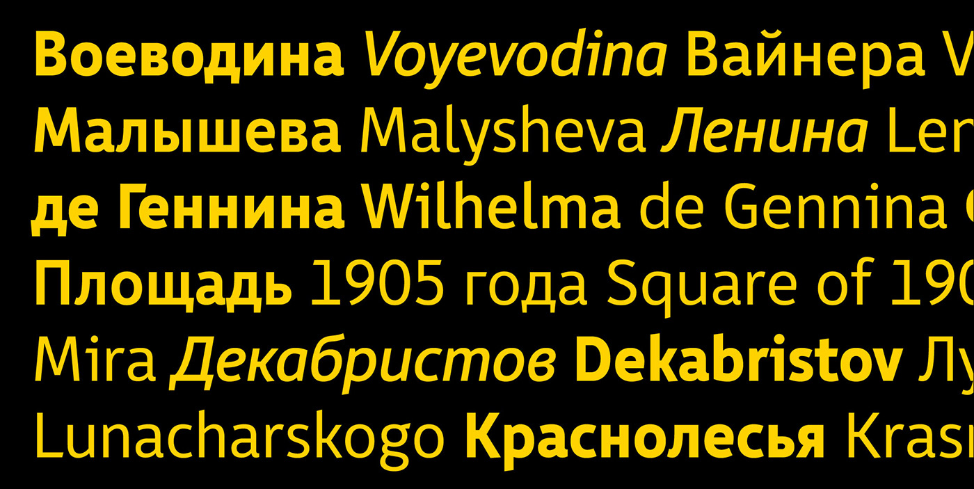
For the first version of the font, we designed the basic typefaces: normal for the main text, bold for accentuation and italic for English.
In the second version, the font family expanded to five typefaces. Besides normal, bold and italic, we added light and medium typefaces. Thanks to this, our font has become more flexible and easier to use.
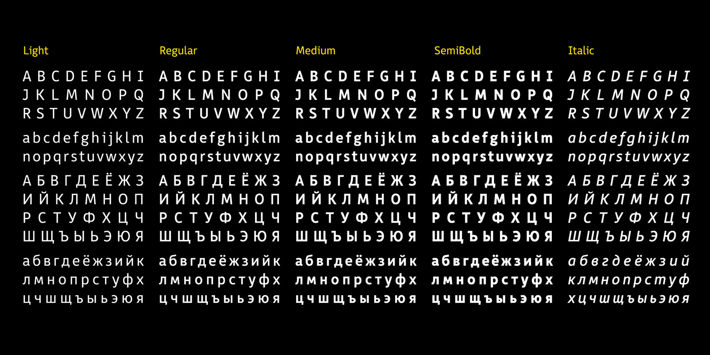
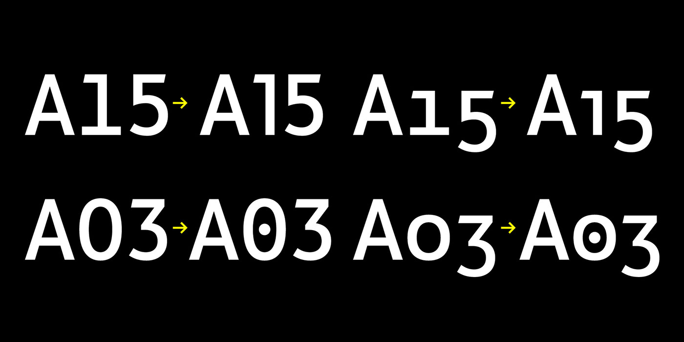
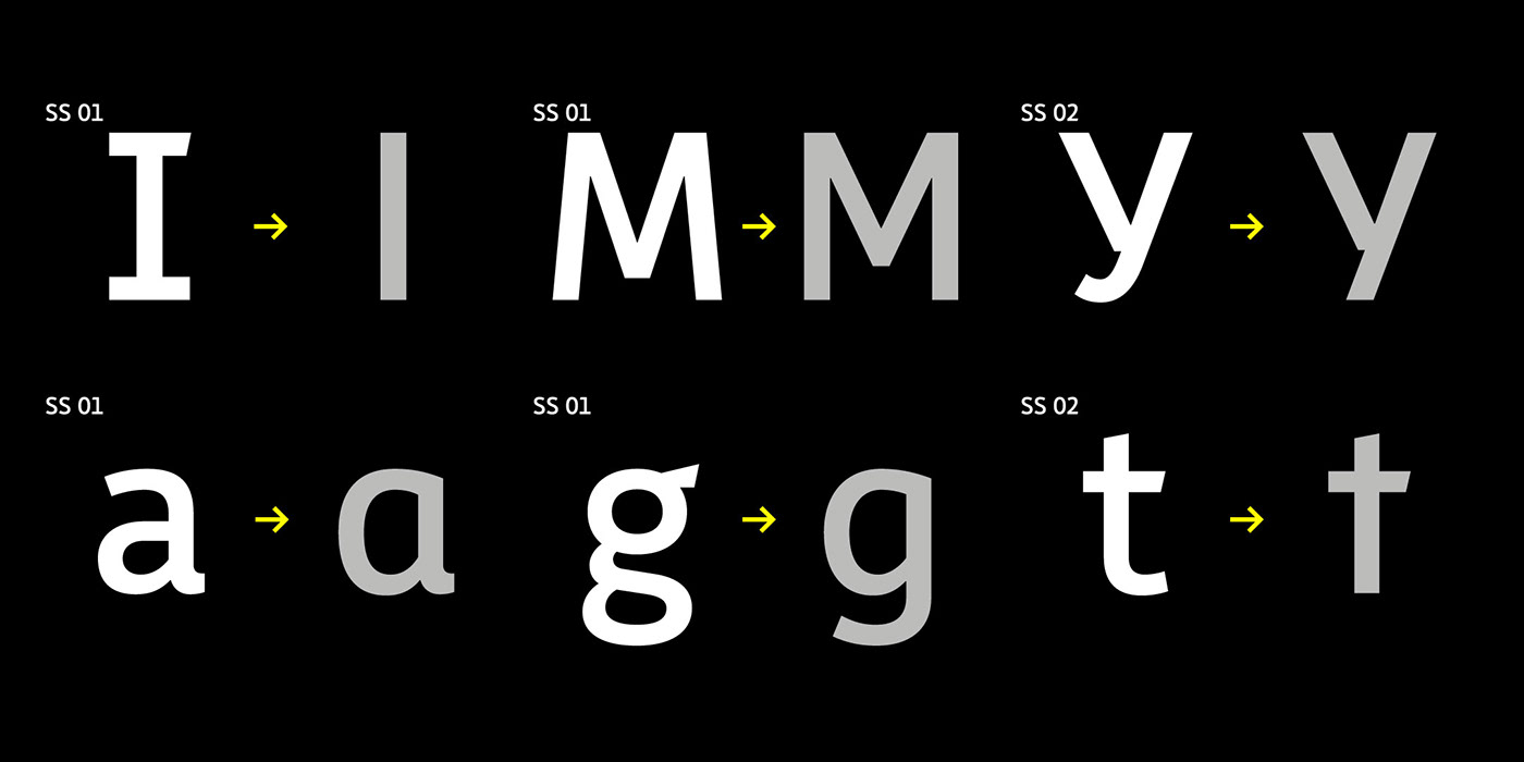
Each typeface has four kinds of figures and a variety of alternative versions of signs.
Readability
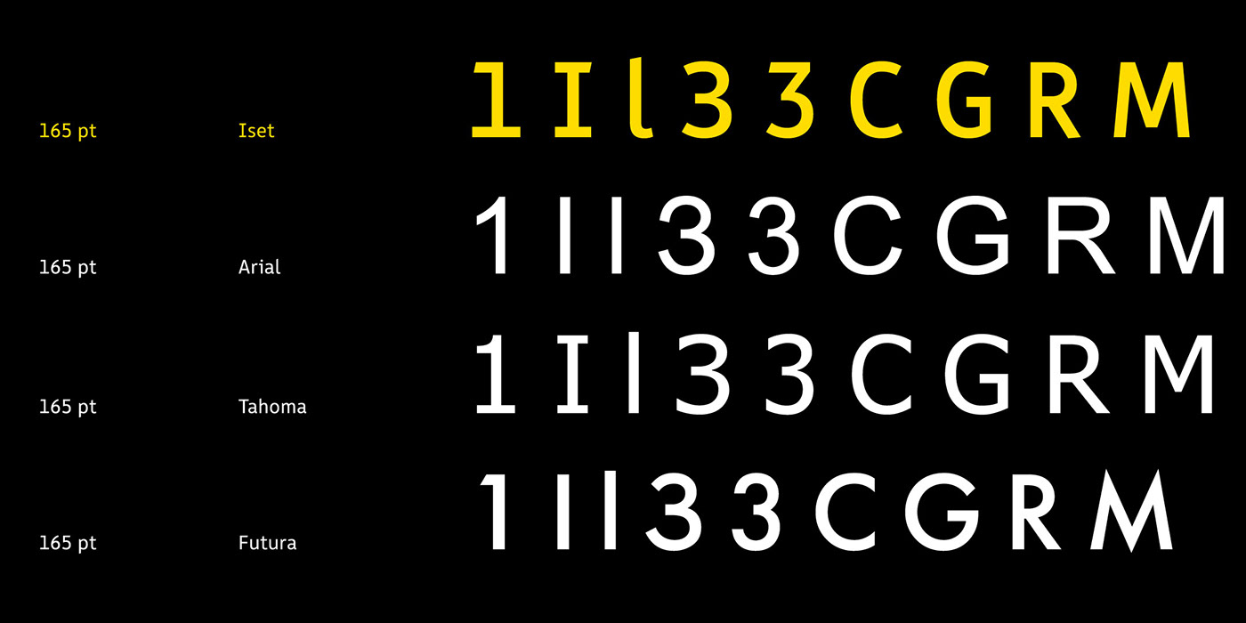
Distinctive features of the letters help read the text quickly and without mistakes. The absence of serifs, openness of letter forms, balance between the stroke width and x‑height allow for a perfect readability.
Convenience in Work
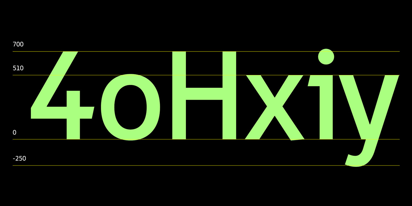
Tall lowercase letters and short ascenders help save some space vertically whereas the same width of the em-box for a normal and bold typefaces help avoid any reimposition.

In Real Life
Iset has already conquered the whole city. The font is everywhere: on public transport stops, plaques, signposts and navigation.


