

R1. Naming, Brand Identity.
Young IT-company inside Er-Holding.
Young IT-company inside Er-Holding.
The goal was to create not only a strong HR is a brand, but also a community that will unite many different professionals under one roof. The first company's name was R-Team, a prerequisite was to keep R at the beginning (reference to the holding). But after that, a simple and elegant option was proposed and approved. R1 is a reference to Formula 1, a metaphor that the project is a track, and the people in the teams are racers.


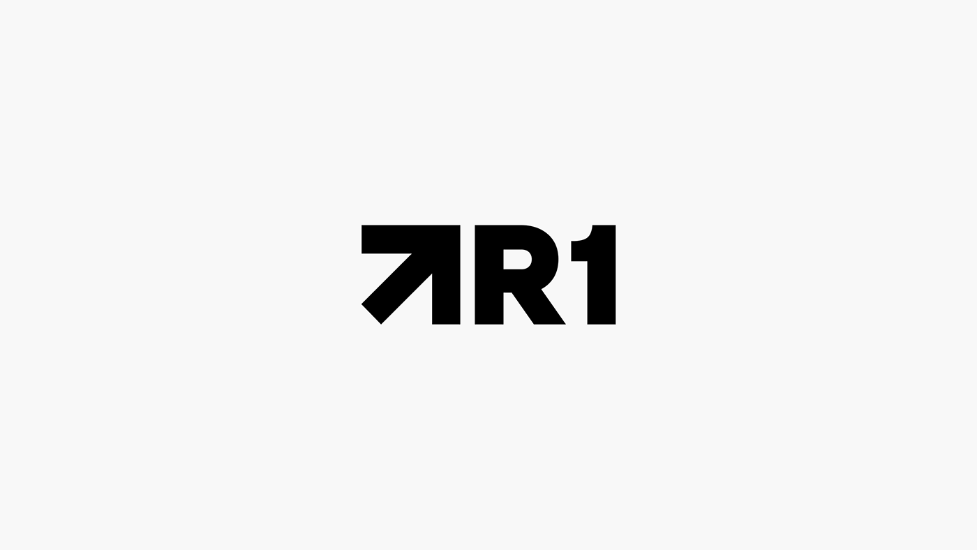
The symbols actually consist of two parts: the mirror letter R and the number 1. In addition to the symbol, we have text, so because of this it was important not to duplicate each other, and they should work well together. This is the reason for the mirroring of the sign.


The direction of the arrow helps to show that people work in different cities, but they are united by one goal, and they are moving in the same direction, helping the business to bring the bright future closer.
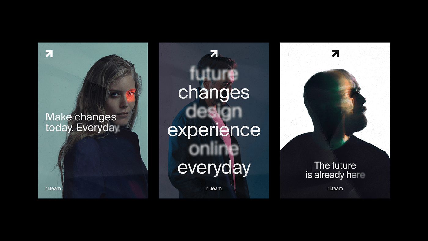
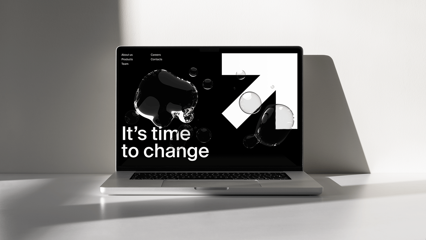


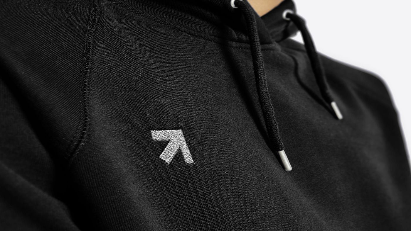
The black and white style helps to keep the focus on the content and products that the team creates (they are bright and colorful). Various designs have been created to show how the brand works both in digital and offline. Right now the company employs more than 400 people, and the new style is being implemented at all levels.


