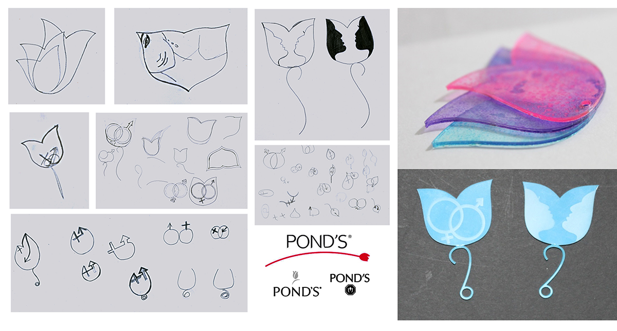
A classroom assignment with a brief to design a keychain using laser cut for any particular brand giving more emphasis to its form and structure.
Understanding the Brand
•Ponds characteristic logo – Tulip Flower
•Basic tulip logo has been stylized at various periods of time in pastel pink , blue , green and shades of white.
•Tulip logo is inspired from a flower bud shape that represents the fragrance , freshness and other versatile features of the brand.
•The most famous cosmetic brand by females.
•Basic tulip logo has been stylized at various periods of time in pastel pink , blue , green and shades of white.
•Tulip logo is inspired from a flower bud shape that represents the fragrance , freshness and other versatile features of the brand.
•The most famous cosmetic brand by females.

The concept which I tried imparting in the 'Ponds' basic logo tulip flower is that , the brand initially started with wide varieties of cosmetic stuff for females and being successful , they recently started launching products for males or more of unisexual products as well. That is how I conceptualized the idea of imparting a male and female face or the symbols of the same in it.
Logo as a keychain with laser cut.This concept applied here is that the three tulip flowers which are blooming from one inside the other is cut out in different layers and stuck together. The flower with widest surface area is given pink color that represents female crowd , the bottom one given blue , indicating male crowd and the middle one a combination of both , representing their latest possibility in unisexual products.The color used is glass paint with sponge.


