


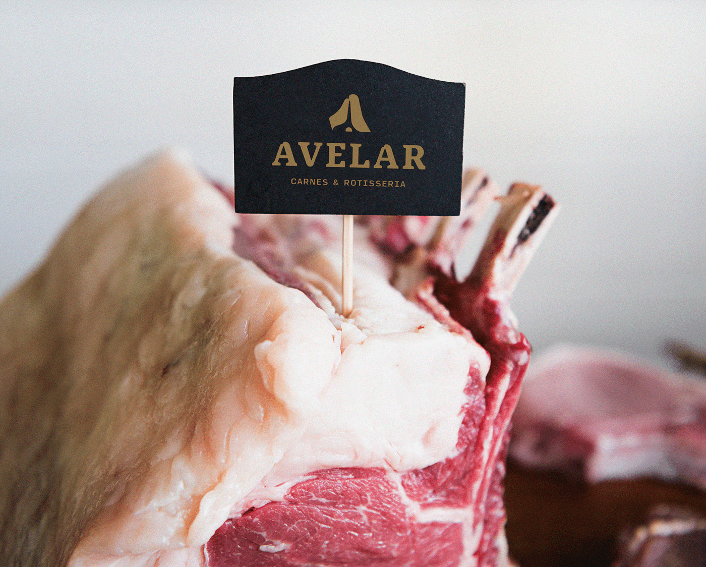
Avelar é um açougue de bairro que ao longo do tempo se posicionou também como uma casa especializada em cortes nobres. Nossa ideia foi trazer um simbolismo que sintetizasse essa mudança de perspectiva e de entrega do cliente. Pensando nisso escolhemos o T-bone para representar a letra A, por ser um corte considerado nobre.
O uso da tipografia remete não apenas a força que a empresa deseja passar, mas também cria um vinculo com o símbolo em seus cantos levemente arredondados e sua base fazendo referencia a divisão do corte bovinho.
-----------
Avelar is a neighborhood butcher shop that over time has also positioned itself as a house specializing in noble cuts. Our idea was to bring a symbolism that synthesized this change in perspective and customer delivery. With that in mind, we chose the T-bone to represent the letter A, as it is considered a noble cut.
The use of typography refers not only to the strength that the company wants to convey, but also creates a link with the symbol in its slightly rounded corners and its base referring to the division of the bovine cut.
The use of typography refers not only to the strength that the company wants to convey, but also creates a link with the symbol in its slightly rounded corners and its base referring to the division of the bovine cut.


